
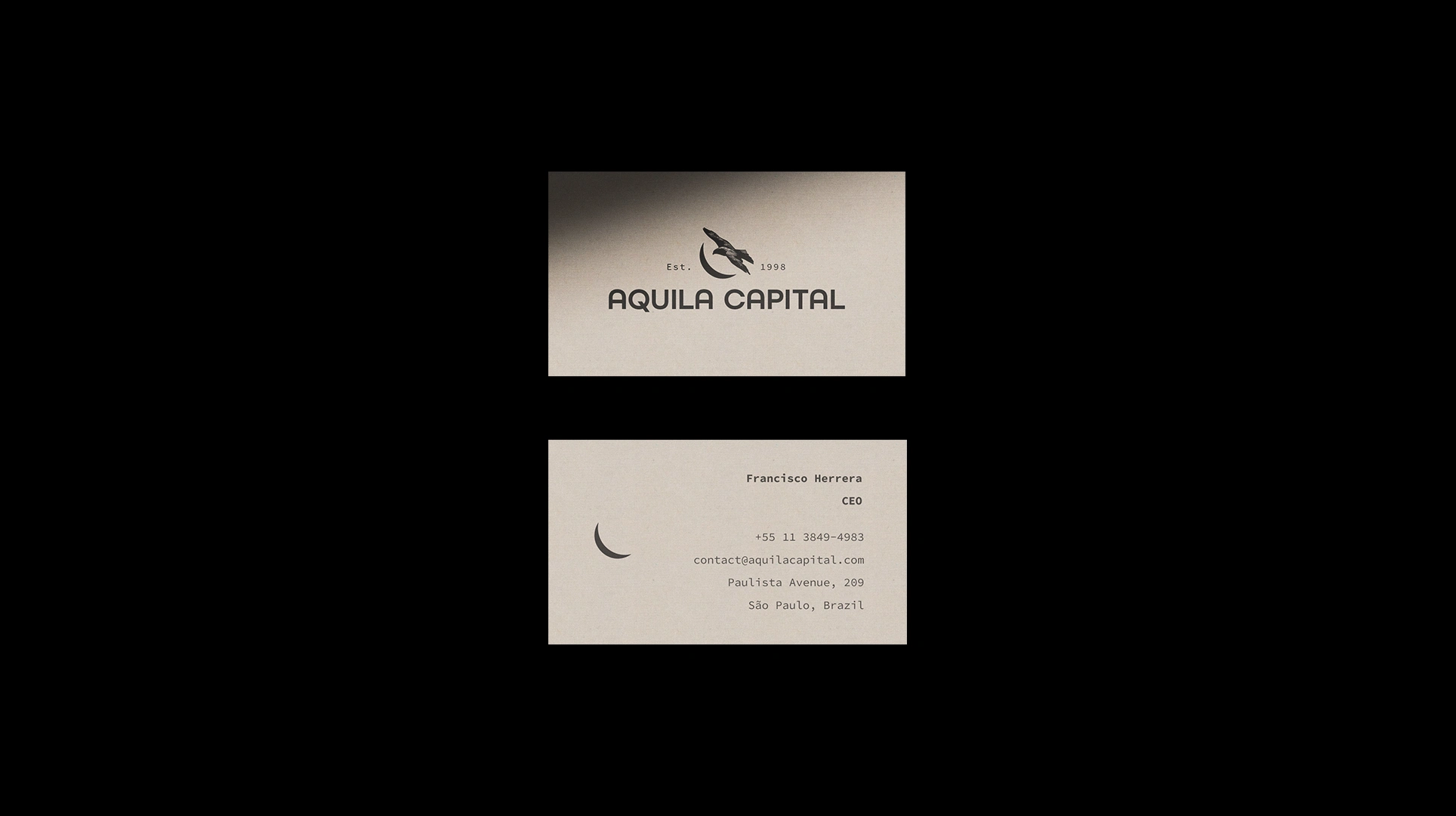
Aquila Capital is an investment firm based on Paulista Avenue, in São Paulo, established in 1998. The identity needed to carry that history with confidence: experienced, precise and built for the long term.
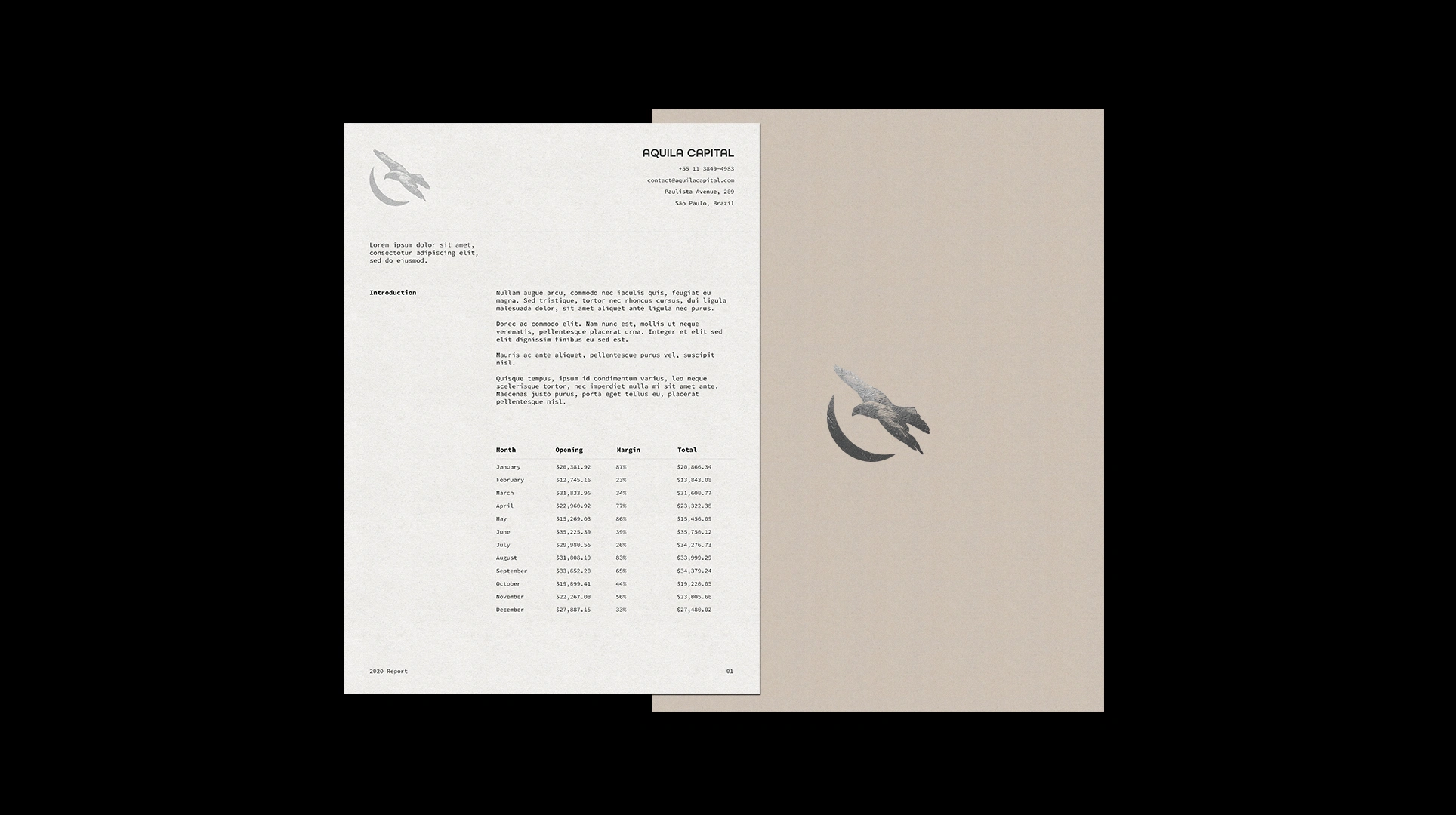
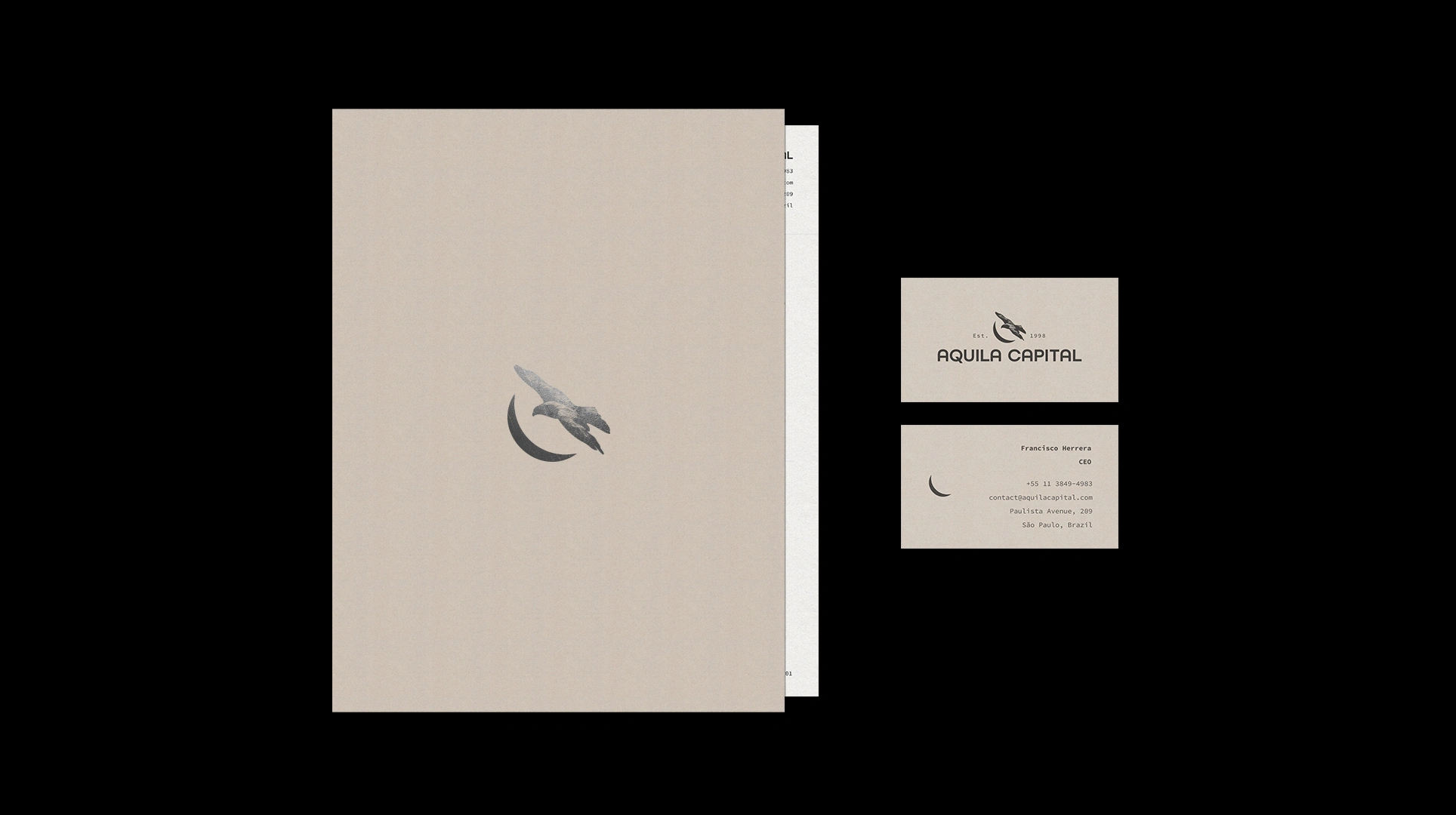
The symbol pairs an eagle (aquila, in Latin) with a crescent moon. The eagle stands for vision and the ability to see further, while the crescent suggests cycles and patience, the rhythm of capital that grows over time. Applied in silver foil over warm, textured paper, it feels quiet and confident.
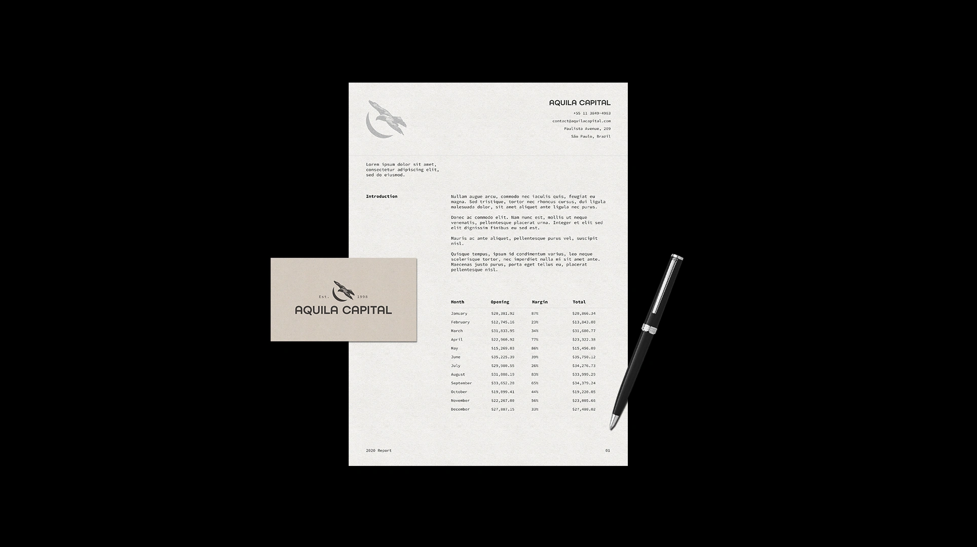
A geometric wordmark built on a precise construction grid carries the name, and a monospaced typeface gives every document the feel of a well-kept ledger. The palette stays restrained: black, warm grey and silver, inspired by modernist architecture and classic objects that only get better with age.
The system extends across business cards, letterhead, reports, folders and a leather notebook.





0 likes · 0 views · Nov 16, 2026
Brand identity for Aquila Capital, a São Paulo investment firm. An eagle and crescent moon in silver foil, with a restrained, timeless system for print.


