Power BI Personal Finances Dashboard

Personal Finances Power BI Dashboard
The requirements:
Must connect to a MySQL database that contains daily transactions data.
Must use a dark-theme representing requested colours
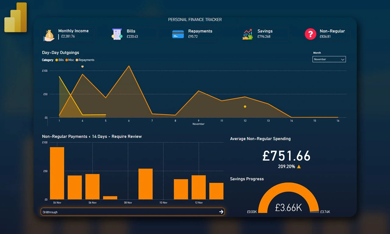
Must show a monthly breakdown (Income, Bills, Repayments, Savings and other uncategorized payments).
Must show a visualisation that contains erroneous payments from the last 14 days that exceed £10 but are below £100.
Needs to be simple - contained on 1 page with a minimalist approach (excluding pages for further analysing data from the main page).
Outcome:
I developed a 1-page dashboard that contained a breakdown at the top, an area graph with categories below, payments > 10 but <=100 from the last 14 days with a tooltip feature (hovering over the a bar shows some more info about that day and the payments inside, as well as a drillthrough feature for further analysis.
Like this project
Posted Nov 19, 2024
Developed interactive dashboards using Power BI, transforming raw data into actionable insights to support strategic business decisions.


