
Tools: Figma
Services: Mobile App Design, UI/UX Design
Overview
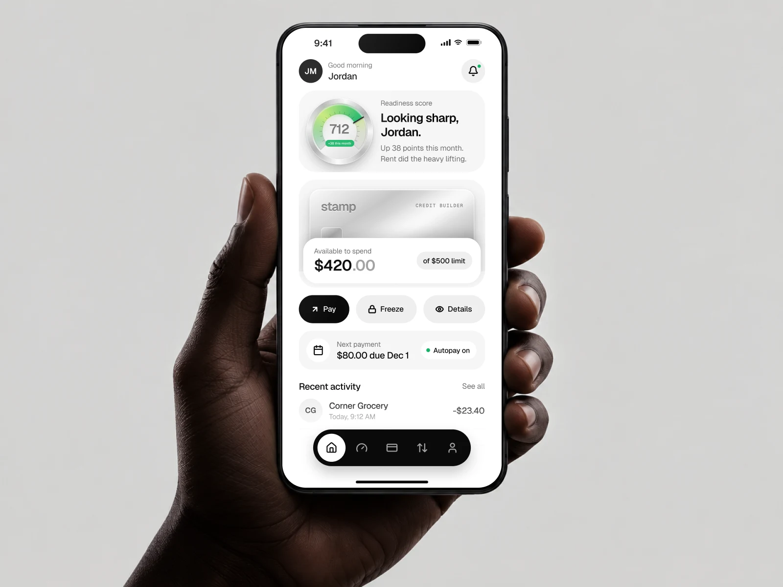
Stamp is a mobile app for people who have just moved to the USA or the UAE. Newcomers often arrive with a solid financial history, but it doesn’t follow them, so they’re turned down for cards, leases and phone plans. Stamp reads their rent, salary and bills through read-only bank access and turns them into a credit score, a starter limit and a virtual card from their first week.
I designed the full app in Figma, from onboarding and identity checks to the score, the card, payments, activity, profile and support.
The Challenge
Make credit feel approachable for people who are new to a country’s financial system.
Build trust fast, since users are asked to link their bank account and share personal data.
Support two countries with different IDs, banks and currencies in one experience.
Turn a slow, invisible process, building credit, into something visible and rewarding.
Design Approach
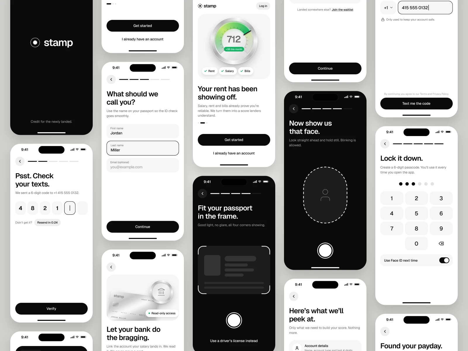
A clear first-week journey: onboarding, ID check and bank linking are broken into short, single-purpose steps, so a new user reaches their first score in minutes.
Trust-first bank linking: every permission is explained in plain words (“Read-only. We can’t move a cent.”), with an income review screen so users can confirm what the app found.
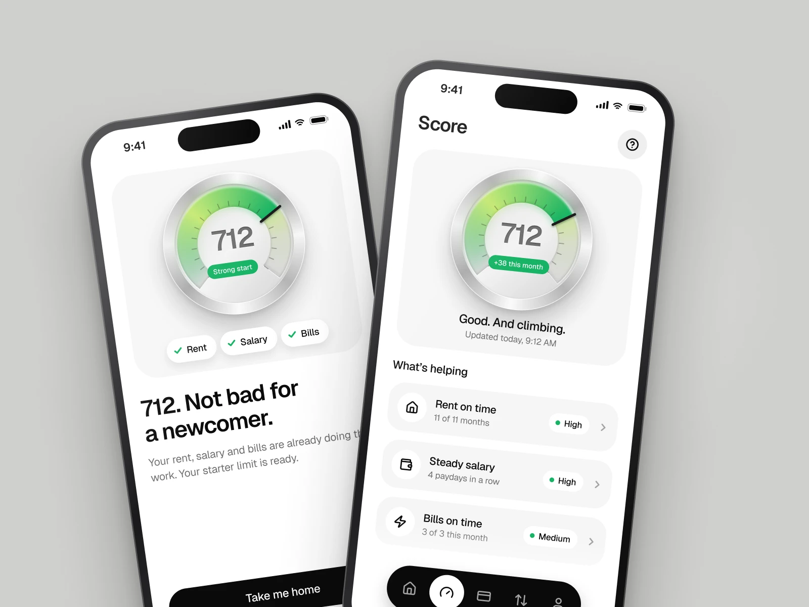
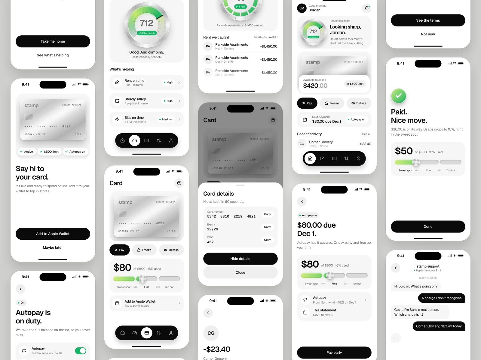
A score you can feel: a metal score dial and metal cards give a premium, tangible sense of progress. The green accent is used only for growth and positive signals.
Playful, human copy: lines like “712. Not bad for a newcomer.” and “Paid. Nice move.” keep a serious financial topic light and encouraging.
Every state designed: loading, empty, error and edge cases are covered across the app, not just the happy path.
Key Features
Onboarding and identity: country selection, phone verification, ID scan, selfie and passcode.
Bank linking: choose a bank, review data permissions, pick an account and confirm income.
Readiness score: a 300–850 score with what’s helping (rent, salary, bills) and factor detail screens.
Card: starter limit offer, clear terms, activation, card details and freeze controls.
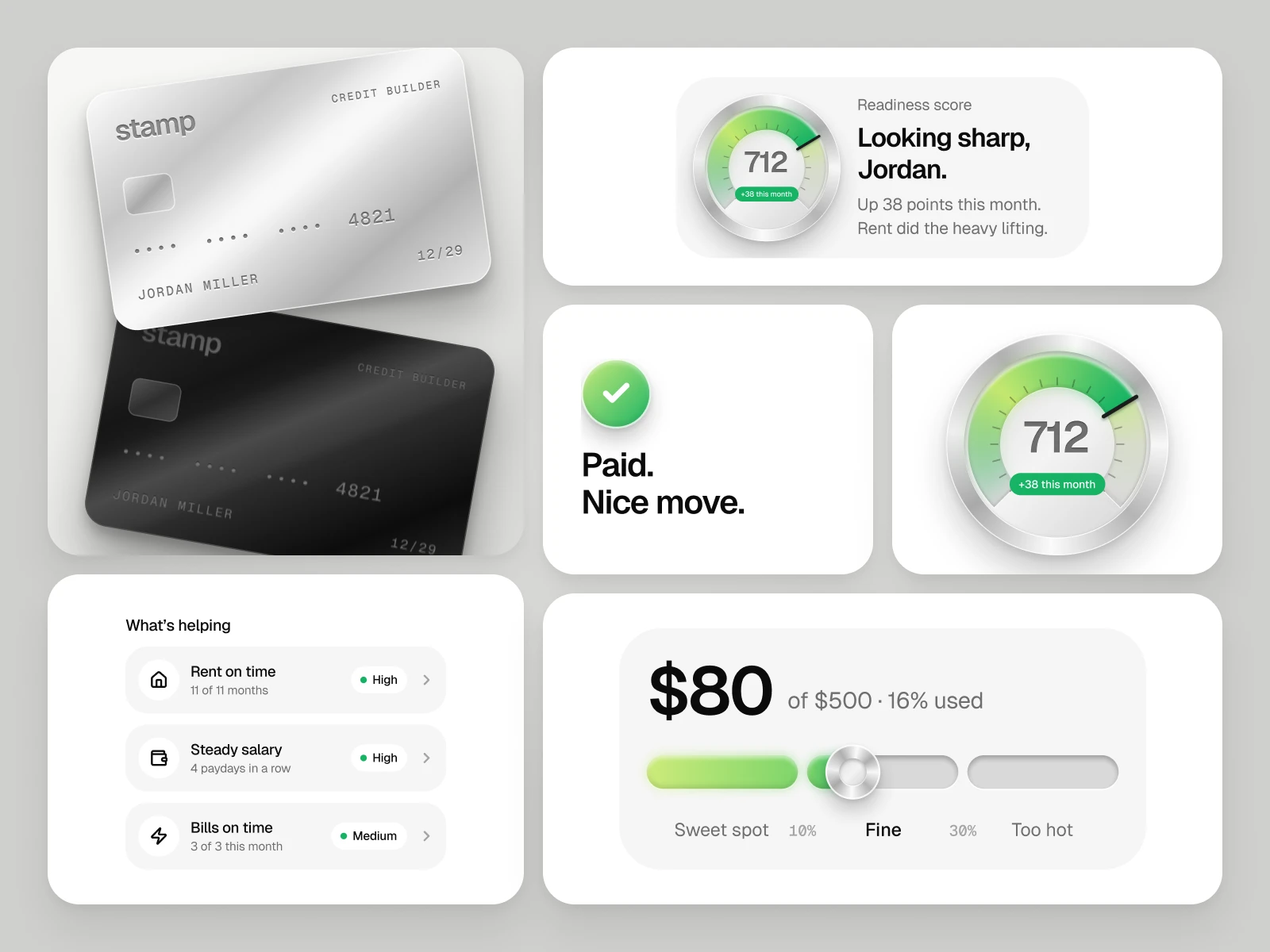
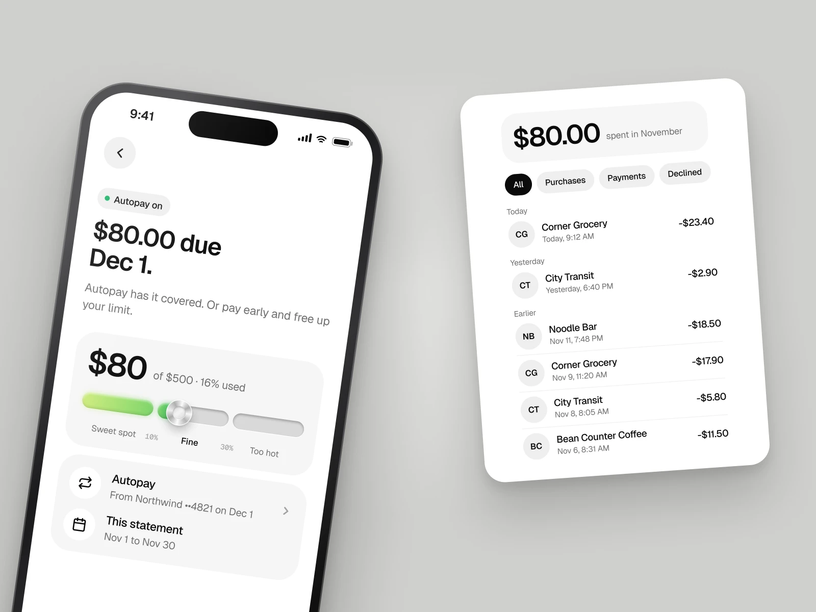
Usage meter: a simple scale showing the “sweet spot” for credit usage.
Payments and autopay: pay early, choose an amount and get a clear confirmation.
Activity, profile and support: transactions, filters, linked banks, documents, security, help and chat.
Design System
I built a compact system to keep the app consistent across 56 core screens and more than 150 states:
A monochrome palette with metal finishes and one green for progress
Geist for UI text and Geist Mono for card details
Reusable components: buttons, status bar, navigation, metal cards, the Score Dial, chips and the usage meter
Outcome
The result is a calm, premium app that turns credit building into a clear and rewarding journey. Newcomers can go from download to a score, a starter limit and a working card in their first week, with every step designed to build trust.
2 likes · 4 views · Nov 15, 2026
