Helping women around the world understand their monthly flow
Procter and Gamble Latam is a well-known multinational company focused on consumer goods. Their innovation department hired us to design and develop a mobile app that panelists would use to better understand their menstrual cycle, complete surveys and test new products.
The challenge
We call the app Happy Changes to reinforce this idea of well-being for the women serving as panelists. The app had to be designed to meet the high-stakes performance, reliability, and security requirements of the company. Users must confidently navigate the app, share personal information and feel secure, integrated, and feeling useful at the same time.
We had limited time to conduct the study, create new flows and processes, design and develop the application and, with this project, take Happy Changes project to the next level.
Approach
We put together a small team of experts in the essential areas (PM, Science, UX Design, UI, Devs) and asked project stakeholders to be involved in the process to fine tune timing and make timely decisions. We decided to co-create this project in about 8 weeks.
The starting point will be a 2-3 week strategy process (user personas, feature focus maps, user flows, to get to user flow wires). Then the UI team joins to kick of system design and UI interpretations of the wires and flows in another 2 weeks.
The end results would be 1 prototypes to demo to the P&G team and beta users. Once approved, we started the development process for about other 4-6 weeks.
Outcome
Our users keep detailed control of their menstrual cycle in a dynamic and fun way. In turn, they answer Procter and Gamble surveys that help improve quality control, test new products and fine-tune marketing or product efforts.
The app is available in 3 languages: Portuguese, Spanish and English, and is used primarily with panelists from Brazil, Mexico and the United States.
Also, thanks to the success of the project and having far exceeded the established time and quality standards, we were able to establish a strong relationship with Procter and Gamble to continue other projects in the coming months and help scale their innovation team in the region.
Now, I will tell you the process
Discovery & ideation
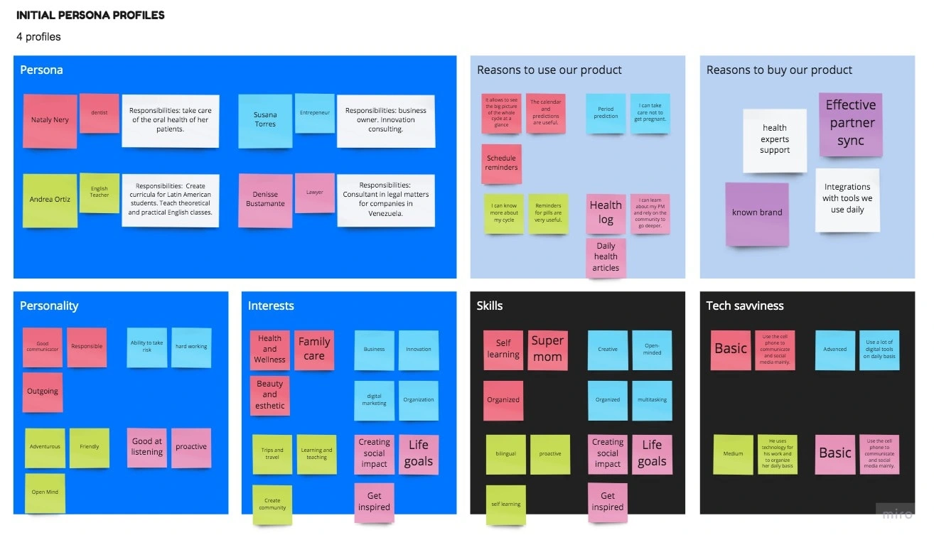
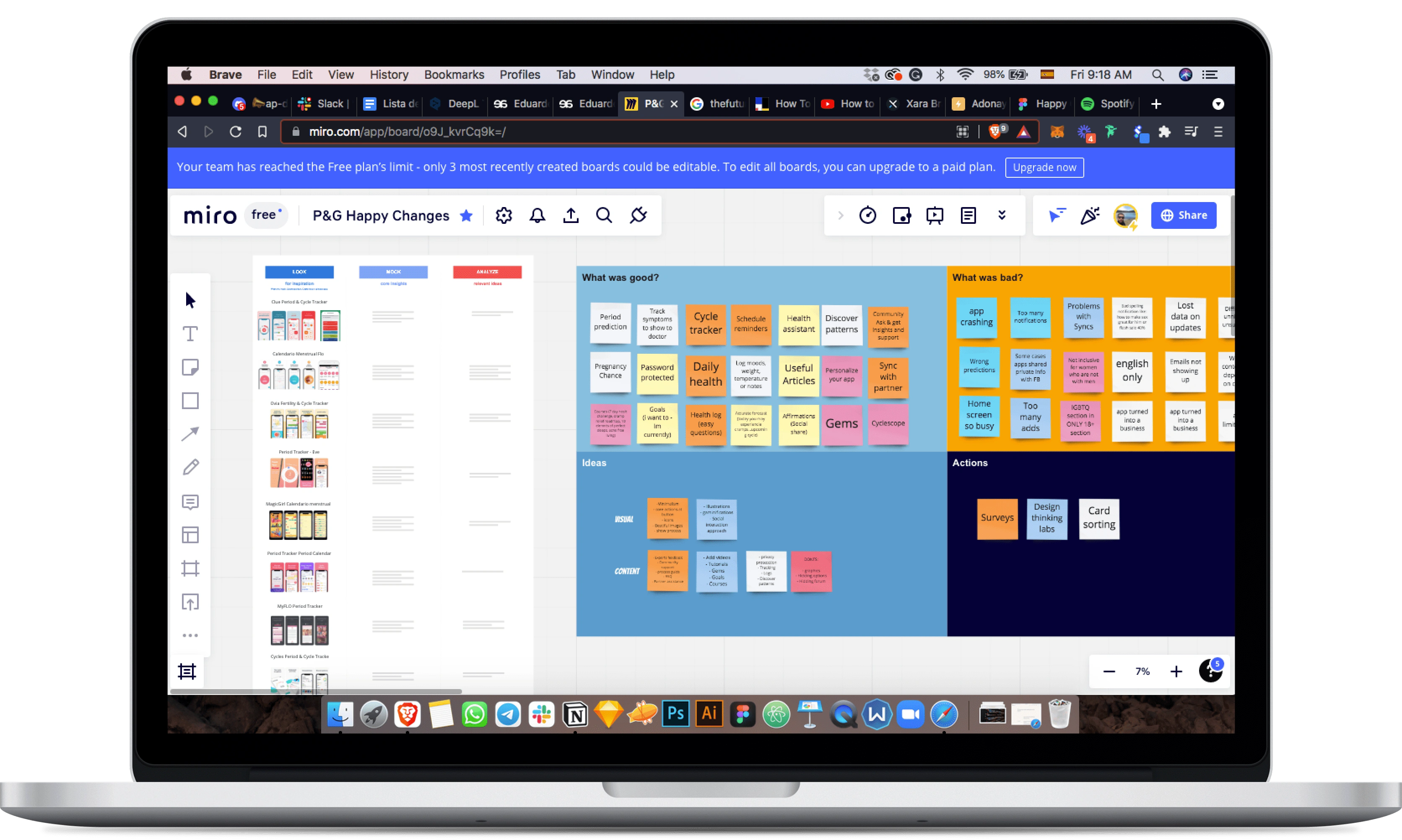
We created 4 user profiles to focus our strategies. We made a benchmark to analyze similar applications and direct competition.Once this analysis was done we started to dig deep into what we could extract initially (industry standards, most common user requirements and needs, most effective communications, etc).
Then we created a moodboard to start visualizing the aesthetic and create the foundation for the design system.
UX Definition
We worked on providing a clear overview of the mobile structure, user flow, intended behaviors, and how the users could go from their entry point through a set of steps towards a successful outcome and final action.
We create flows and wires to cover the main functionalities of the app:
Calendar and symptom recording.
Visualization and control of the menstrual cycle.
Gamification system to strengthen the use of the app over time.
News to educate and share interesting insights for users.
P&G's product quality control and survey system
UI Design
We approach the UI phase starting with a Moodboard and designing the core screens. Then we built the design system (components, interactions and animations, empty states and edge cases, etc).
After that we designed the rest of the screens needed. Finally we put some specifics areas in motion using our team skills for bring sparks into the final product.
Home screen
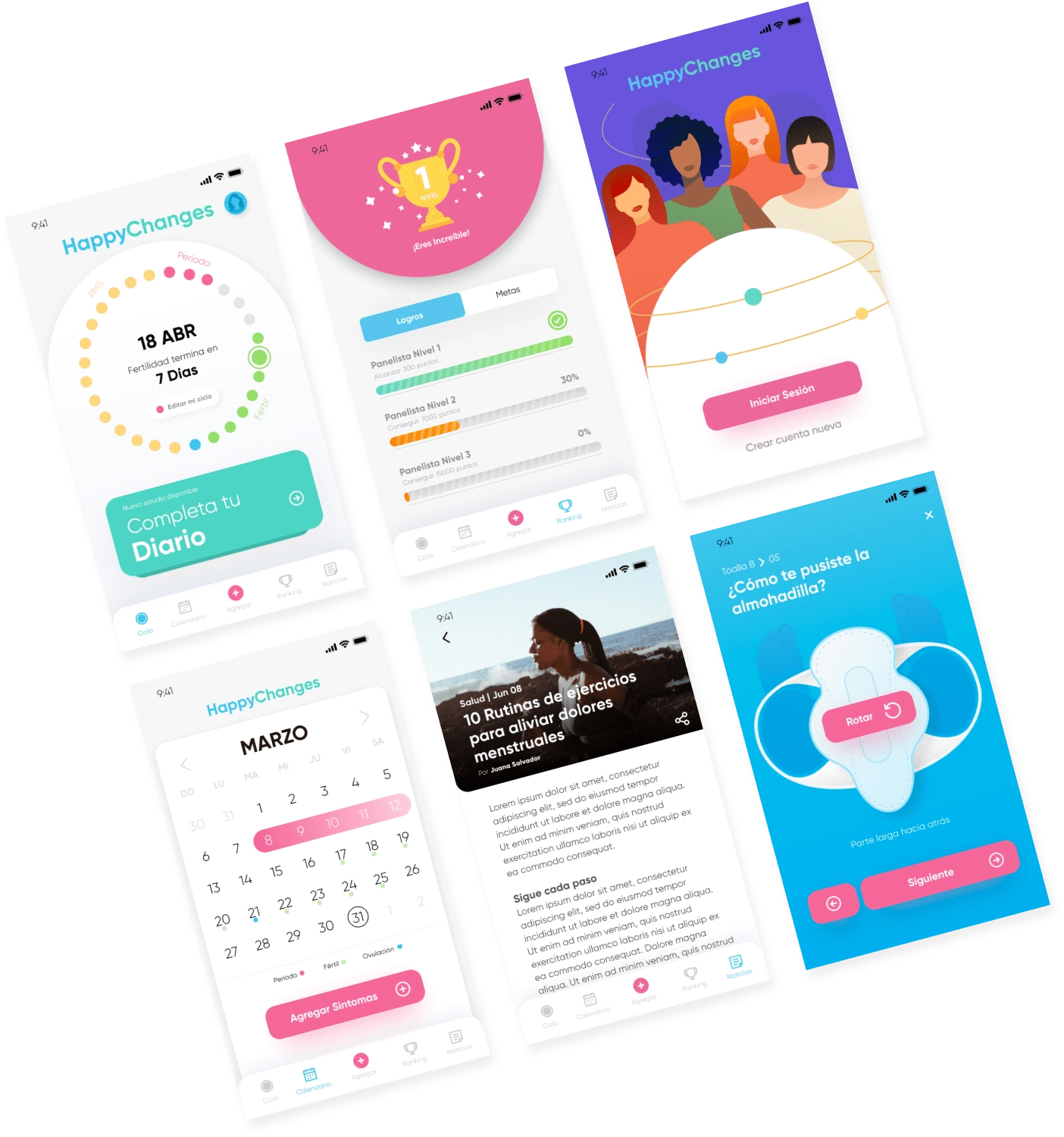
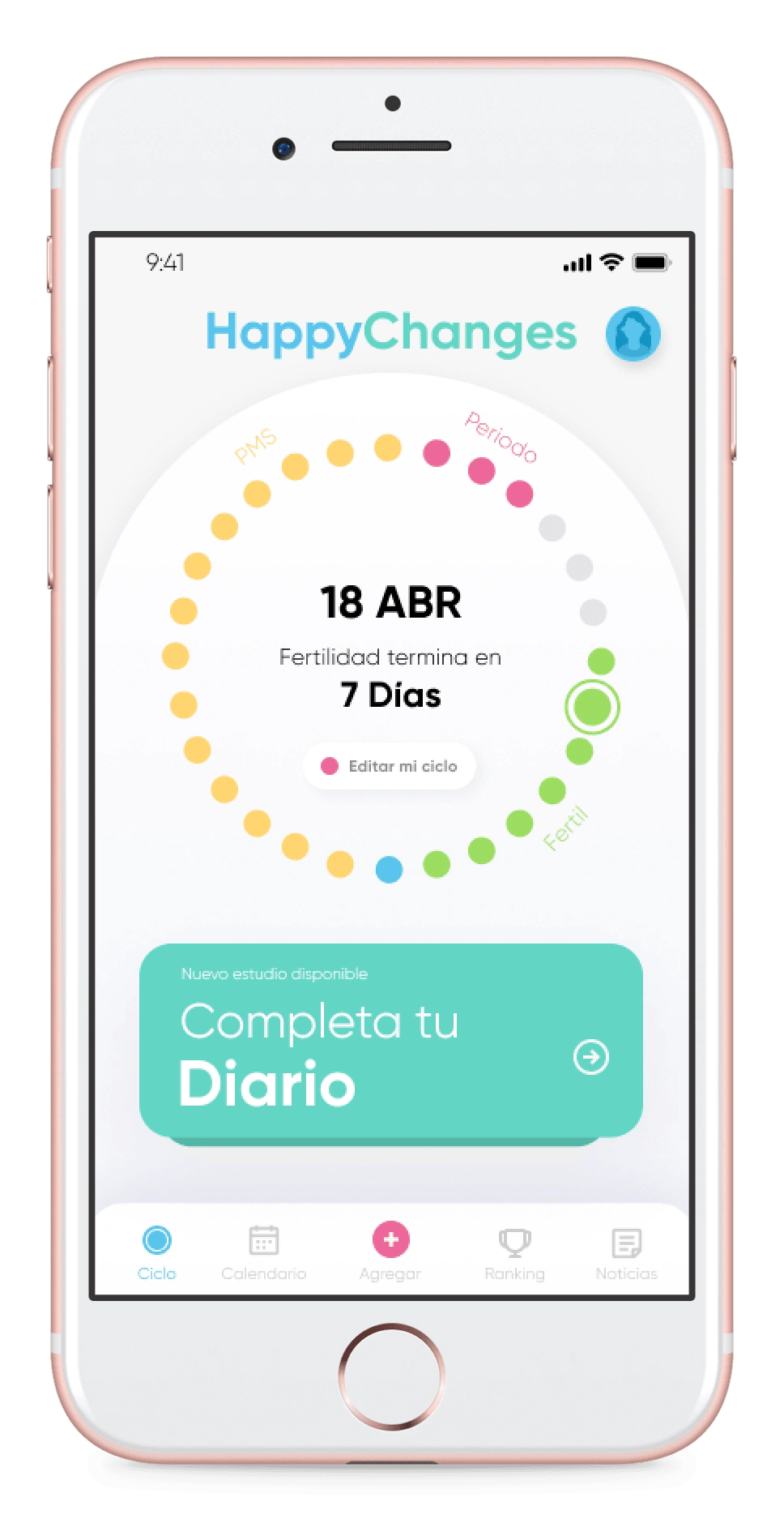
The main screen had to reflect and streamline the main functions of the platform. In that sense we created a graphical representation of the menstrual cycle highlighting 4 base colors for the different states of the cycle (Fertility, PMS, Period, null).
We also added a module that varies according to the status of the user: Inviting to complete a diary when their support is required for quality control or a featured items in case there are no surveys to complete.
Symptoms and Calendar
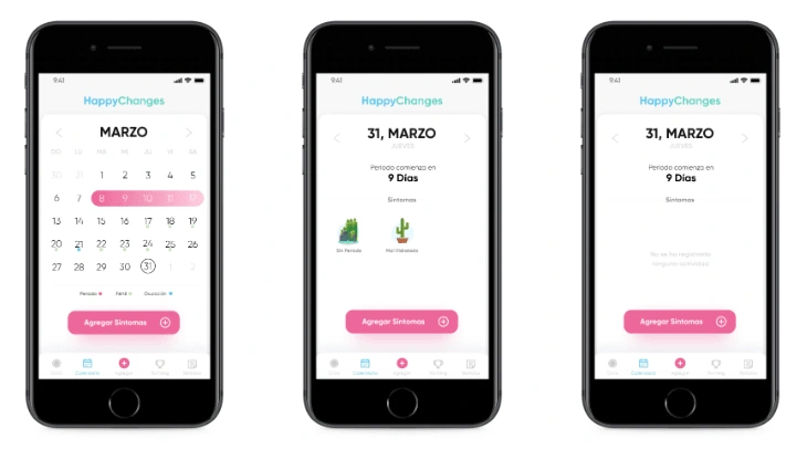
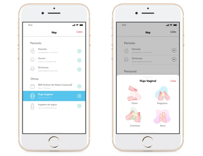
We allow quick access through the calendar button, the menstrual cycle wheel and also the add button to record users' progress over time. This decision was made after several interviews, heuristic tests, and design thinking sessions where we detected navigation differences between our user profiles. We also made illustrations with a very conceptual style to emulate the information we wanted to record originally and respectfully.
Survey System
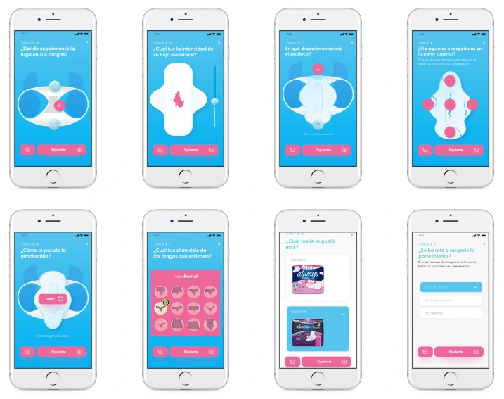
We call this system Diary. We linked it to the gamification system to make it attractive and entertaining to fill out, but at the same time, we worked hard to determine how to visualize the different cases that could be presented according to the type of questions.In some cases they were simple choice or open-ended questions. But for the most part, the interaction was more specific to find out where specifically a problem had been detected in P&G products.Below are some of the more unique cases.
Highlights
The app its launched and being tested by real users.
We managed to create a product that our users find useful and rely on to use frequently. P&G team is super hype about the new possibilities and they are scaling up the platform already.
Overall, we were all proud that we were able to solve the users pain points, achieve the business objectives and leave a clear roadmap in the team for the next challenges and future iterations.
Team
Fernando Galindez - Project Manager
Raquel Reis, Product Development Scientist
Mariella García, Scientist
Ana Paola Gómez, Scientist
Adonay Lizardo - UX/UI Designer
Jesús Morillo - UI & Motion Designer
Like this project
Posted Oct 31, 2023
Our users keep detailed control of their menstrual cycle in a dynamic and fun way. The app is available in 3 languages.

