Sales Data Comparison & Analysis (2023–2024)

Chirag Suri


🛍️ Sales Data Comparison & Analysis (2023–2024)
A complete end-to-end data generation, cleaning, and visualization project comparing two business years (2023 vs 2024) through custom synthetic data. Built entirely in Python (Jupyter Notebook) and visualized using Power BI — combining storytelling with interactivity using dynamic slicers, maps, and custom tooltips.
🛠️ Tools & Technologies Used
Python (pandas, Faker, NumPy) – Generated and cleaned 2023 & 2024 datasets using random logic and libraries.
Power BI – Designed interactive dashboards with city/state maps, slicers, donut charts, KPI cards, tooltips, and bar graphs.
Generative AI (ChatGPT) – Used as a co-pilot to debug scripts, organize logic, rewrite markdown, and brainstorm layout/design enhancements.
👤 Author
Chirag Suri
Always curious with data, a fan of combining visuals with meaningful insights.
GitHub: Link
LinkedIn: Link
Portfolio: Link
📁 Dataset Description
This project doesn’t use real-world business sales data. Instead:
🔹 I first generated synthetic sales data for 2023 and 2024 using Python’s Faker and NumPy libraries.
🔹 Then saved them into two datasets:
Sales_data_2023.csvSales_data_2024.csv🎯 Problem Statements / Goals
While most people look at just total revenue per year, this project dives deeper into:
🛒 Are certain product categories more dominant by sales or by total orders?
🏙️ Which cities contributed the most to overall revenue?
📈 How do trends change month-by-month across KPIs like Sales, Orders, Quantity Sold?
👤 Who are the top customers and how much are they contributing to our growth?
🧭 What is the business growth direction comparing 2023 and 2024?
These questions often get ignored in surface-level reports — this project is about answering them clearly and interactively.
🔄 Project Workflow
🐍 Python (Jupyter Notebook)
Used
Faker, random, and NumPy to simulate customer/product/order behaviour.Created two different logic blocks — one for 2023 and another for 2024 (with product-category mappings, customer/product ID formatting, etc.)
Ensured consistent column names, formats, and realistic date ranges.
Final output was saved as
.csv files to be imported into Power BI.➡️ Notebook:
SalesDataset.ipynb📊 Power BI Dashboard
This dashboard combines a clean layout with multiple pages to show different stories across product, region, and customer KPIs.
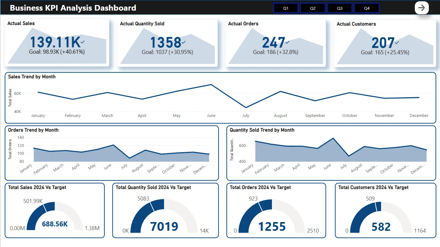
📄 Page 1: KPI Dashboard
📌 KPI cards: Actual sales, quantity sold, orders, customers
📈 Line charts: Month-wise sales and orders
🎯 Gauge charts: Year-end vs target metrics (sales, orders, customers)
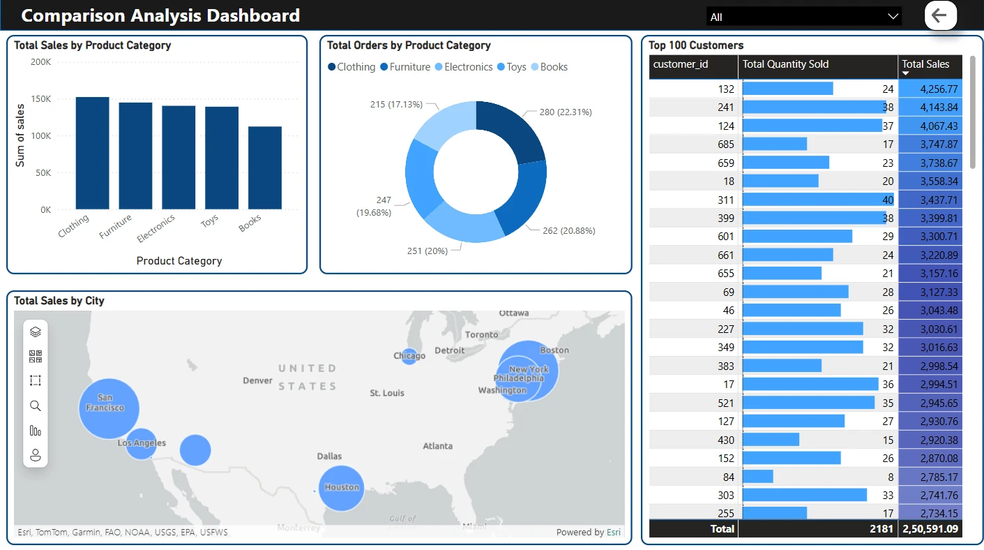
📄 Page 2: Comparison Analysis
📊 Total sales by product category (bar chart)
🧮 Total orders by product category (donut)
🗺️ Total sales by city (map view)
🧑 Top 100 customers (ranked by sales & quantity sold)
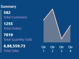
📄 Page 3: Custom Tooltip View
This view appears as a tooltip when users hover over visuals (e.g., sales chart).
Designed as a Qtr-wise breakdown of all KPIs.
💡 Key Insights
📈 2024 saw a significant increase in both total customers and total sales.
📚 Categories like Clothing and Electronics were the most ordered and highest selling.
🗺️ Cities like San Francisco, New York, and Houston led the sales map.
💎 Top 100 customers accounted for over 60% of the total sales.
🎯 Almost every metric beat its original yearly target.
🚀 Things I Learned
How to create realistic synthetic datasets with controlled randomness.
Clean structuring of logic blocks across multiple simulated datasets.
Setting up well-formatted data to be dashboard-ready.
Designing Power BI dashboards that are interactive, not overwhelming.
Leveraging Generative AI to write cleaner markdowns, handle exceptions, and make quick adjustments in logic.
📦 How to Explore This Project
📥 Download both sales datasets from the repo folder (
Dataset/)🐍 Run the Python notebook to understand the data generation logic.
📊 Open the Power BI
.pbix file and explore dashboards/slicers/tooltips.🧭 Use custom slicers to filter per category, city, or customer and watch visuals change dynamically.
➡️ Power BI File:
Sales_Data_Dashboard.pbix
🖼️ Published version: [Add Power BI service link here]THANK YOU 🙌
Like this project
Posted Jul 27, 2025
Data generation, cleaning, and visualization comparing 2023 vs 2024 using Python and Power BI.
Likes
1
Views
0