GṺNO Coffee Brand Identity Design
Didem Dönmez
GṺNO Coffee Brand Identity Design
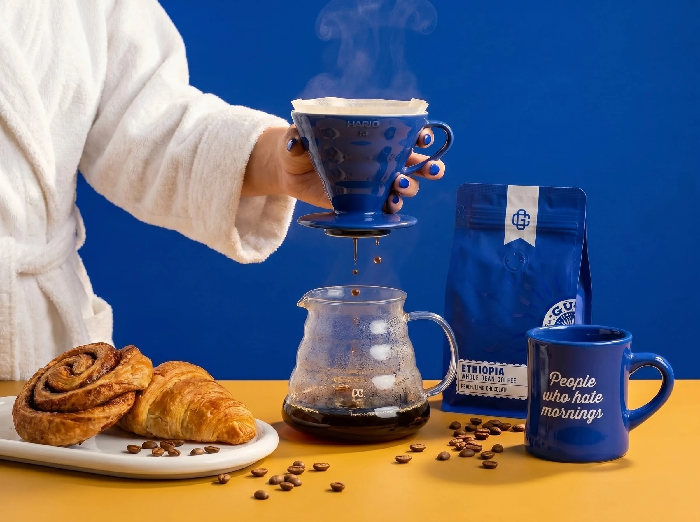
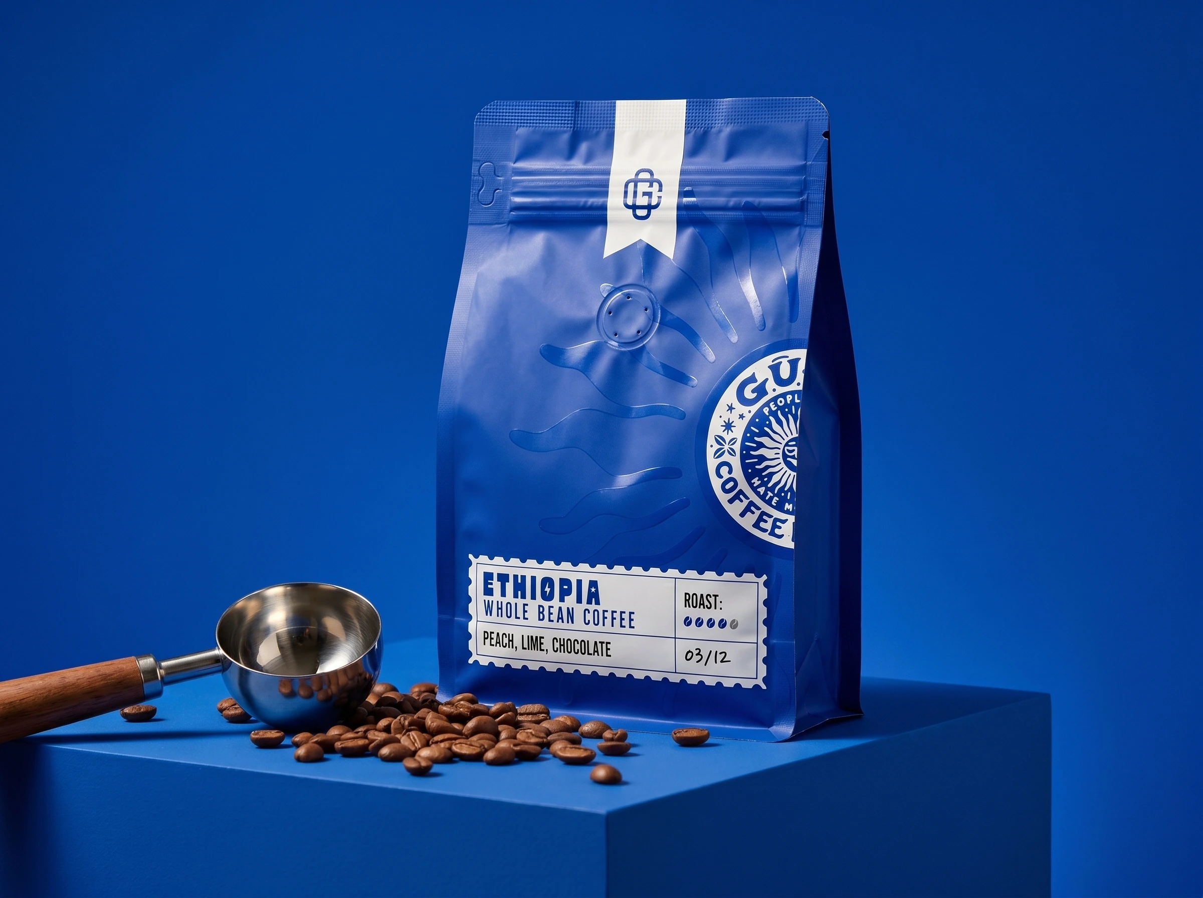
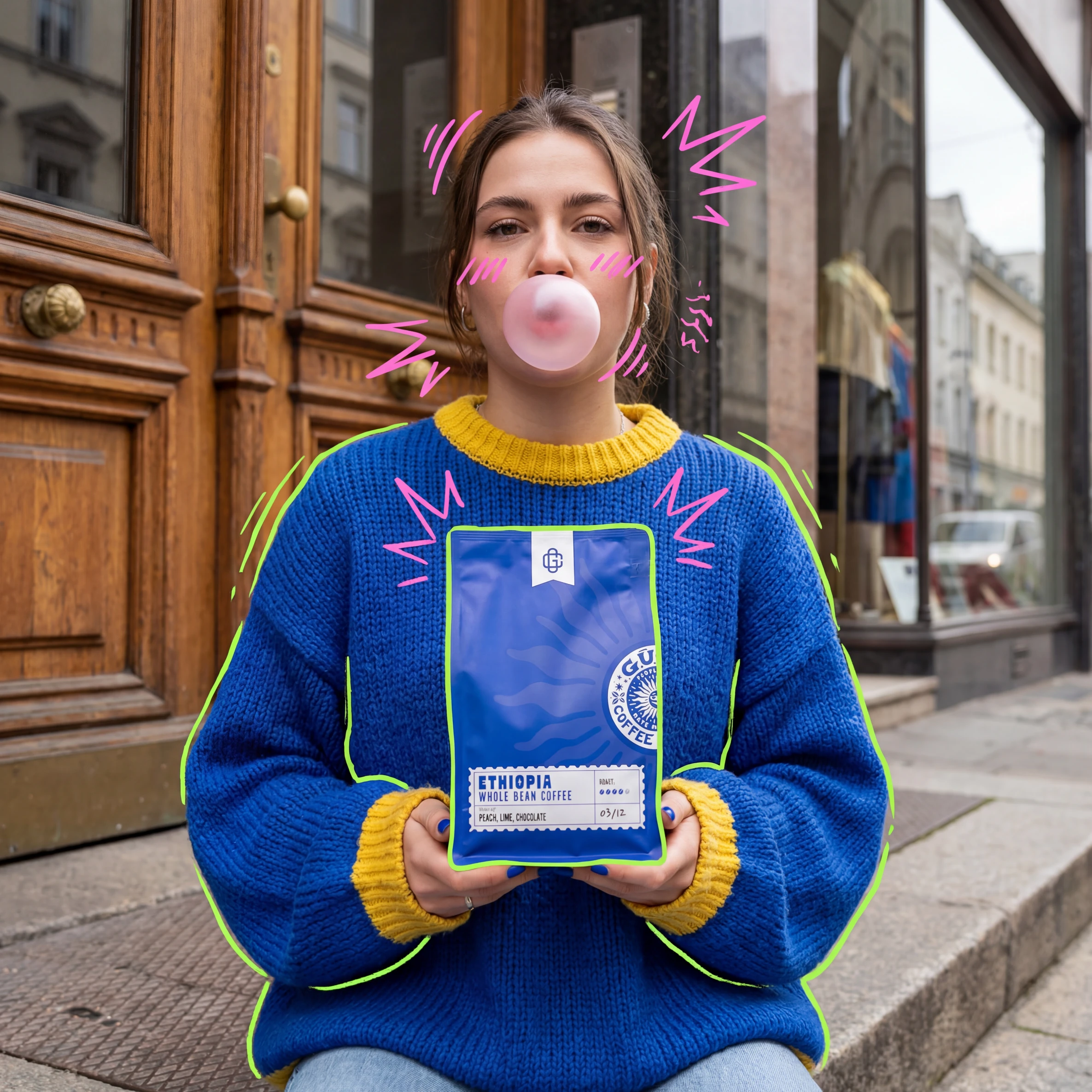
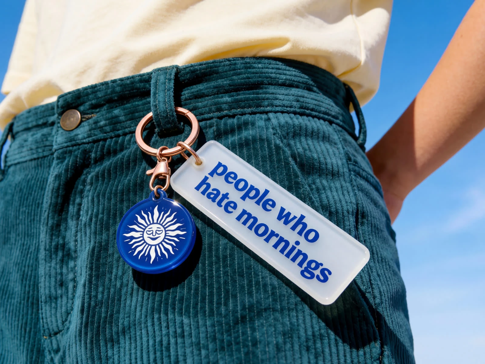
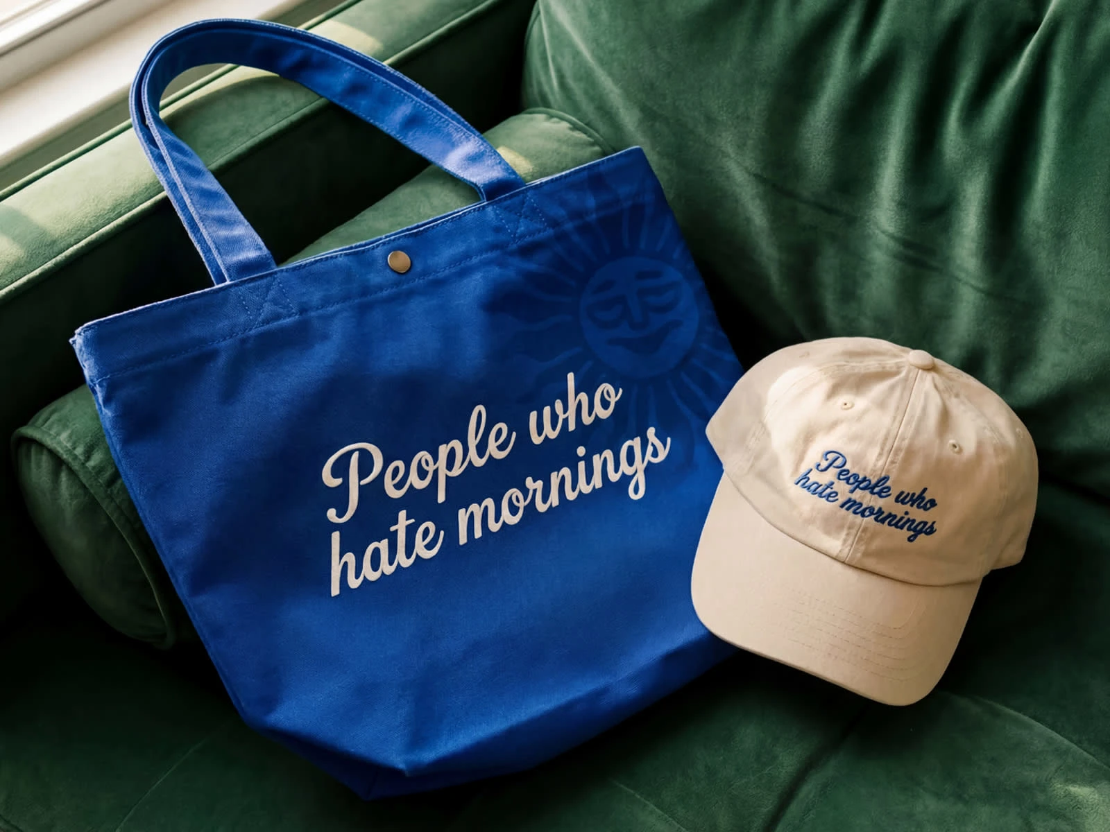
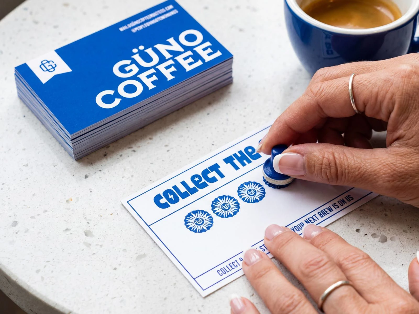
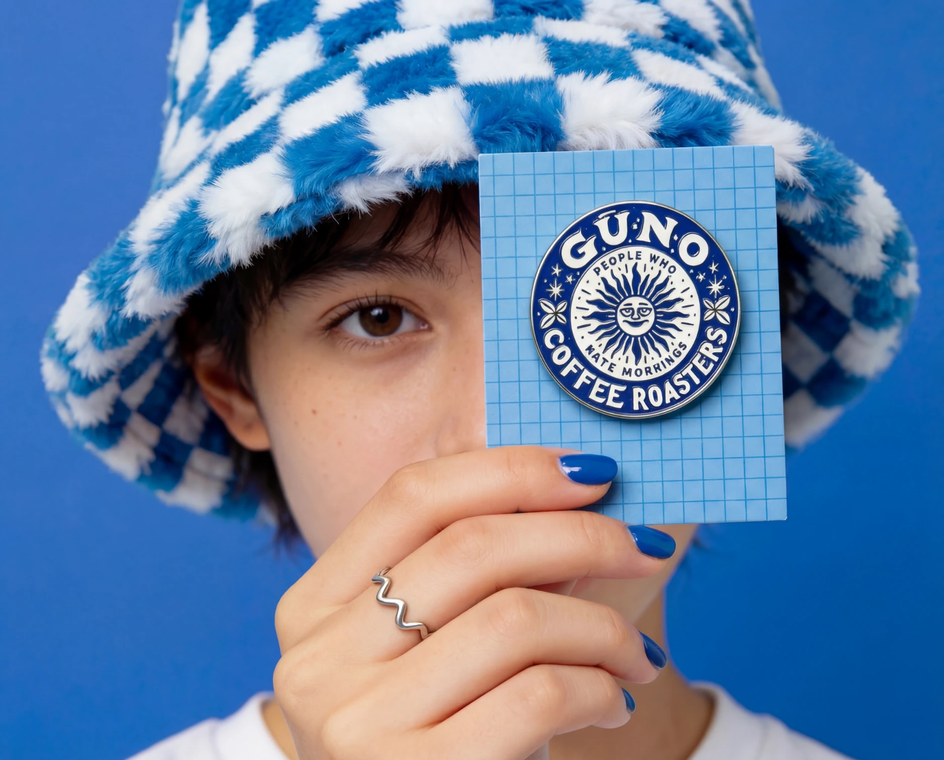
GṺNO is inspired by the Turkish shorthand for “günaydın” — meaning good morning. The brand playfully embraces the irony behind mornings with the line:
For people who hate mornings.
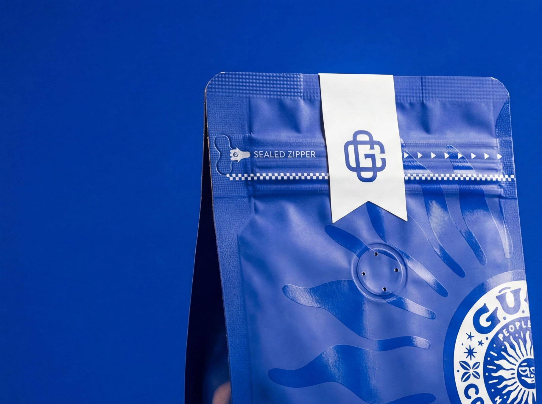
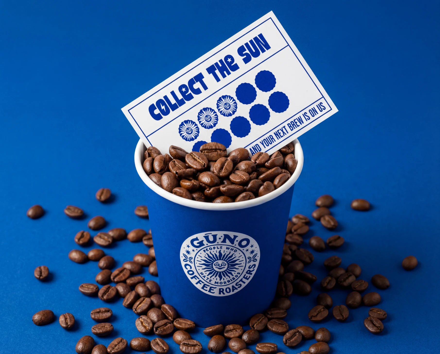
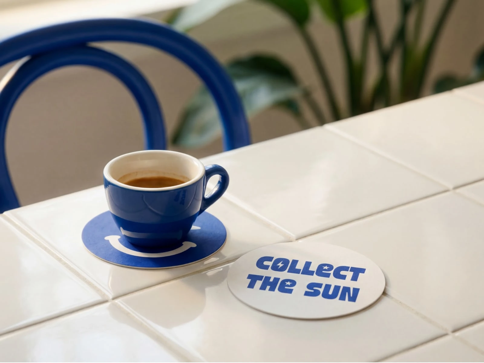
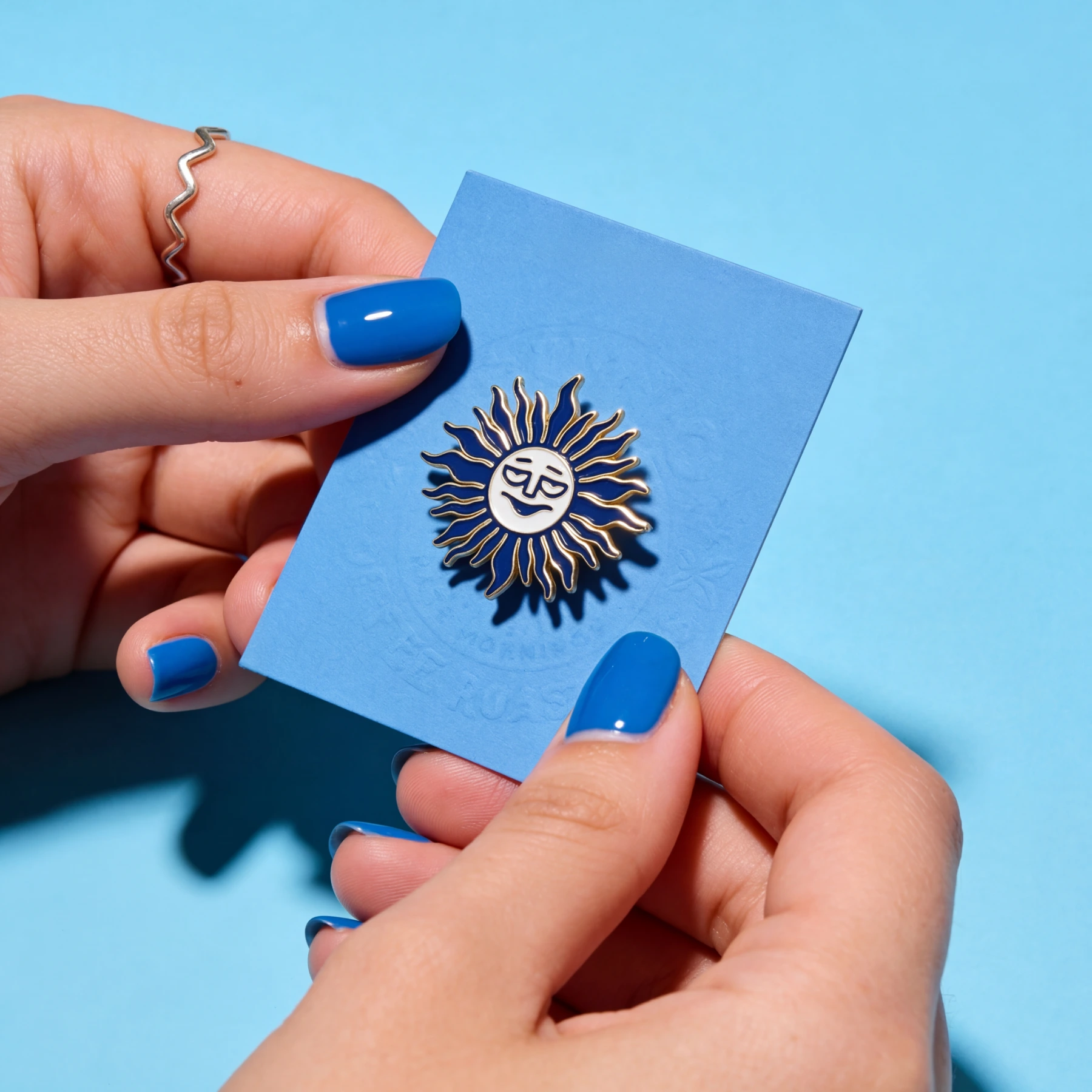
The packaging system combines a bold cobalt blue bag with a subtle sun-inspired watermark and a glossy sticker-style logo seal, creating a clean yet expressive identity for a modern specialty coffee brand.
Minimal typography and a strong color presence keep the focus on the ritual itself — great coffee that makes mornings a little more bearable.
Drop a ❤️ if you hate mornings too.
Start building it with intention →
Who we are?
Creafinch® — Branding & Design Studio
Brand identities that feel clear & naturally bright.


Like this project
Posted Mar 10, 2026
GṺNO is inspired by the Turkish shorthand for “günaydın” — meaning good morning. For people who hate mornings.
Likes
0
Views
16
Timeline
Mar 1, 2026 - Mar 10, 2026