Logo Design for Food Truck
Ololo Daniel
Overview:
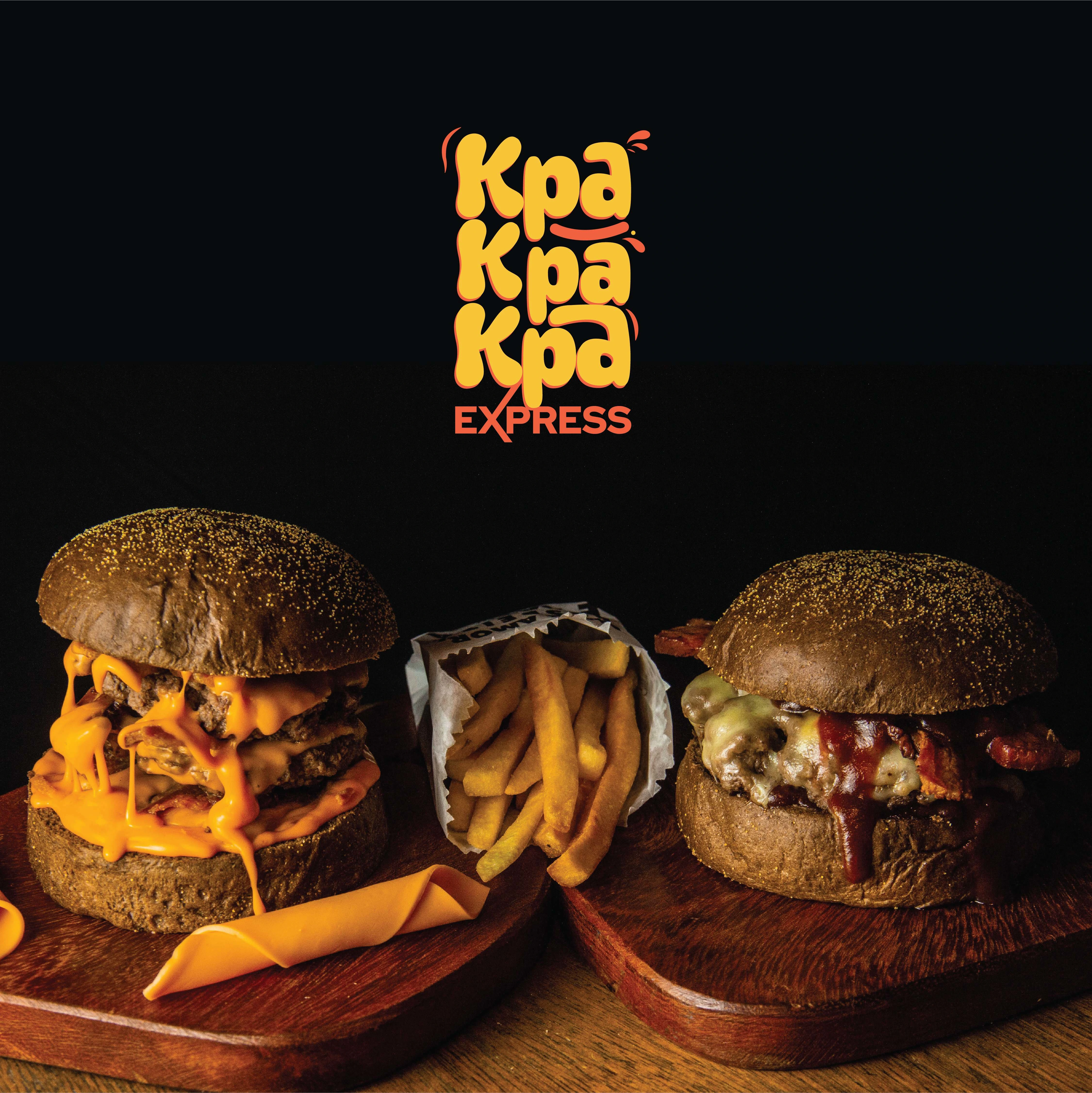
KPA KPA KPA is a food brand that draws inspiration from a popular exclamation in Nigeria, embodying fast , fast. This case study details the challenges and creative solutions involved in designing a distinctive wordmark logo that effectively relates to the culinary experience while capturing the essence of the brand.
'
Design Concept:
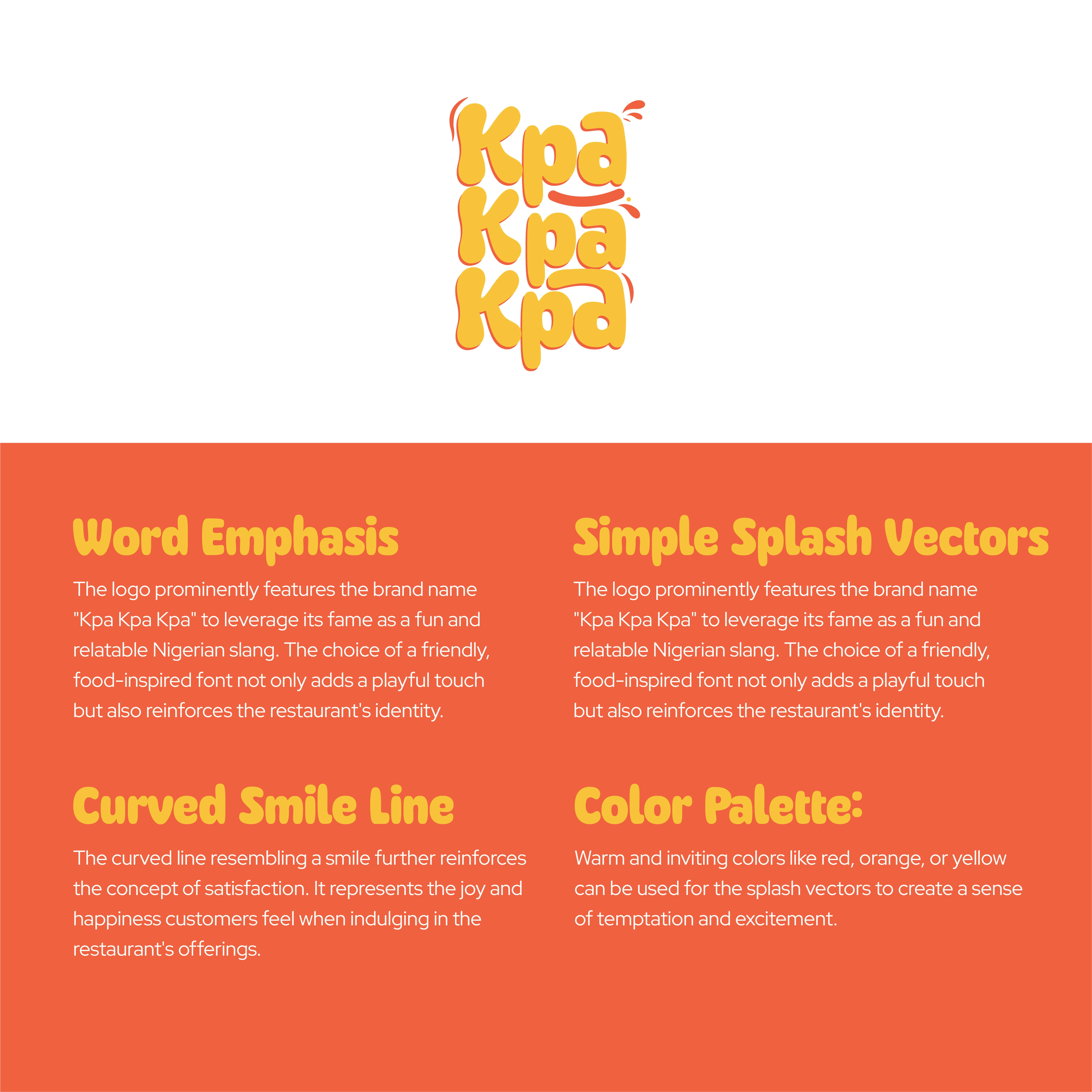
The primary design challenge was to create a wordmark logo that resonates with the vibrant culture of Nigeria and conveys the brand's focus on food. The repetition of "KPA" emphasizes the brand name, while the playful nature of the exclamation adds a sense of joy and energy. The logo aims to evoke a connection to food through its typography, ensuring it stands out in a competitive market.
Design Process:
Research and Ideation:
Conducted research on Nigerian culinary culture and popular food branding trends.
Explored various typographic styles that could reflect the vibrancy and excitement associated with food.
'

Sketching and Concept Development:
Developed multiple sketches focusing on different typographic treatments for "KPA."
Experimented with letterforms that could visually suggest food elements (e.g., curves reminiscent of plates or bowls).
'
Digital Design:
Transferred selected sketches into digital format using design software.
Tested various color palettes that resonate with food, such as warm tones that evoke appetite and freshness.
'
Typography Customization:
Chose a bold, playful typeface that reflects the energetic nature of the brand.
Ensured legibility while maintaining a unique character that differentiates the brand from competitors.
Client Collaboration:
Presented initial concepts to the client for feedback, focusing on how well each design captured the essence of their vision.
Iterated on designs based on client input, refining typography and color choices to enhance brand alignment.
'

Finalization:
Finalized the wordmark logo after several revisions, ensuring it met all branding requirements.
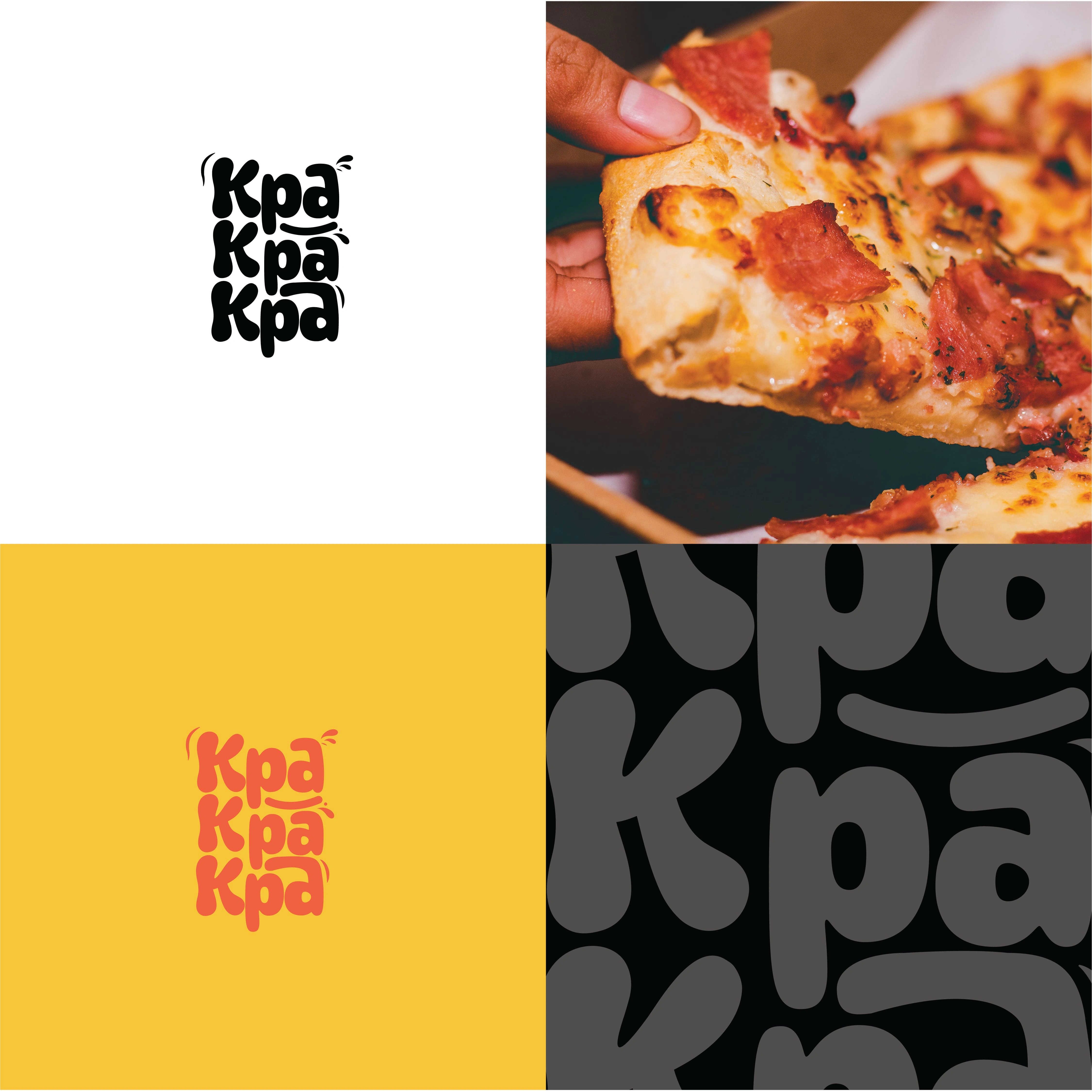
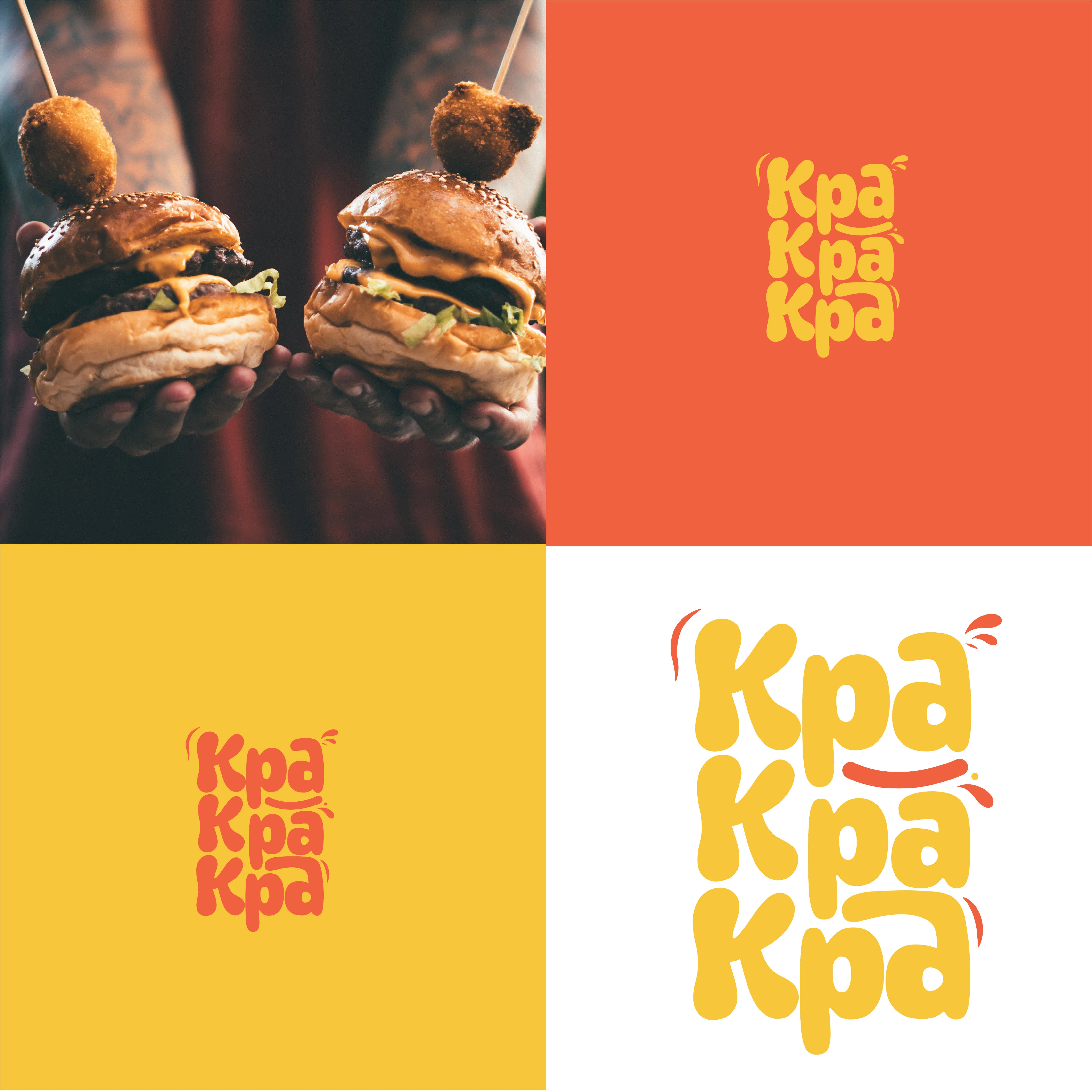
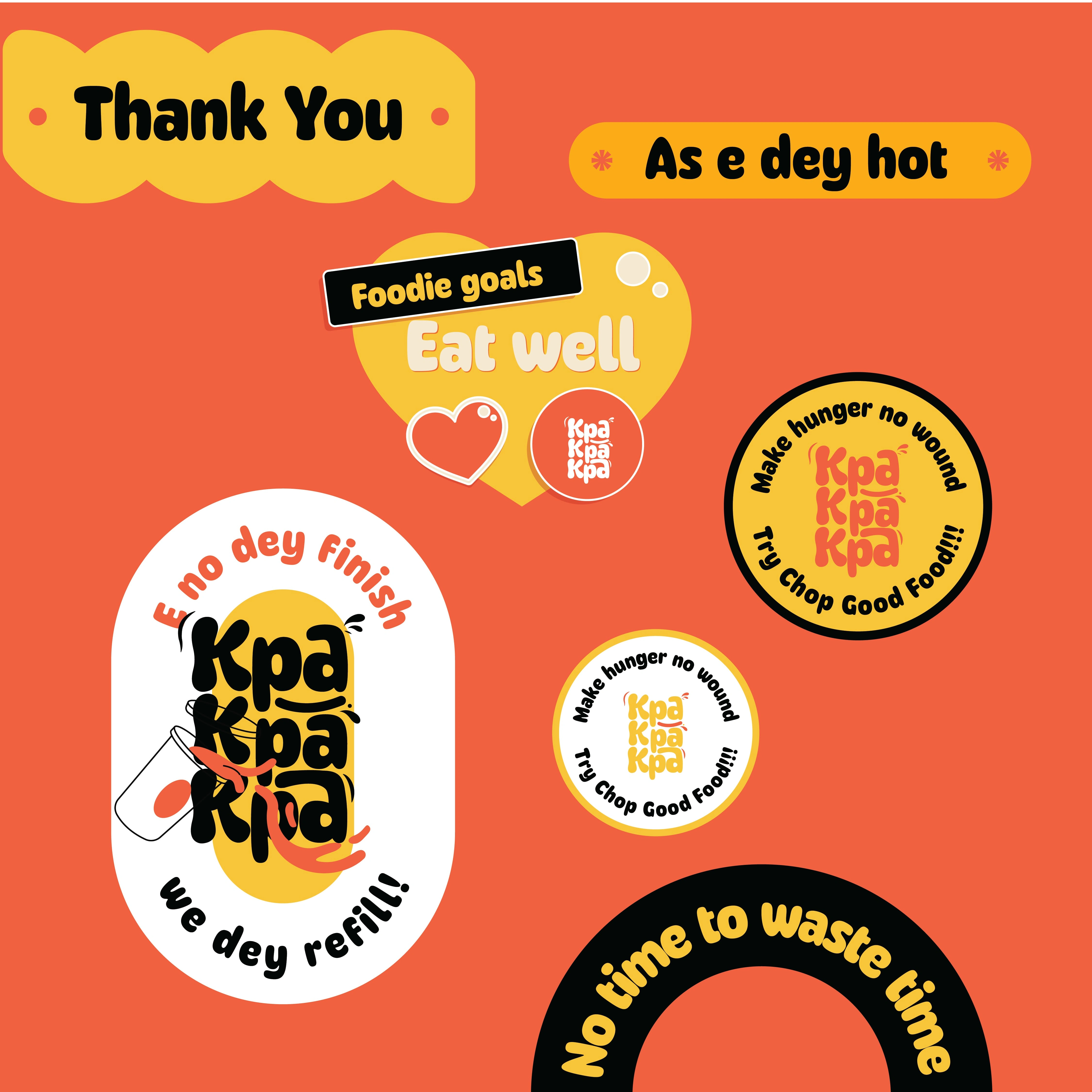
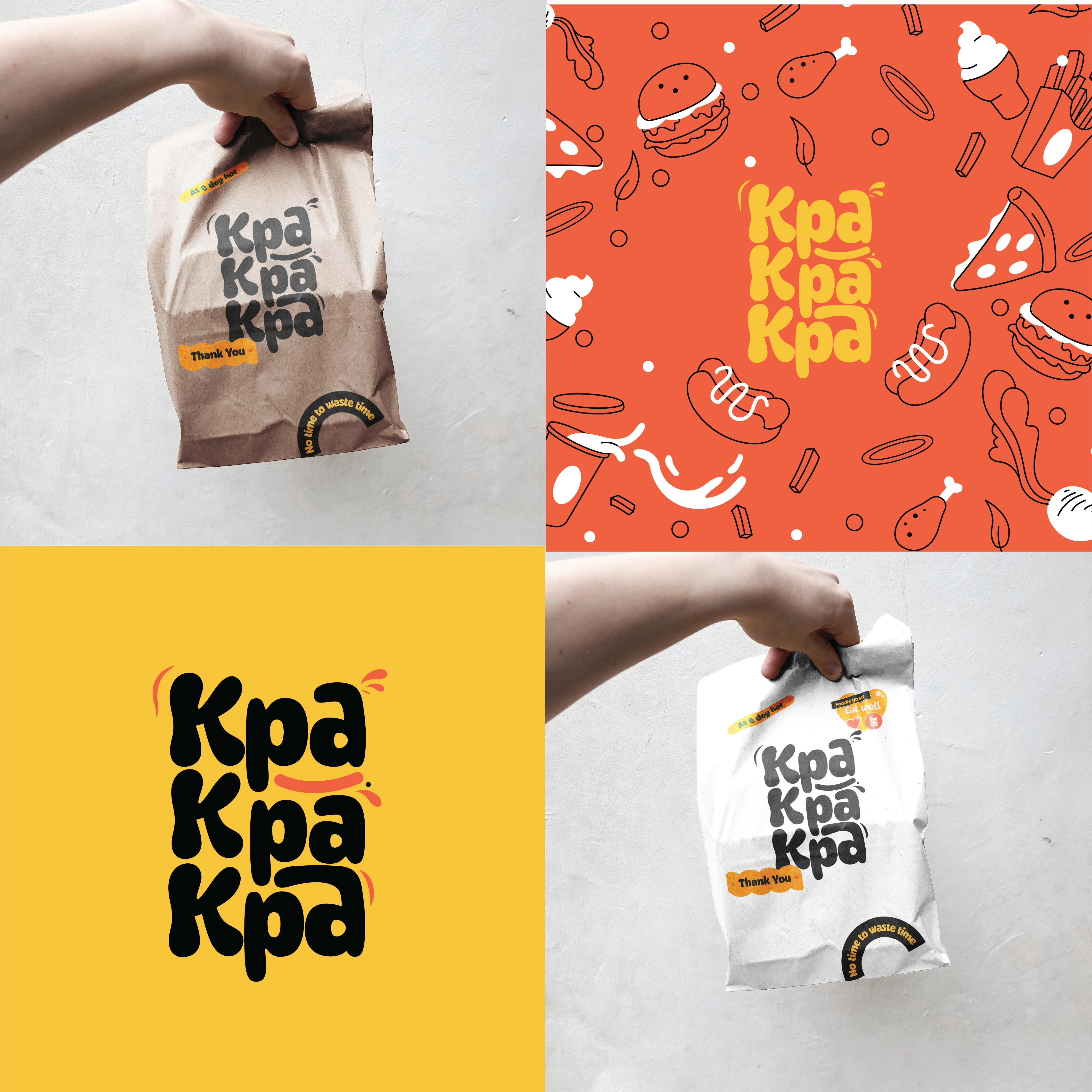
Developed brand guidelines to maintain consistency across various applications, including packaging, signage, and digital platforms.
'
Outcome:
The final wordmark logo for KPA KPA KPA successfully encapsulates the brand's identity and cultural significance. Its vibrant typography not only captures attention but also conveys a sense of excitement associated with food. The logo has been well-received by stakeholders, establishing KPA KPA KPA as a memorable player in the food industry.
Conclusion:
This project showcases how thoughtful design can bridge cultural significance and branding in the food sector. By focusing on creativity and user engagement through innovative typography, KPA KPA KPA is positioned to make a lasting impact in its market. Feel free to modify any sections or details to better align with your project specifics!
'
Like this project
Posted Jan 4, 2025
The final wordmark logo for KPA KPA KPA successfully encapsulates the brand's identity and cultural significance. Its vibrant typography not only captures atten