Designing for Awareness and Engagement for Superposition Rabat
Timeline: 4 Weeks Materials: Cards, Sticky Notes, Pen, Paper, Tools: Adobe XD, WordPress, Octopus. do
UX Techniques Used: Secondary Research, Competitive/Comparative Analysis, User Archetypes, Site Map, Sketching, Wireframing, Usability Testing
The Problem
The primary needs we defined were:
Improve people's understanding and awareness surrounding the impact of education for women and non-binary
Increase contributions on an individual level
The Solution
We designed the current Superposition Rabat website to provide individuals with more meaningful information about women in STEM, Superposition Rabats’ mission and programs, and easy ways to get involved. This would help establish trust and confidence, increase awareness, and ultimately empower individuals to get involved.
The 2 primary areas of focus for our solution
Education
Awareness
Research
Secondary Research
Extensive research on this issue was conducted by the Stanford Center for Longevity, which discussed the three main reasons why people don’t volunteer. The reasons listed were lack of time, money, and resources are the most common barriers to involvement, the article also revealed another important insight: most people don’t volunteer because they simply aren’t asked to.
The most common reason for not volunteering is lack of free time
Research Synthesis
User Archetypes
Based on the patterns identified and secondary research, We came up with primary user archetypes:
The Outsider: Someone who is curious about supporting women in STEM, but is unsure where to start or how they can make an impact
Competitor/Comparative Analysis
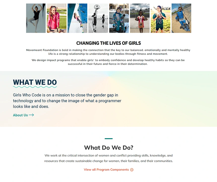
To gain inspiration and identify best practices for our website redesign, We conducted a competitor analysis. We began by looking at the websites of several other non-profit organizations including Girls Who Code, National Organization for Women, Movemeant Foundation, and Women for Women International
One common feature We identified across these websites was the placement of the donate button to emphasize it as the main call to action. This was an important design pattern to consider to make it easier and more efficient for users to get involved and donate.

Another common design pattern We observed was that each non-profit prominently displayed its mission statement at the beginning of its homepage. This was an important method to effectively communicate each non-profit’s mission to the user and help them better understand what each organization does.
Information Architecture
Sitemap
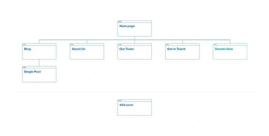
To give me a comprehensive overview of how a user might navigate through the website, We created a sitemap. The map showed me a bird’s eye-review of everything and gave me a general direction of where the visitors can go. This high-level view allowed me to feel the size and complexity of a site.
Sketching
Once we organized all our research and defined our solution, we began to explore potential designs for the website. This allowed us to quickly explore several concepts for the website layout as illustrated by the quick sketches below. We defined the core functionalities that we needed to include in our solution
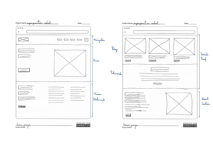
Using these sketches, we were able to conduct usability testing with 3 participants. This allowed us to gather some crucial feedback to help us decide what to include in the final experience.
Overall users had an easy time navigation through the website
Design
Creating our identity
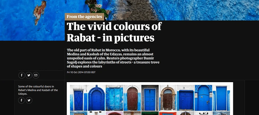
Superposition Rabat is a chapter of a bigger organization Superposition. To protect the individuality of the chapter we branded the website using the colors that represent the city and the county of Morocco itself.
In Morocco, every city has its own signature color. The most famous of the colorful cities in the small town of Chefchauen in the North, which are all painted in blue, and the red city of the South, Marrakech.
Hence Casablanca is white, Rabat blue and white (as well as most of the cities on the Atlantic coast), Fes’ color is blue and the cities of the South come in many different hues of red. The identity of the city is rooted in its signature color.
Leading users to ways they can support the cause
In order to immediately catch the attention of our users, we designed a donate button as the main call to action, it would make it easier and more encouraging for users to contribute — bridging both the organization and user needs.

We wanted to expand the focus beyond businesses and organizations to be more inclusive of individuals. In order to do so, it was important that we provided more meaningful and easily accessible information to users about the issues at hand.
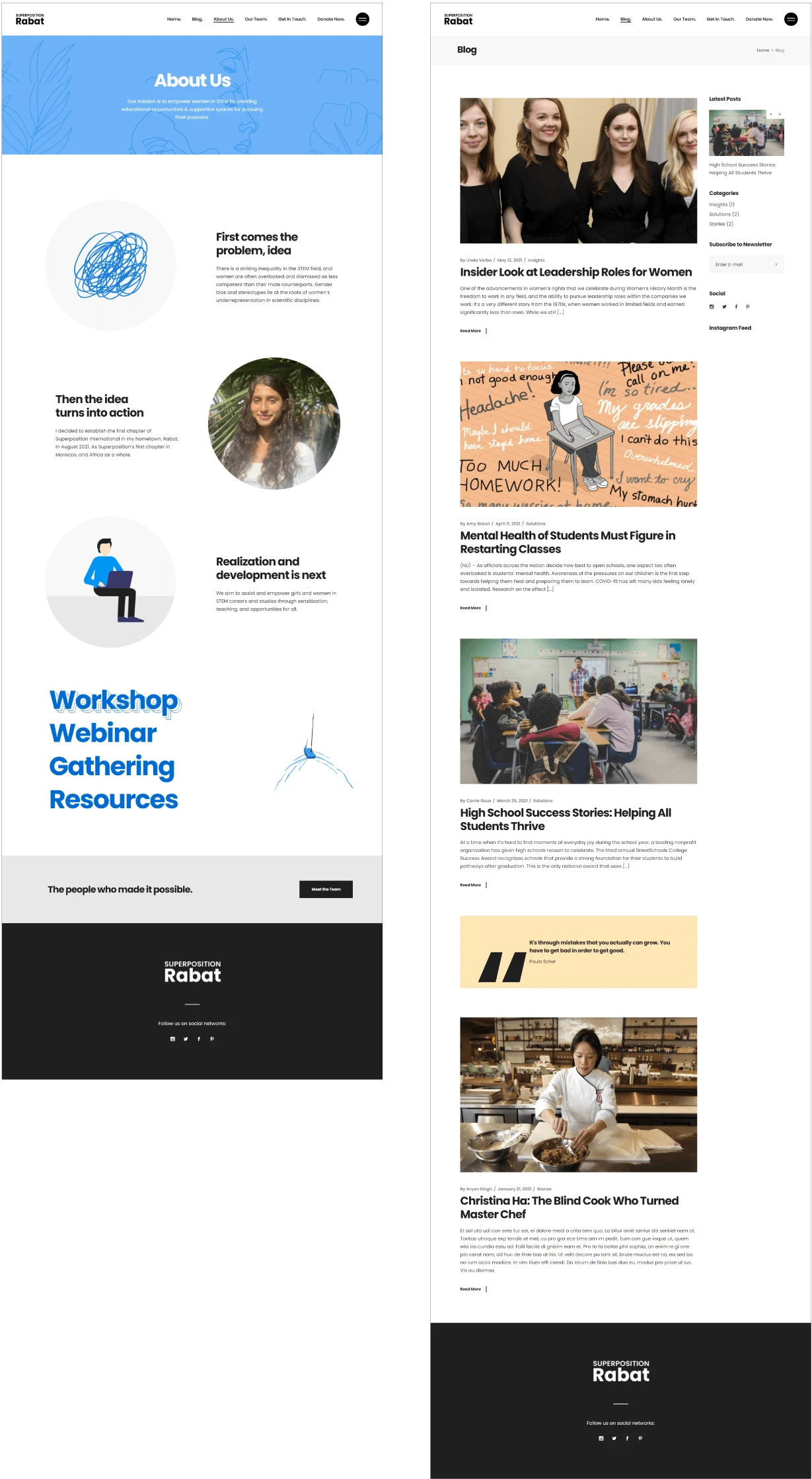
One of the ways we accomplished this was by designing an “About us” page. Users could go could visit this page to inform themselves.
We also designed a blog where users could learn more about Superposition Rabat events, stories, and other resources surrounding the issues.
Establishing trust and confidence
We wanted to ensure that the user would feel confident and have trust in
Prominently displayed mission statement on the homepage
“About Us” page to give users a deeper understanding of Superposition Rabat
“Blog” page showcasing facts, statistics, and personal testimonials from people impacted by or involved with Superposition Rabat
Delivering a more streamlined donation process
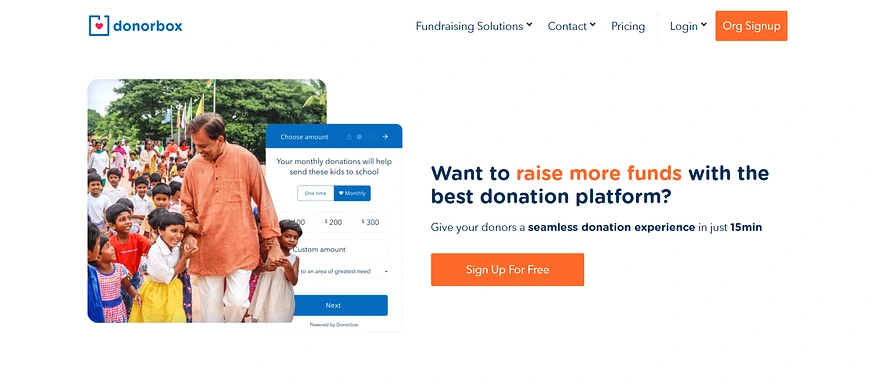
It was important that we made the donation process more simple and efficient since our research revealed that many people lack the time to get involved.
We use donorbox as our fundraising platform, which offloads a lot of fundraising barriers from Superposition Rabat and strengthens the relationship with donors.
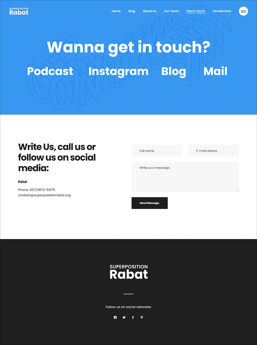
Additional Pages
Next Steps: Looking At The Bigger Picture
Moving forward with this project, I’d like to start looking at the bigger picture of how to get more individuals involved in Superposition Rabat.
Like this project
Posted Jun 28, 2023
Our design project aims to enhance awareness of education's impact on women and non-binary individuals, enabling increased individual contributions.


