JETPAY Brand identity
Objective - Developing a brand identity for JETPAY, as well as improve on the current logo design.
Role - Graphic designer, researcher
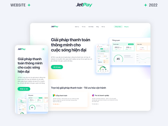
JETPAY (jetpay.vn) provides payment automation solutions, which are integrated into websites and softwares, helping businesses to optimize resources and costs.
My task was to improve upon the already existing brand assets which were logotype, colors and use those assets to create a full-fledged brand identity for JETPAY.
After conducting multiple interviews with the stakeholders, we've managed to narrowed down a list of elements that the Brand identity will have:
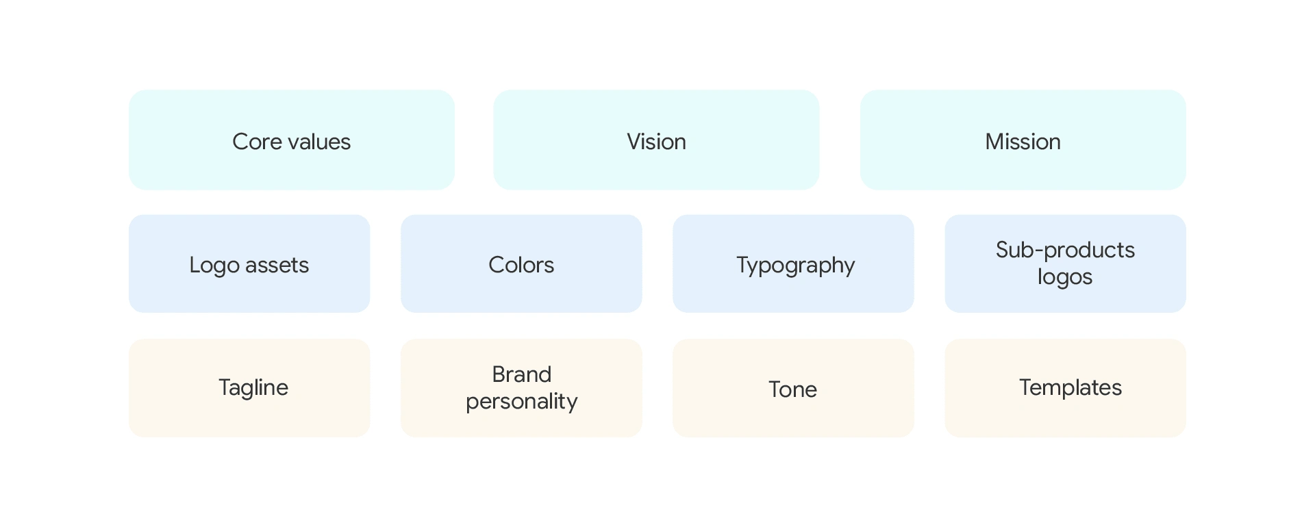
In this case study, I will delve into the visual aspects of the Brand identity: Logotype, Colors, Typography, Sub-product logos and applications.
To start off, the old logo looks like this:

After carefully examining, I've made several tweaks to the spacing between letters, as well as the form of the letters to give the logo a more sleek, seamless feeling while maintaining the original look and feel of the logo (which was something the stakeholders wish to keep)
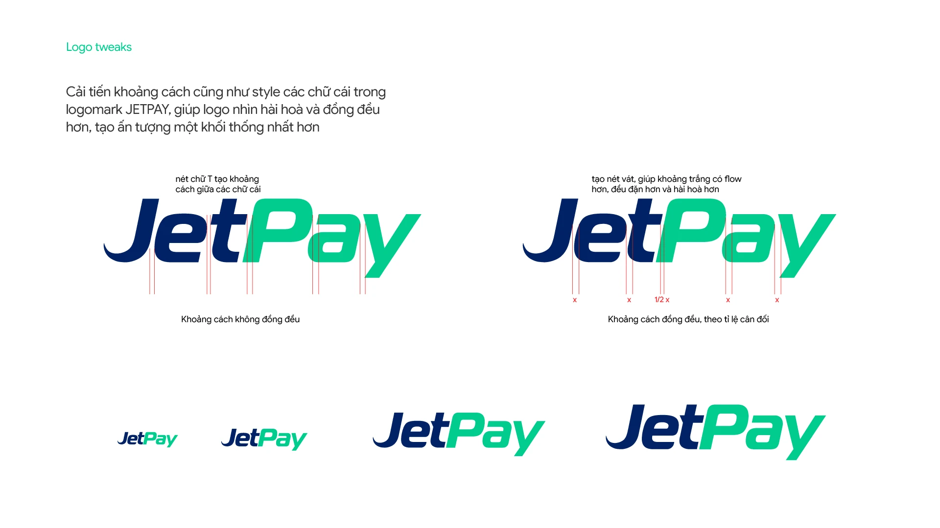
The newer version of the logo has a small cut on the letter t, creating a consistent space between the letter "e" and "t".
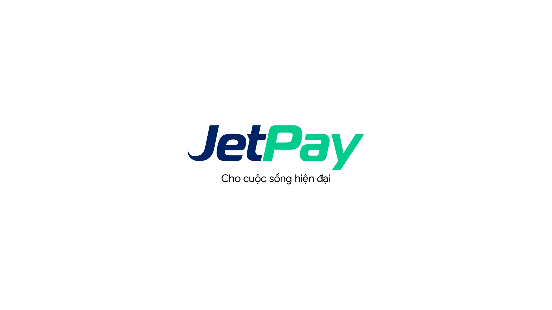
The new logo with tagline
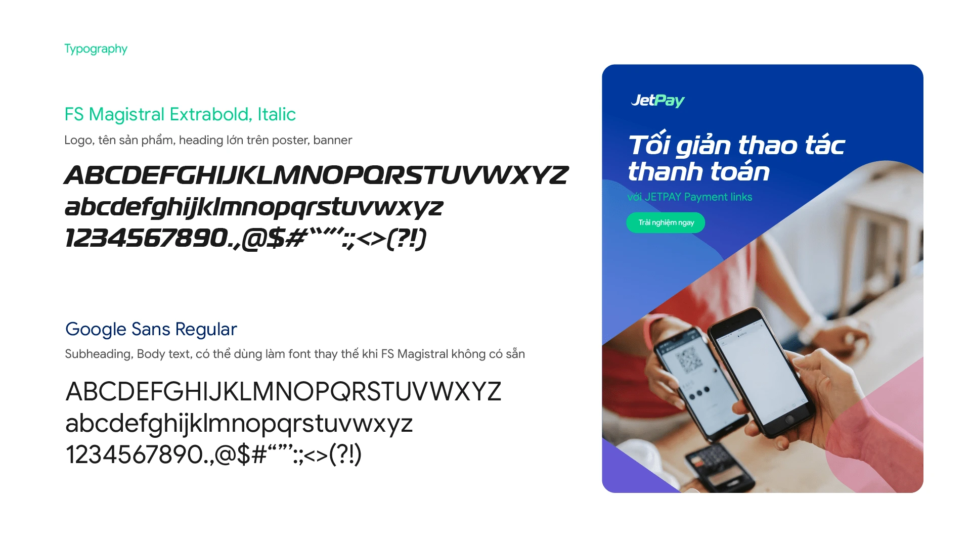
Typography
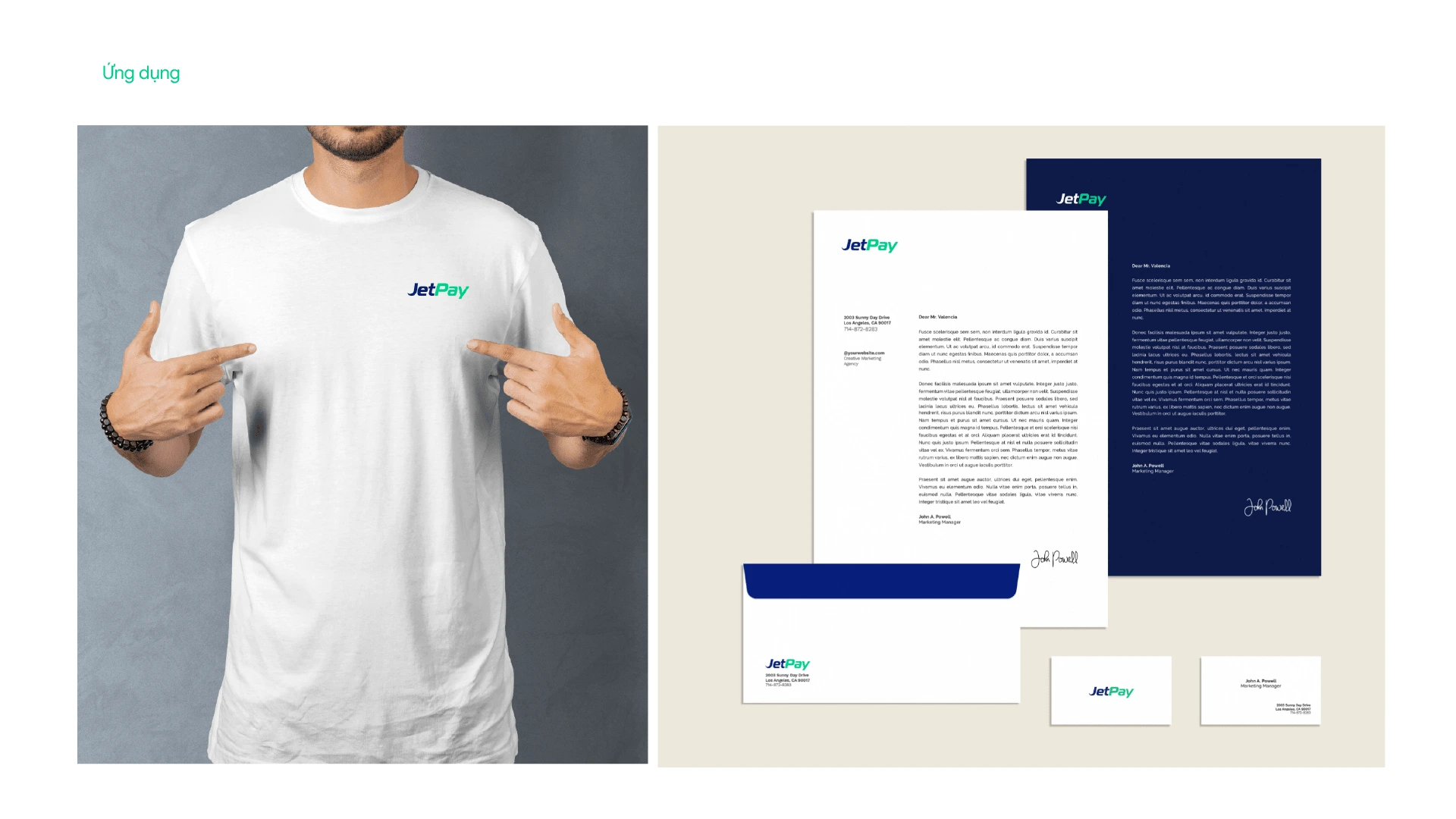
Applications on stationaries and merchs.

App icon

Like this project
Posted Dec 20, 2023
Designing a modern and professional brand identity for a Tech startup

