Lincoln Way App
The Lincoln Way App
Project Overview
Audit the app in its current state and deliver recommendations for improving the customer journey and converting poor ratings to a better reflection of brand value.
Client: Lincoln, Hudson Rouge
Services: UX, UI, Research, Strategy
Business Type: B2C
The Lincoln-Way App was not delivering the value proposition users expected, largely discovered by call center recordings, app store reviews and Lincoln concierge data. This translated to not only a poor user experience but abysmal ratings in the Google Play and Apple App stores.
Uncover the user pain points that were responsible for the app’s poor ratings in both the Apple App Store and Google Play. Additionally, I was tasked with finding strategic opportunities that could better the overall user experience and deliver feedback and insights for new features Hudson Rouge and VML could implement in future versions.
What is the Lincoln Way App?
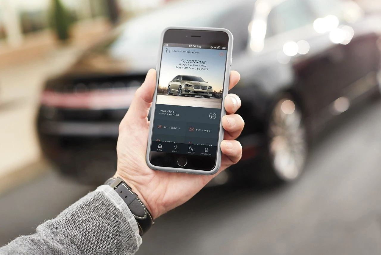
The Lincoln-Way App is a mobile experience that allows owners of Lincoln vehicles to check the overall health of their vehicle. Some of these key features are checking tire pressure, battery life, remote start, lock/unlock and pickup & delivery. The app is free to download and use by any Lincoln Motor Company customer that can supply their VIN (Vehicle Identification Number).
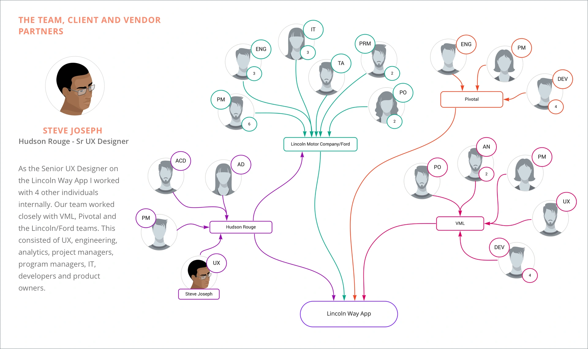
These were the analysis frameworks I used to evaluate the Lincoln Way App.
Qualitative Data Analysis
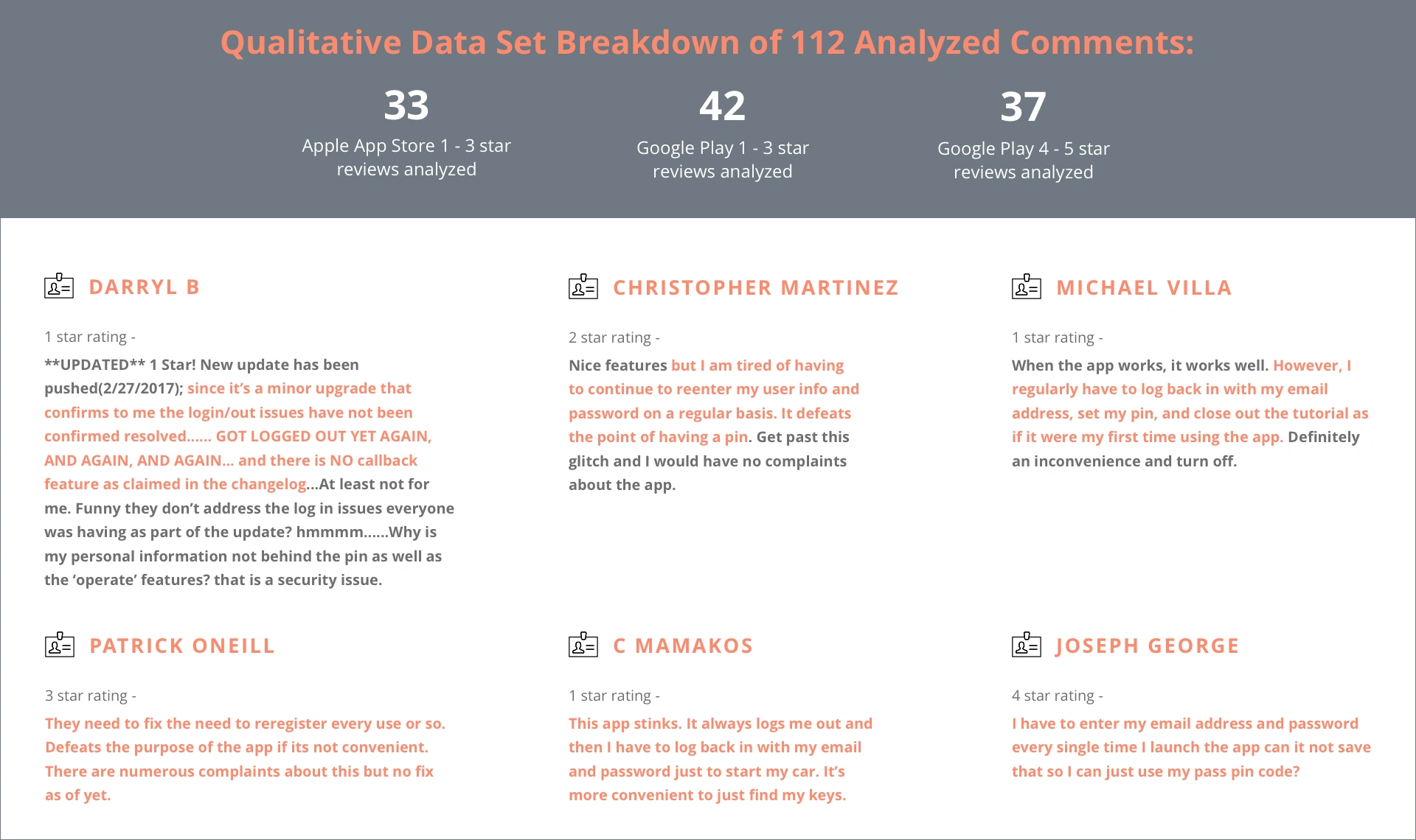
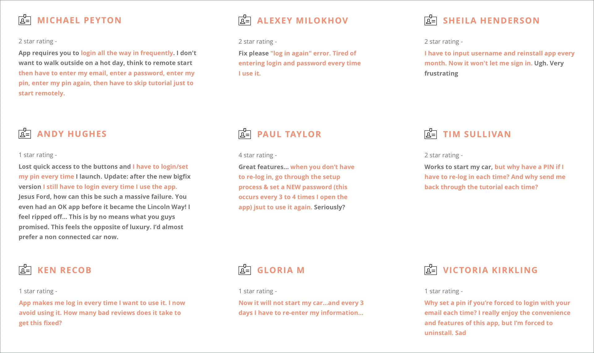
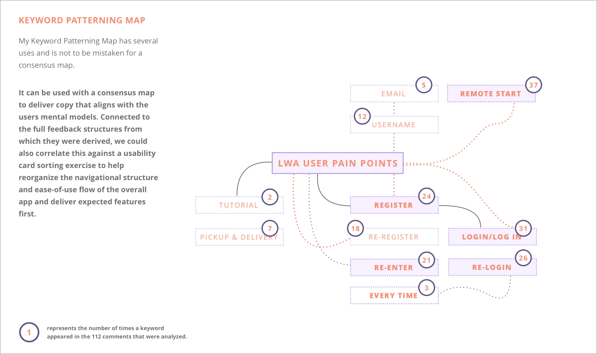
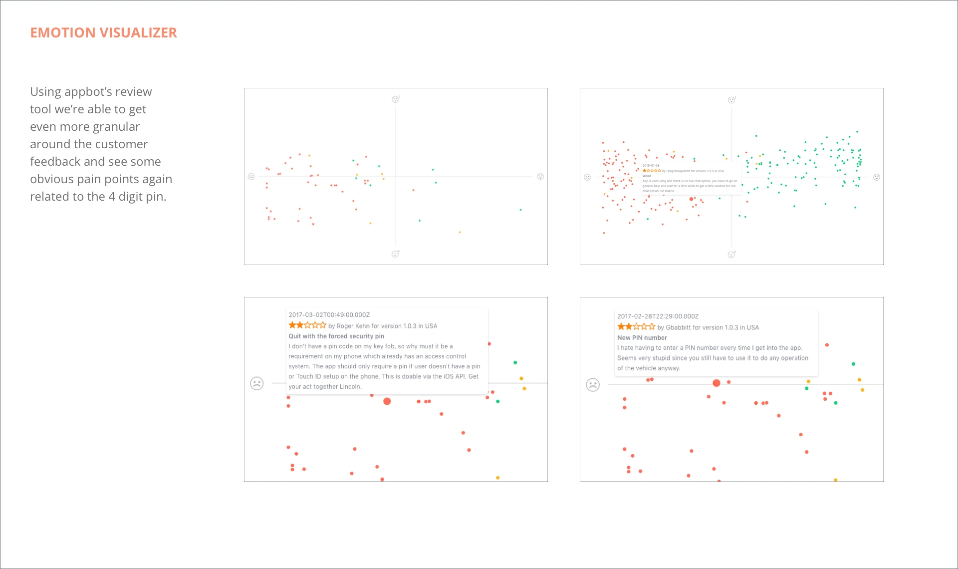
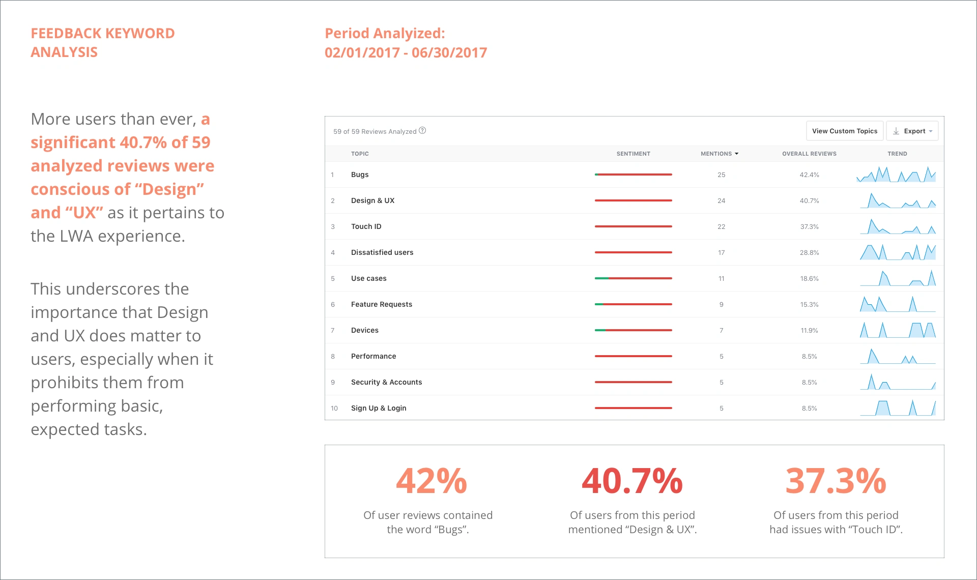
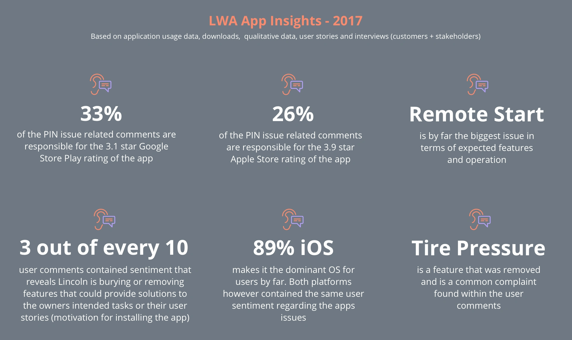
To validate the user pain points and underlying causes of the apps poor ratings, I used reviews from the Apple App Store and Google Play to assemble common keyword patterns and capture user sentiment.
App Feature Audit and Analysis
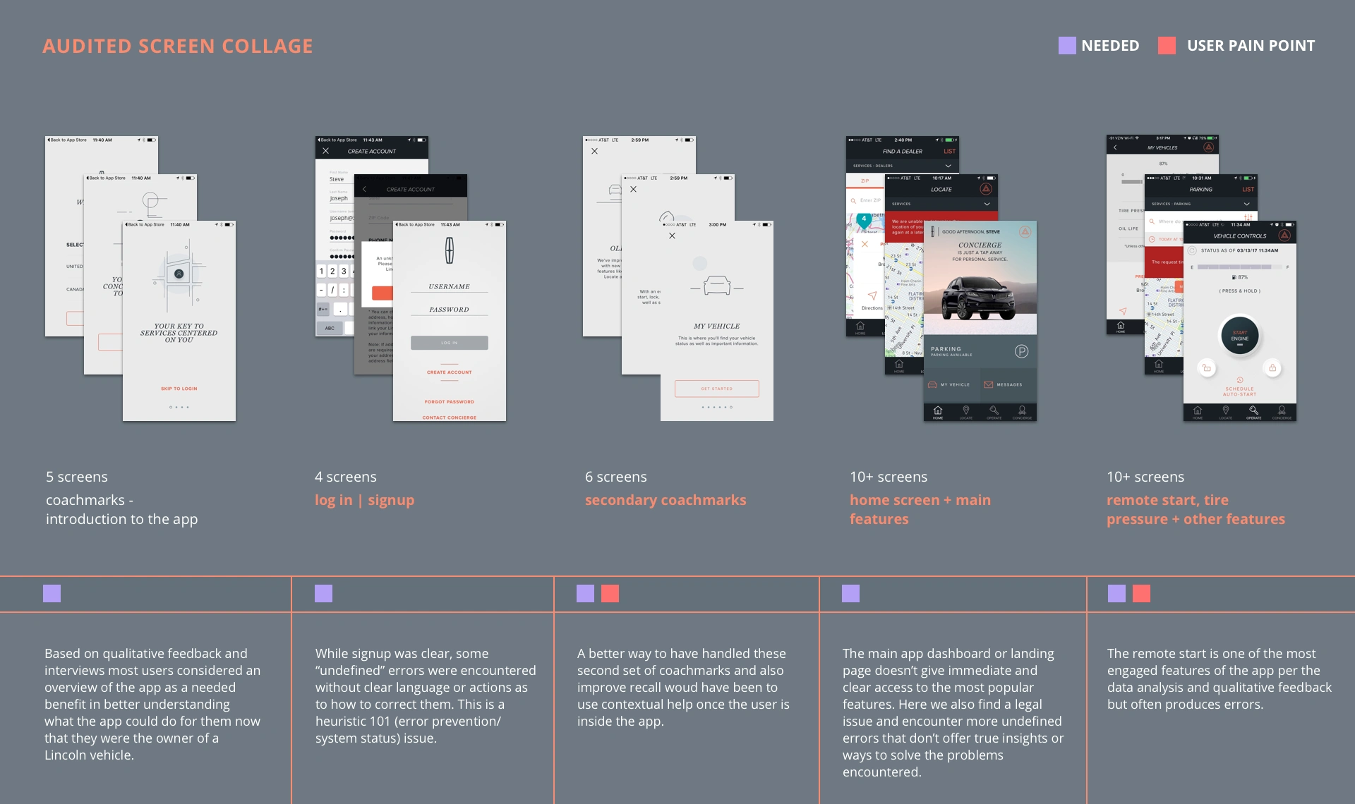
After building insights from the qualitative data and creating a keyword map I started to test the app’s features using heuristic and comparative feature analysis.
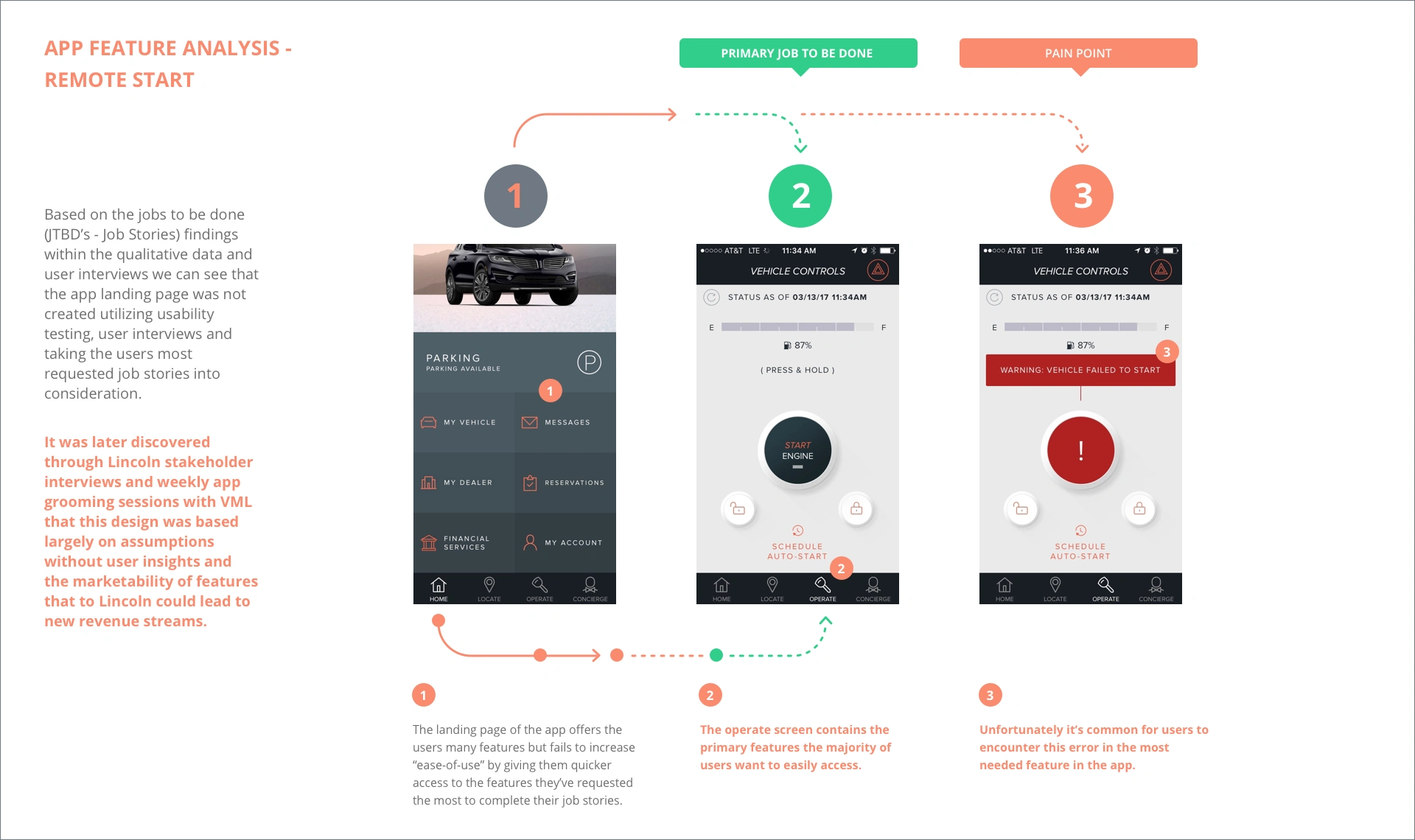
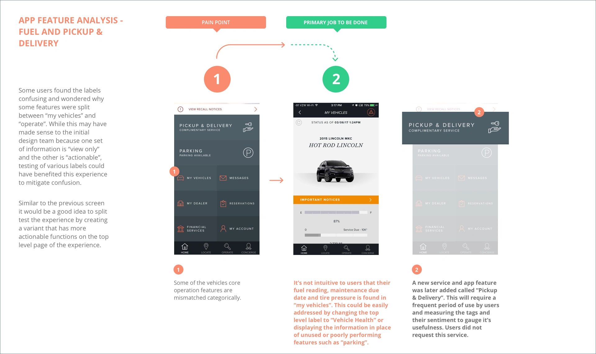
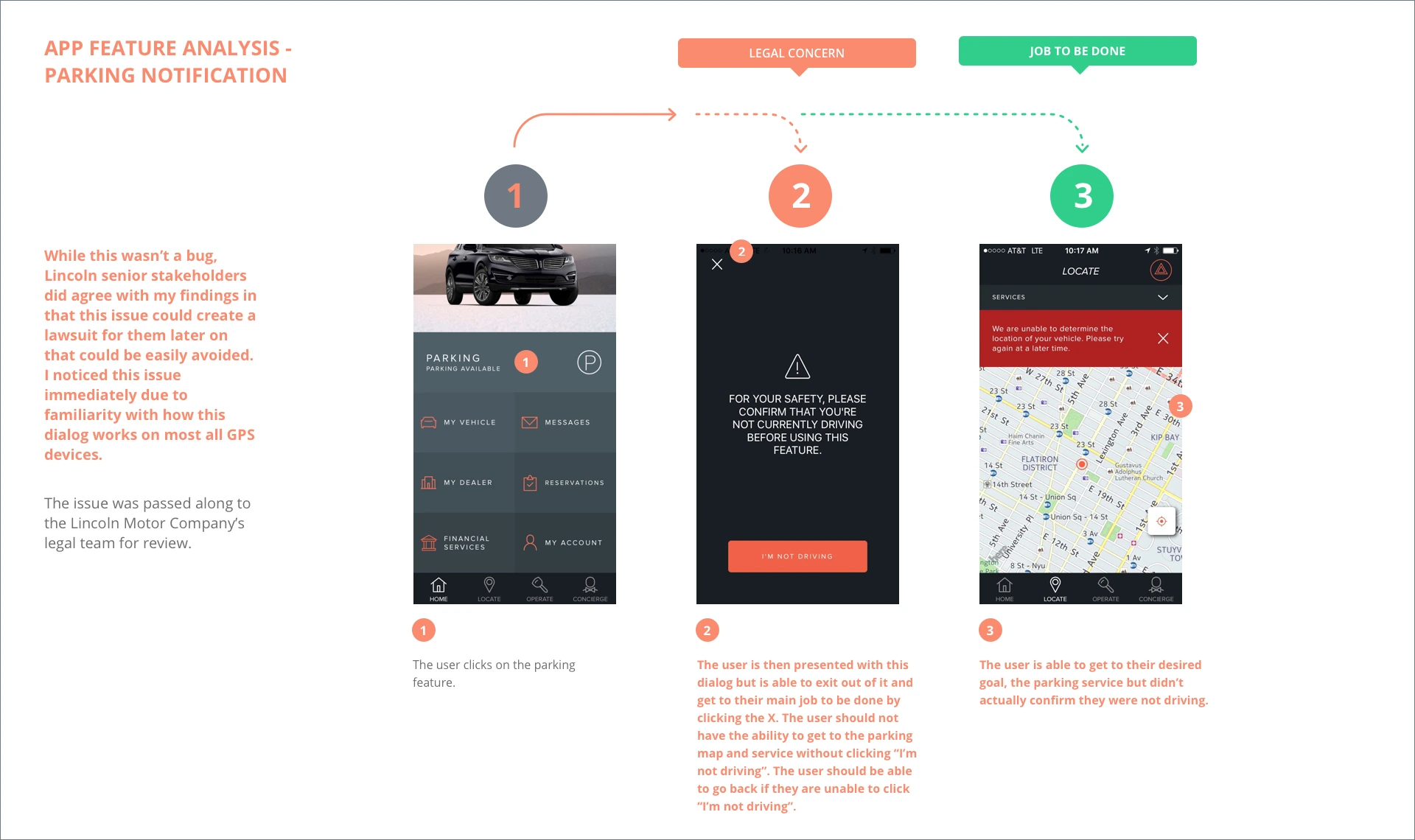
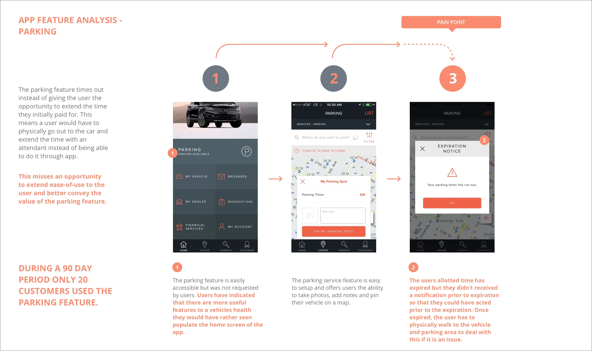
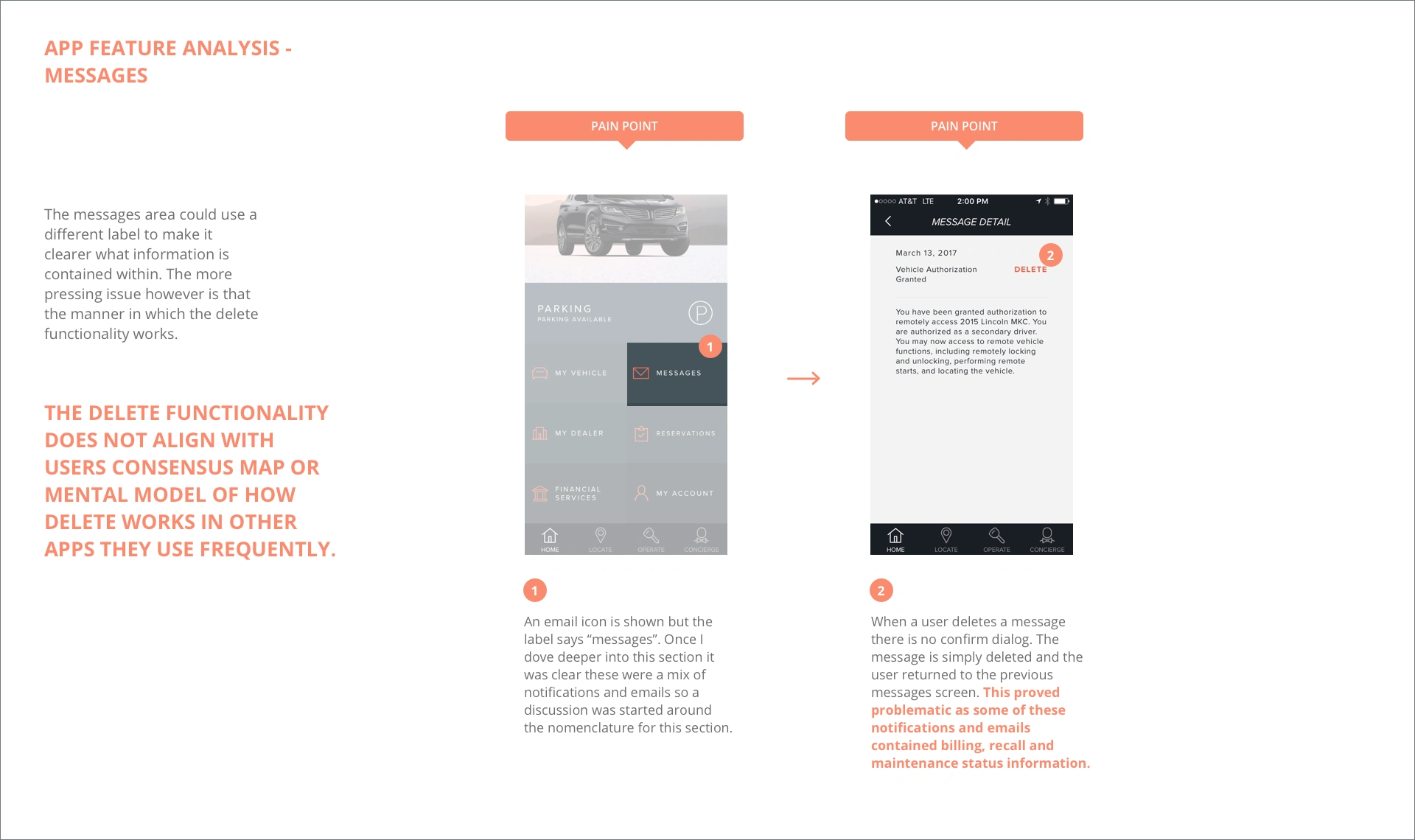
Once the app was fully audited (all screens not shown above) and I had a clearer sense of user pain points I mapped out some jobs to be done around some of the more common user tasks and what shifting tactics around the UI and strategy could look like.
Urgency Matrix
After the research, audit, and jobs to be done were completed, an urgency matrix was created to help our project manager, VML and the client better understand the importance of each finding and properly construct a roadmap for rolling out the agreed upon changes.
Visual Exploration
While it wasn’t a requirement to create UI solutions or explore new options for the user flow and layout, I approached a few of the sections for the sake of conveying clarity to the visual designs, VML and the client.
Many of the recommendations from this work made it into the 2017 roadmap and future updates, improving the overall user experience. While the app has been visually updated since my time on the project, we can still see carryovers from this research in the current version.
Impact
Users no longer need to enter a 4 digit PIN unless they’re accessing financial information.
A user can’t exit out of the “confirm you’re not driving” overlay, which has now also been moved to the front of the experience.
Key time-saving features have been moved to the front of the app.
Errors around Remote Start were addressed.
Remote Start, Lock and Unlock were moved to the front of the app as per my recommendations.
Like this project
Posted Oct 5, 2024
Delivered qualitative insights and actionable next steps that helped move the app rating +2 points in the Apple App Store.


