Logo & Brand Design
Developing a clean, user-friendly and approachable brand
Boomerang aims to make the life of developers easier by allowing the entire process of implementing and responding to feature requests smooth and intuitive. The primary goal is to connect users and developers in a way that saves both sides time and effort.
The logo had to have an energy of movement and flow - this was clear from the off with a name like Boomerang. I designed the brand, colours, mockups and guideline documents to help Boomerang maintain a consistent presence online.
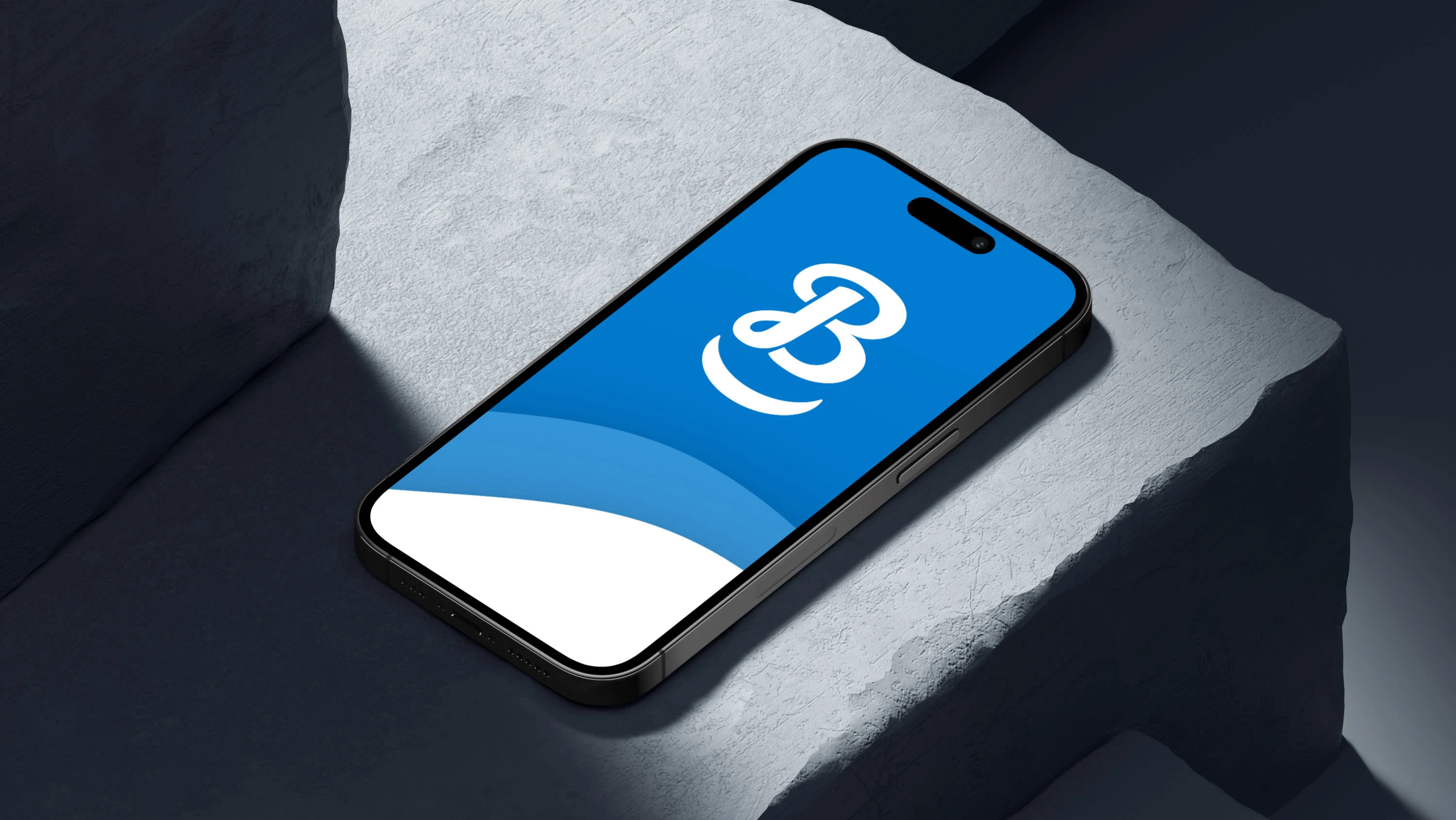
On-brand mockup designs
The goals were simple:
Design a memorable logo
Craft an approachable, familiar feeling brand with a clean look and feel
Build out the brand guideline document to ensure consistency
So was the plan:
Research the market for existing successful brands
Explore several logo concepts and land on a final design
Design the colour palette and experiment with typefaces and style motifs
Build out the brand guide and deliver alongside the logo in various formats
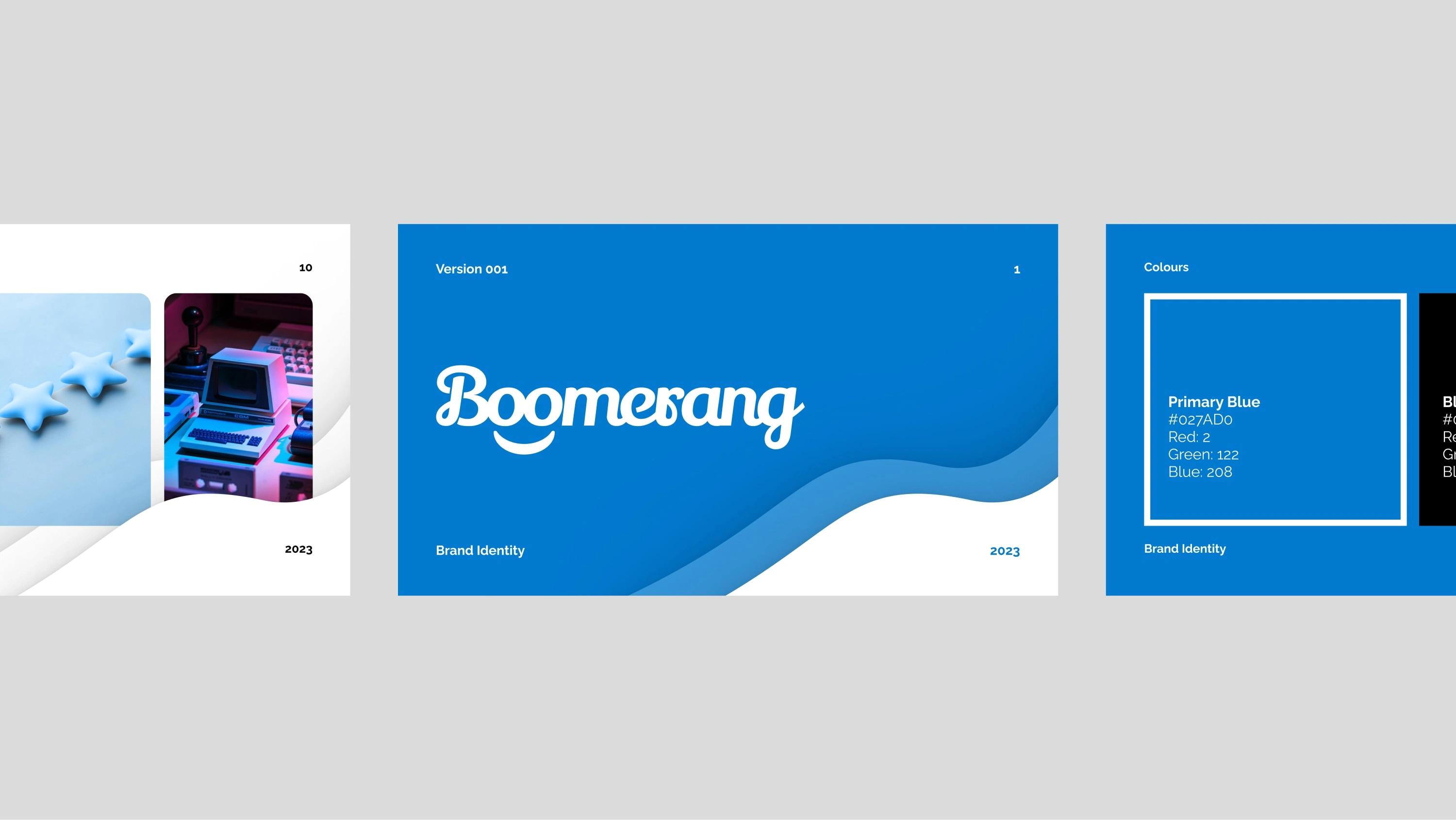
Brand guidelines document
Above is a small preview of the brand guidelines document - a lightweight portable document that can help any collaborators, developers and designers use the brand correctly and maintain a strong brand wherever it is used.
Mockup designs, like below, help those who use the document gain an understanding of brand applications and how the brand should be used and worked with.
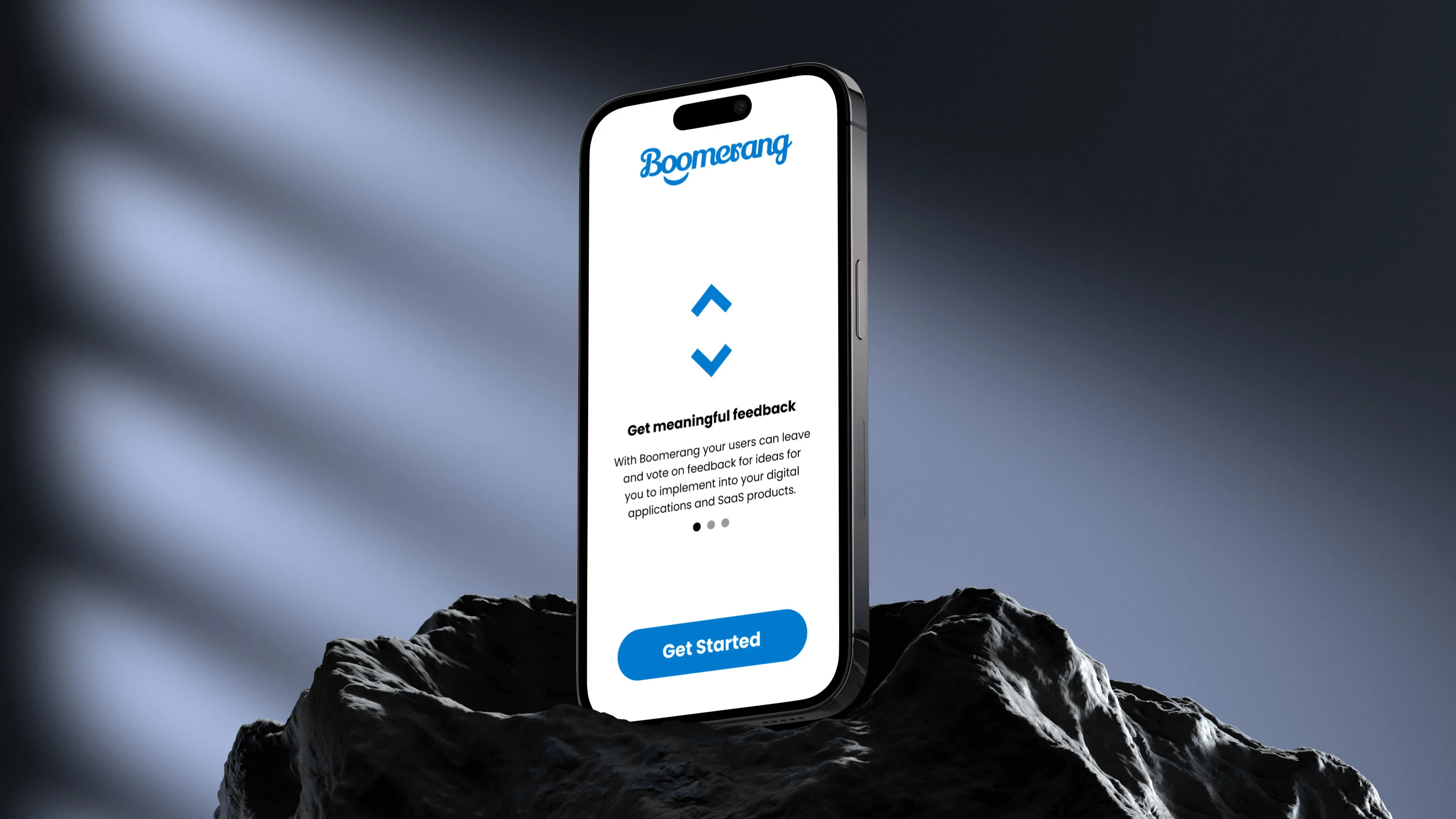
App screen example mockup
Like this project
Posted Aug 24, 2023
Professional, modern logo and brand design, mockup design and brand guide document production from the ground up for a feature request WordPress plugin tool.
Likes
0
Views
78

