Predicting Heart Disease with Machine Learning: How I Built a 9…

Predicting Heart Disease with Machine Learning: How I Built a 97% Accurate Model Using Random Forest
·
5 min read
·
3 hours ago
Heart disease claims 17.9 million lives annually, making early detection not just a technical challenge, but also a global imperative. In this project, I harnessed machine learning to predict heart disease with remarkable accuracy, merging data science with real-world impact. My goal? Build a classifier that excels at identifying heart disease cases (high recall) while maintaining top-tier accuracy. Using a dataset generously provided by David Lapp on Kaggle, I crafted a Random Forest model that hit the mark. Let’s dive into the journey.
Step 1: Preprocessing the Data
Great models start with great data. I loaded the dataset using pandas:
This dataset was a gem. There were no missing values, just 13 numerical features like age, chol (cholesterol), and thalach (max heart rate), paired with a binary target: 1 for heart disease, 0 for none. I split it into features (X) and target (y):
With only ~300 samples, I chose a 40% test set to ensure robust evaluation:
This larger test set reduces overfitting risk and tests generalization — a calculated trade-off for reliability.
Step 2: Casting a Wide Net — Model Selection
Next, I tested six classifiers, grouped by scaling needs, to find the best performer:
Scale-Insensitive Models
Random Forest Classifier: Captures non-linear relationships, perfect for complex medical data.
Gaussian Naive Bayes: A simple probabilistic model suited to smaller datasets.
Gradient Boosting Classifier: Iteratively boosts weak learners for high accuracy.
Scale-Sensitive Models
K-Nearest Neighbors (KNN): Uses local patterns, intuitive for medical features.
Logistic Regression: A baseline for binary classification.
Support Vector Classifier (SVC): Shines in high-dimensional data with clear separation.
These required scaling with StandardScaler:
Why split them? Scaling ensures fairness — KNN and SVC struggle without it, while Random Forest thrives unscaled.
Step 3: The Scoreboard — Model Evaluation
I evaluated models on accuracy (overall correctness) and recall (catching true positives), critical for medical applications. Here’s the lineup:
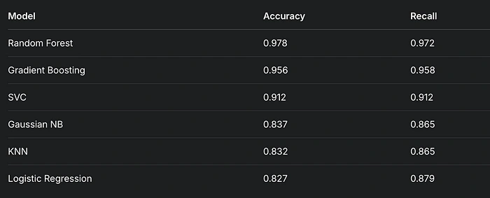
Random Forest led the pack, but I confirmed its dominance with ROC curves and AUC scores:
Visual Spotlight: ROC Curves

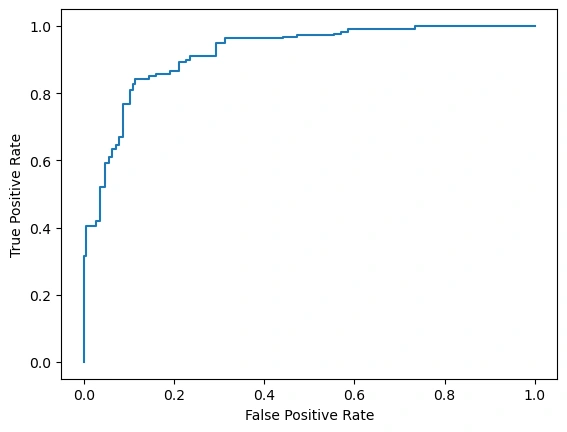
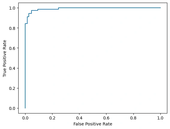
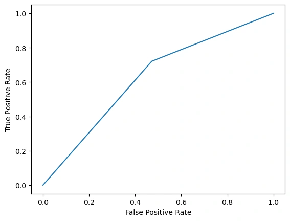
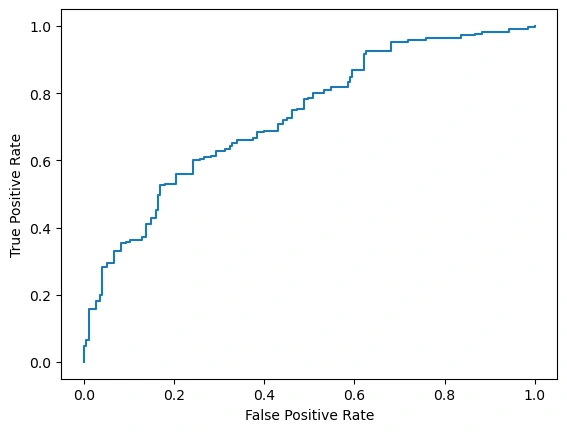
Random Forest: Near-vertical rise to (0, 1), then flat along the top — AUC 0.999. Nearly flawless.
Gradient Boosting: Steep but less perfect, slightly lower AUC.
SVC: Strong start, more gradual later — solid but outpaced.
Gaussian NB, KNN, Logistic Regression: Moderate curves, trailing the leaders.
Random Forest’s AUC of 0.999 highlights its ability to nail true positives with minimal false positives.
Step 4: Tuning the Winner — Grid Search
With Random Forest in the lead, I optimized its hyperparameters using GridSearchCV. I tested max_depth, min_samples_split, max_features, and n_estimators. Most parameters had minimal impact, but n_estimators — the number of trees — stood out. After exploring 200, 250, and 500, I found 500 trees delivered peak performance: 0.978 accuracy.
The final model settled on n_estimators=500 as the key driver of success.
Step 5: Peeking Inside — Feature Importance
What fuels this model? Here’s a visualization that shows what.
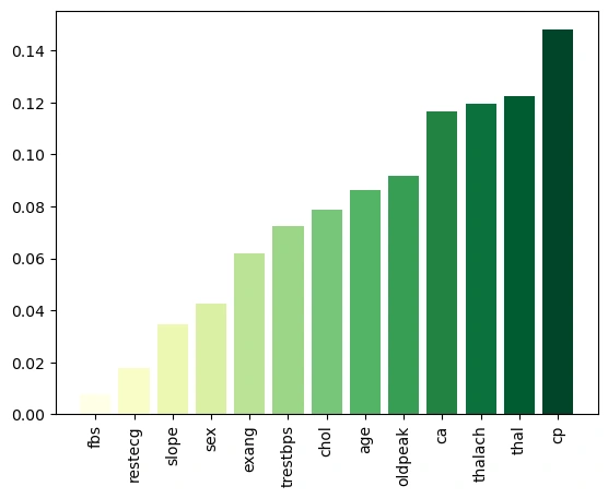
Key Insights:
Top Features:
cp (chest pain): ~0.14 — diagnostic royalty.
thal (thalassemia): ~0.12 — a heart health staple.
thalach (max heart rate): ~0.11 — vital sign power.
Mid-Tier: ca (~0.10), oldpeak (~0.09), age (~0.08).
Lower Impact: chol (~0.07) to fbs (~0.01).
Chest pain and thalassemia lead, aligning with medical intuition about heart disease risk.
Lessons Learned
Model Diversity: Testing six classifiers revealed Random Forest’s edge — explore widely!
Scaling Nuances: KNN and SVC need scaling; Random Forest doesn’t — know your tools.
Tuning Pays Off: 500 trees outperformed 200 — optimization matters.
Explainability: Feature importance connects tech to medicine — don’t just predict, interpret.
Future Frontiers
Deeper Tuning: Experiment with max_depth or Random Search for efficiency.
Feature Engineering: Test interactions like age * thalach.
Stacking: Combine Random Forest and Gradient Boosting for a hybrid boost.
More Data: Larger datasets could enhance generalization.
The Finish Line: Impact Unlocked
This journey produced a Random Forest Classifier with 0.978 accuracy, 0.972 recall, and a 0.999 AUC — a near-perfect tool for heart disease prediction. With 97.2% recall, it could help clinicians spot high-risk patients early, potentially saving lives. From clean data to actionable insights, every step built a winner. Thanks to David Lapp’s Kaggle dataset, this project thrived. Next, I’ll push for even sharper models — because in healthcare, every edge counts.
What’s your data challenge? Share below — I’m all ears!
Personal Note
As a machine learning engineer passionate about healthcare, this project blended challenge and purpose perfectly. It’s polished, data-rich, and ready to inspire!
Like this project
Posted Mar 18, 2025
Heart disease claims 17.9 million lives annually, making early detection not just a technical challenge, but also a global imperative. In this project, I harne…

