AsterCanada - Branding and website design
Vpin Babu
ASTERCANADA is committed to delivering healthcare staffing solutions that prioritize convenience and affordability.
Recently, I was presented with an exciting opportunity to work on a project for ASTERCANADA, which involved creating a logo and other marketing materials such as flyers, brochures, and a website. The client envisioned a logo that would represent Canada in its design while remaining simple. I incorporated the Canadian maple leaf and the letter “A” from “Aster” to create a self- explanatory logo. The gradient colors used are Hot Corail (Red) and Lollipop (Purple), as per the client’s request for an additional color other than the maple leaf red.
In addition to the logo, I also designed a one- page website with six sliding blocks, which met the client’s specifications.
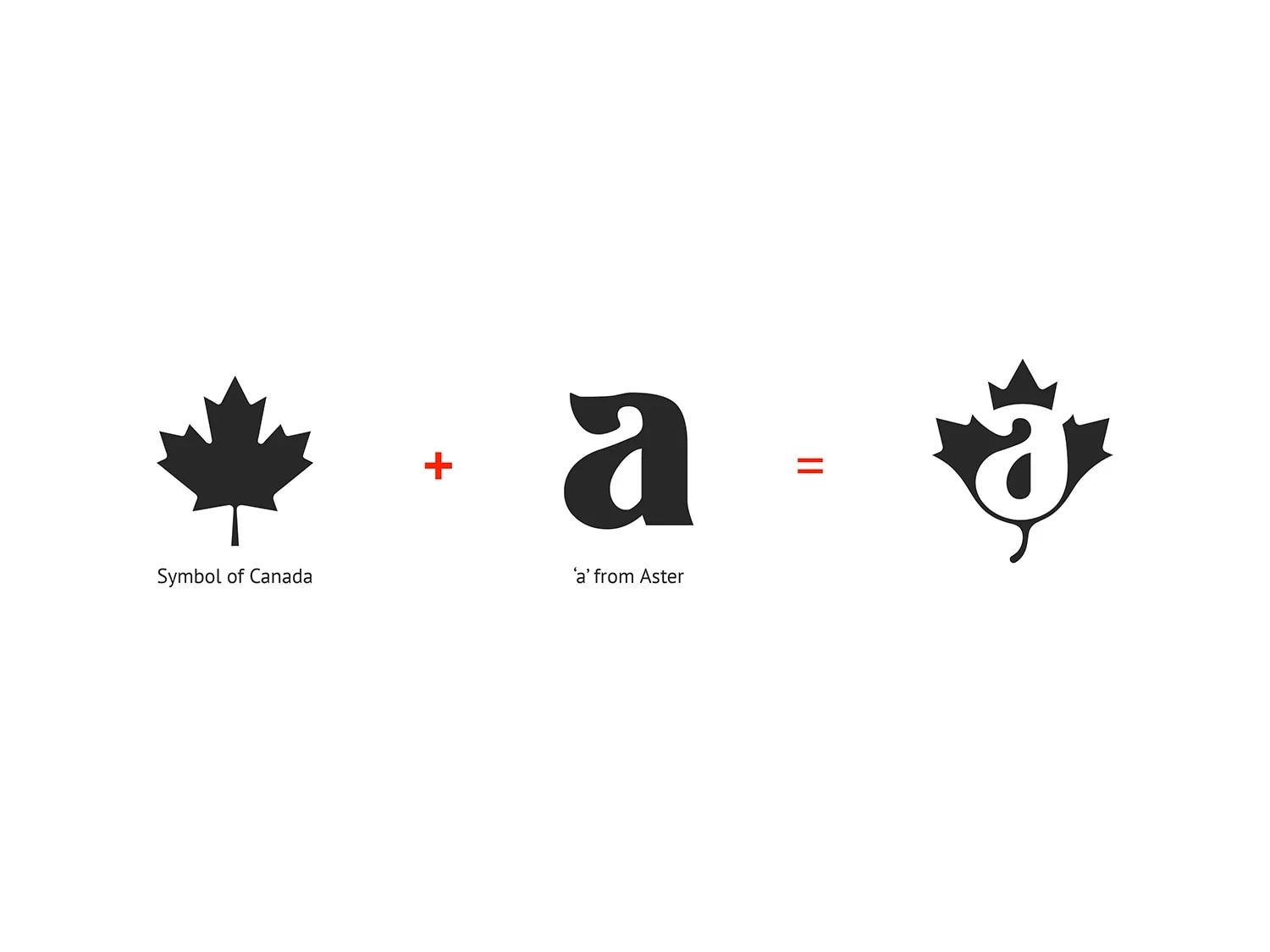
Logo design process
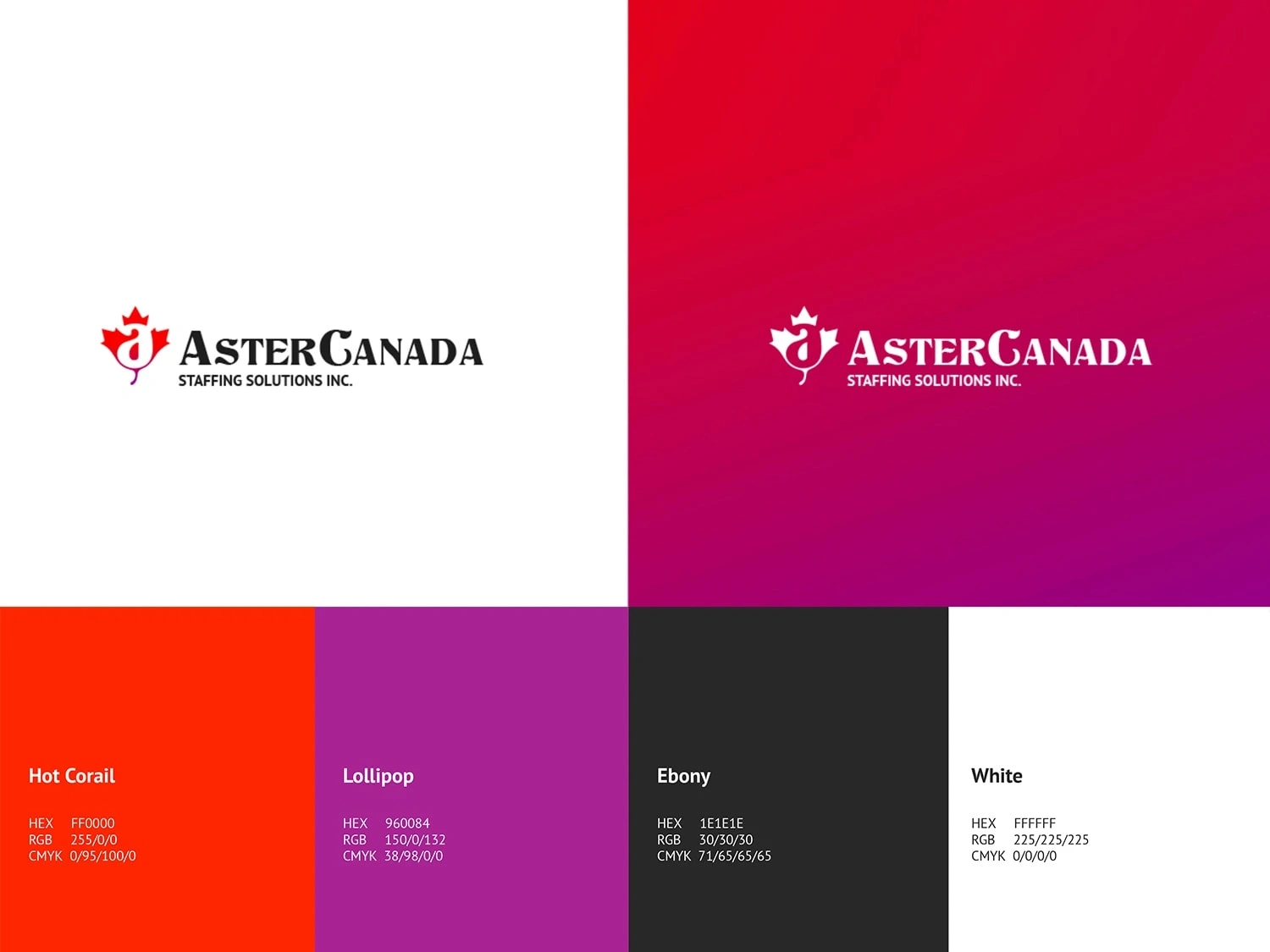
Colors
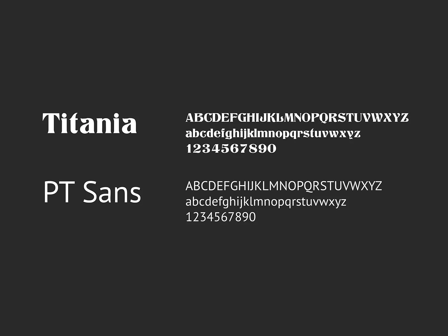
Typography
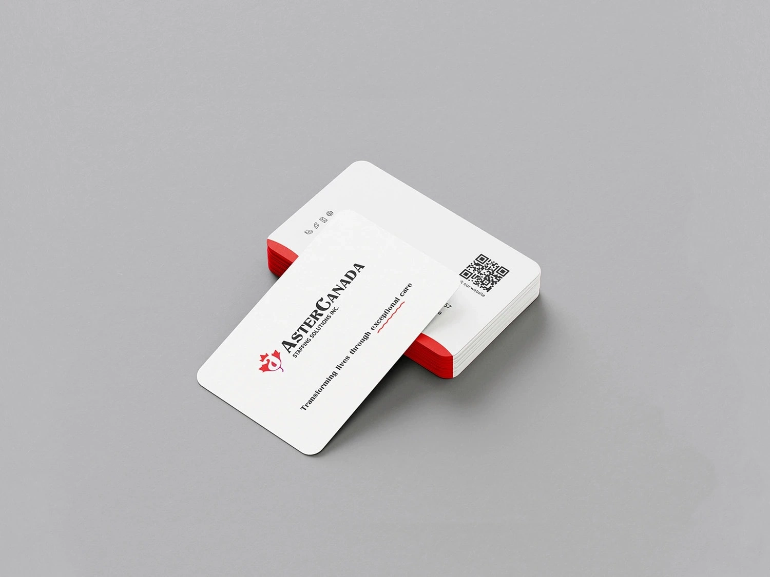
Business card
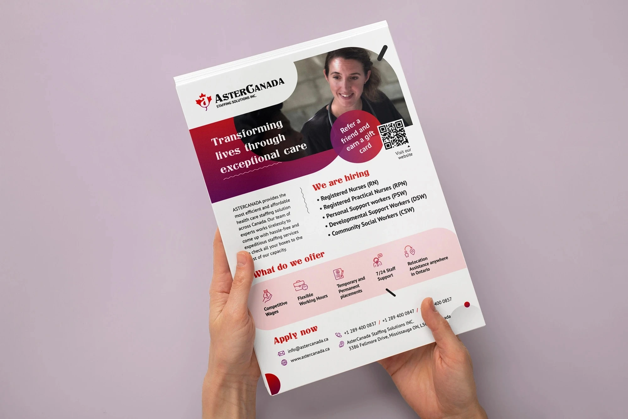
Flyer
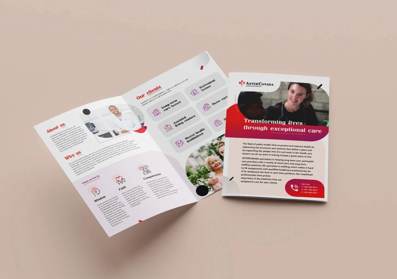
Brochure
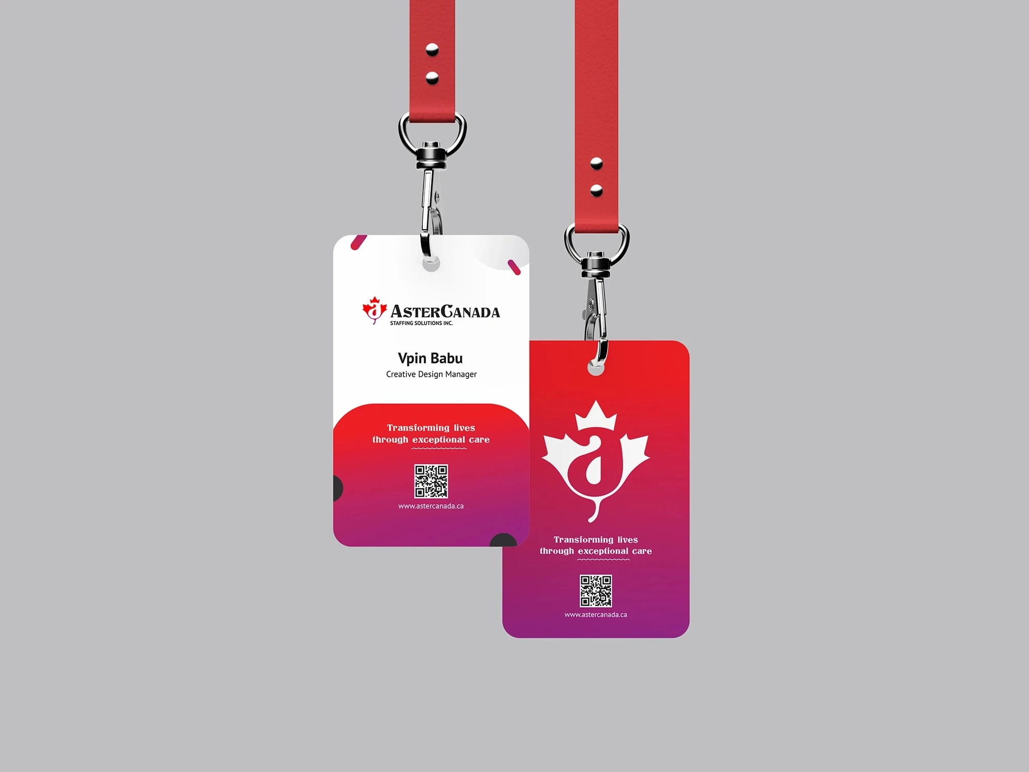
ID card
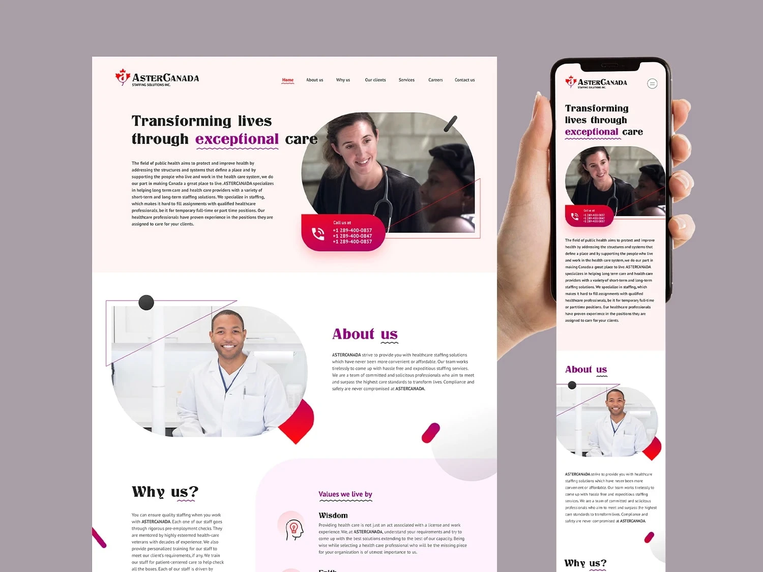
Website
Like this project
Posted Dec 26, 2023
ASTERCANADA prioritizes affordable healthcare staffing. Crafted a Canada-themed logo with maple leaf & "Aster," plus marketing materials & a six-block website.