Blue Bus — Bus Ticket Booking App for Seamless Travel
Sen Design

Blue Bus — UI/UX Case Study
6 min read
·
Apr 10, 2025
📌Context
Project Title
Blue Bus — Bus Ticket Booking App for Seamless Travel
Description
This project focused on improving the digital ticket booking experience for bus travelers. From confusing navigation to frustrating payment flows, I explored how to make planning bus trips more intuitive, efficient, and enjoyable.
In an era of digital transformation, public transportation is increasingly adopting online solutions to provide convenience and accessibility to travelers. This case study highlights the process of designing a user-centric bus ticket booking application to simplify the travel planning experience. The primary focus was to create a seamless, intuitive, and efficient platform for users to book bus tickets with minimal friction while addressing the pain points commonly found in existing solutions.
Blue Bus is your all-in-one solution for booking bus tickets online. Designed with simplicity and convenience in mind, Blue Bus connects you to a vast network of bus operators across multiple routes, ensuring you find the perfect ride for your travel needs.
Role
I worked as the UI/UX Designer, handling the full design process from research to prototyping, wireframing, and usability testing. This was a self-initiated case study aimed at sharpening my skills and understanding user needs in the travel tech space.
❗ Problem Statement
Problems Identified
The home page design doesn’t have a feature to directly search for tickets with the user’s desired route.
Confusing bus timetable search and ticket booking process.
Seating options that are hard to see with an unintuitive interface.
Lack of payment options which makes the user experience not smooth.
It is difficult to find detailed information such as the journey route, departure time, facilities, available seats, bus name, and bus number.
Design Thinking
Solutions
Simplify the ticket booking process: Users can search schedules, select seats, and make payments in a few easy steps.
Provides complete and detailed information: Users can view bus facilities, refund policies, and journey route details.
Improving app accessibility: Design that is easy to use by all, including users who are not very familiar with technology.
Provide diverse payment options: Make the payment process more flexible and convenient for users.
🔍 Research Process
Research Method
I conducted supervised user research and received feedback from users that we incorporated into user personas. For example, our persona, James Adam, was having trouble finding bus tickets. He tried searching for tickets online, but he hasn’t found an app that can provide complete information about the desired ticket or bus.
User Persona
Personas embody the characteristics of actual users, including their demographics, behaviors, goals, and pain points. This ensures that designs are focused on the needs of real people rather than hypothetical assumptions.
Empathy Map
This empathy map captures James needs and experiences, providing valuable insights for creating a user-centric bus ticket booking application.
✏️ Design Process
User Flow
Design user flows to illustrate the path that users take through our products, detailing each step from start to finish. This process helps us refine the user experience, creating a smooth and intuitive journey that effectively fulfils their needs.
User Stories
I write user stories to understand what our users want and need, guiding our product development to meet their expectations and deliver value.
Wireframe
Wireframes are an indispensable step in UI/UX design, bridging the gap between user needs and a polished interface. They demonstrate how user insights informed layout decisions and provide evidence of a thoughtful, structured approach.
Visual Design / High Fidelity
Style Guide
A style guide ensures that typography, color palettes, icons, spacing, buttons, and other UI elements are used consistently across all screens and features. This consistency helps users recognize patterns, reducing the cognitive load and improving the overall user experience.
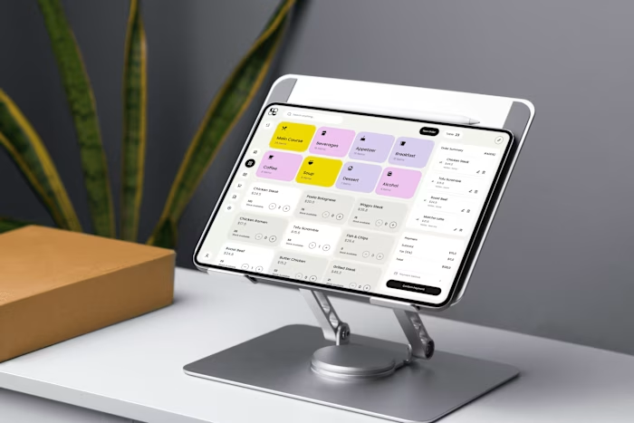
Home Screen
Main Flow
UI Exploration
🚀 Challenge & Impact
Designing a seamless and accessible bus ticket booking experience was not without its challenges. One of the key hurdles was balancing simplicity for first-time users while still providing robust features for frequent travelers. Ensuring clarity in navigation, minimizing booking steps, and addressing accessibility needs required several iterations and constant feedback loops.
Through usability testing with 5 participants using Maze, we gained critical insights into how real users interact with the application. These findings led to improvements in task flow efficiency, reduced confusion on route selection, and enhanced overall satisfaction. Users completed tasks with a 100% success rate, and the average satisfaction score reached 4.6 out of 5, signaling a strong alignment between the design and user expectations.
The final product not only improved the digital booking process but also brought ease, speed, and confidence to users planning their bus journeys — helping them spend less time booking and more time looking forward to the road ahead.
Usability Testing Results
To evaluate the effectiveness and intuitiveness of the redesigned bus ticket booking flow, I conducted a remote usability test using Maze. The prototype was tested with 5 participants, all of whom regularly travel by bus and book tickets online.
Task Scenarios
Search and select a bus route
Choose a preferred seat
Complete the booking and view detail order
Observations
The is a visualization of the results of usability testing from 5 participants on the bus ticket booking application:
Task Completion Rate (%)
All participants successfully completed the tasks given, indicating that the main flow of the application can be understood well.
User Satisfaction (Scale 1–5)
The average satisfaction score is 4.6 out of 5. This indicates that the interface and user experience is quite comfortable.
Number of Misclicks
Some participants experienced a small number of misclicks, especially on navigation elements. This suggests that there is room for improvement in interaction design, such as enlarging buttons or providing better visual clarity.
🏁 Closing
This case study allowed me to dive deep into the mindset of bus travelers and understand the nuances of functional, accessible design. By simplifying the booking journey and focusing on user confidence, the redesigned experience supports a smoother, faster, and more enjoyable trip for anyone hitting the road.
✨ Traveling should be about the journey — not struggling with the ticket.
Like this project
Posted May 8, 2025
Designed a user-centric bus ticket booking app for seamless travel.
Likes
0
Views
4
Timeline
Feb 1, 2025 - Feb 28, 2025