💋 Hot As Kell Cosmetic Tattoo Logo Redesign
Project Overview 🔎
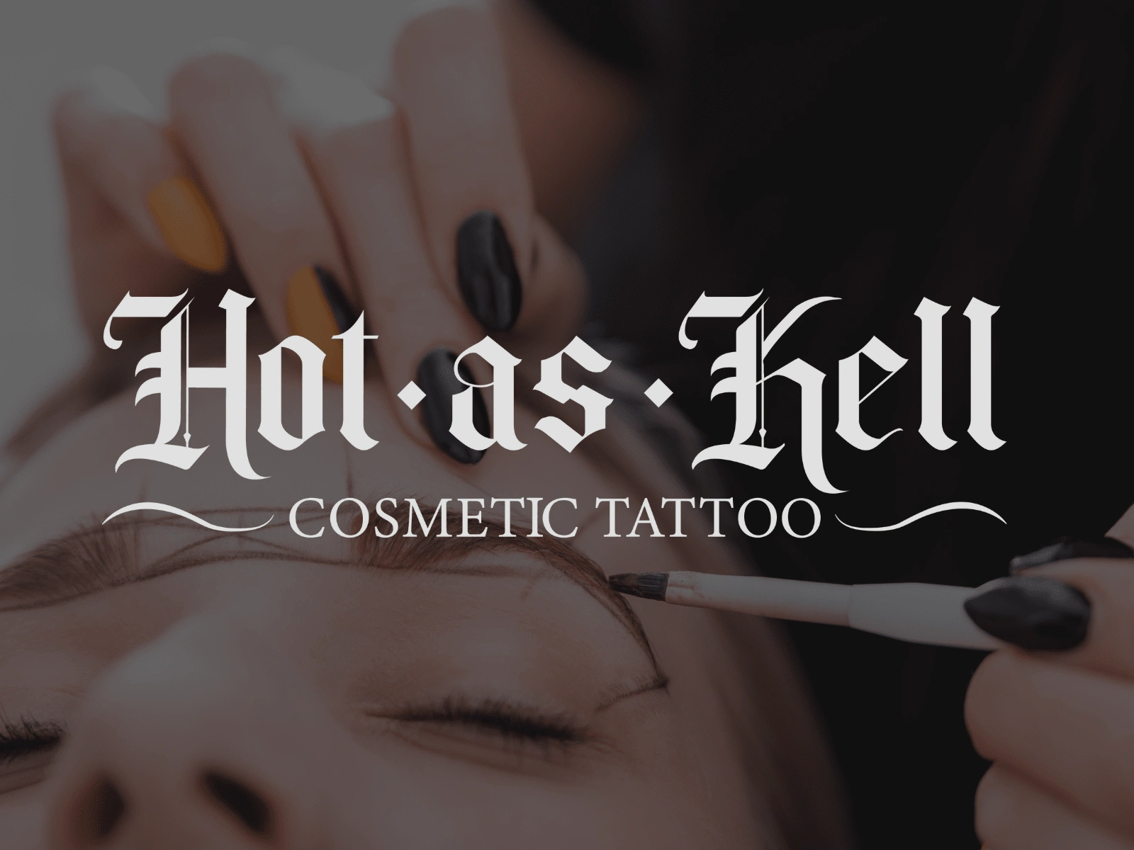
Hot As Kell is an Illinois local cosmetic tattoo shop. Jodi, the owner of Hot As Kell Cosmetic Tattoo, requested a logo redesign for her brand. She felt it was outdated and didn't show her personality. With this in mind I set forth to create the perfect logo suite that fit her needs.
Creative Services ✍️
Creative Direction
Brand Identity Design
Logo Design
Business Card Design
Aftercare Instruction Card Design
Creative Direction/Mood board
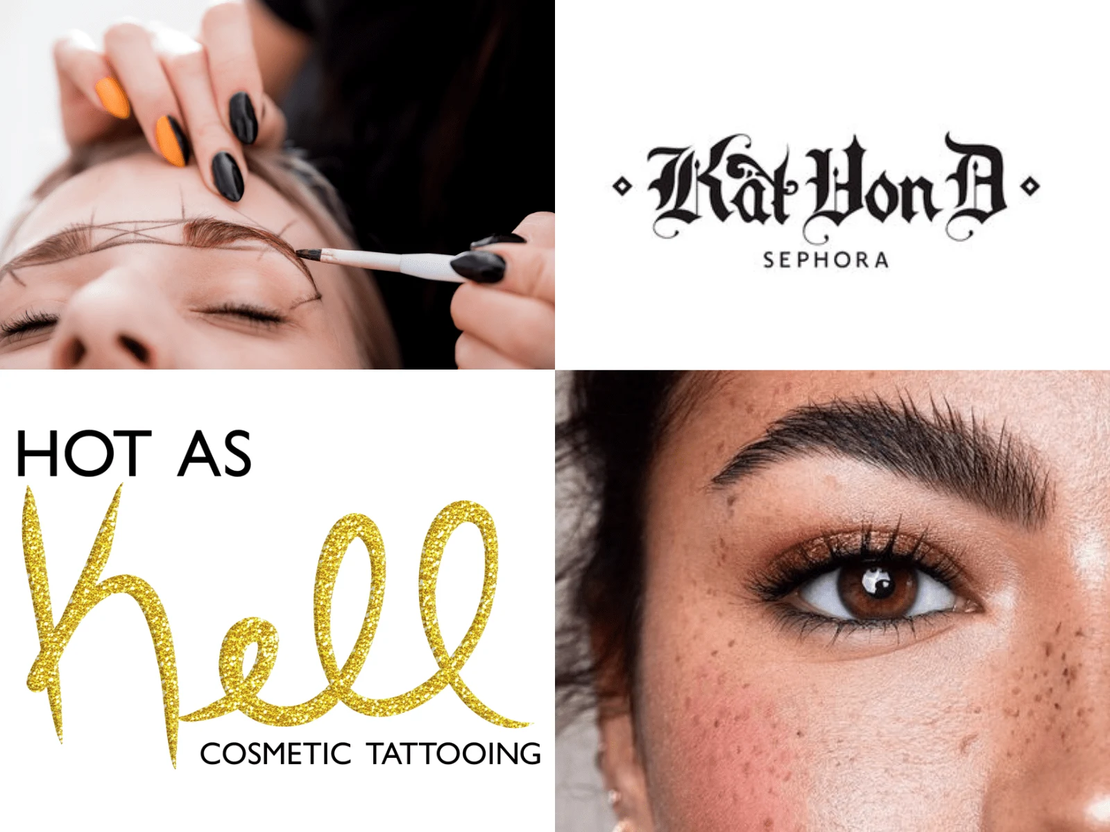
For the creative direction, Jodi wanted something that was gothic but with a feminine edge. She really liked the Kat Von D logo pictured below, but wanted to keep some elements of her previous logo.
Logo Design
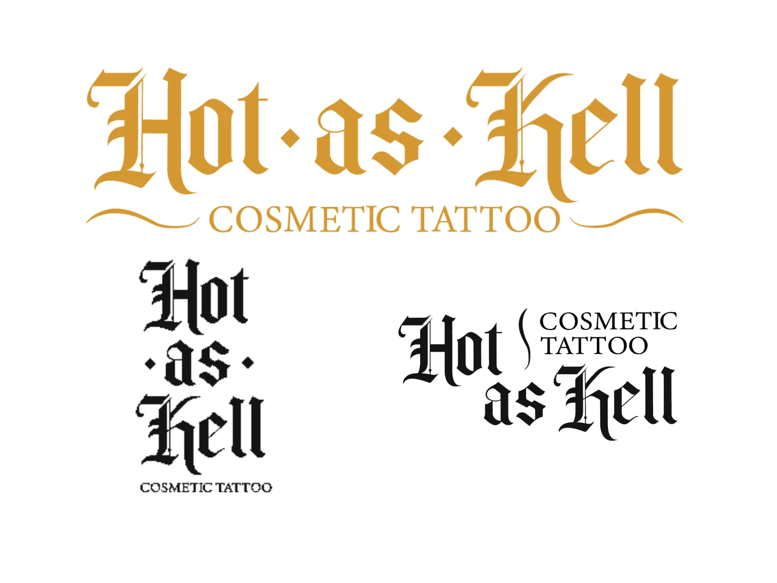
Keeping the theme of gothic with a feminine edge, I chose a gothic/medieval font for the primary logo, a curved line to add some symmetry and mimic the curves of an eyebrow, and diamonds shapes. The font is a customized gothic font, as the original K did not have the feminine edge and looked too harsh.
Business Card Design
Aftercare Instructions Card
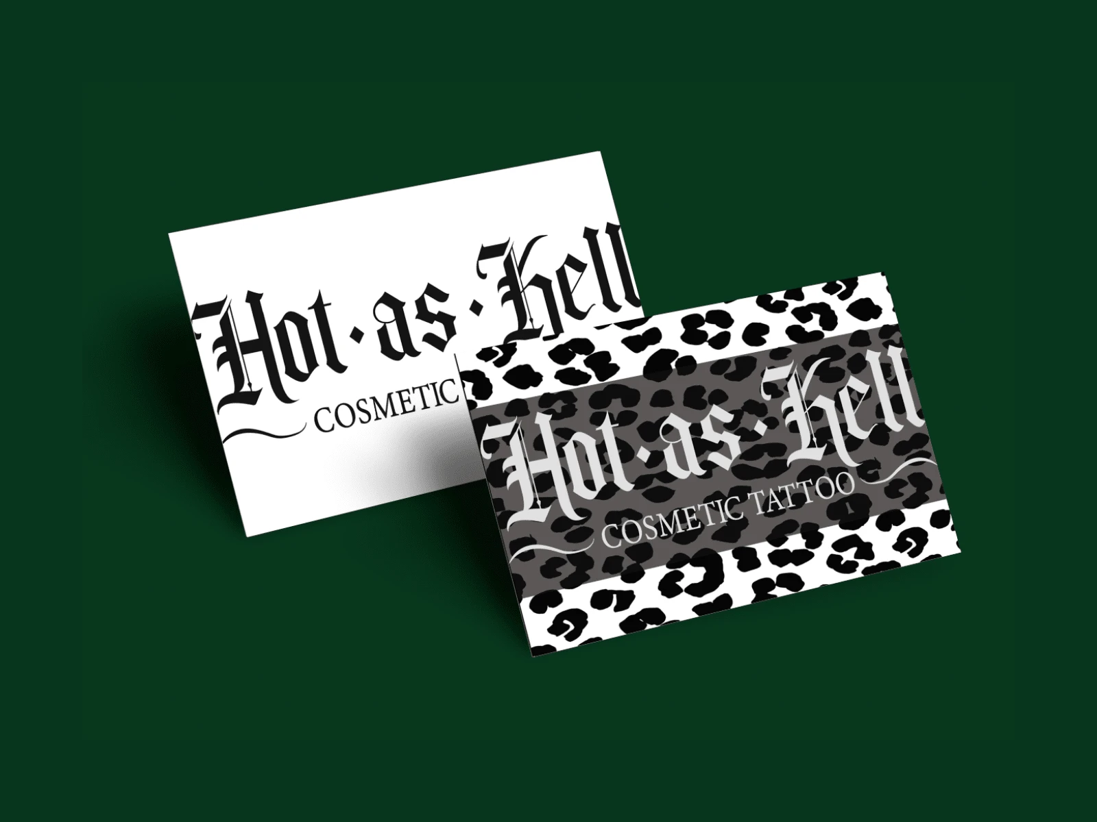
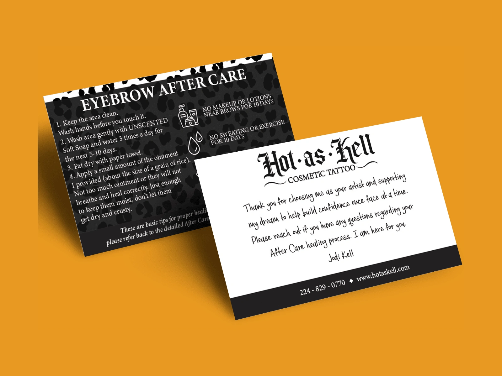
With cosmetic tattoo procedures, aftercare is key to keep them looking perfect before your next color boost. These cards hold all of the information that a client of Jodi's would need in the aftercare process to keep their cosmetic tattoo in tact.
Like this project
Posted Jan 2, 2024
A logo redesign for a permanent makeup artist. A gothic/medieval style logo with a feminine edge.

