Kotak Mahindra Brand Guidelines
Raksham Shahu
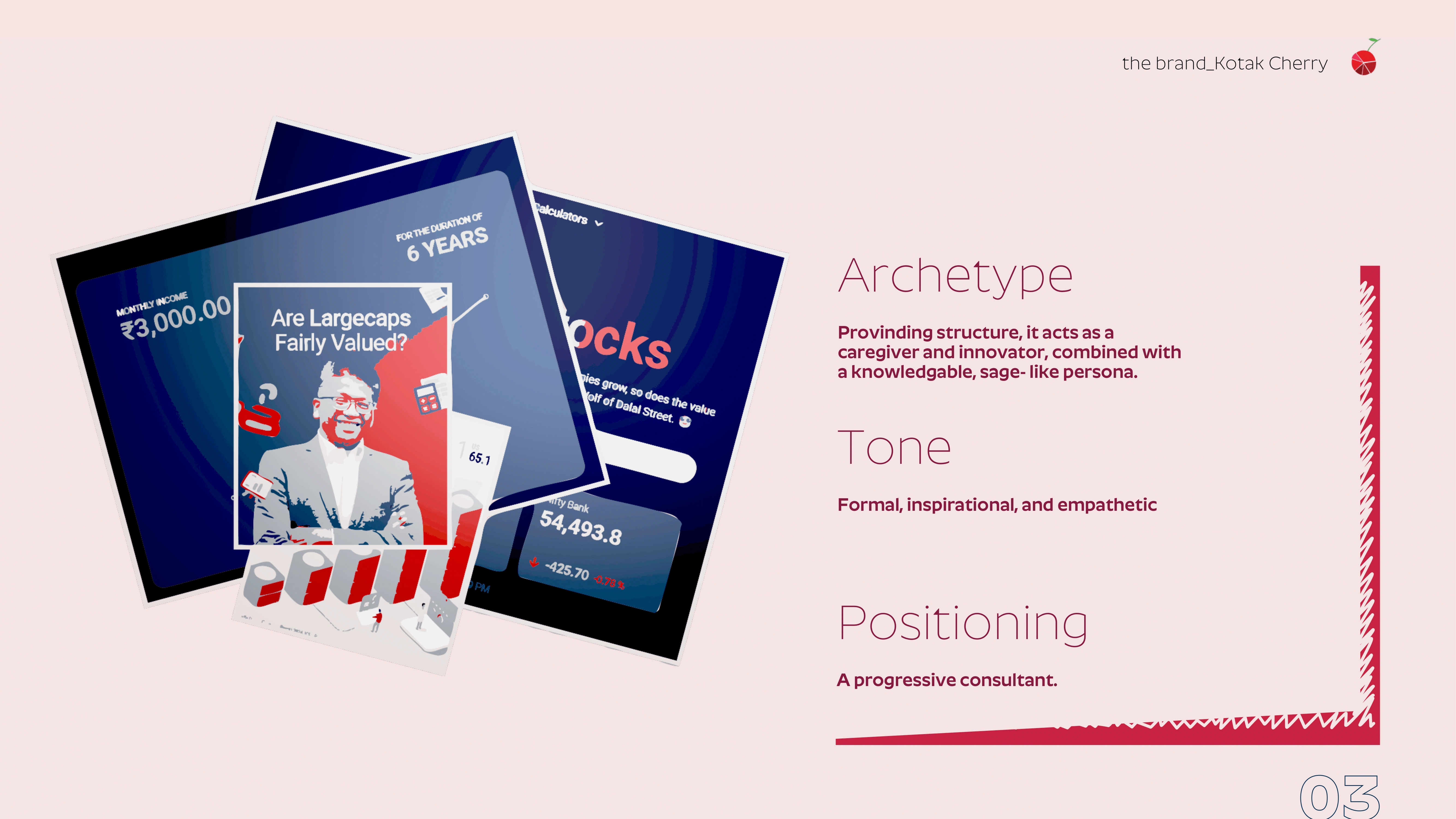
In this project, we crafted a distinctive visual identity for Kotak Cherry that balances structured professionalism with empathetic communication. Anchored in the archetype of a caregiver-innovator with a sage-like persona, the design reflects Kotak’s positioning as a progressive consultant.
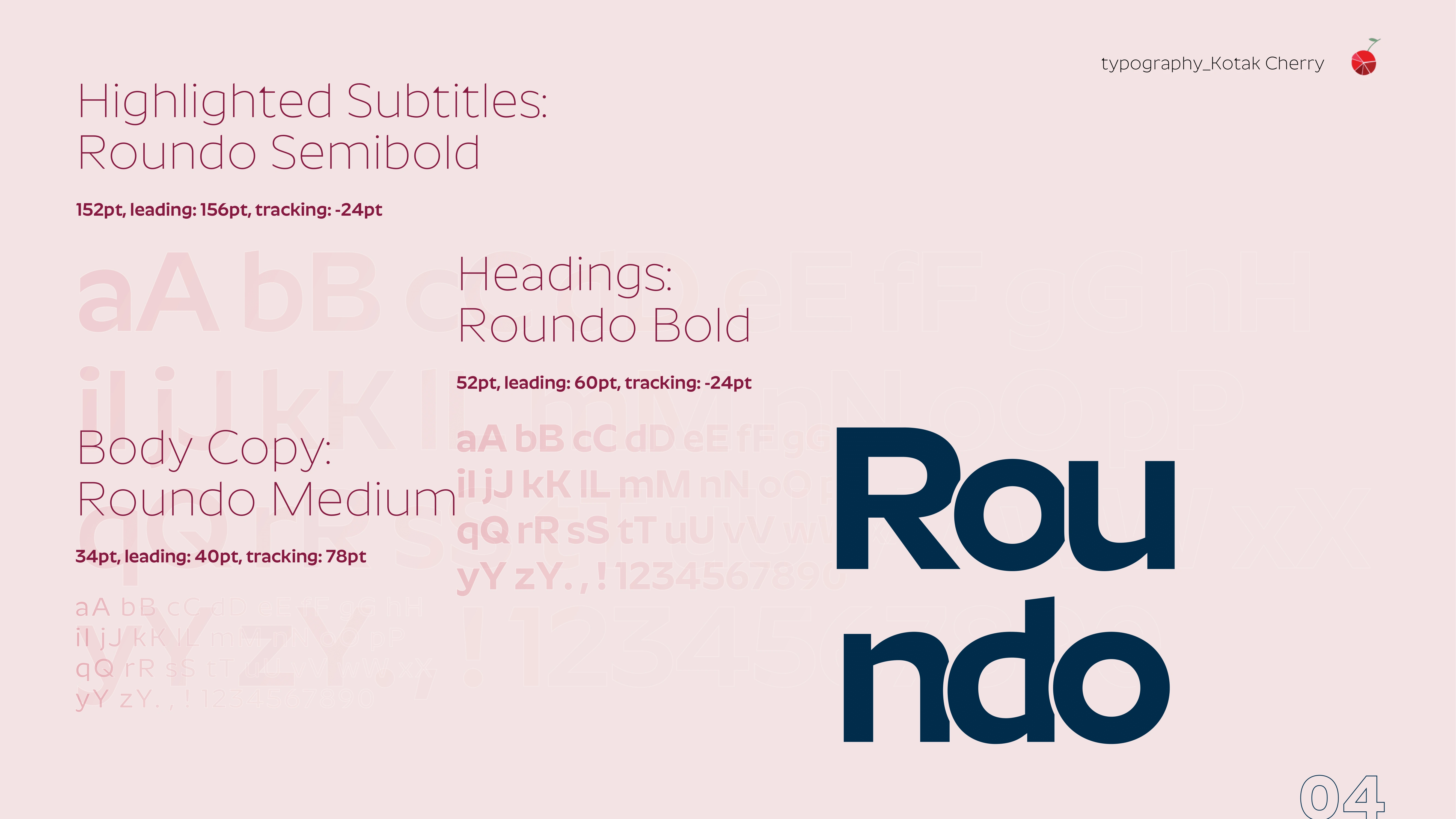
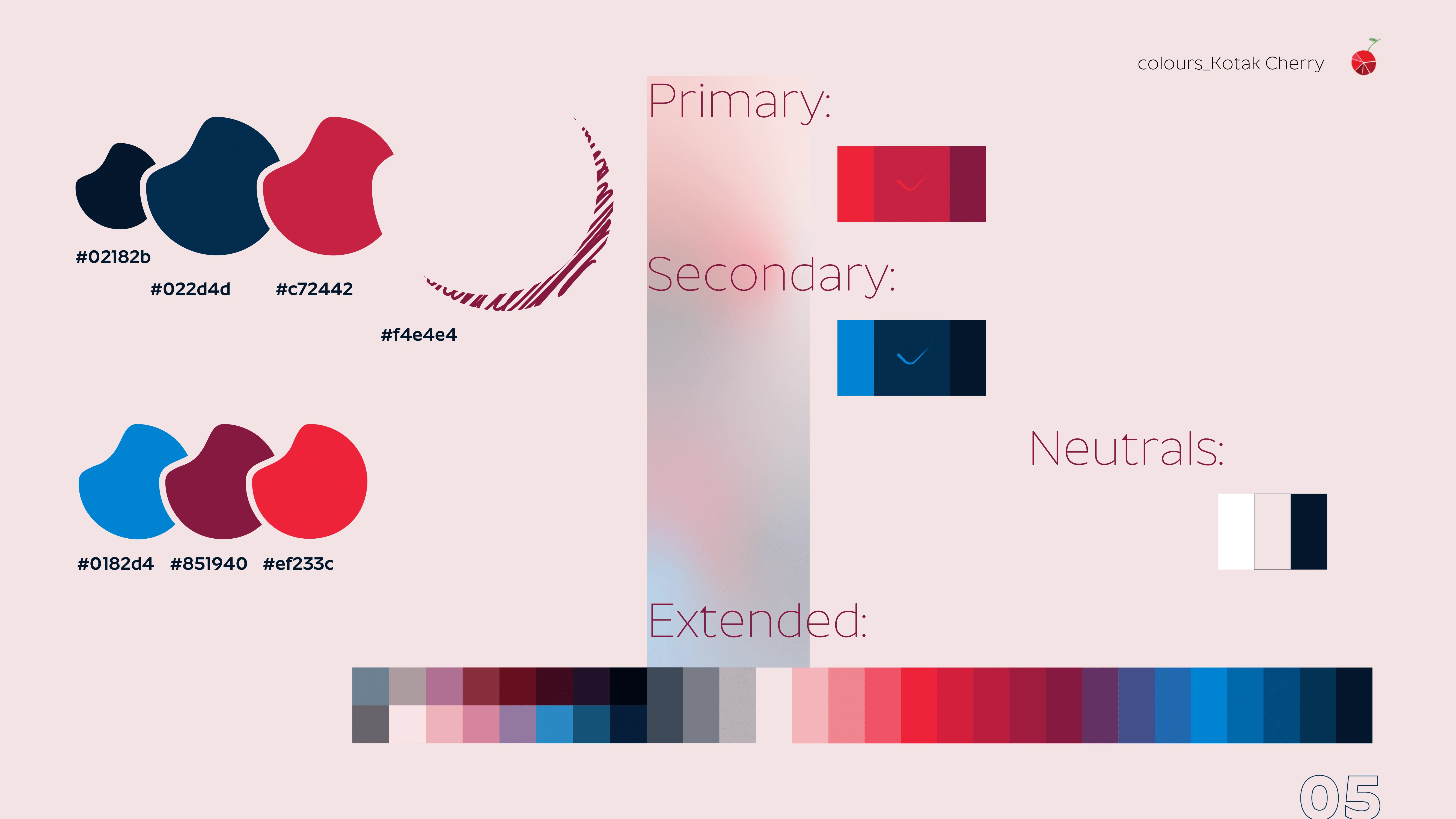
We used the Roundo type family across headings, subtitles, and body copy to maintain clarity and friendliness. The color palette—dominated by deep blues, cherry reds, and supportive neutrals—enhanced the brand’s formal yet warm tone.
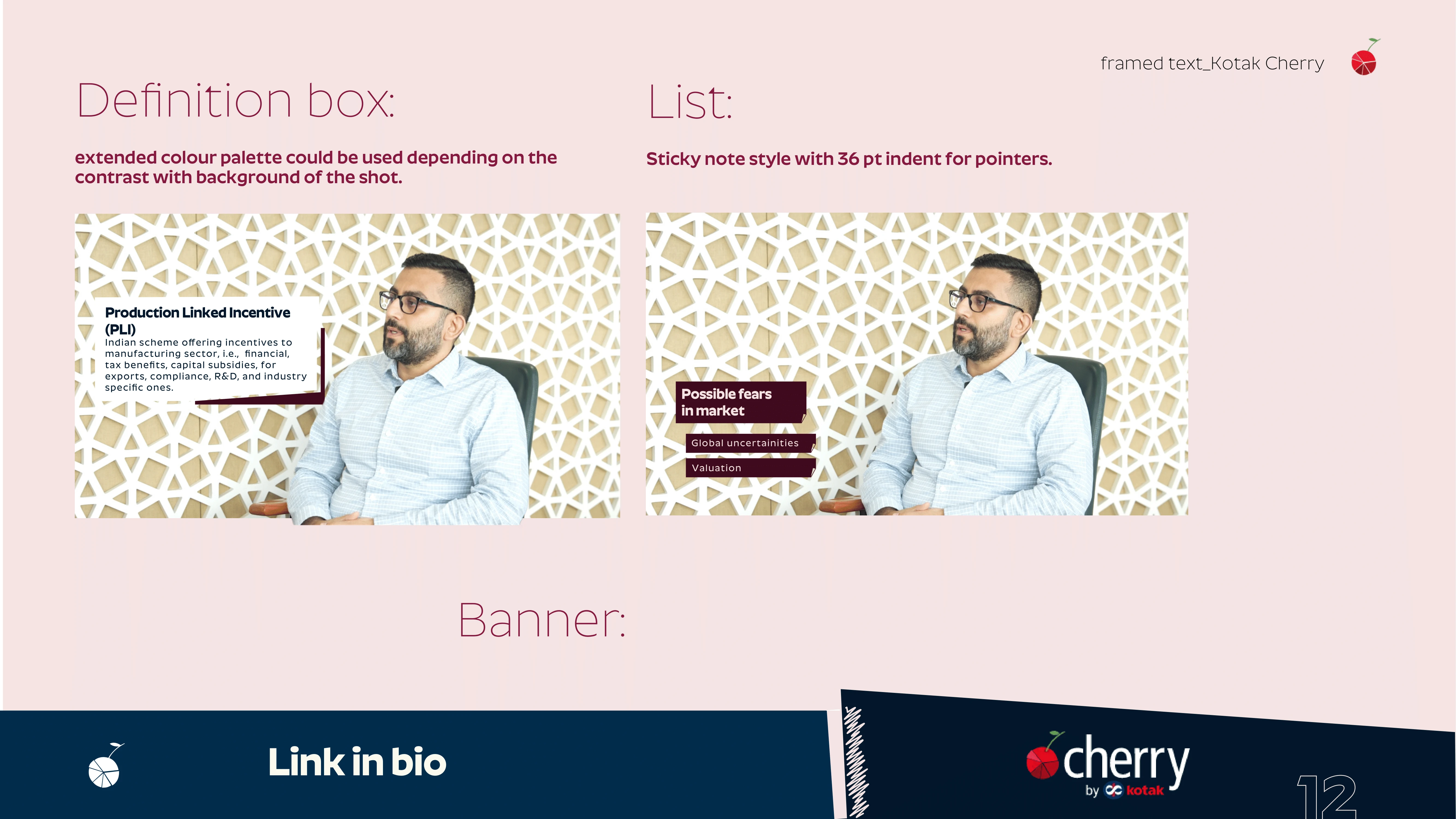
Visual storytelling played a crucial role. Frames, scribbled illustrations, and custom iconography (spanning geopolitics to IT) brought abstract financial topics to life. Lower thirds, infographics, and split screens followed a consistent style, ensuring each video component aligned with the broader narrative. Definition boxes, sticky note lists, and color-coded banners made complex information digestible.
Overall, our design work for Kotak Cherry exemplifies how structure and empathy can coexist in finance-focused content, building trust while informing and inspiring the audience.

Like this project
Posted Jun 3, 2025
Designed brand guidelines for Kotak Mahindra Bank’s podcast to maintain a consistent visual and tonal identity across episodes and platforms.
Likes
0
Views
5