Tu Menú Web: Design That Delivers
Natalia Calderón
Role: Lead UX Designer (Freelance)
Timeline: 4 months (ongoing improvements)
🚩 The Problem
Restaurant owners struggled with clunky delivery apps causing frustrated customers, order abandonment, and poor engagement. The existing platform was inconsistent, complex, and hard to use—especially for non-tech-savvy owners.
🎯 Goal
Redesign three core interfaces to:
Uncover key pain points of restaurant owners with delivery and order tools
Simplify flows from landing page to first order
Fix usability issues and improve information clarity
Empower non-tech-savvy owners to manage their business independently
Boost task completion and reduce navigation errors by 40% within 3 months
🔍 Research & Strategy
I started with a heuristic evaluation and uncovered two major issues:
❌ Inconsistent UI confused users
❌ Poor system feedback led to frustration

Heuristic Evaluation Analysis
But the real insight came from my time as a call center agent. I watched restaurant owners struggle in real time. What I learned:
👴 Most owners were in their 40s–50s and not tech-savvy.
🧭 They wanted clarity, not control.
💡 Platforms should empower—not micromanage—their business.

User insights
These insights grounded every design decision moving forward.
🧩 Defining the Users
To ensure the redesign fit real needs, I created two personas:
👨🍳 Juan Pérez — Fast-food restaurant owner
Struggles with tech. Needs an intuitive platform to manage orders and grow.
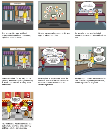
Juan Storyboard
👩💼 Adriana González — Colombian restaurant admin
Turned to online sales during the pandemic. Delivery apps made her feel lost and dependent.
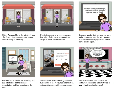
Adriana Storyboard
These personas helped us focus on one thing: simple, clear design that puts users in control.
💡 Ideation & Flow Design
After interviewing over 200 restaurant owners, I crafted a content brief to align goals, user needs, and platform tone. Then, I mapped the full journey:
🧭 User flow: From website → registration → admin panel → first order
📐 Information architecture: Clean, linear, no dead ends
🧰 Content prototype: Prioritized clarity and guidance over marketing fluff
The focus: guide users with confidence, not complexity.
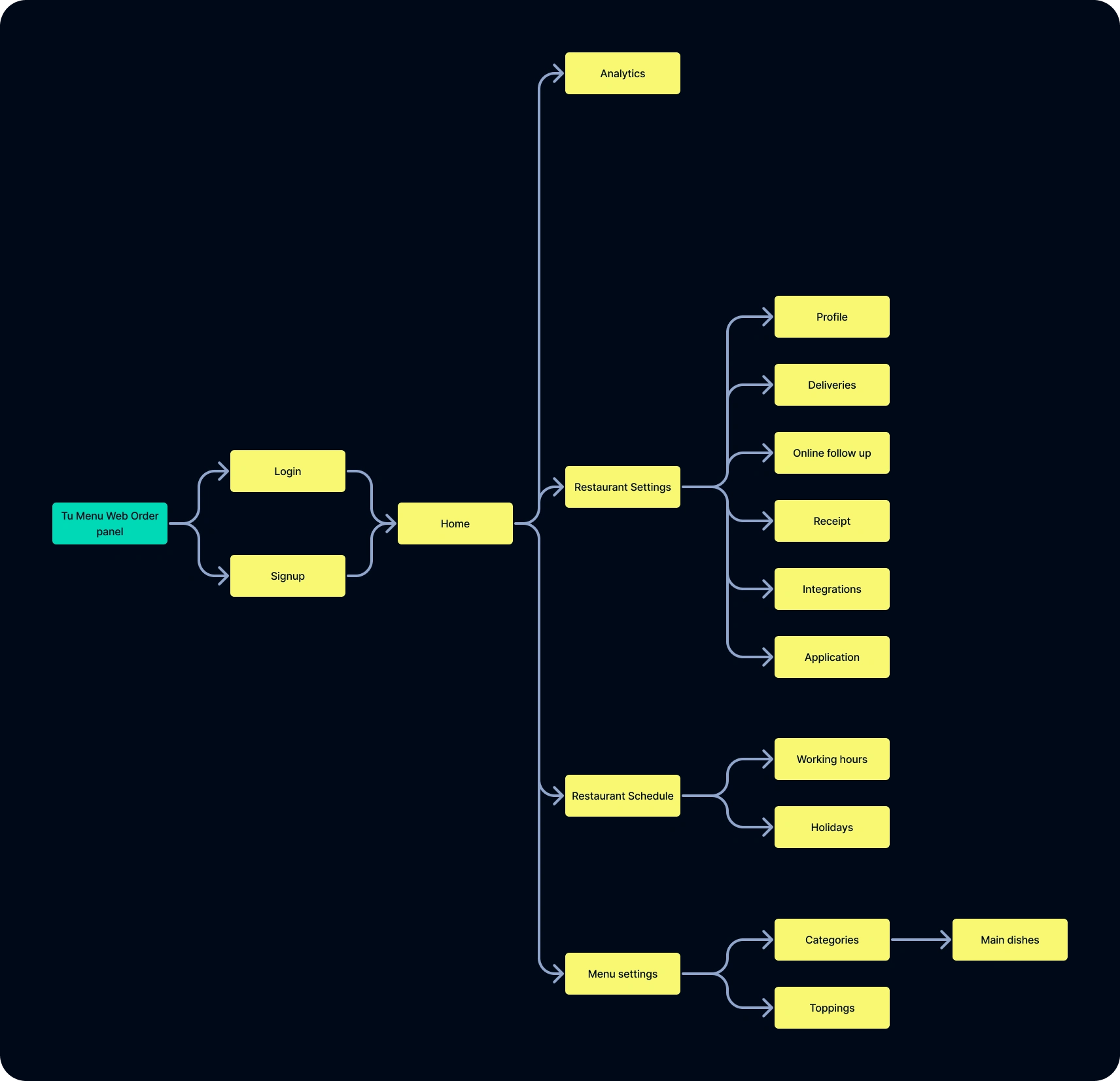
Order Panel User Map
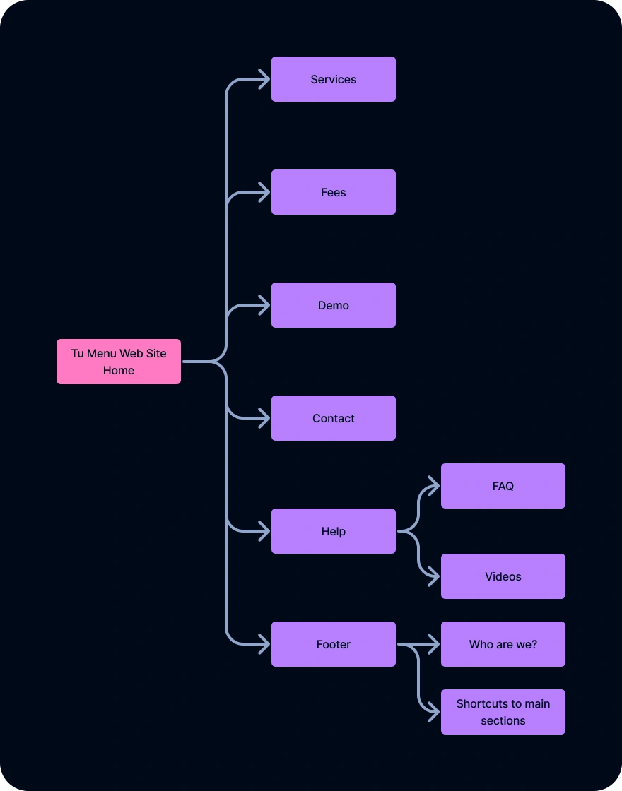
Web Site User Map
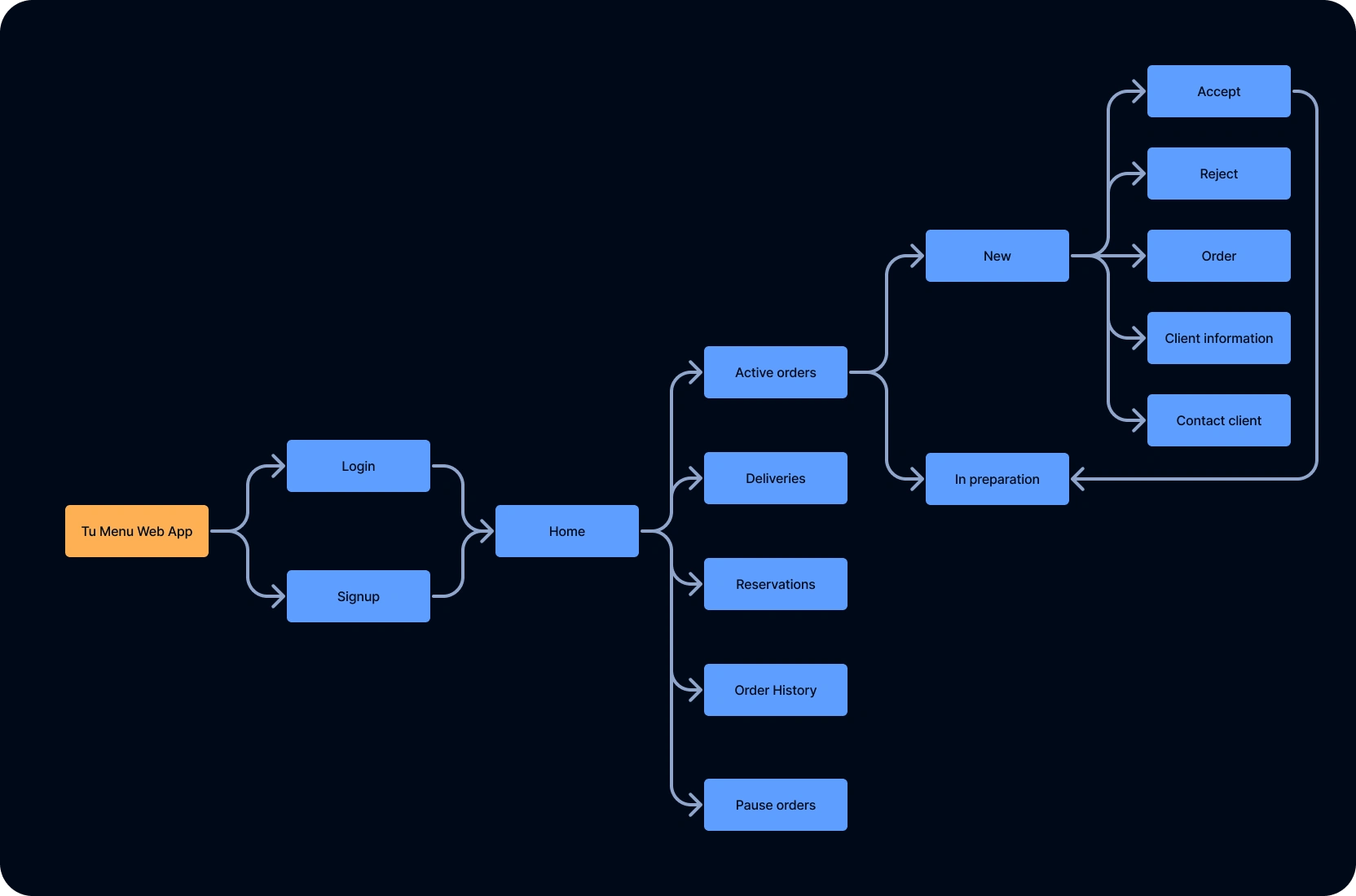
Web App User Map
🧪 Prototyping Three Interfaces
I designed a complete style guide to ensure consistency across colors, fonts, buttons, and icons—then tackled three interfaces, each solving a unique pain point:
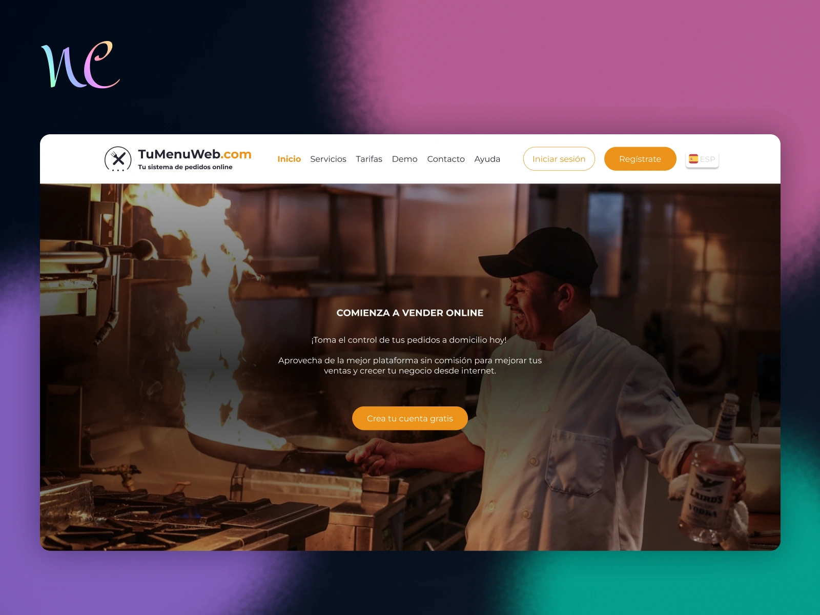
🌐 Website — Clarity First
Designed to inform, not overwhelm.
Sections: Home, Services, Prices, Demo, Contact, Help, Login
✅ Simple navigation
✅ Clear value prop
✅ Easy access to demos and signup
Web Site Video
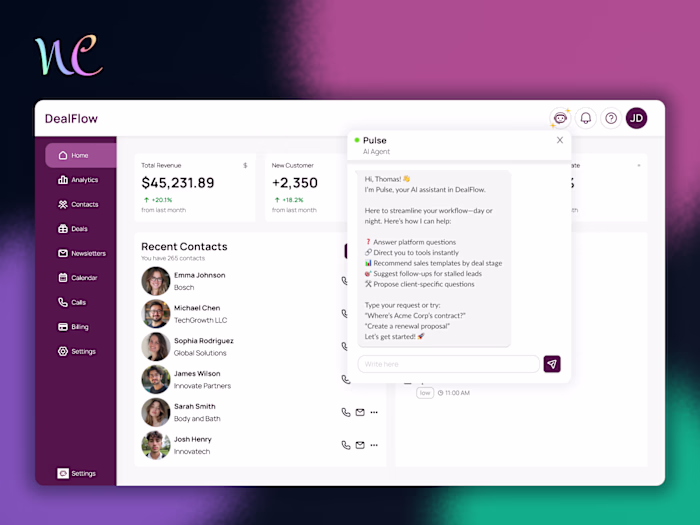
🧭 Admin Panel — Empower the Owner
Designed for restaurant owners to run their business—not wait for approvals.
Key Sections:
📋 Menu Management
⏰ Schedule Setup
📊 Analytics
🛠️ Settings (payments, delivery, reservations)
📰 News & Service Updates
✅ Big, guided buttons for core actions
✅ Modular setup—activate what you need
✅ Clear connection status + updates
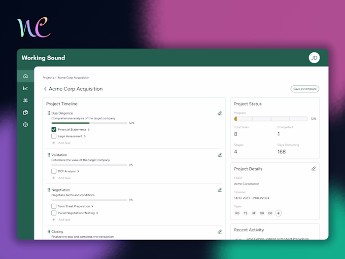
📦 Order App — Operations Made Easy
Built to help owners handle live orders under pressure.
Sections:
🔥 Active Orders
🚚 In Delivery
📅 Reservations
🕓 Order History
⏸️ Pause Orders
✅ Critical functions are front and center
✅ Owners can pause during rush hours
✅ Built for clarity during chaos
🧪 Testing & Feedback
I ran usability tests with real restaurant owners. What they loved:
👍 Guided admin suggestions
👍 Organized, easy-to-follow flows
👍 Seamless menu creation
What needed refinement:
⚠️ Submenus in the admin panel were hard to find
⚠️ Editing products needed better visibility
⚠️ Some order icons were unclear
I used this feedback to iterate on the final versions.

Before and after the changes
📊 Key Outcomes
🚀 3 full interfaces redesigned from the ground up
🧑🍳 Simplified platform tailored for non-tech-savvy users
✅ Boosted ease of use and satisfaction
⏱️ Reduced time to first successful order
🔧 Continuous updates based on user feedback
🧠 Key Learnings
📐 Information architecture is everything
Designing for clarity means understanding how users think. I shaped flows around real mental models.
⚒️ Consistency builds trust
A unified style guide helped avoid confusion and gave the platform a professional, reliable feel.
👥 Tech empathy is non-negotiable
Designing for users who aren’t “digital natives” takes more than simplification—it takes respect.
💬 Takeaway
I don’t just design for users—I listen to them. Tu Menú Web wasn’t just about UX polish. It was about giving small business owners confidence, clarity, and control in a space that usually overwhelms them.
Like this project
Posted Jun 23, 2025
Redesigned 3 interfaces to simplify order flows and empower non-tech-savvy restaurant owners—boosting clarity, control, and user confidence.
Likes
0
Views
7
Timeline
Jun 23, 2022 - Sep 22, 2022