Dalu Brand Design
Susana Fabre

Dalu Case Study
Dalu (Arabic 'دلو') translates roughly as a 'water container,' traditionally used in the Gulf to carry it from the nearby well.
The brand's pursuit to support local, traditional and contemporary arts and crafts, takes this container as a symbol for what it stood for—being able to gather life's most essential necessity: water—which, in the case of Qatar, acquires particular importance due to local weather and geographic conditions.
As such, the aim was to represent this quality of containing—of keeping together—something of great value. In the case of Dalu, this translates as holding the country's current most prized possession: culture and it's visual expressions, inside the object that has been historically known to be used as container for life’'s essential source.
Above the container, the iconic Qatari sun shines beams of light over the water, bringing together two quintessential elements of local life.

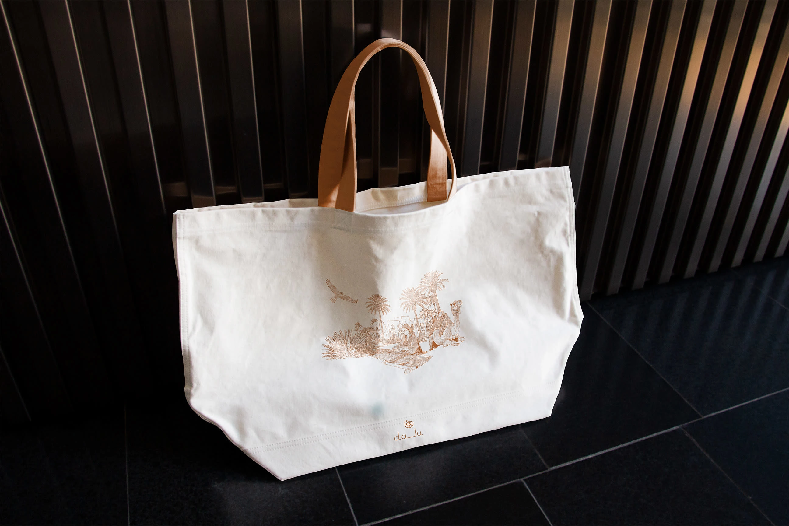
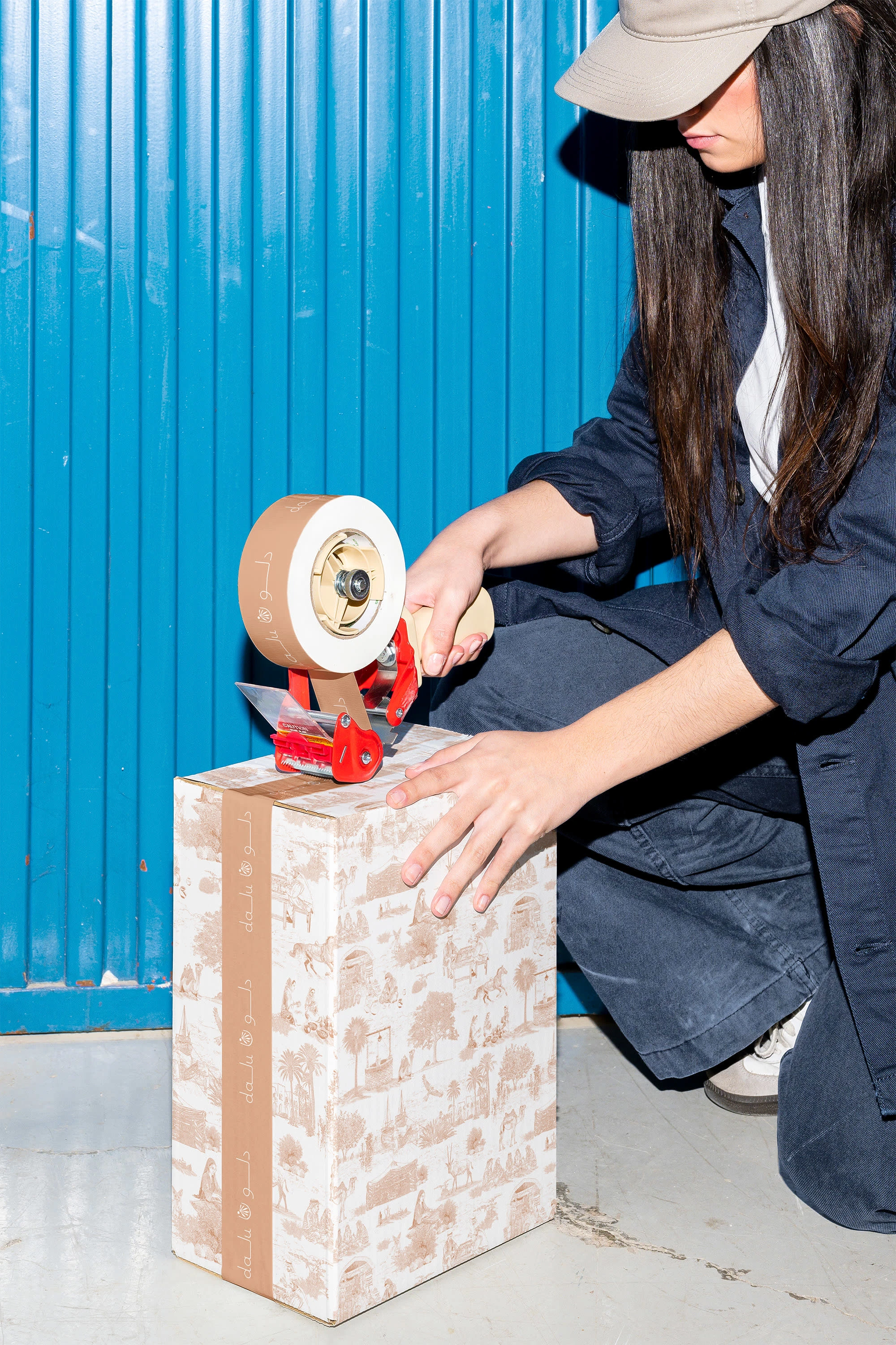
Dalu bilingual logotype with typogram and symbol
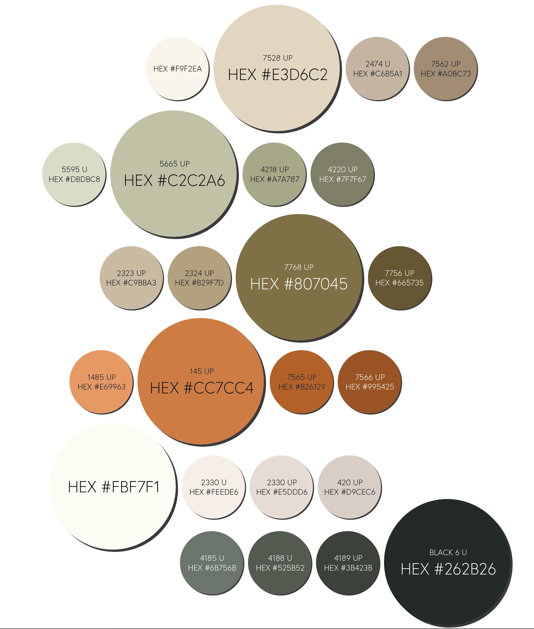
Primary and secondary colour palettes
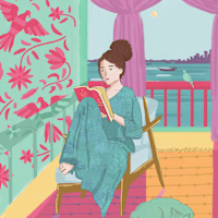
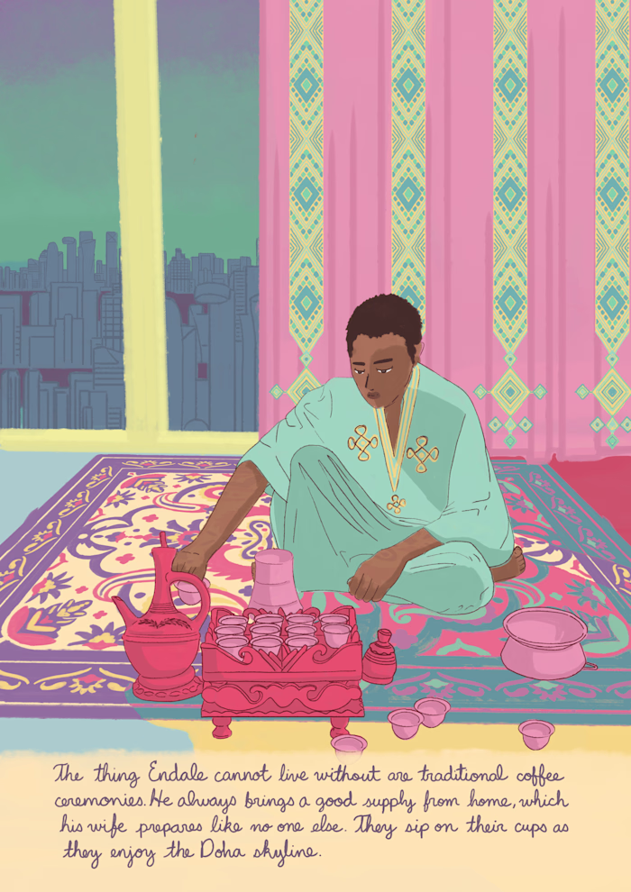
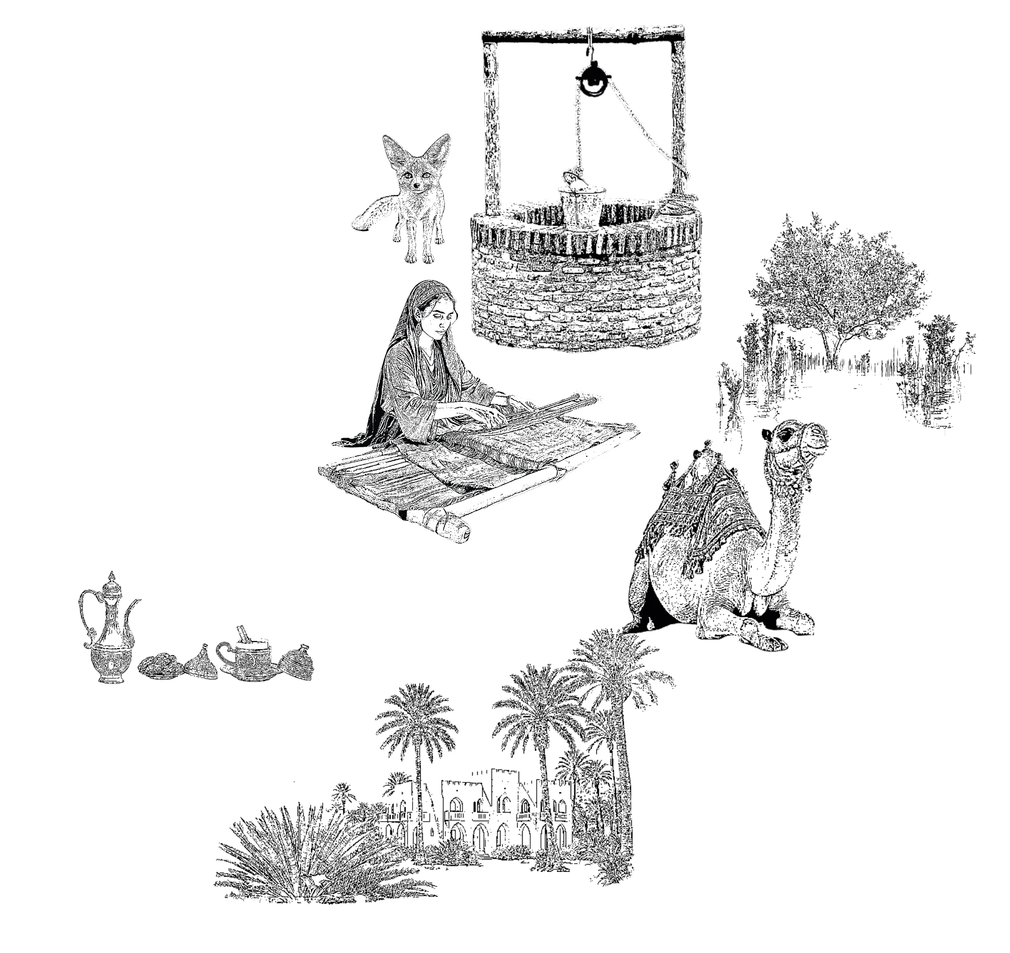
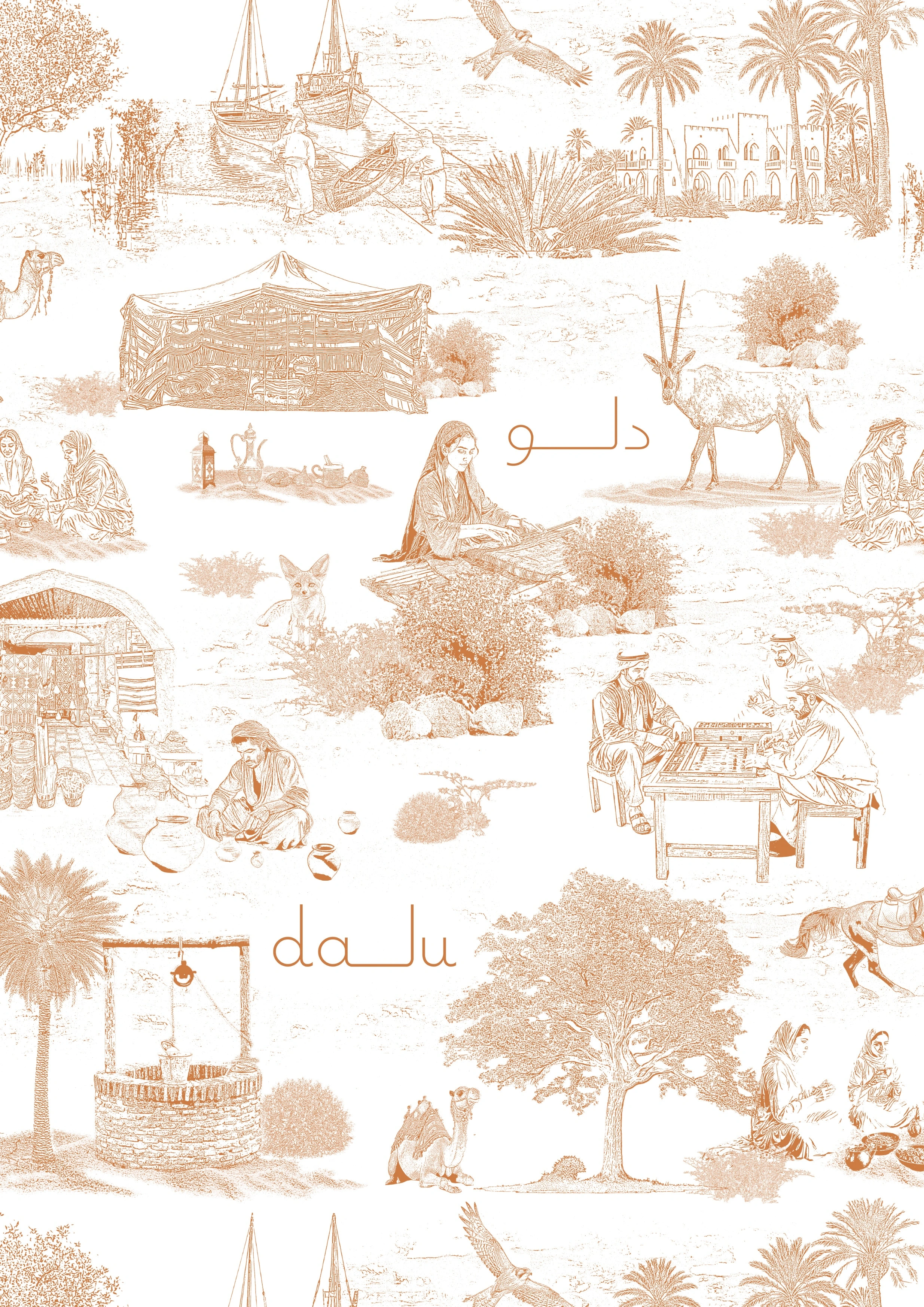
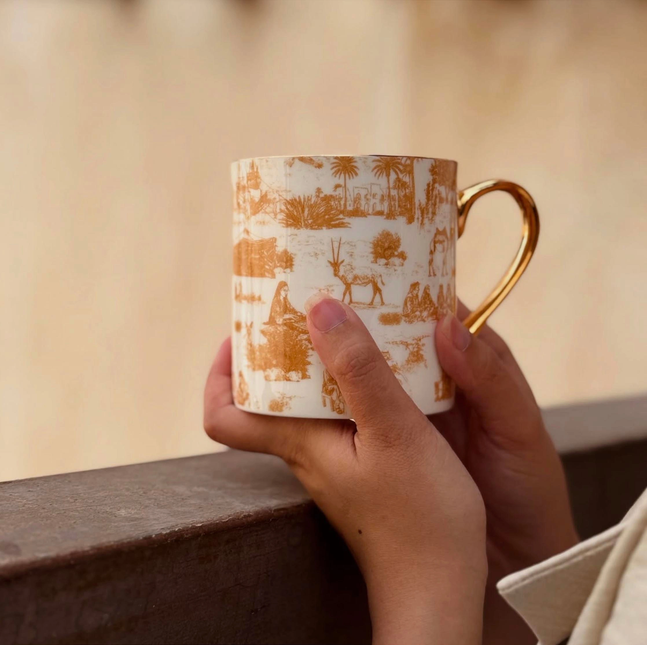
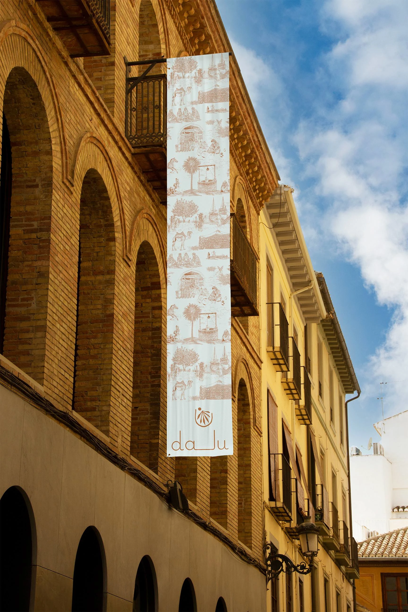
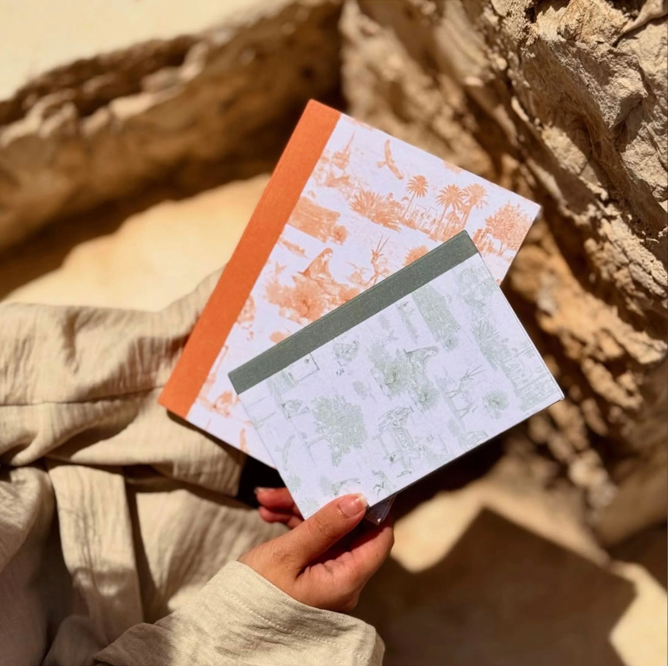
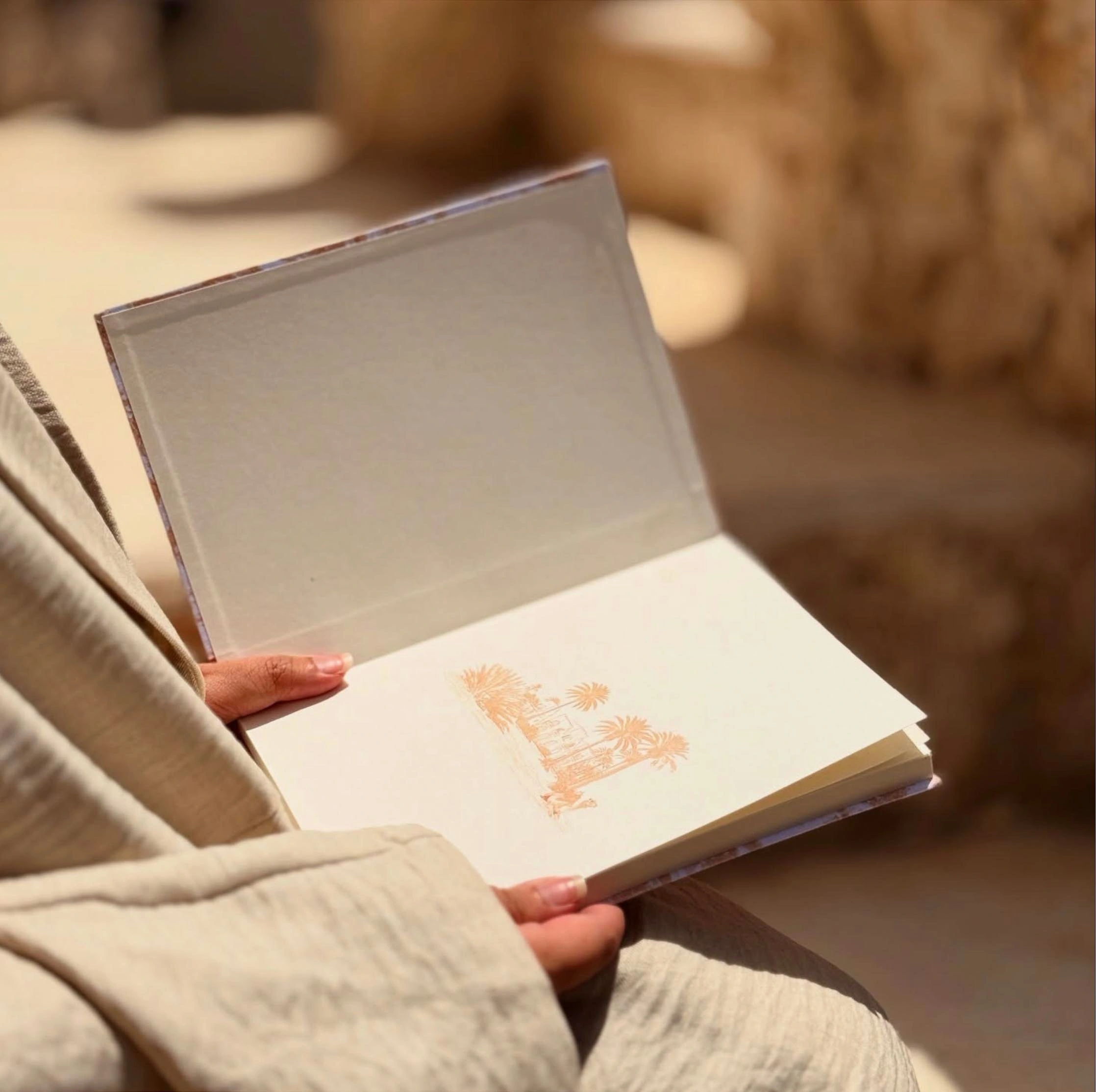
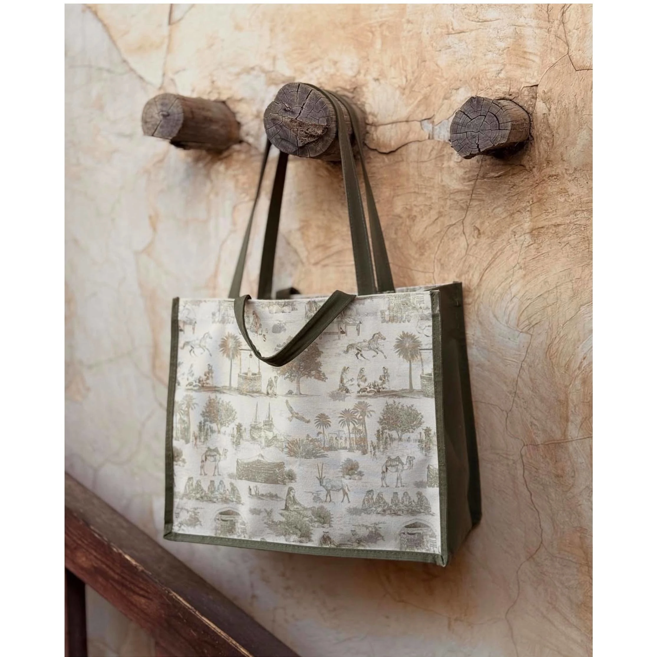
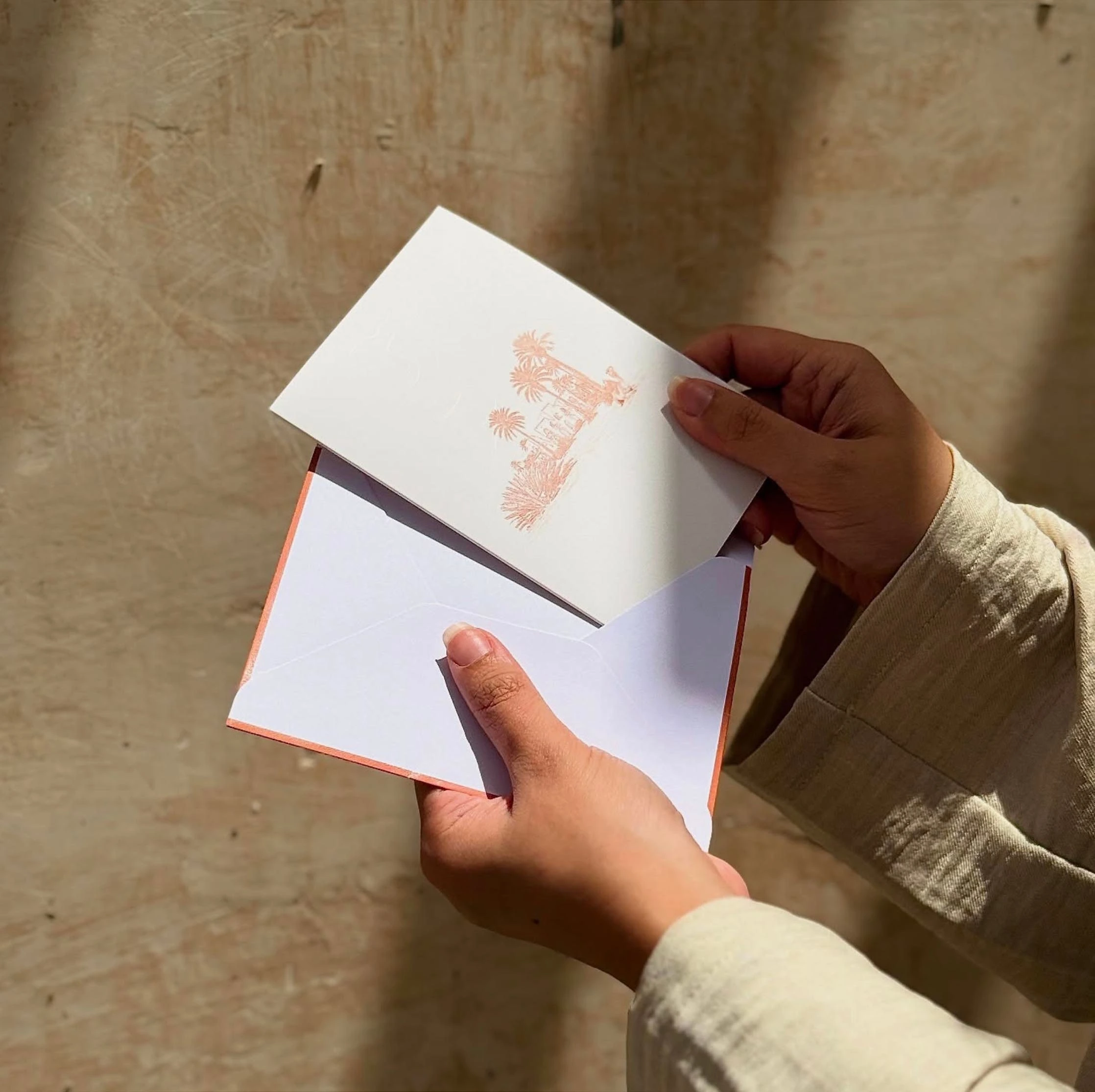
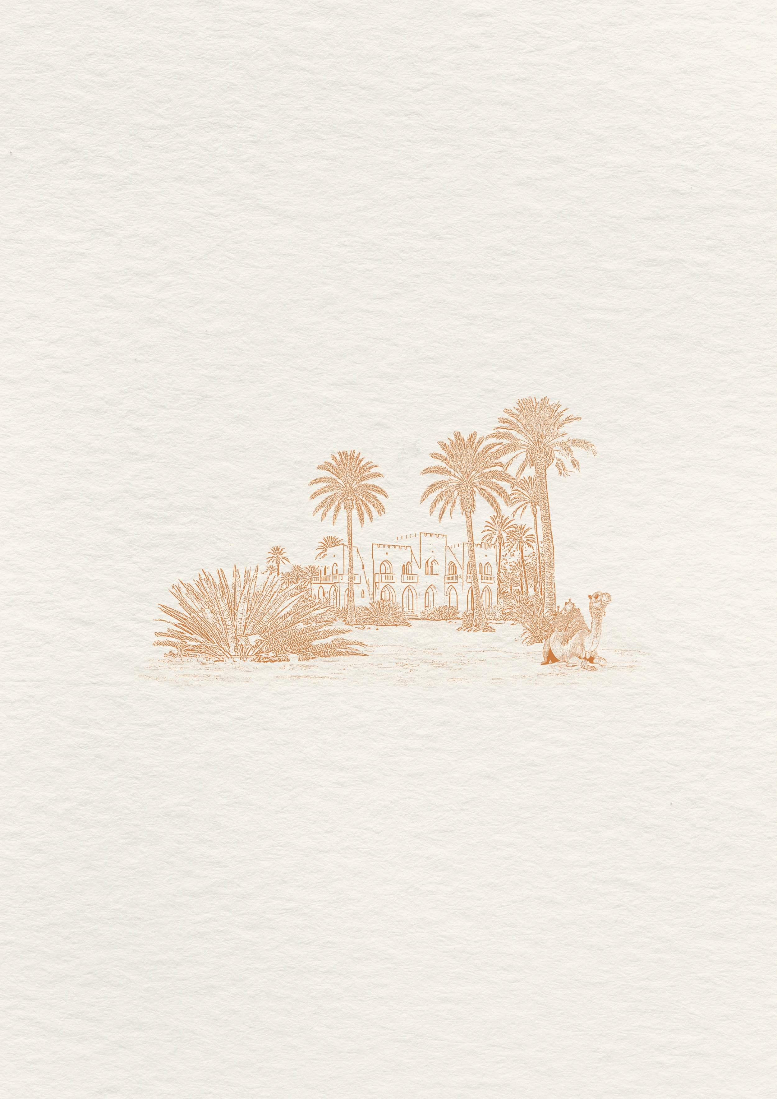
Brand pattern: Toile de Jouy / Toile d'Arabie
Toile de Jouy’s characteristic style has stood the test of time by its capacity to tell stories.
These patterns, originally from France, have taught generations about literature and mythology. They have remained relevant through their reinterpretation from different geographic and cultural centres. This collection uses toile the Jouy’s traditional look to tell a unique and localised story.
Check out more on Toile de Jouy’s versatility.


Like this project
Posted Jan 11, 2026
Created brand guidelines and merch for Dalu to represent Qatari culture and tradition.