Built with Framer
Jaun - Dentist website
Summary
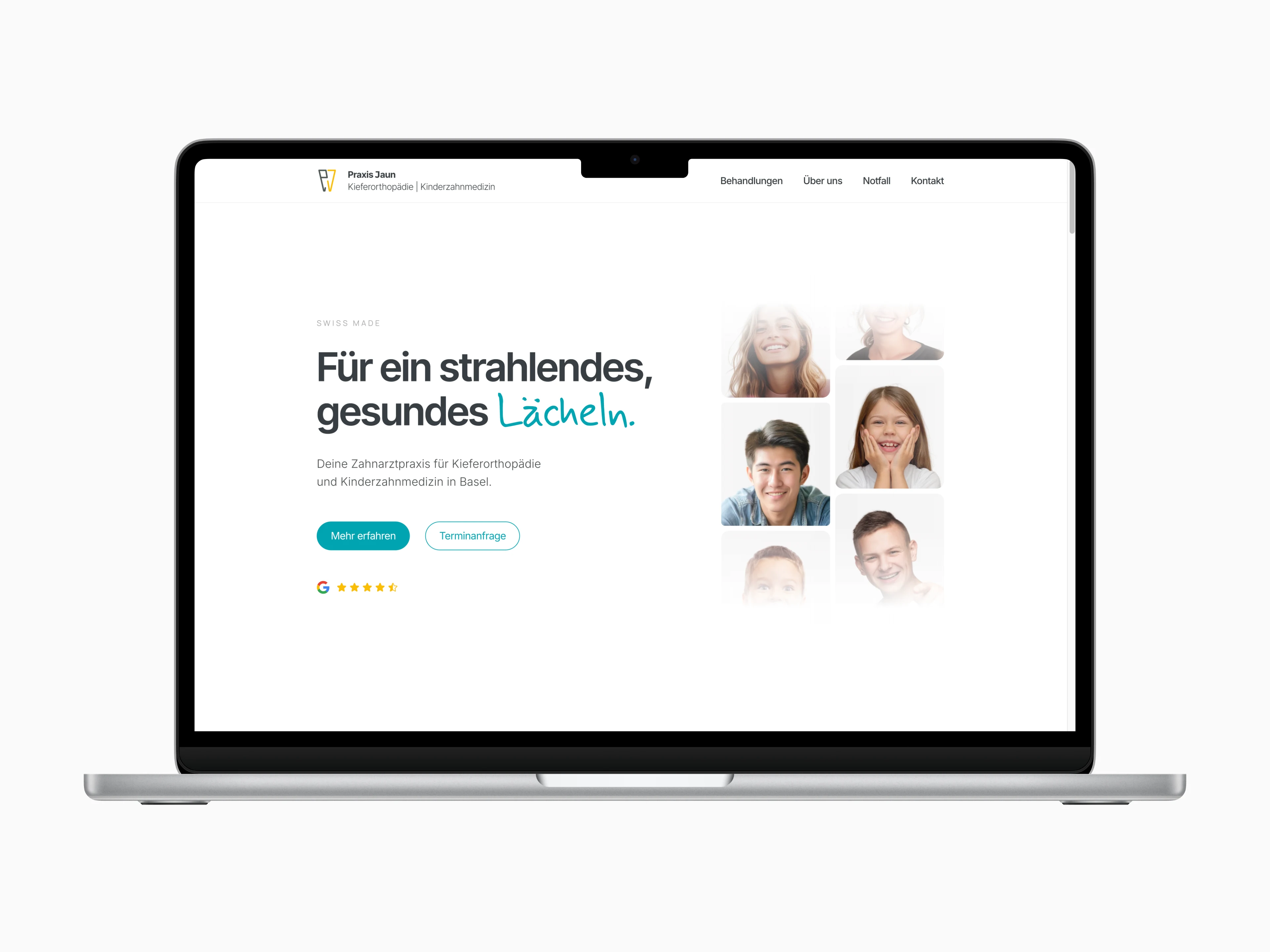
Complete new design and development of dentist Jaun's website with focus on simplicity and responsiveness.
Header
Overview
The original website was built in 2010 and was outdated. The site was optimized for desktops and was barely usable on a mobile device. Research showed that 75% of site visitors were using a mobile device. In addition, the logo and color scheme had changed.
Challenge
Keep all the existing information, add additional information and still keep the site light and easy to scan. Use the color scheme provided by the client, which was particularly difficult because two of the main colors (yellow and gray) are not necessarily associated with dentistry. Also, focus on responsiveness on all devices.
Solution
The main element of the new website is the landing page, which contains the most important content (Services, Team, Contact). The site is easy to browse and basic information about services, team and contact is easy to find. Since only a few visitors need more information on each topic, specific details are moved to subpages. The site is fully responsive and optimized for all devices to improve conversion rate.
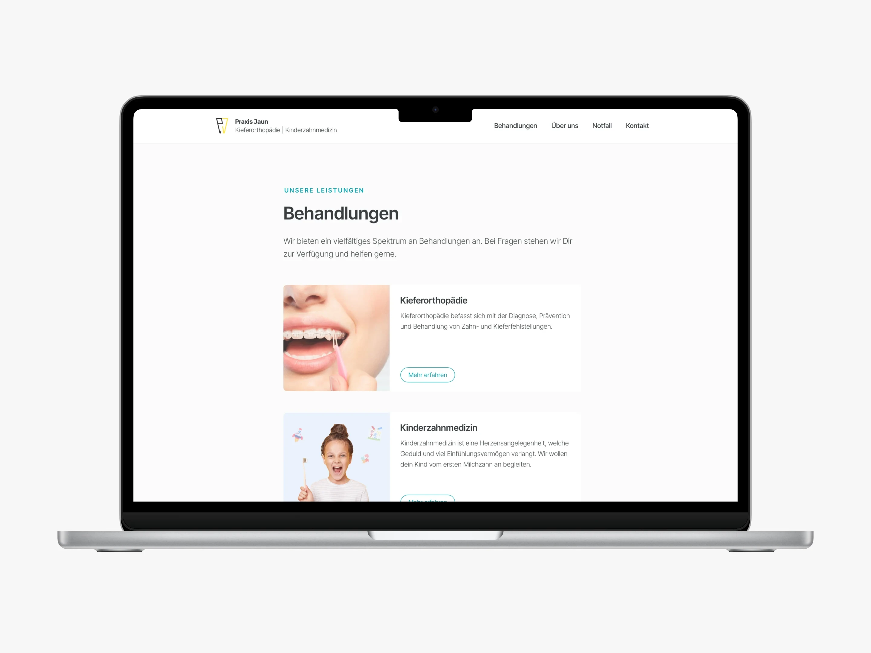
Services
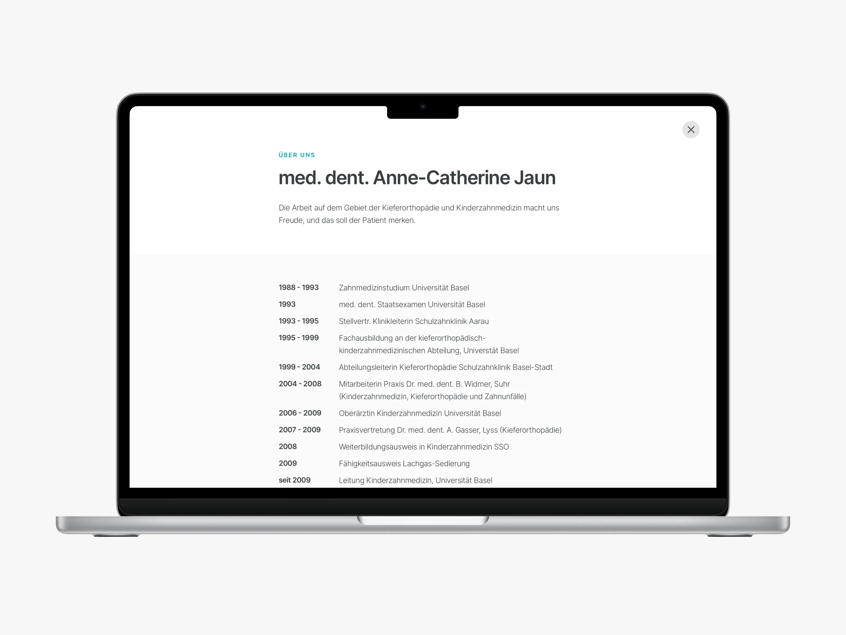
About - Career Details
Features
Fully responsive
Easy to navigate
Landing page + sub pages
Google Maps
Flexible card design
Link to Live Website:
Like this project
What the client had to say
Fantastic work. Very happy with the result. Philippe pays great attention to detail, is very professional, flexible and patient. Very high quality work. I highly recommend working with him!
Praxis Jaun
Jun 18, 2024, Client
Posted Jun 13, 2024
Complete new design and development of dentist Jaun's website with focus on simplicity and responsiveness.
Likes
1
Views
36
Timeline
Jun 14, 2024 - Jun 18, 2024

