Lightening Icon ⚡
Vanshika .
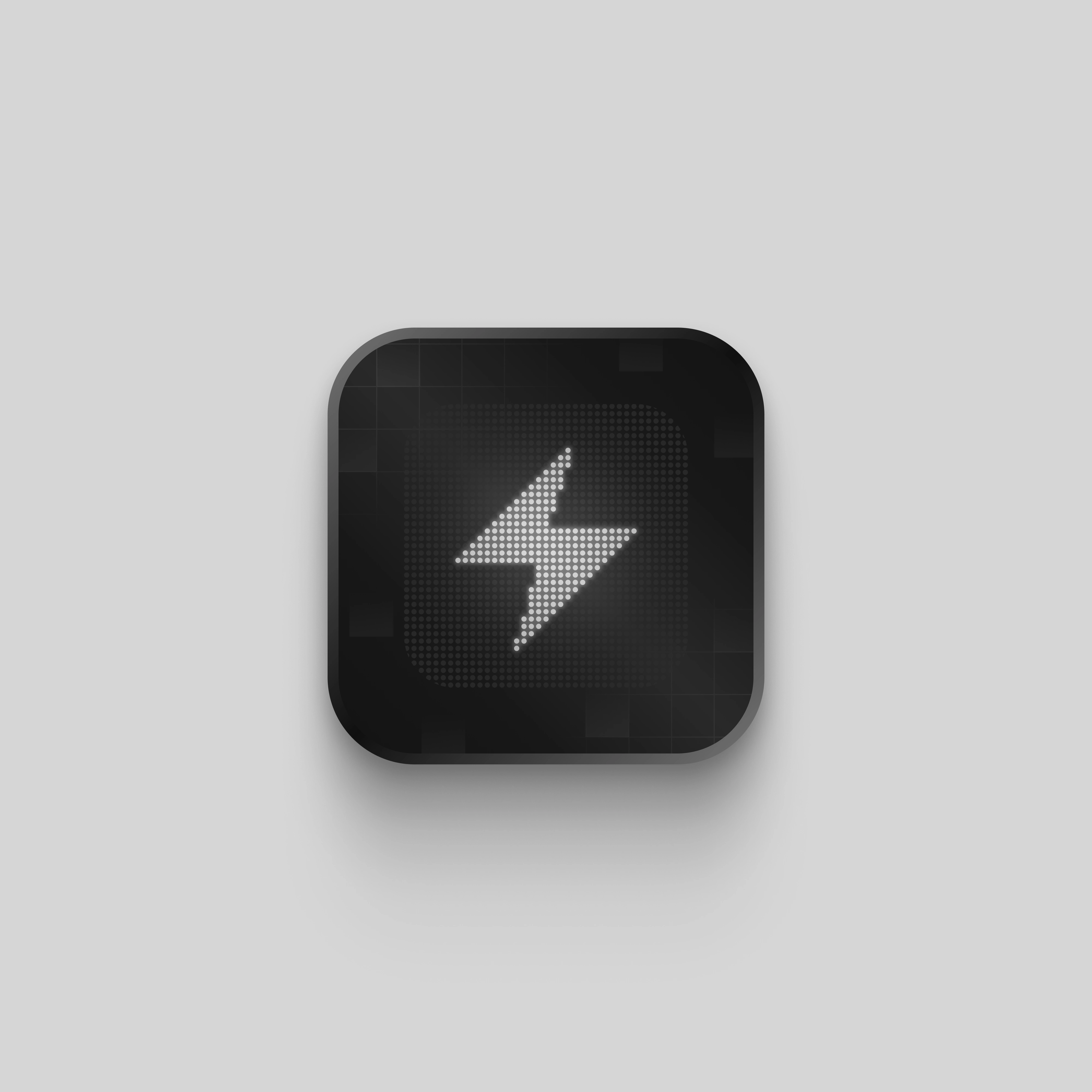
The Lightening Icon
Nothing much to say here - but look at that app icon, gorgeous!
I personally love this one because it makes use of a simple palette but the details give it a personality.
I wanted to experiment with dot grid and so this came to be. The bolt looks stand out in between the grid with a subtle glow.
Beyond the grid, the background is decorated with gradient grid squares. The border has a metallic shine that completements the icon's theme very well.
Lastly the background is a plain light grey because the icon is the star of the show ⚡
Like this project
Posted Feb 15, 2025
Just as it looks - an icon
Likes
1
Views
20