Fitup Services Branding
Introduction
Building experiences on land and water
Founded in 2016 Tallinn, Estonia FITUP Services OÜ for over 4 years has been focusing on crafting interior spaces suitable for occupation. Over time this passion for building interior spaces has grown from ships to real estate and expanded it's service portfolio.
With ever changing environment and growing industry FITUP Services OÜ needed a whole new direction for it's brand.
This is a presentation of New FITUP Services Identity
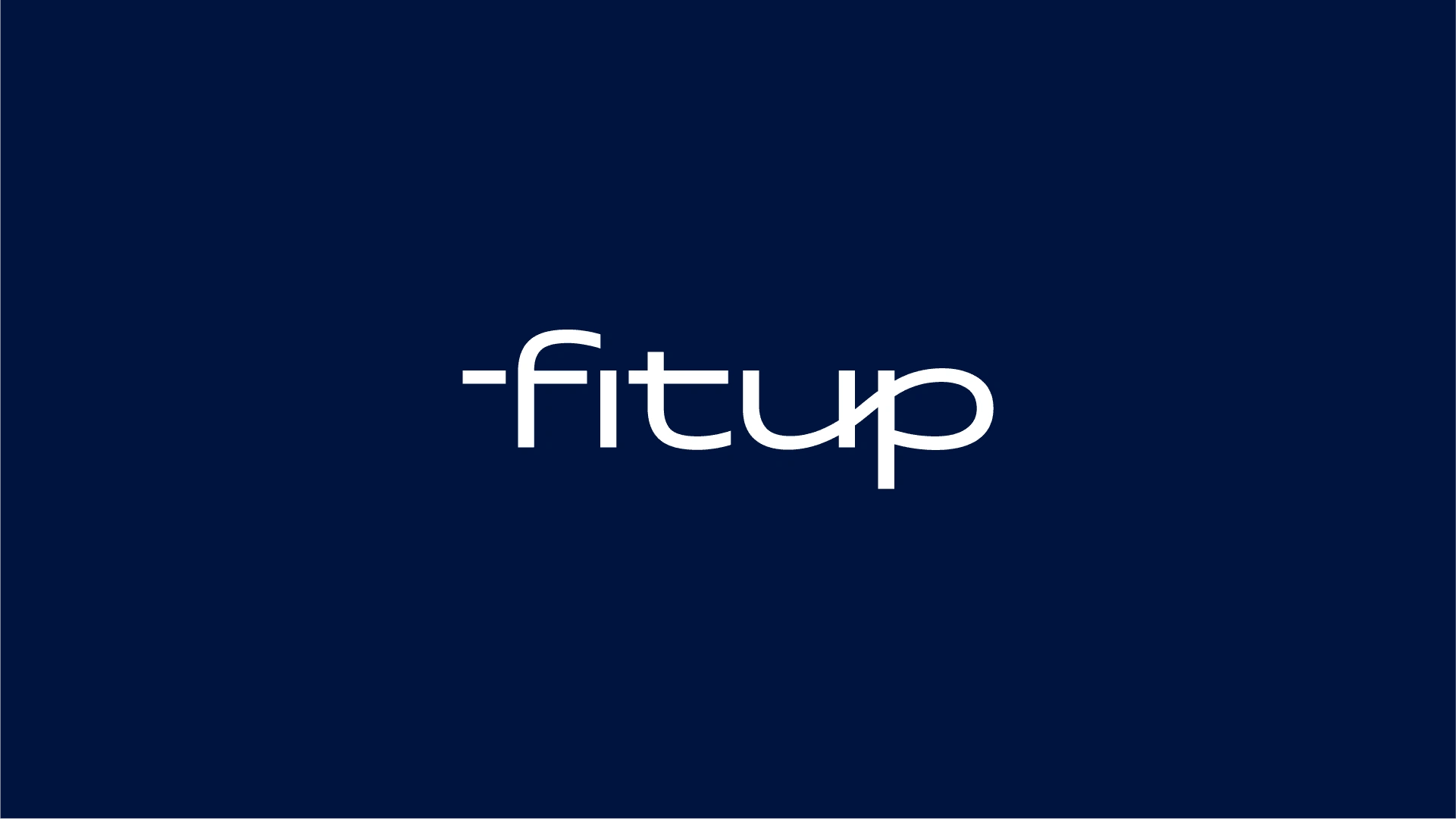
Fitup Services Logotype Design
Concept
Matis Branding has created new Brand System of FITUP Services OÜ that highlights and connects two different markets in a unified way, while communicates it's values and vision through out identity weather is digital or analog.
Logotype Wordmark
Newly designed FITUP Services OÜ logotype word-mark evokes a sense of duality between land and water. We positioned to create a singular logotype that can communicate two separate ideas into single concept.
It's modern, simple yet timeless approach allows to stand out in appealing way.
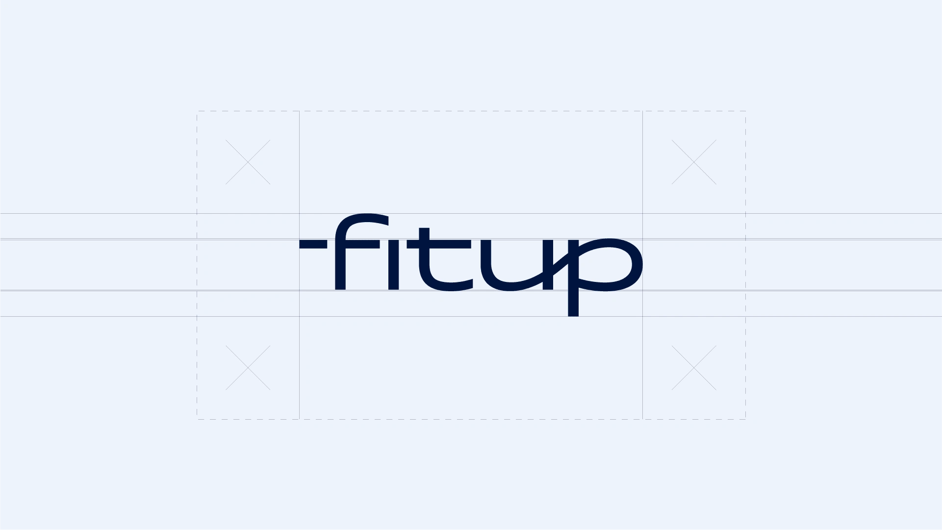
Fitup Services Logotype Wordmark
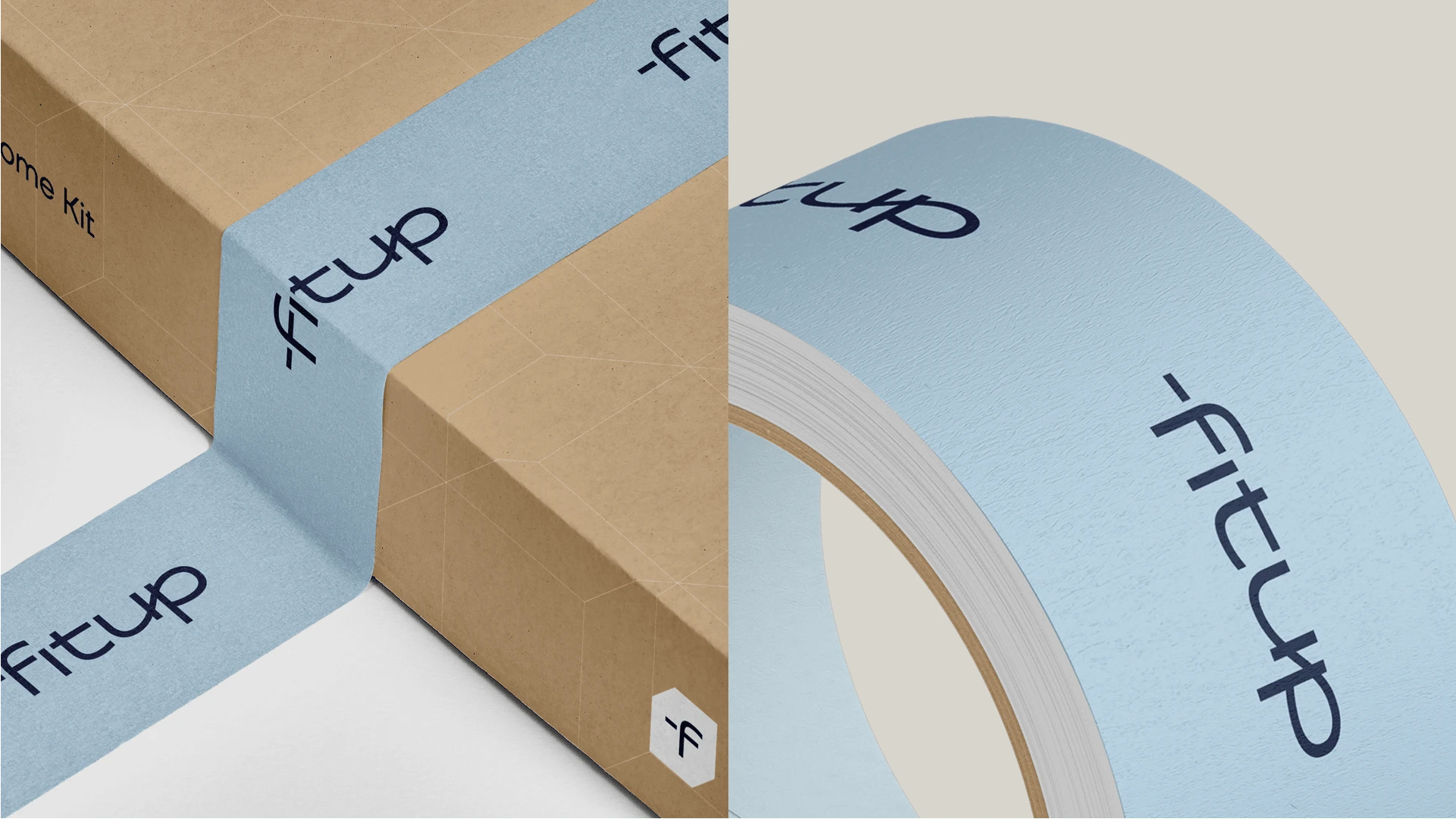
Fitup Services Packaging & Tape
Logotype Symbol Mark
Symbol mark is an extension of Fitup's logotype word-mark with integrated identity system holder. Symbol mark is used in an environments where whole logo is not needed or in an analog or digital environments where logotype word-mark is not suitable in size.
There are two versions of symbol marks - Stroked and filled versions
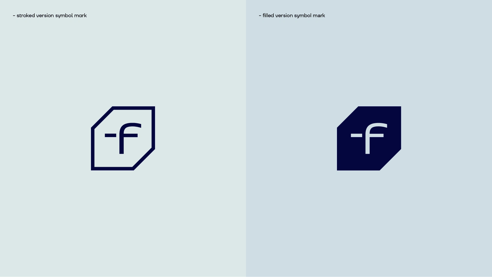
Fitup Services Symbol Marks
Brand / Service Extensions
We expanded Fitup's new identity to be expandable in various market's that highlights it's core meaning. By simply adding market section / industry we extend a brand to the next level.
Fitup Services Brand Extensions
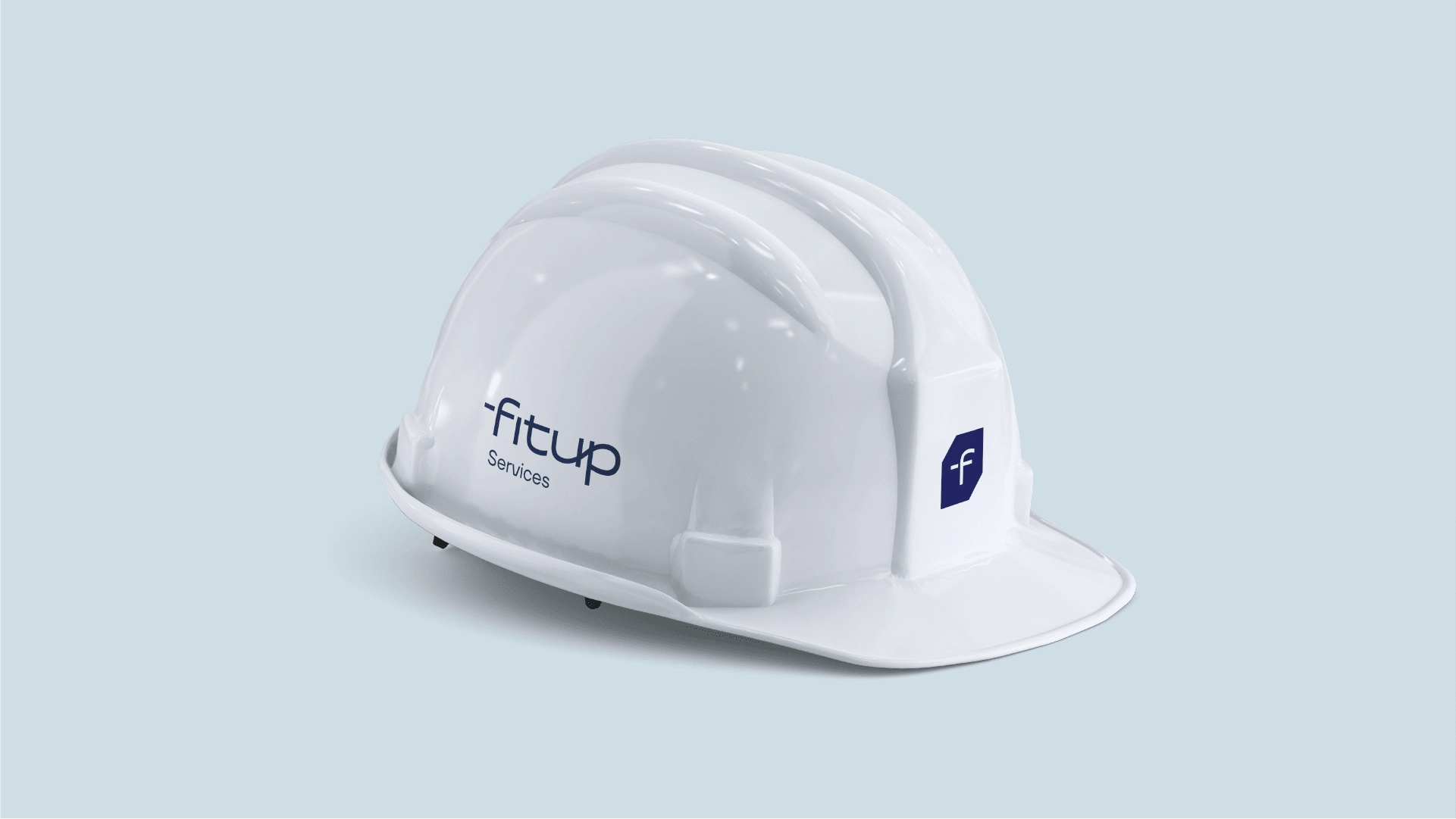
Fitup Services Healment
Brand Extensions
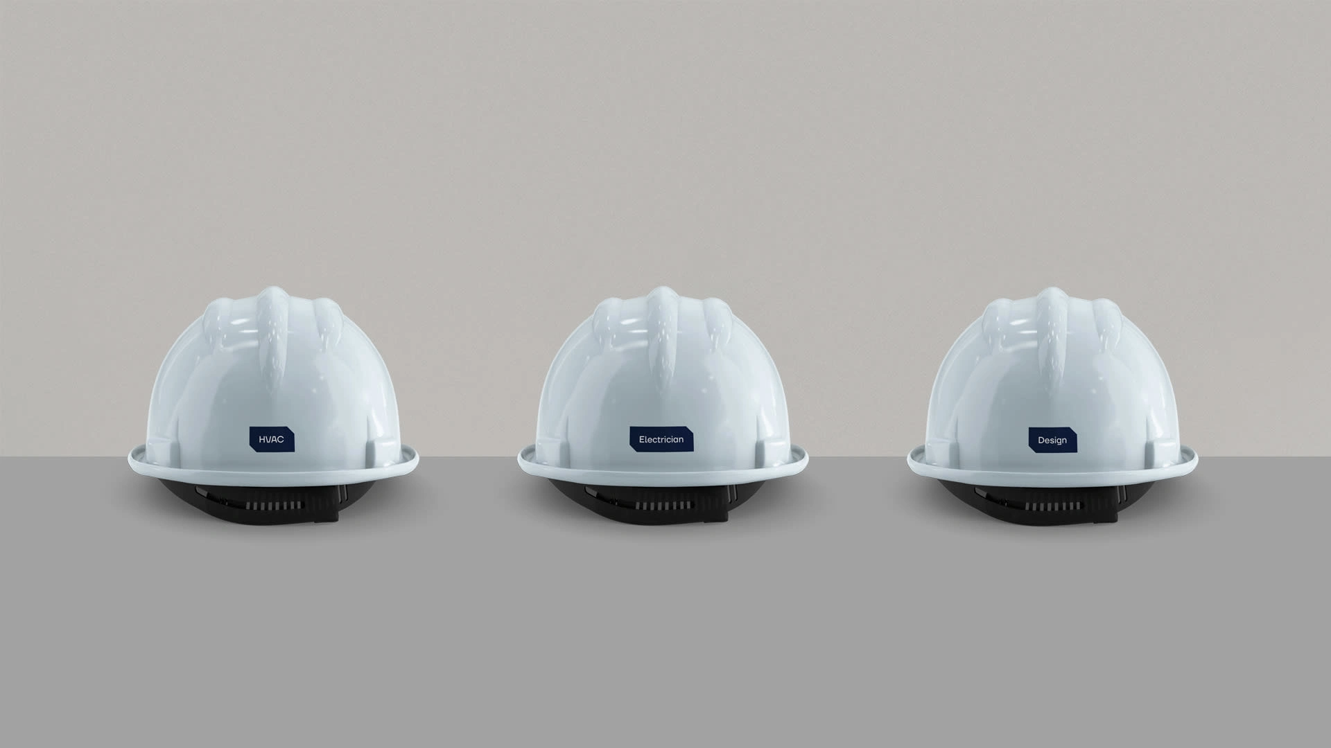
Brand Extensions Healments
Primary and Complementary Colors
Primary Fitup color highlights values such as integrity, trust, authority and importance. As the brand has grown and got recognition in the marketplace, we found unnecessary to highlight leader qualities within the colors.
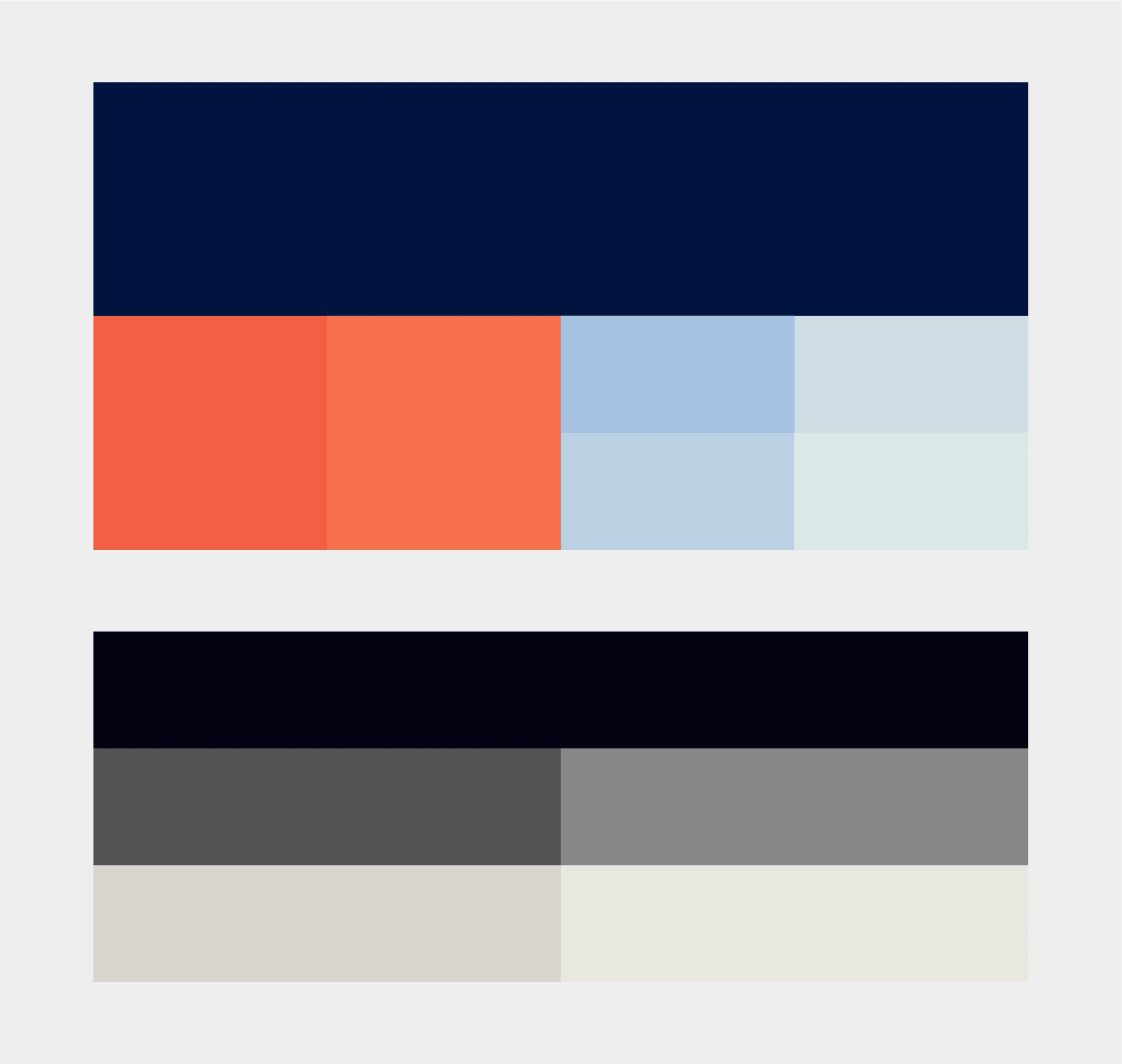
Primary and Secondary Colors
Primary Typography
TT Firs Neue is a contemporary reincarnation of the good old Scandinavian TT Firs sans-serif. This typeface works in multiple languages and it's structural design aligns with logotype wordmark and whole identity structure.It's modern, simple yet timeless
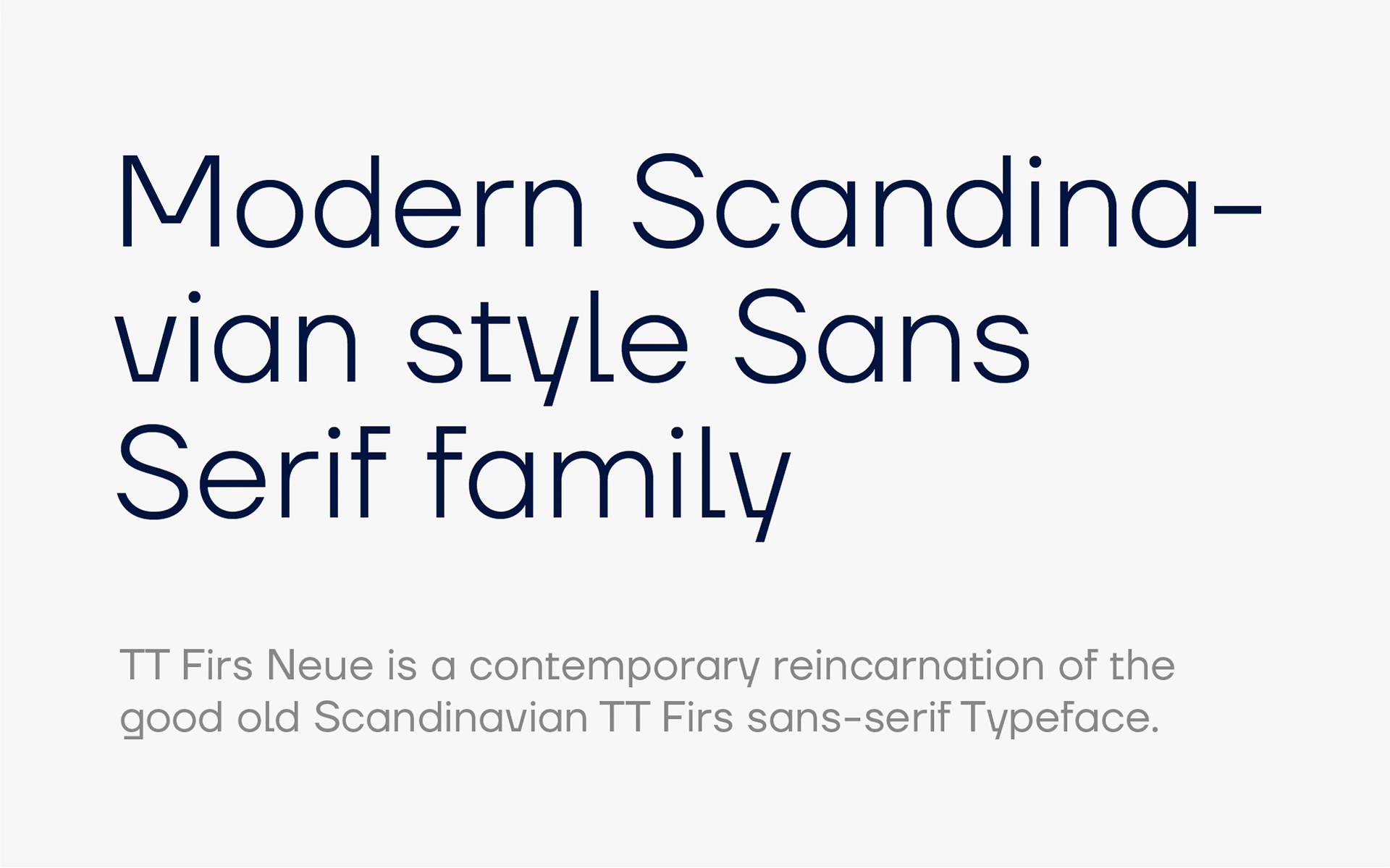
Primary Typography
Pattern Structure
Pattern / Identity visual structure is inspired by space, space of interior. Joining each element we manage to design a unique and modular pattern structure that aligns with new brand direction.
Pattern Structure
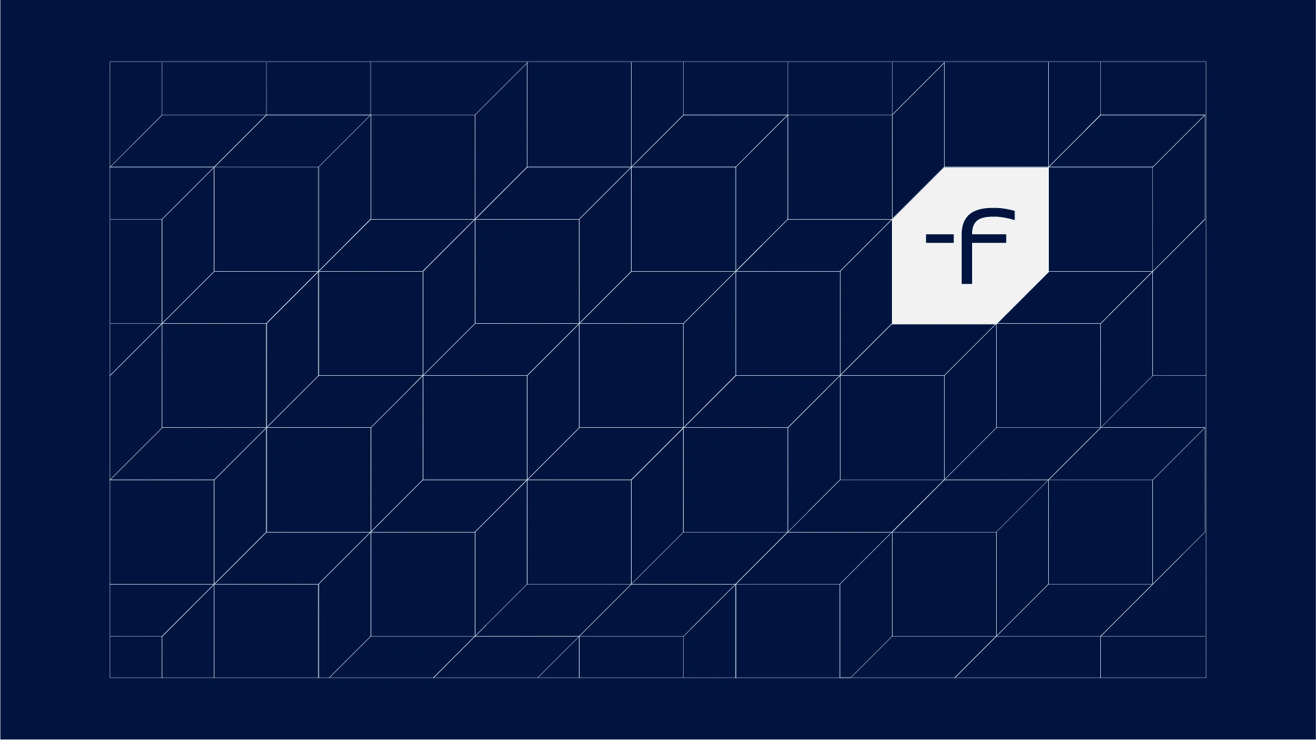
Fitup Services Pattern
Corporate Identity
FITUP Services OÜ provides more than one specialised service for their clients in industries such as Marine or Construction. We did not extended these service extensions as sub brands, but included them into new Identity System as a whole.
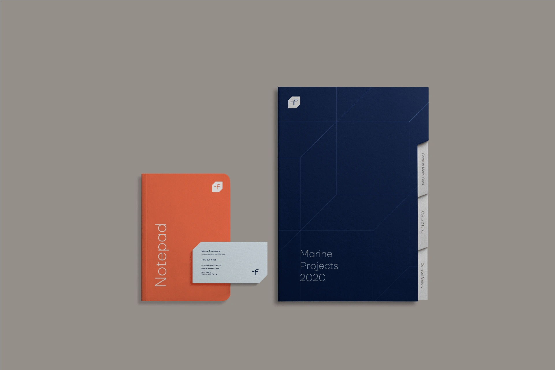
Fitup Services Notepad, Folder and Business Card
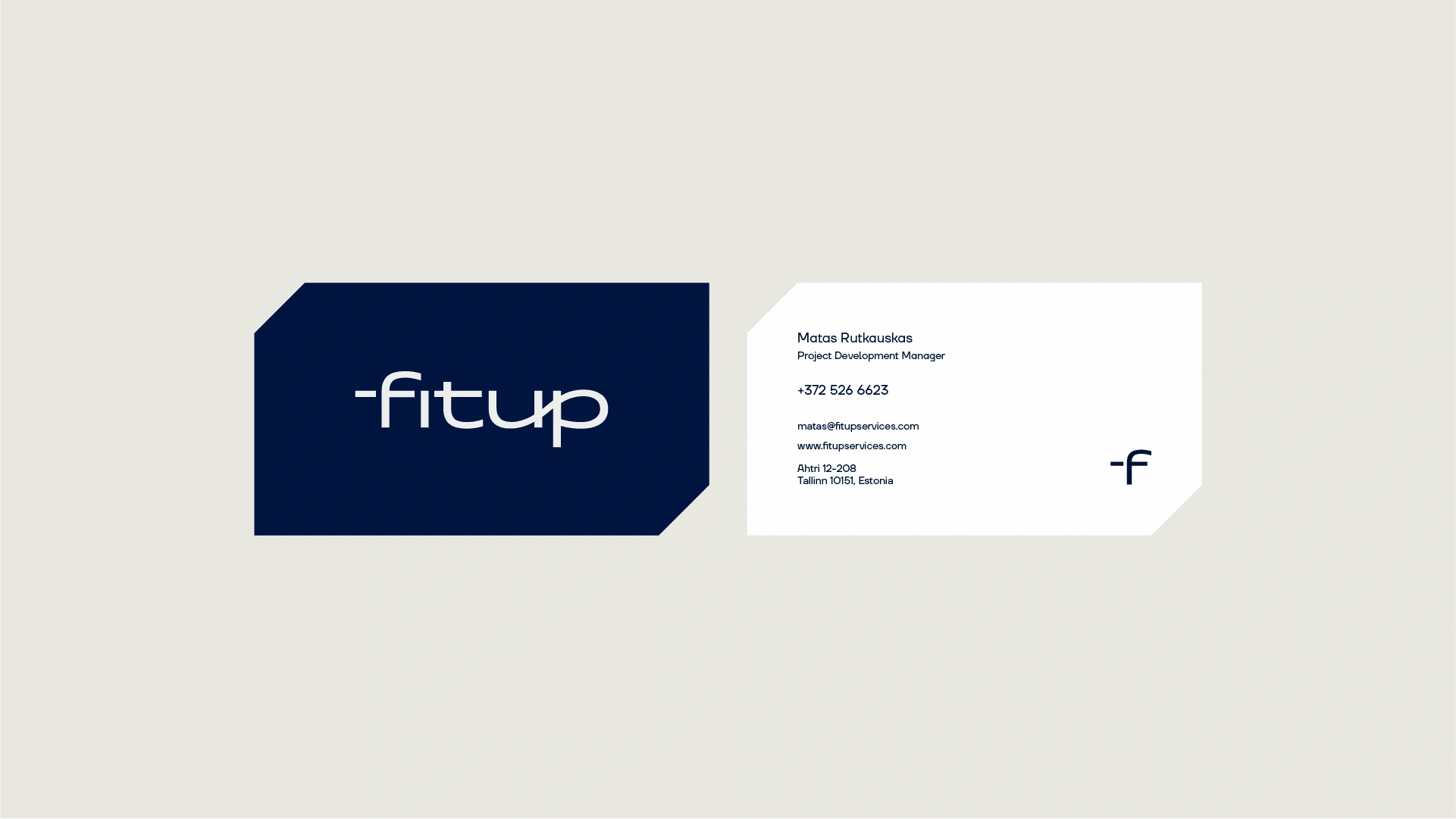
Fitup Servies Business Cards
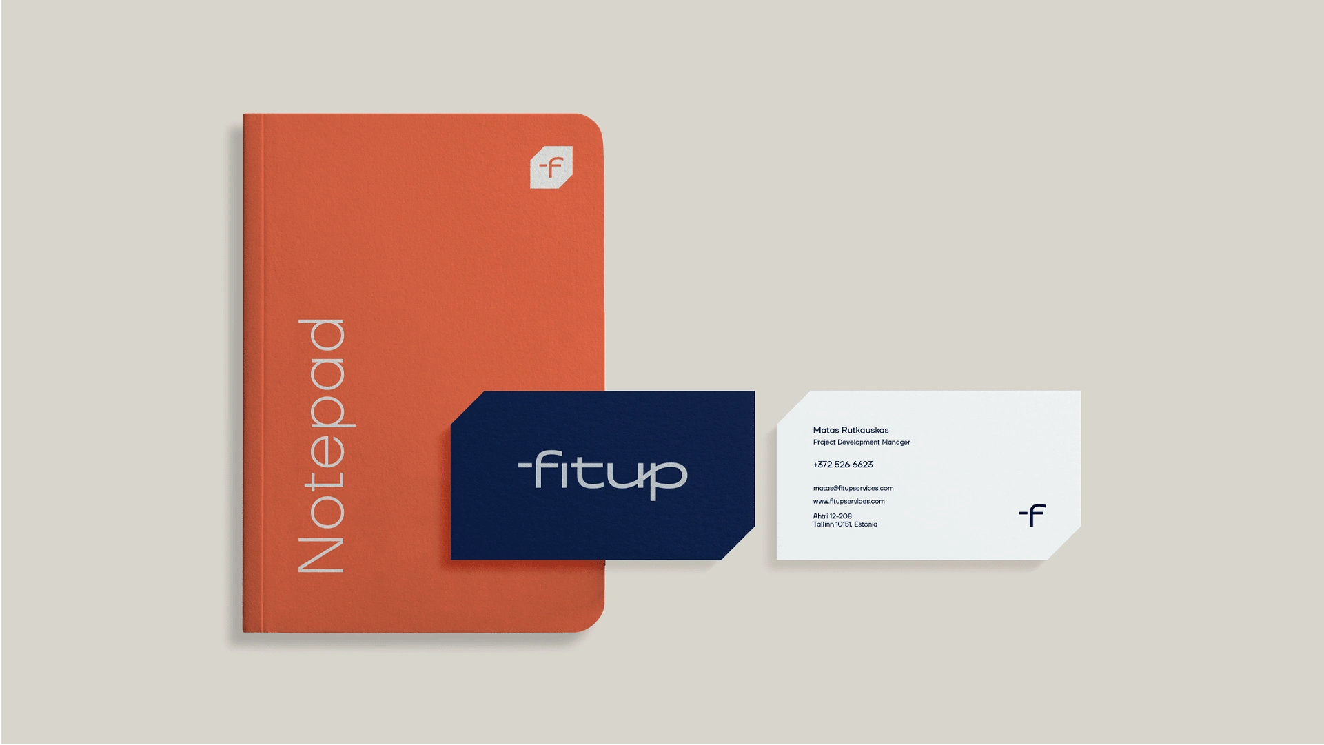
Fitup Services Notepad and Business Cards
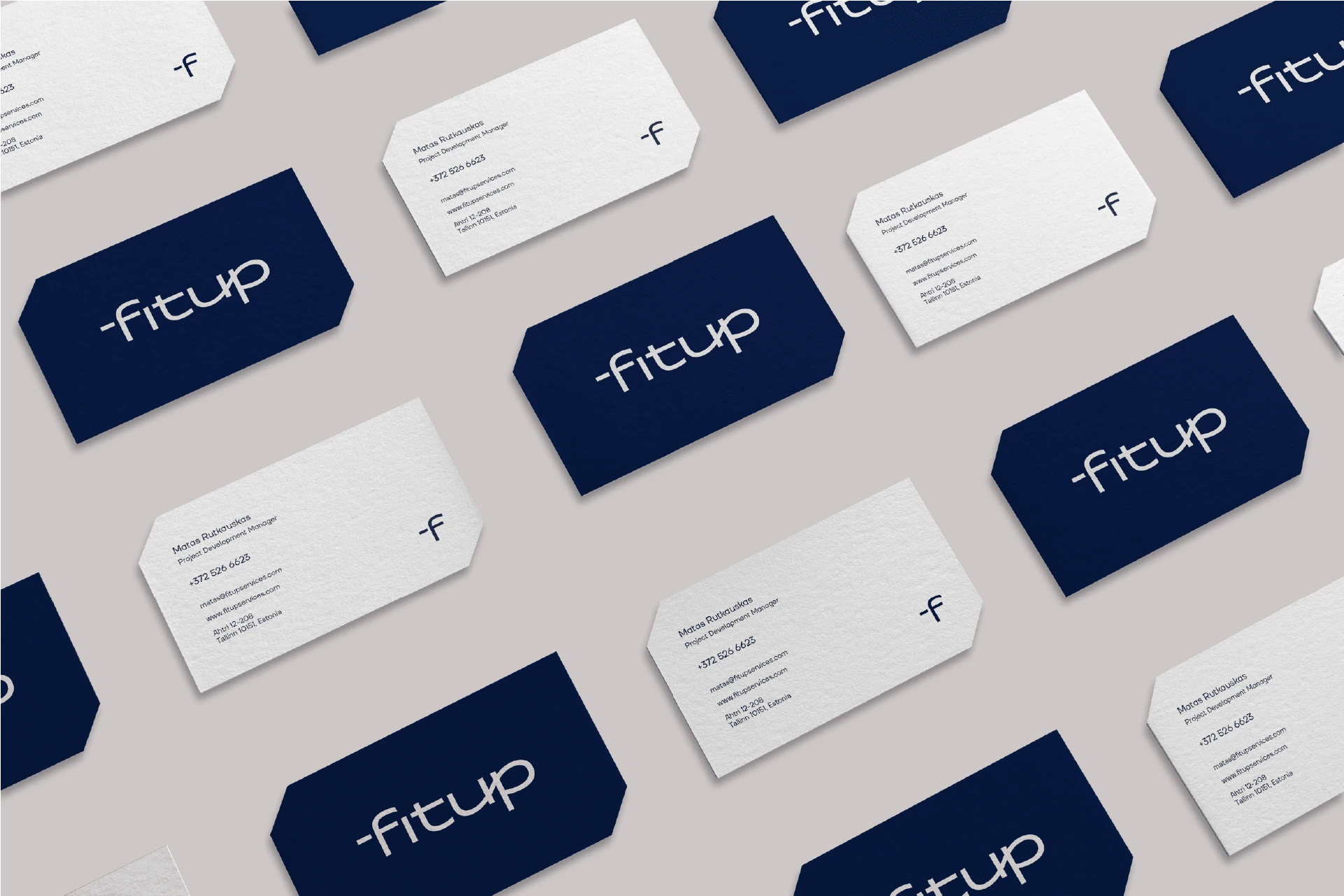
Business Cards
Corporate Identity for Executives
We found important also to add items for corporate level personal or representatives.
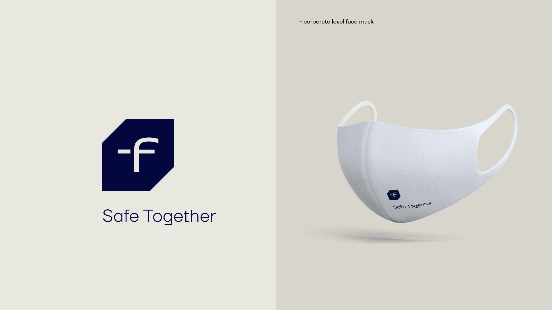
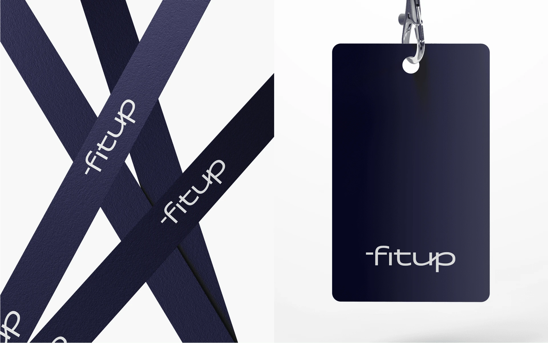
Card Tag
Employee Identity
Probably is most important Fitup Services image and feel what companies employees are wearing and how they are feeling. This is a sample of how we imagined how employee identity should feel like.
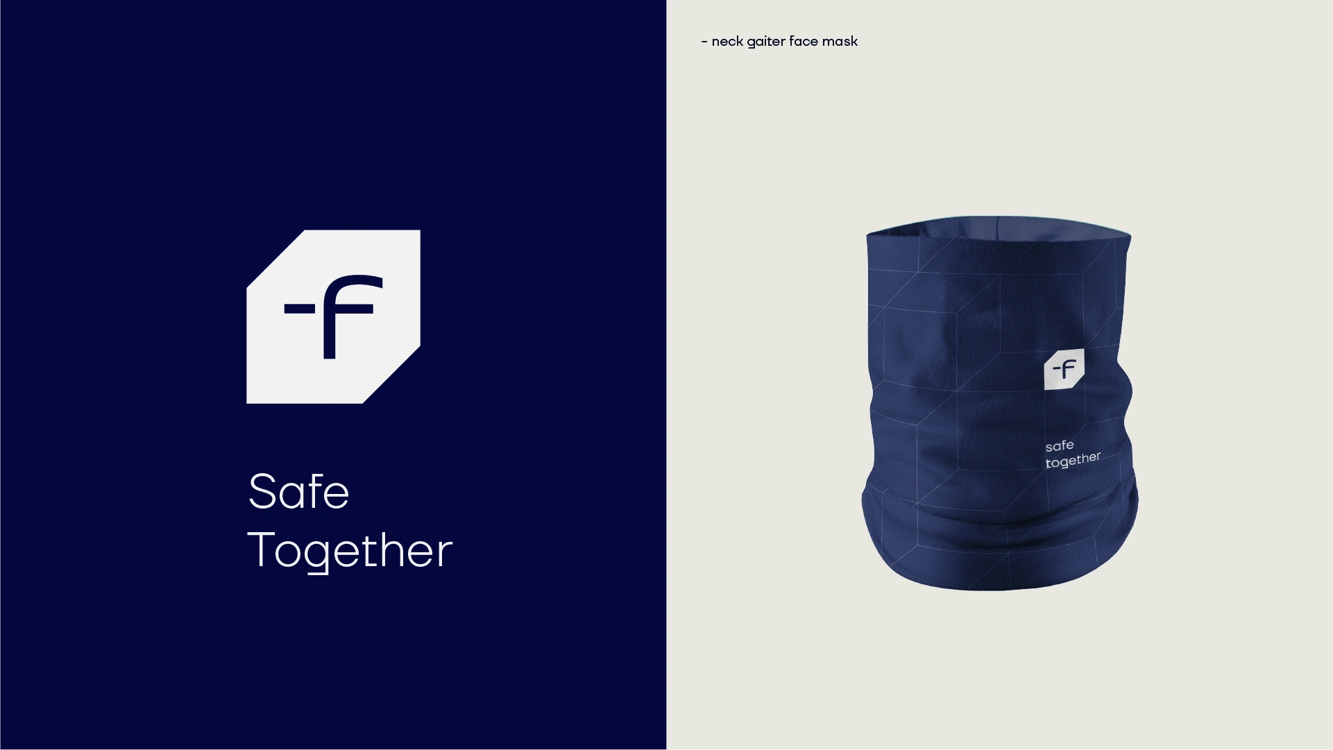
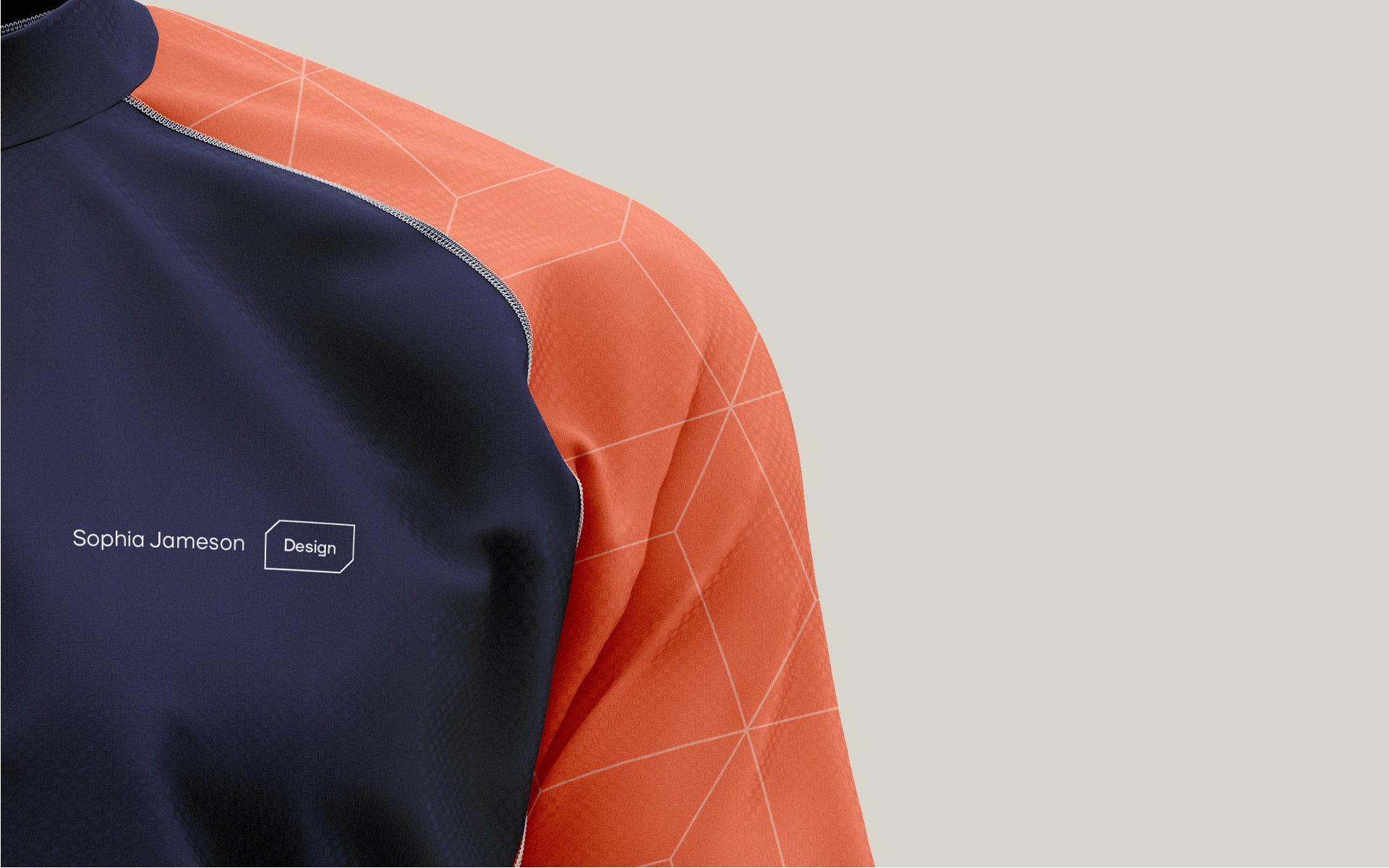
Apparel
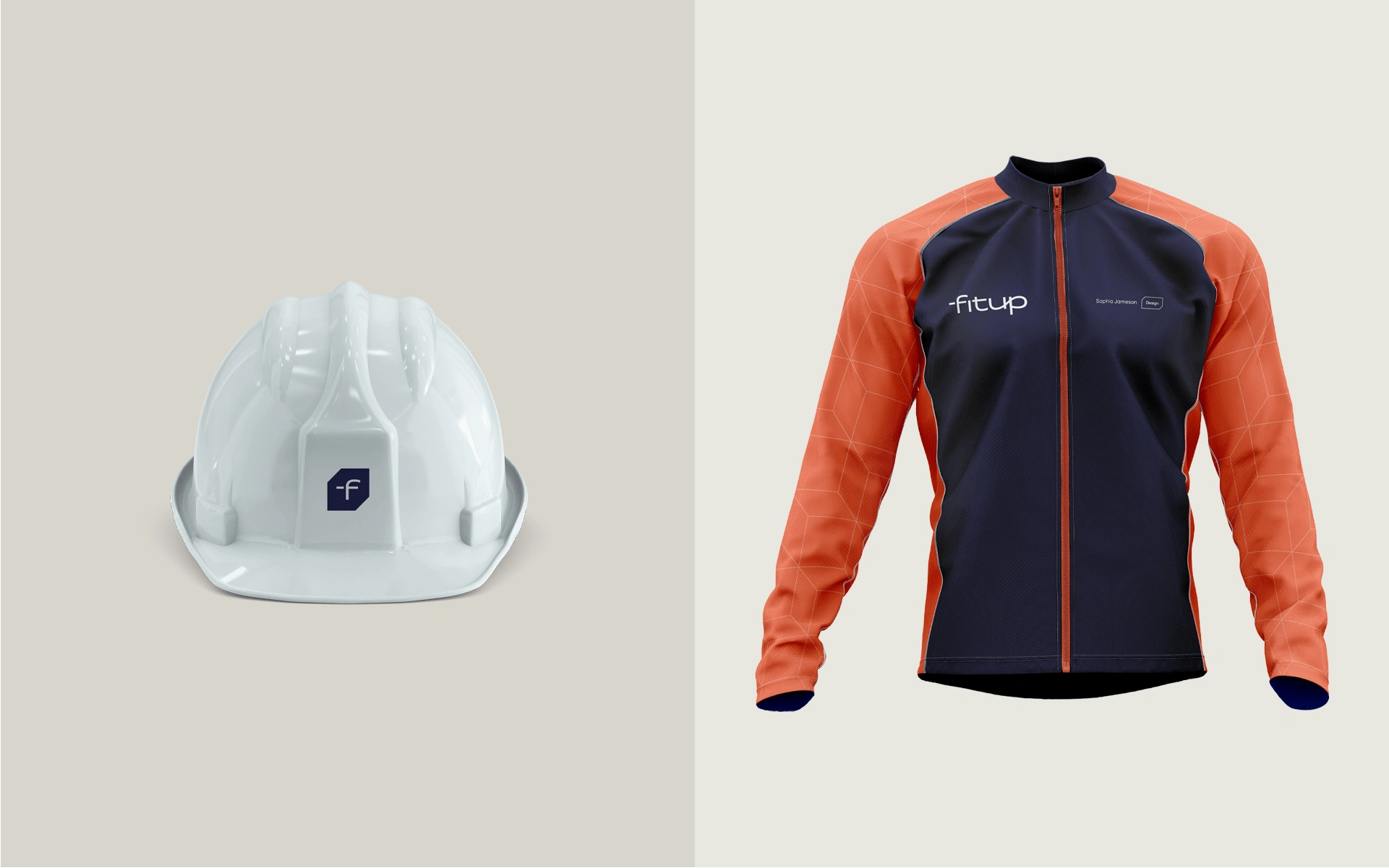
Healment and Apparel
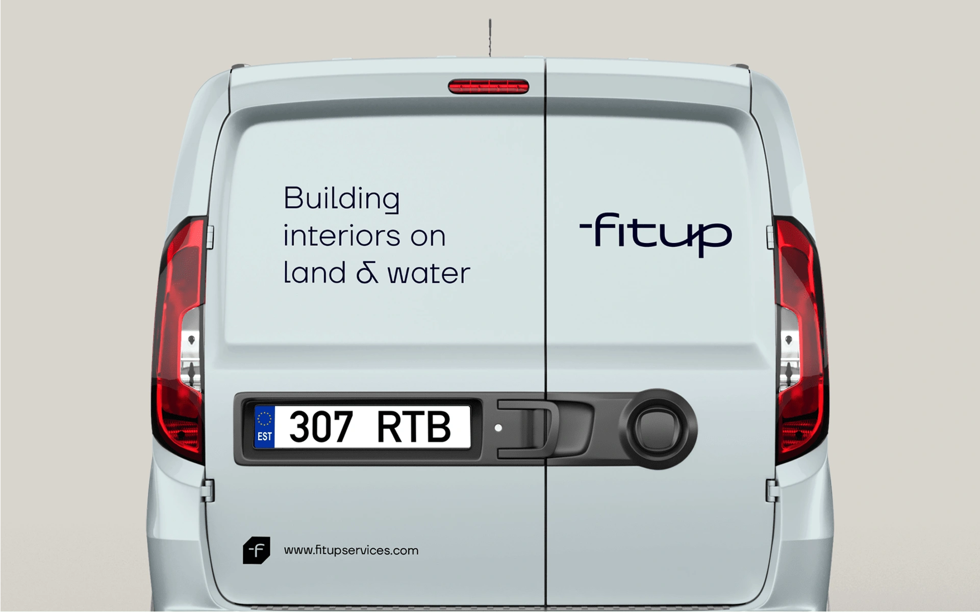
Van Stickers
Thank you for watching!
If you liked this project you can follow for more great work at:
Dribbble, Behance or our Portfolio.
For branding projects reach us at: matis@matisbranding.com
Like this project
Posted Jan 26, 2023
Matis Branding has created new Brand System of FITUP Services OÜ that highlights and connects two different markets in a unified way, while communicates it's va
