ZEN Sushi Bar

Omar Gamal


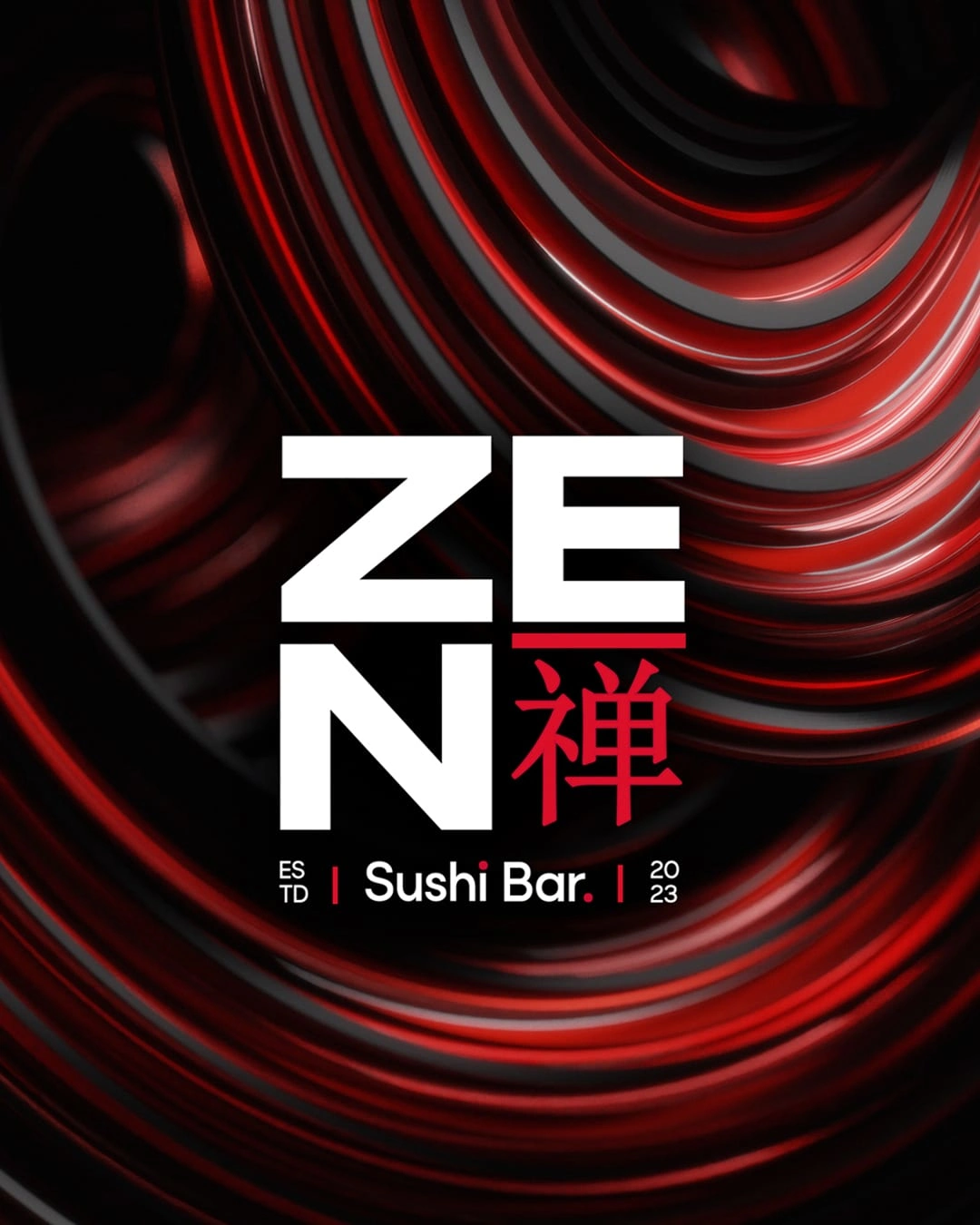
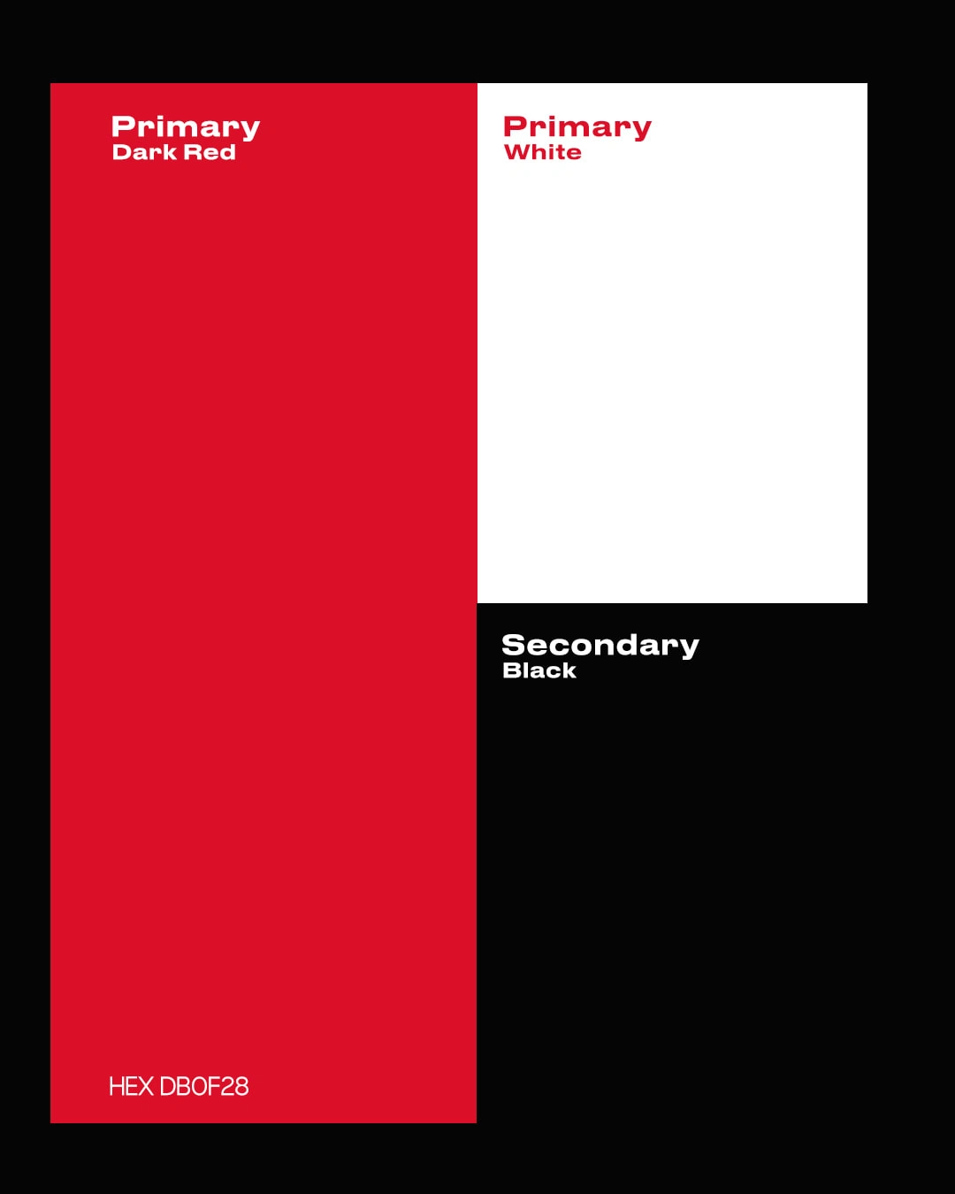
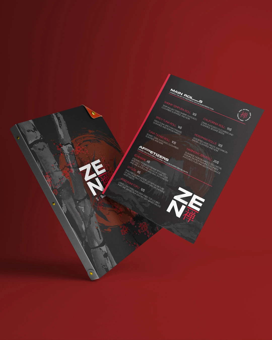
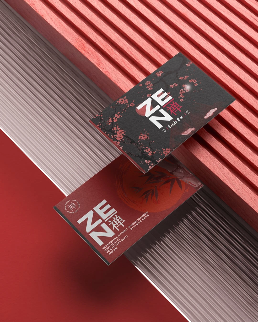

The key element of the rebranding was the incorporation of a bold and vibrant red color palette. Red, being associated with energy, passion, and appetite, was chosen to convey the rich flavors and dining experience offered by Zen Sushi. The color red played a vital role in creating a visually striking and memorable brand presence that would captivate potential customers and make a lasting impression.
Like this project
Posted Jun 7, 2023
The Zen Sushi Red Branding was centered around creating a vibrant and energetic visual identity for the client presence in the competitive sushi industry.


Faris Advocates

360+ Construction & Architecture