Most dental websites don’t have
Shireen Zainab
Most dental websites don’t have a
service problem hey have a trust problem.
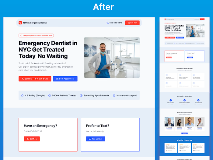
This project focused on redesigning a dental
clinic website that felt outdated, visually heavy,
and difficult to navigate, despite offering high-quality care.
The goal was to transform the experience
into something that feels modern, premium,
and easy to trust from the first interaction.
The original design lacked clear hierarchy, relied
heavily on dark sections, and didn’t guide users effectively.
Important information felt scattered, services
were not easy to explore, and the overall experience
didn’t reflect the level of professionalism the clinic actually offered.
Instead of only improving visuals, the redesign focused
on how users perceive and make decisions.
The layout was restructured to create better flow,
spacing was refined to improve readability, and a
modern typography system (serif + sans) was introduced
to elevate the overall feel. A softer, more premium color
palette replaced the heavy contrast, helping the interface
feel calmer and more approachable.
Service sections were redesigned into clean, easy-to-scan cards,
making it simpler for users to understand their options.
Trust signals such as reviews, stats, and visual cues
were placed more strategically to support decision-making.
The hero section was completely reworked to create a strong first impression and clearly communicate value within seconds.
The final result is a website that feels more refined,
more intuitive, and more aligned with a high-end dental experienc.
It not only looks better but guides users more effectively, builds trust faster, and supports conversion in a natural way.
Because in healthcare, especially dentistry, people don’t just choose a service they choose a place they feel comfortable trusting.
If a website doesn’t create that feeling instantly, it loses the opportunity before the user even explores further.
Like this project
Posted Apr 14, 2026
Most dental websites don’t have a service problem hey have a trust problem. This project focused on redesigning a dental clinic website that felt outdated,...
Likes
0
Views
0