Logo Design For Morgan Serenity Estates
Client: Morgan Serenity Estates
Industry: Residential Assisted Living
Deliverables: Logo Conceptualization, Brand Identity System, MSE Monogram, Brand Presentation
Overview
Morgan Serenity Estates approached me seeking a brand identity that felt clean, elegant, professional, and luxury-driven, tailored specifically to their 65+ audience. As a first-responder–owned assisted living home, they wanted a brand that communicates trust, dignity, warmth, and the feeling of home.
My goal was to create a visual identity that truly reflects their mission: care that feels like home.
Logo Conceptualization
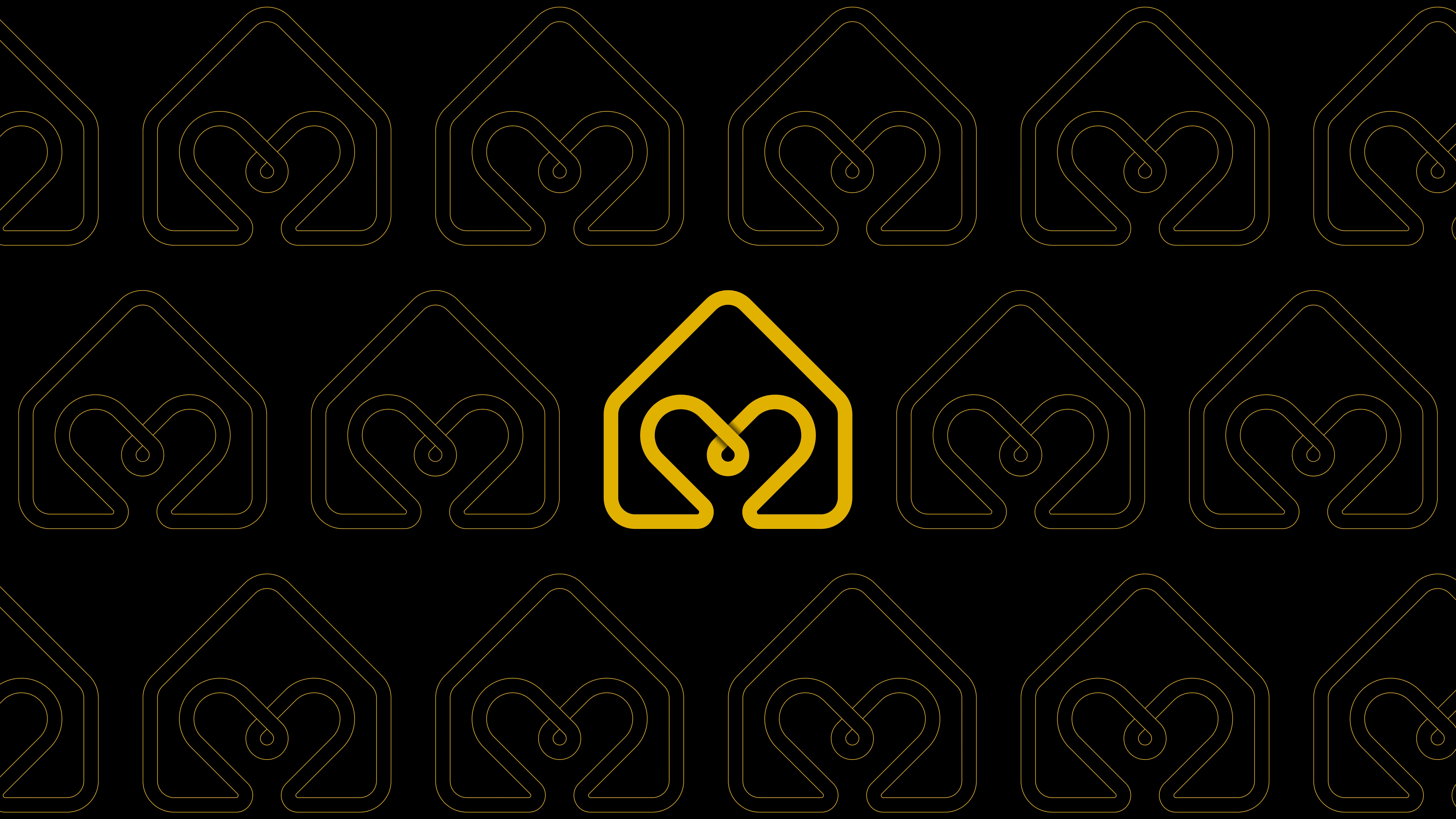
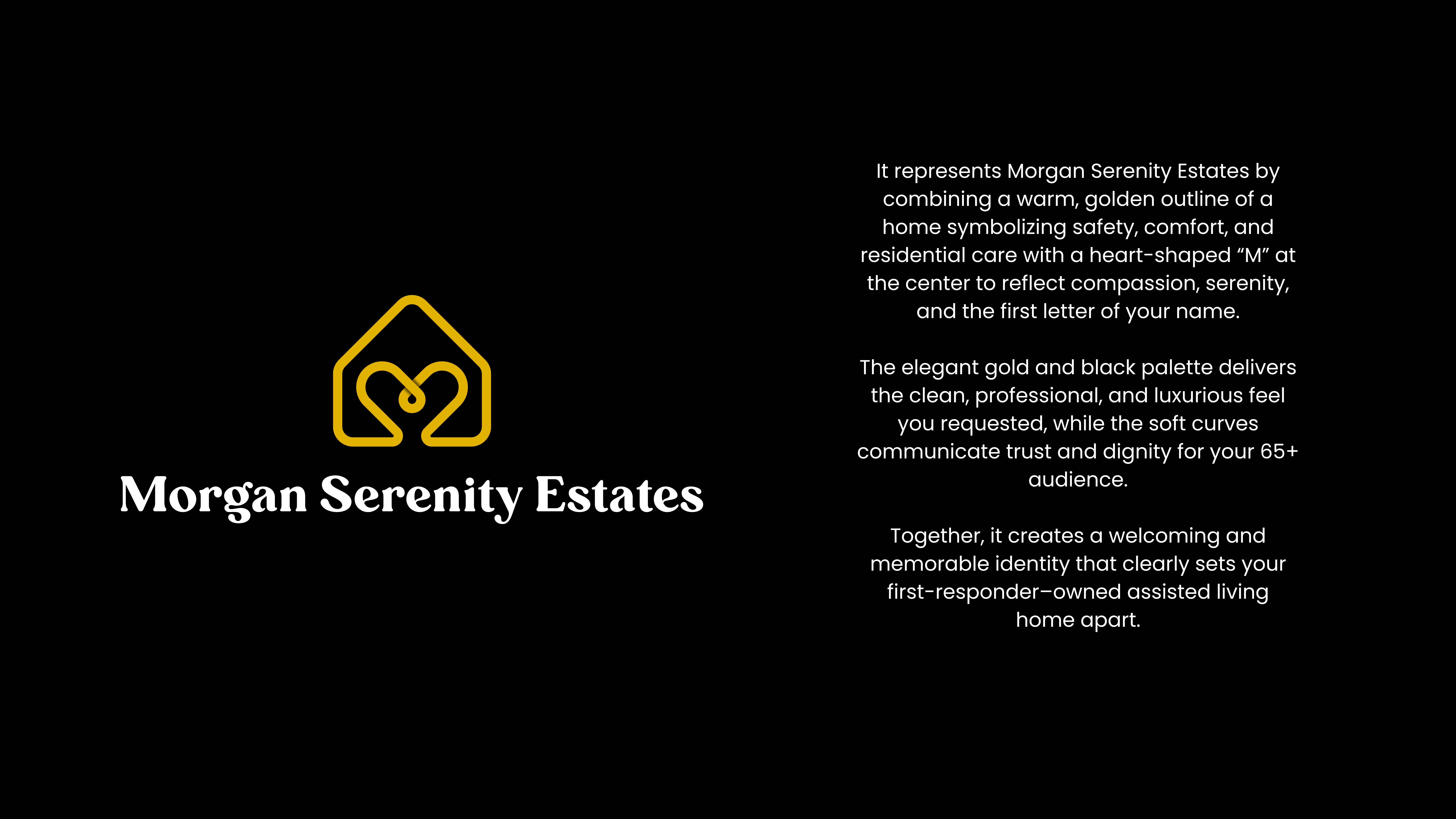
The final logo is built around three core ideas:
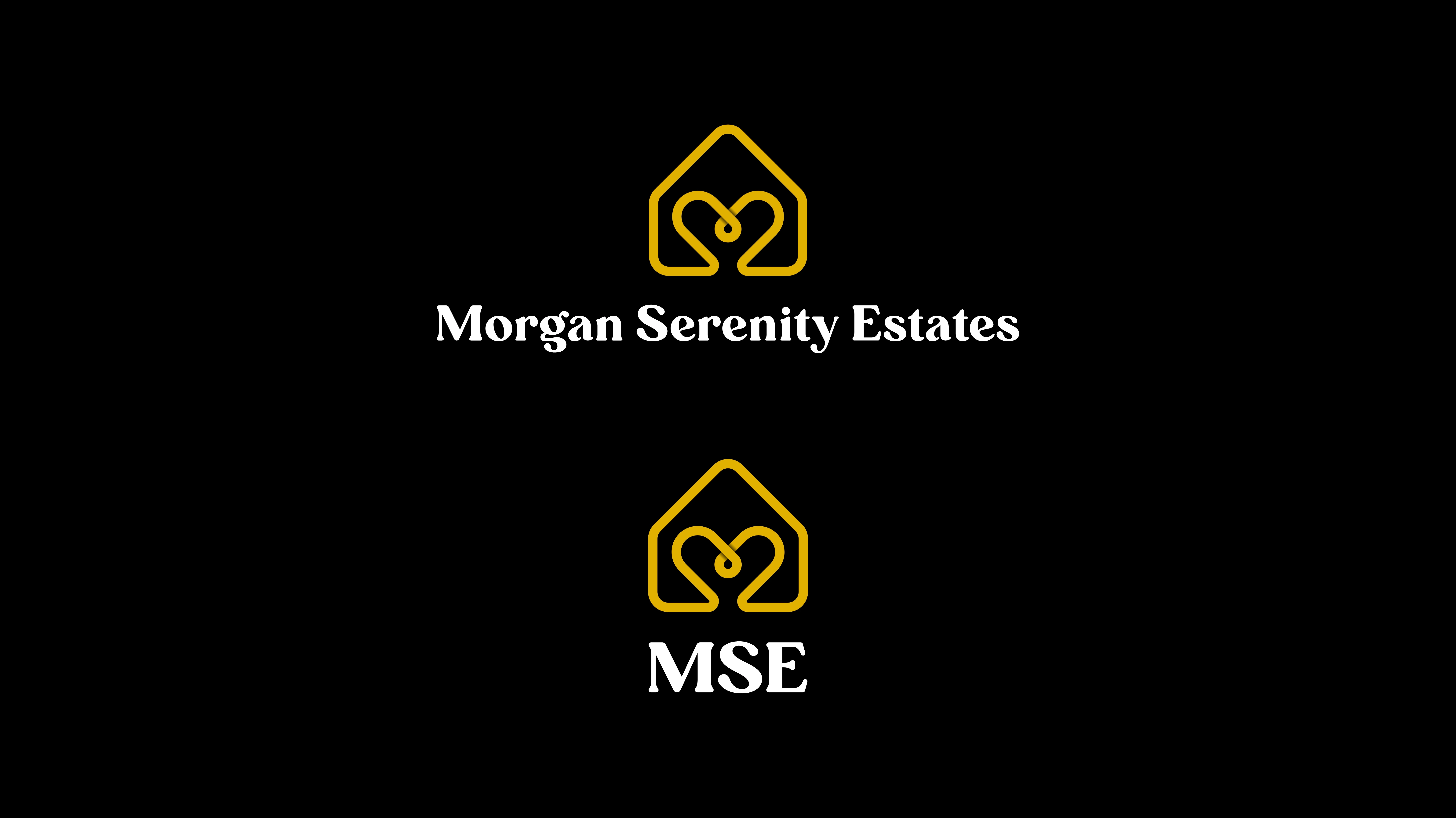
1. The Golden Home Outline
Represents:
Safety
Stability
Comfort
A peaceful residential environment
This immediately positions the brand as a trusted and welcoming assisted living space.
2. The Heart-Shaped “M” Symbol
Inside the home outline sits a soft, elegant “M” shaped like a heart.
This element symbolizes:
Compassion
Care
Serenity
The initial of Morgan
It creates an emotional connection and reassures families choosing care for their loved ones.
3. Warm Luxury Gold Palette
The client preferred gold and black, so I developed a rich gold tone paired with premium serif typography to communicate:
Elegance
Professionalism
High-quality service
A hospitality-inspired experience
This aligns flawlessly with their goal of standing apart from typical senior living brands.
Typography Exploration
I explored multiple serif families to achieve the perfect balance of warmth and luxury.
The final type system uses:
A premium serif for the logotype
A softer sans-serif for future brand extensions
This maintains readability for older audiences while keeping the identity sophisticated.
MSE Monogram Development
The client requested a second version of the logo with initials.
I created a clean and balanced MSE monogram, maintaining:
Consistent line weight
The gold palette
A stacked luxury layout
Perfect proportion to the main icon
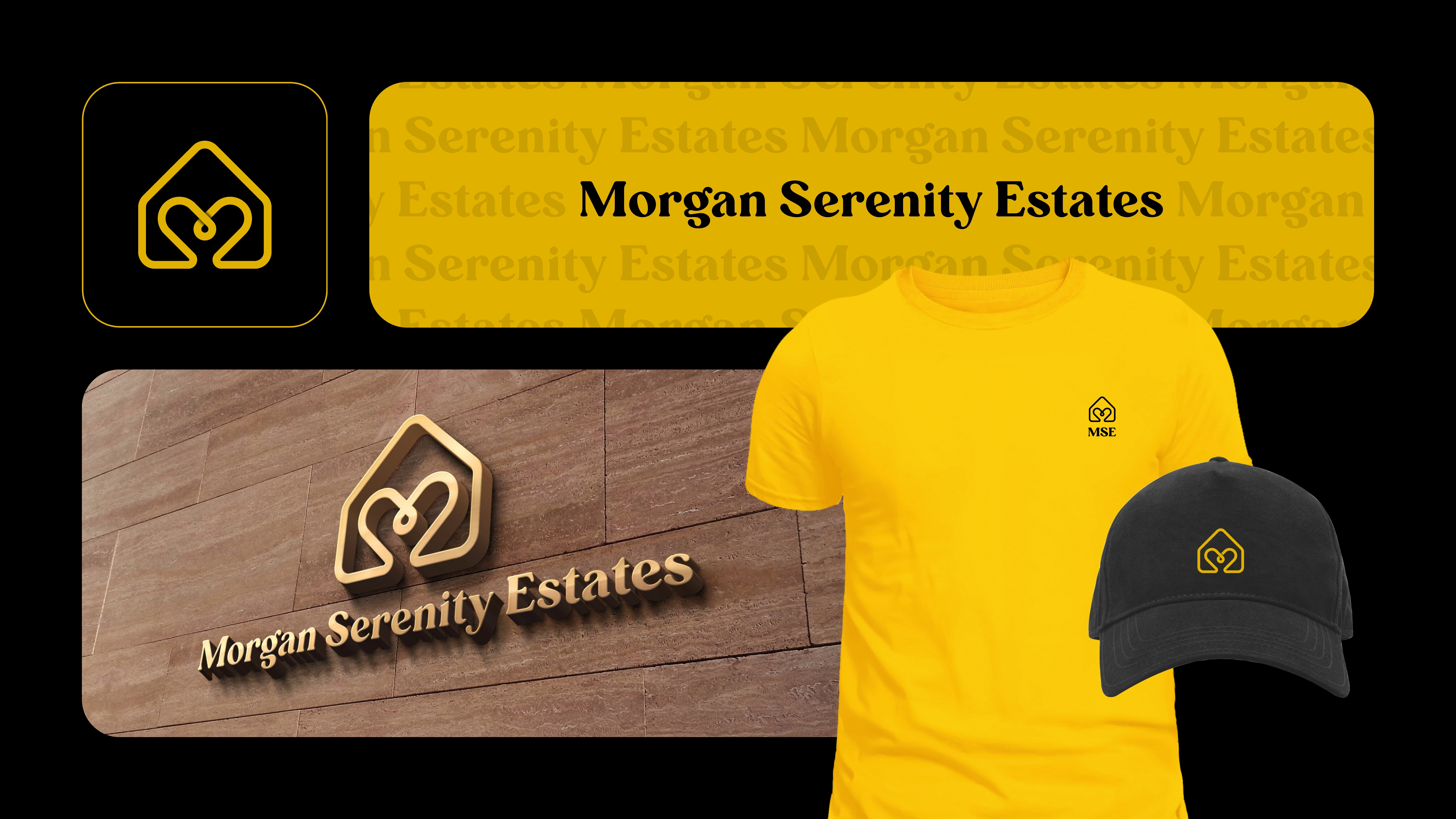
This monogram works perfectly for:
Social media
Business cards
Signage
Embroidery
Badges
Color System
Estate Gold — #C79606
Estate Black — #000000
Warm White — #F9F6EF
This palette reinforces the brand’s peaceful, caring, and upscale personality.
Tagline Development
I created multiple tagline options rooted in emotion and dignity:
Where Care Feels Like Home
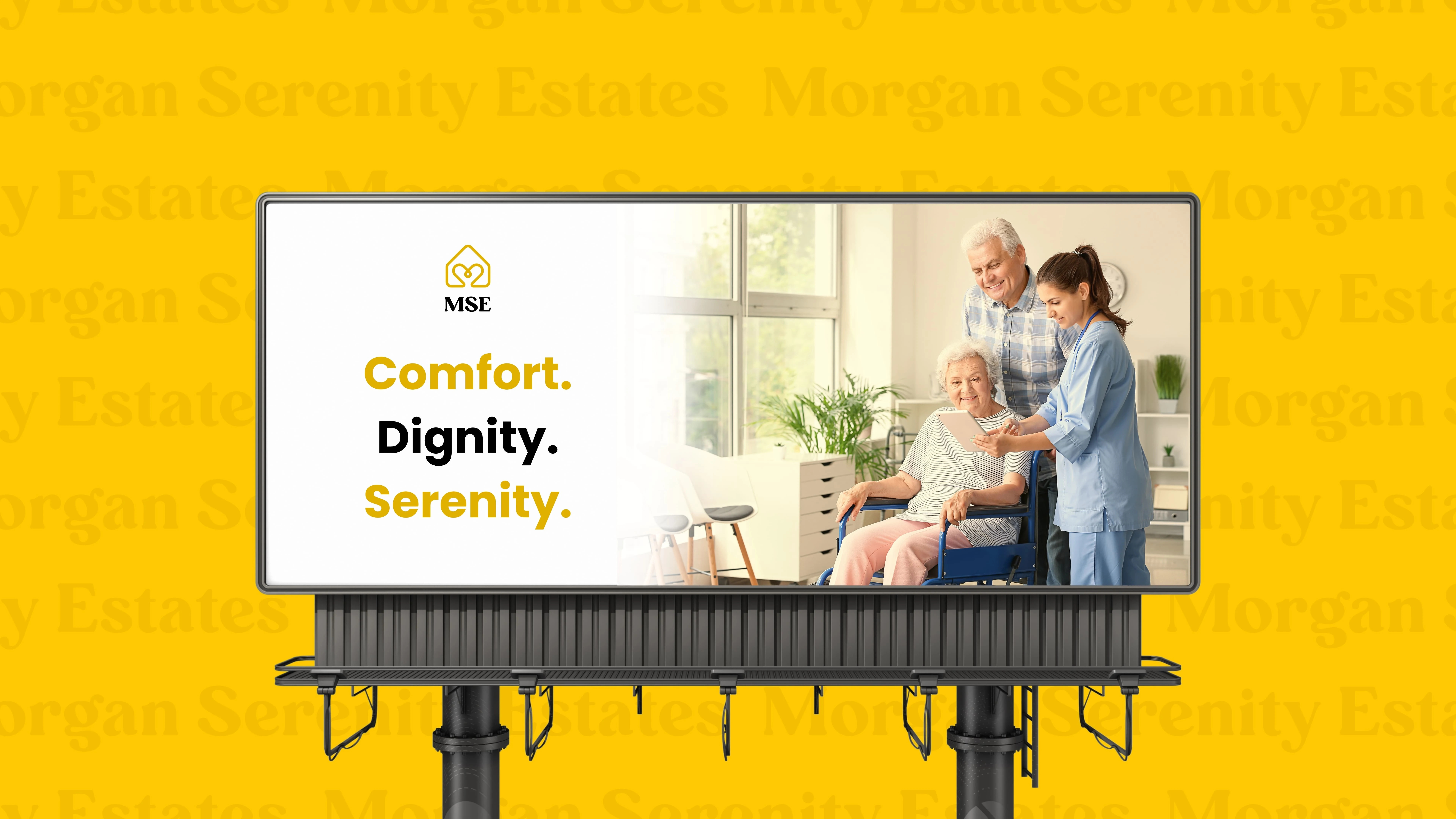
Comfort. Dignity. Serenity.
Exceptional Care, Warmly Delivered.
The client’s preferred tagline can be paired with both the full logo and monogram.
Brand Presentation
To help the client visualize the brand fully, I assembled:
A presentation-ready PDF
Gold-on-black and gold-on-white variations
Vertical and horizontal lockups
A branding video showcasing the full identity

Like this project
Posted Nov 22, 2025
Designed a luxury brand identity with a heart-shaped “M” home icon, gold palette, refined typography, and MSE monogram for Morgan Serenity Estates.
Likes
0
Views
11
Earned
$500
Timeline
Nov 13, 2025 - Nov 21, 2025

