A transformative journey for dnata’s website (Emirates Group)

Farhan Rao
When dnata, a global leader in airport services, needed a complete website overhaul, the challenge was clear: create an experience as world-class as their services. Here's how we reimagined their digital presence.
Working with Valtech agency, I set out to create a design that speaks to dnata's global audience. Our goal was to create a modern, intuitive site that feels like dnata - solid, dependable, and innovative.
Every design decision centered around simplicity and ease of use.
Project deliverables included:
1. Unique website design 2. Pages templates 3. UI Kit / Design System
Problem statement
The existing dnata website had an outdated structure, making it difficult for visitors to find key information. Vital details, like contact information and service summaries, were buried or unclear. Users were frustrated, we knew we had to fix this.
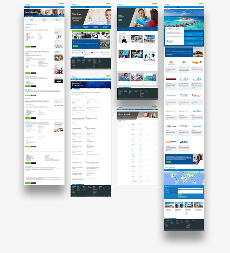
New look and feel
The final website design brings dnata's identity to life, putting user experience at the forefront. With easy navigation, a mobile-first approach, and a flexible UI Kit, dnata's online presence now feels as reliable and innovative as the brand itself.
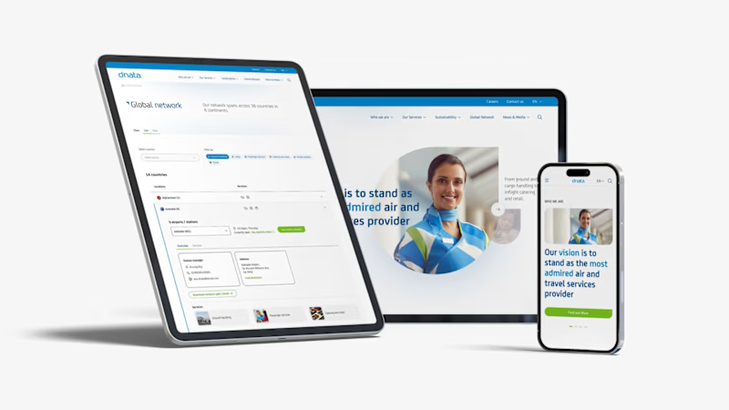
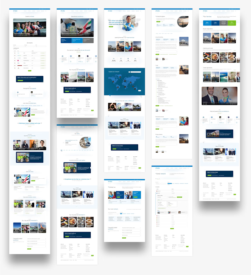
Mobile first design approach
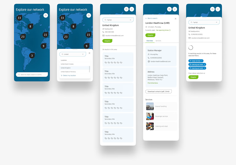
Knowing dnata's audience is constantly on the move, we adopt a mobile-first approach. This meant ensuring every feature, from complex navigation to interactive maps, would function smoothly on small screens without losing quality or clarity.
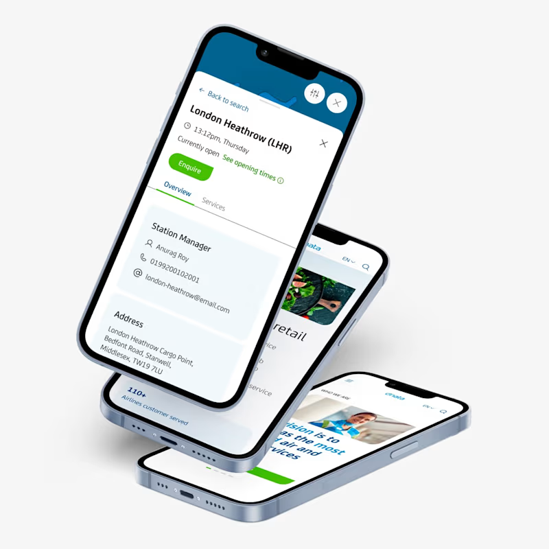
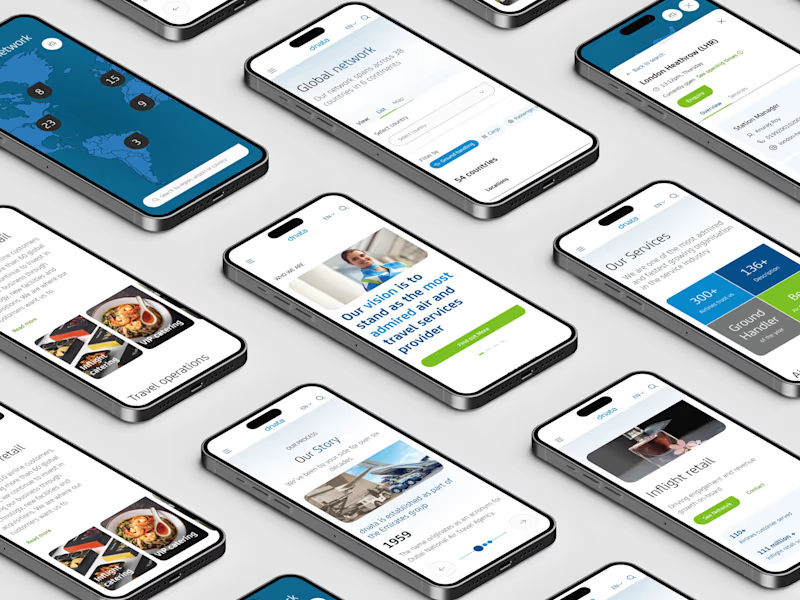
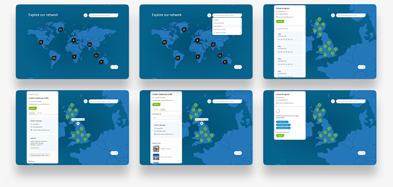
Global network design
dnata's extensive reach across five continents is a core part of its identity. We wanted visitors to instantly connect with this network, making it easy for them to find specific airports, services, and contact information. Designed for seamless use on both desktop and mobile, this section lets users explore dnata's global footprint without frustration. Whether they're looking up a location or discovering service details, everything is now clear, accessible, and right at their fingertips.
UI Kit / Design System
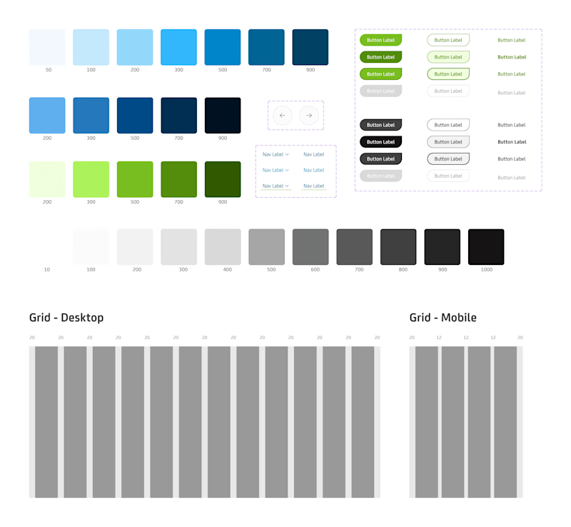
To future-proof dnata's website, we created a UI Kit that simplifies page creation. This toolkit allows dnata's team to add pages and make updates while keeping the look consistent and on-brand, ensuring their new site stays fresh and professional.
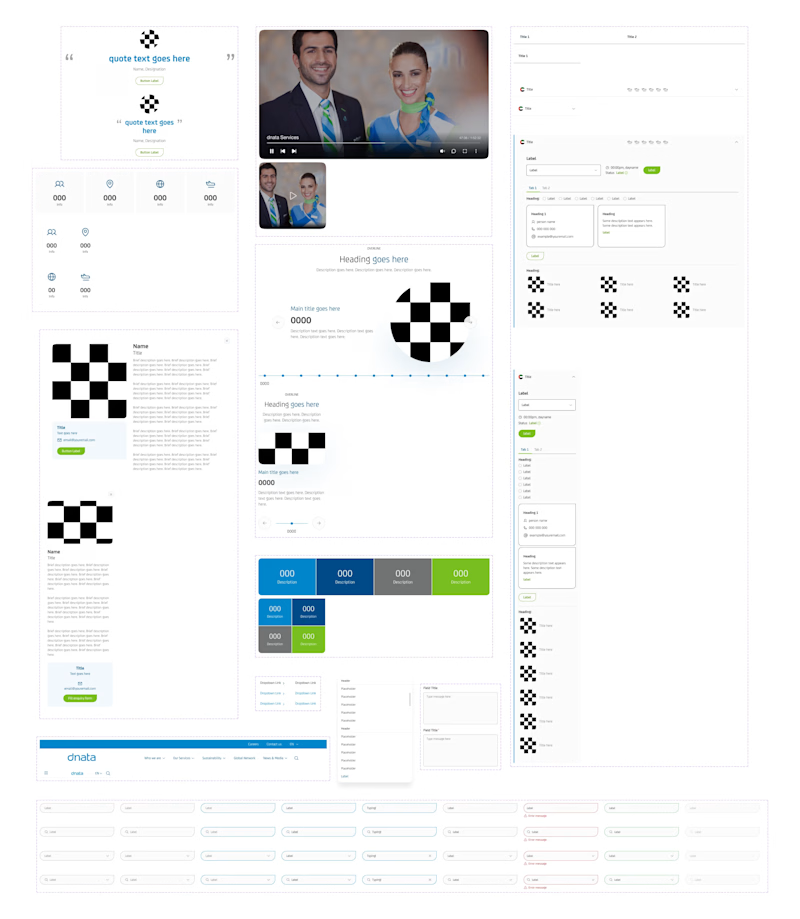
Easy to use components
To make future updates simple and efficient, we created a comprehensive UI Kit. This toolkit provides pre-built, ready-to-go design components that work flawlessly across both desktop and mobile.
Want to make your digital presence stand out?
Connect with me at farhanrao.com
Or drop a message at emailme@farhanrao.com


