Built with Framer
Bohemian Research Webdesign & Mobile Apps

Robin Holesinsky
Verified


Overview
Bohemian Research runs a global research panel: millions of people across 80+ countries and 32 languages answer surveys, and agencies, universities and brands use that panel to reach respondents. The company had grown fast, launched games, and ended up with several apps and a website that no longer felt like one product.
I worked on three things: a new brand identity, a redesigned marketing website built in Framer, and the design of all the apps in the portfolio. The goal was simple. Make Bohemian Research look and feel like one brand, and make it obvious to a researcher what they get and how to start.
Animated proof section on the website: registered users, countries and languages, right at the top.
The challenge
Bohemian Research serves two very different audiences. Panel members want apps that feel rewarding and easy to use. Researchers want a partner they can trust with their data and their deadlines.
The old setup served neither well:
The brand felt serious but flat, and did not match the playful direction the company was taking with games.
Each app lived in its own world, so the panel did not feel like one family.
The website spoke to everyone at once. The headline described a category instead of a service, the strongest proof sat halfway down the page, and visitors had several competing things to click.
Brand identity
Once Bohemian Research launched games, the brand had to become more playful. The risk was going too far and losing the credibility that researchers need before they hand over a project.
So the direction was playful, but confident. Bold shapes and color bring energy to the apps and the games, while a clean layout and clear typography keep the website calm and trustworthy. The same identity now runs across the website, the apps and the marketing materials, which is what makes the panel feel like a single product instead of a collection of them.
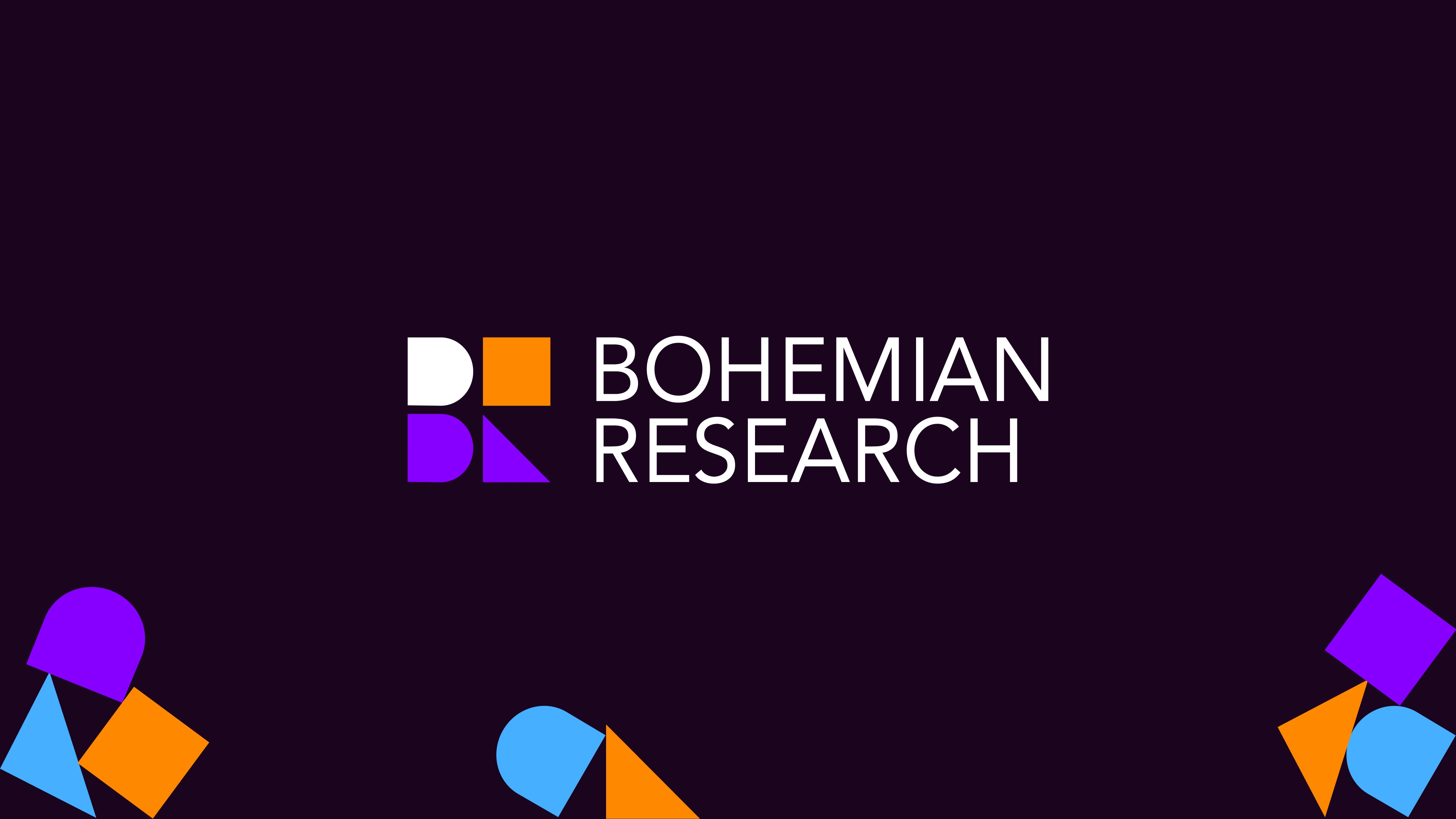
The new Bohemian Research logo and the geometric shapes that carry the brand.
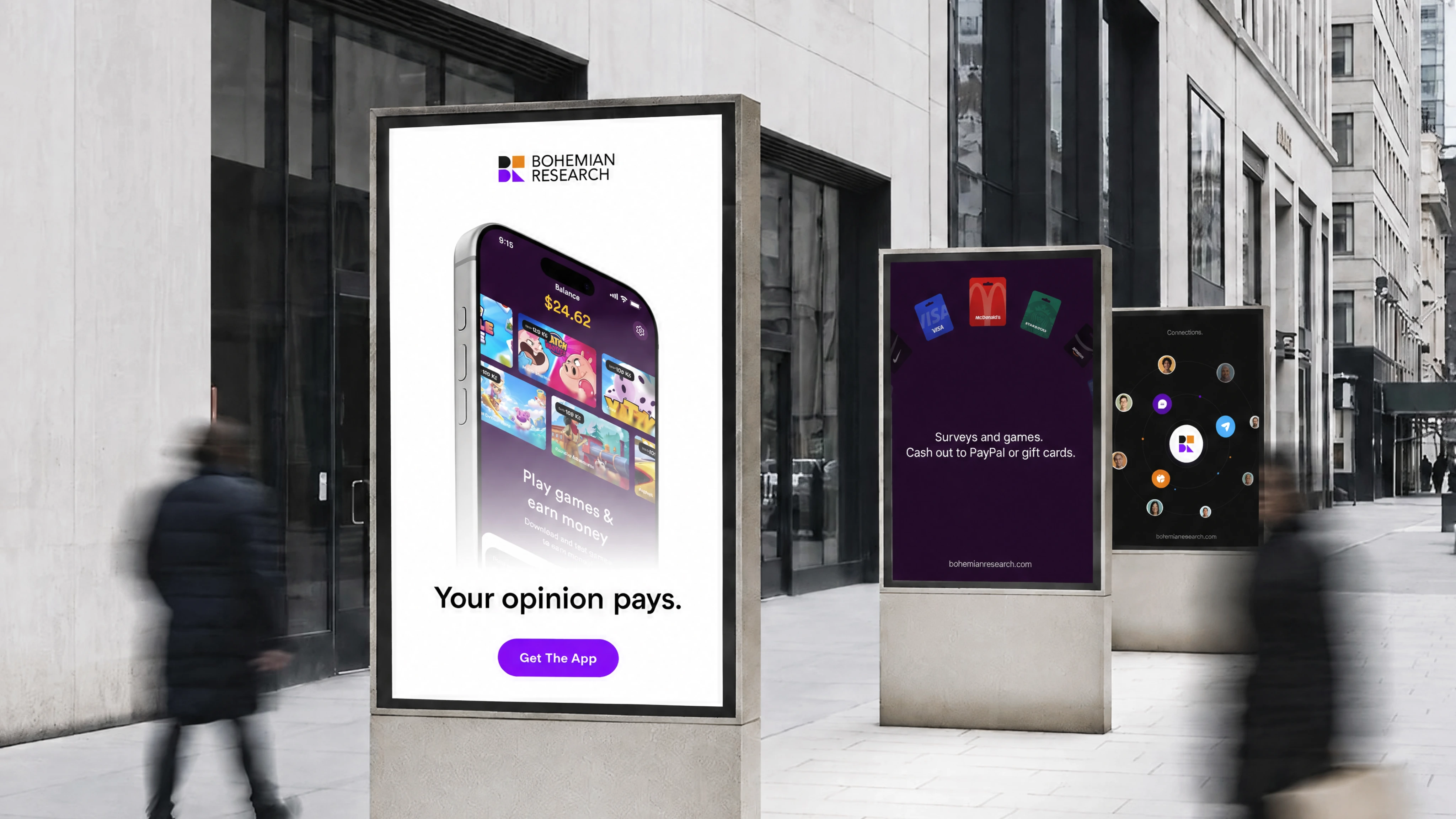
The brand in the real world: an outdoor campaign built around "Your opinion pays."
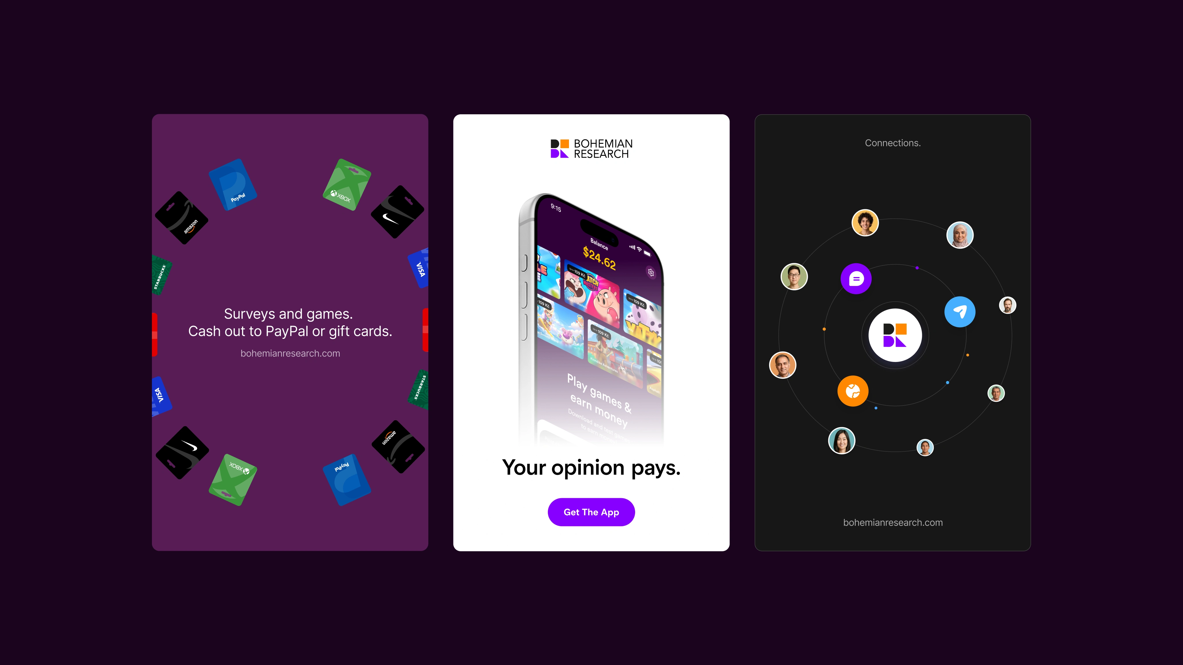
Brand applications for ads and social: surveys and games, with cash out via PayPal or gift cards.
Website
The redesigned site is built in Framer. Every change followed one question: what does a researcher need to see to decide quickly?
The hero. The old headline, "The end-to-end market research solution", became "Got a survey? We'll get you respondents." Same company, but now the page says what it does in one line.
The proof. The numbers that matter most, millions of users, 80+ countries and 32 languages, moved from halfway down the page to the very top. That is the main reason to pick Bohemian Research, so it should not take scrolling to find.
The audience. One page trying to speak to everyone became three clear paths: research agency, university and marketing agency. A PhD student and a brand team want different things, and each now sees their own version.
The effort. The old page left people guessing how long anything takes. The new one says it plainly: set up in 5 minutes, launch in 1 click, results straight away. People do not buy what they think will be slow.
The button. A few different things to click became one. "Request demo" appears everywhere. Every extra thing to click is another chance for someone to leave.
The form. Client logos used to sit on the homepage while the form stood on its own. Now the logos sit right next to the form fields, so the proof is exactly where the decision happens.
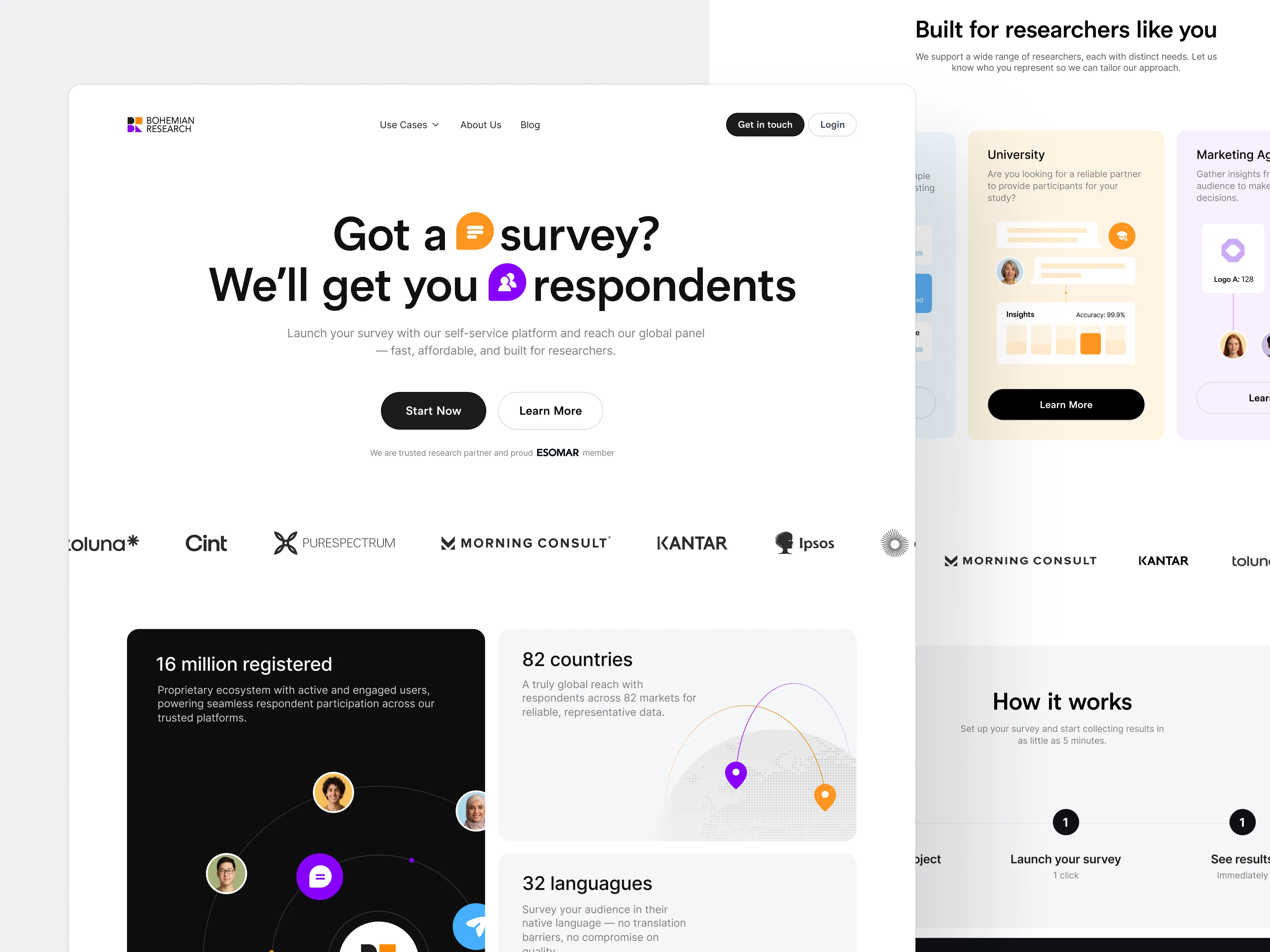
The redesigned homepage: a clear hero, client logos and the key numbers in the first screen.
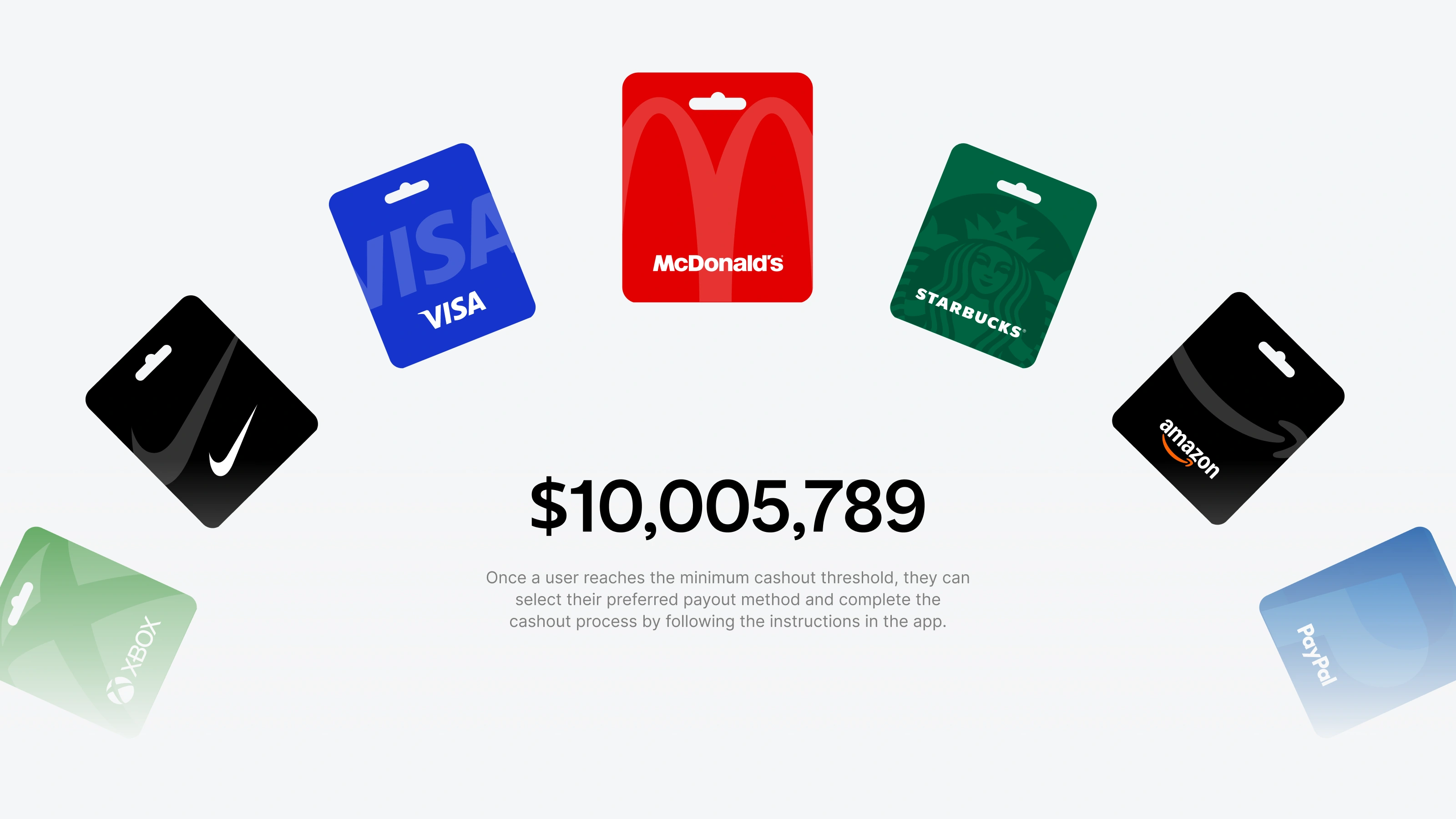
Rewards section: users cash out their earnings as gift cards from well-known brands.
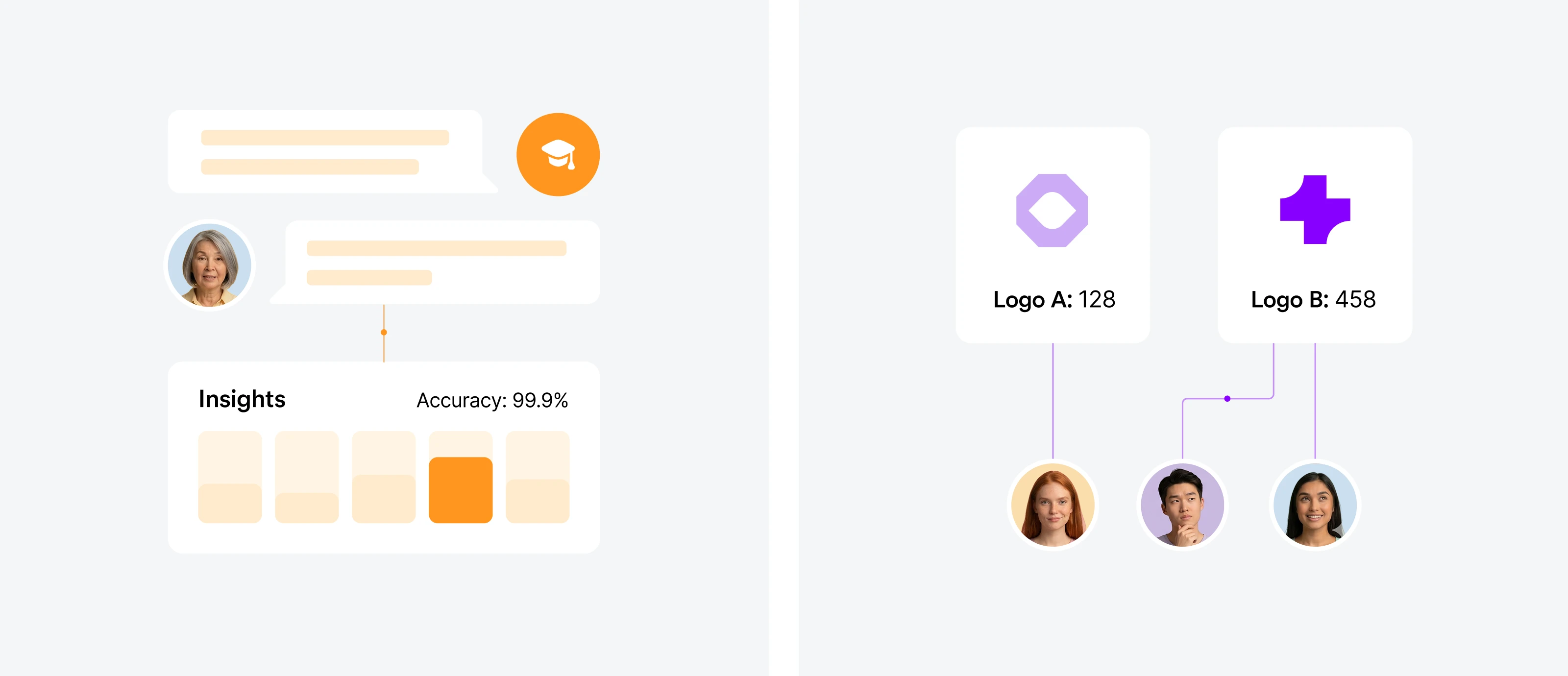
Product visuals for researchers: survey insights and audience quality at a glance.
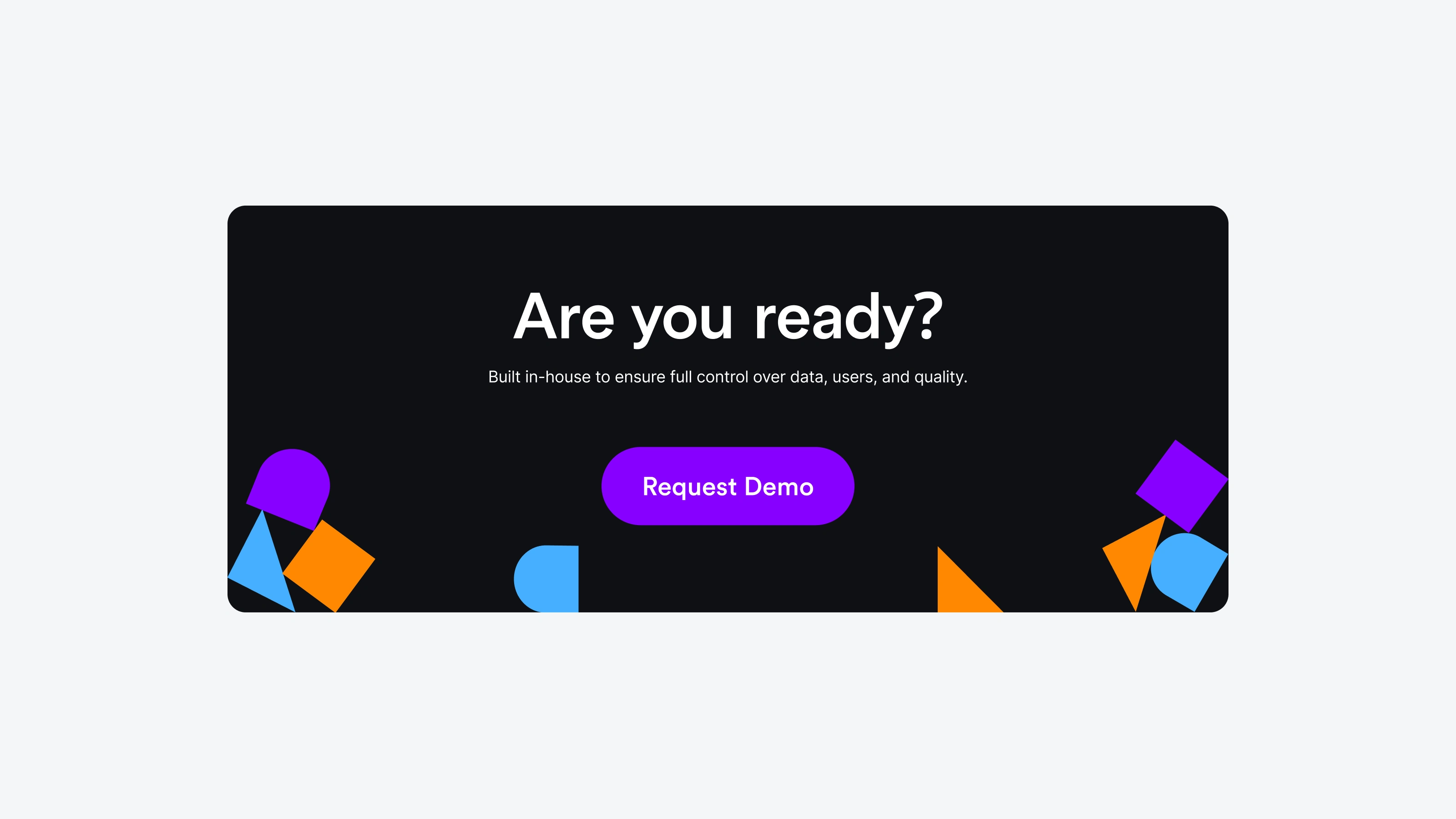
The closing call to action: one clear "Request demo" button.
Apps
I designed the full app portfolio so the apps feel like one family while each keeps its own personality.
Multipolls is the flagship, trusted by millions of users across 80+ countries. It is built around a clear earnings overview, so people see right away what they can earn and which survey to start next.
RewardsRoo is the newest addition. It grows the panel by giving users another way to earn, in a style that stays recognisably part of the same brand.
Golden Surveys completes the portfolio, with the same system of components, color and motion behind it.
On the website, the apps are presented together as one panel: more apps and more opportunities for users, and a bigger panel for researchers.
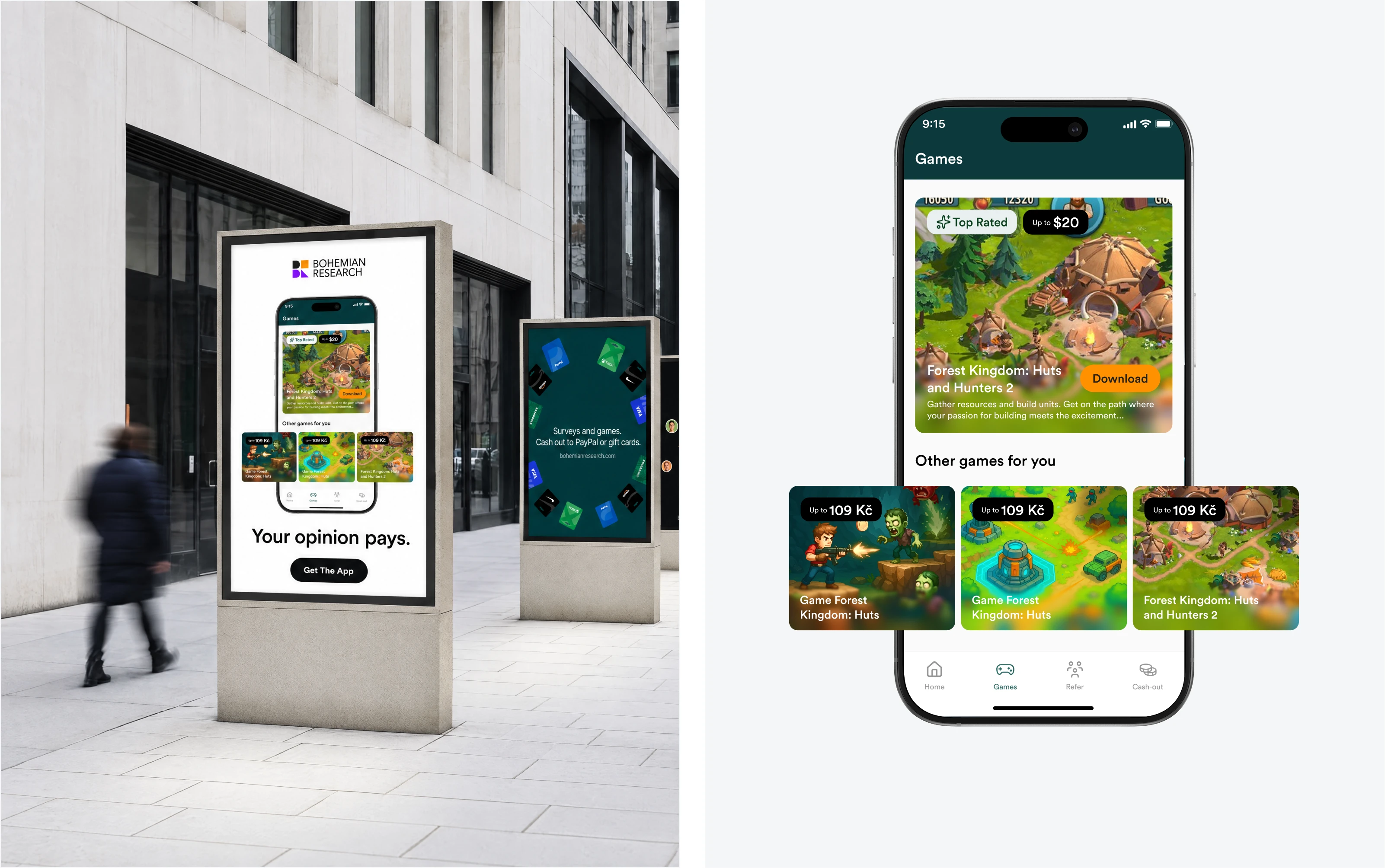
Games in Multipolls: the street ad and the games screen inside the app.
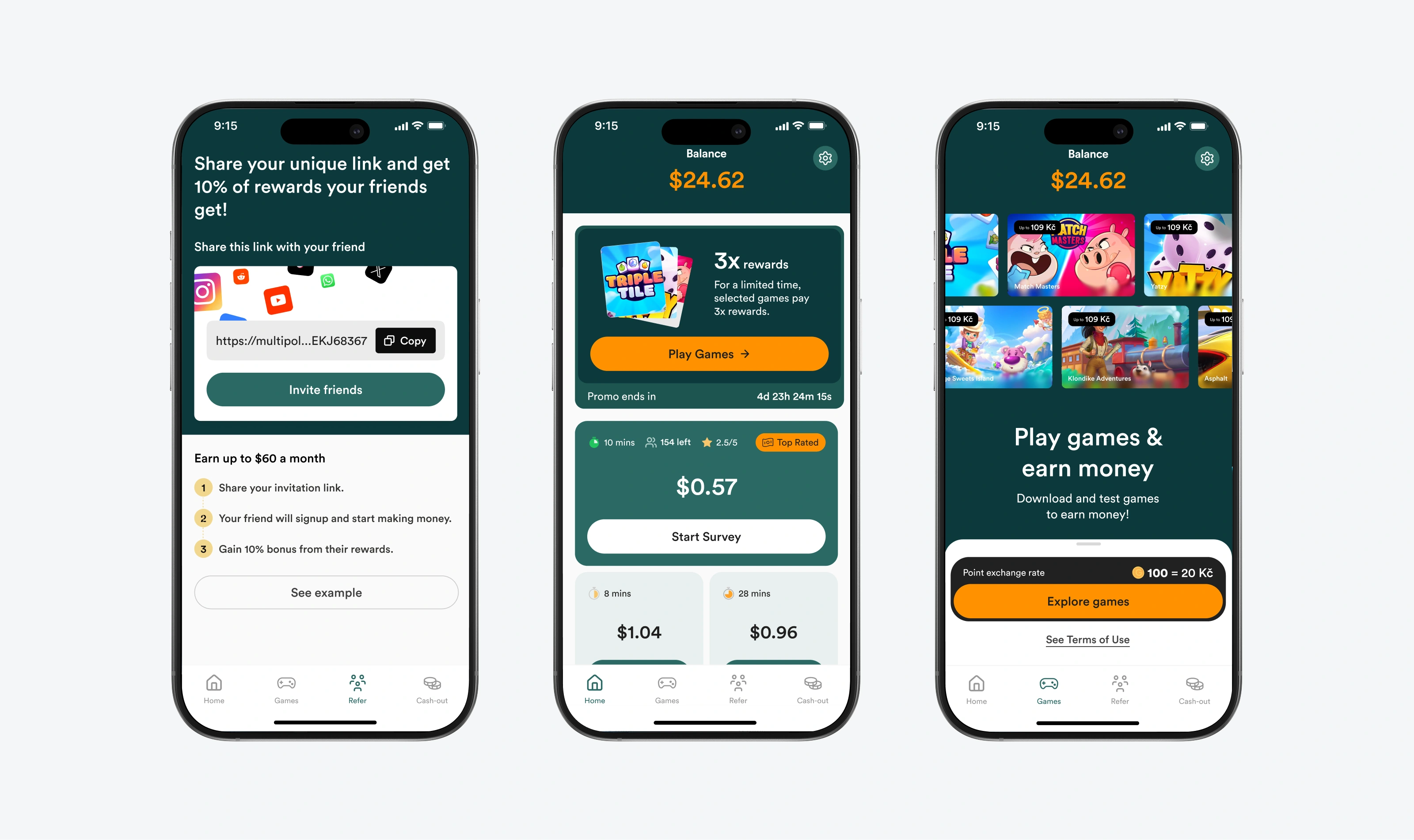
Multipolls: invite friends and earn, the balance overview, and play games to earn money.
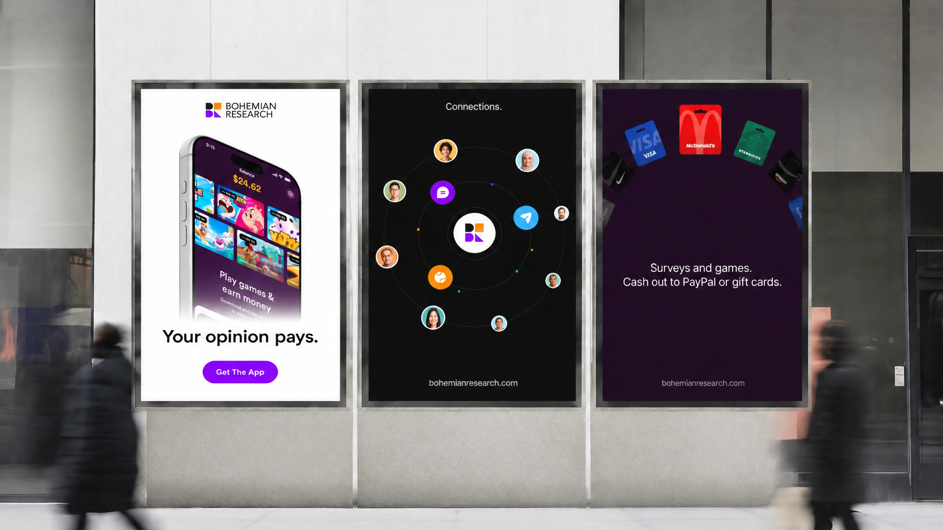
Poster campaign for the Bohemian Research brand and its apps.
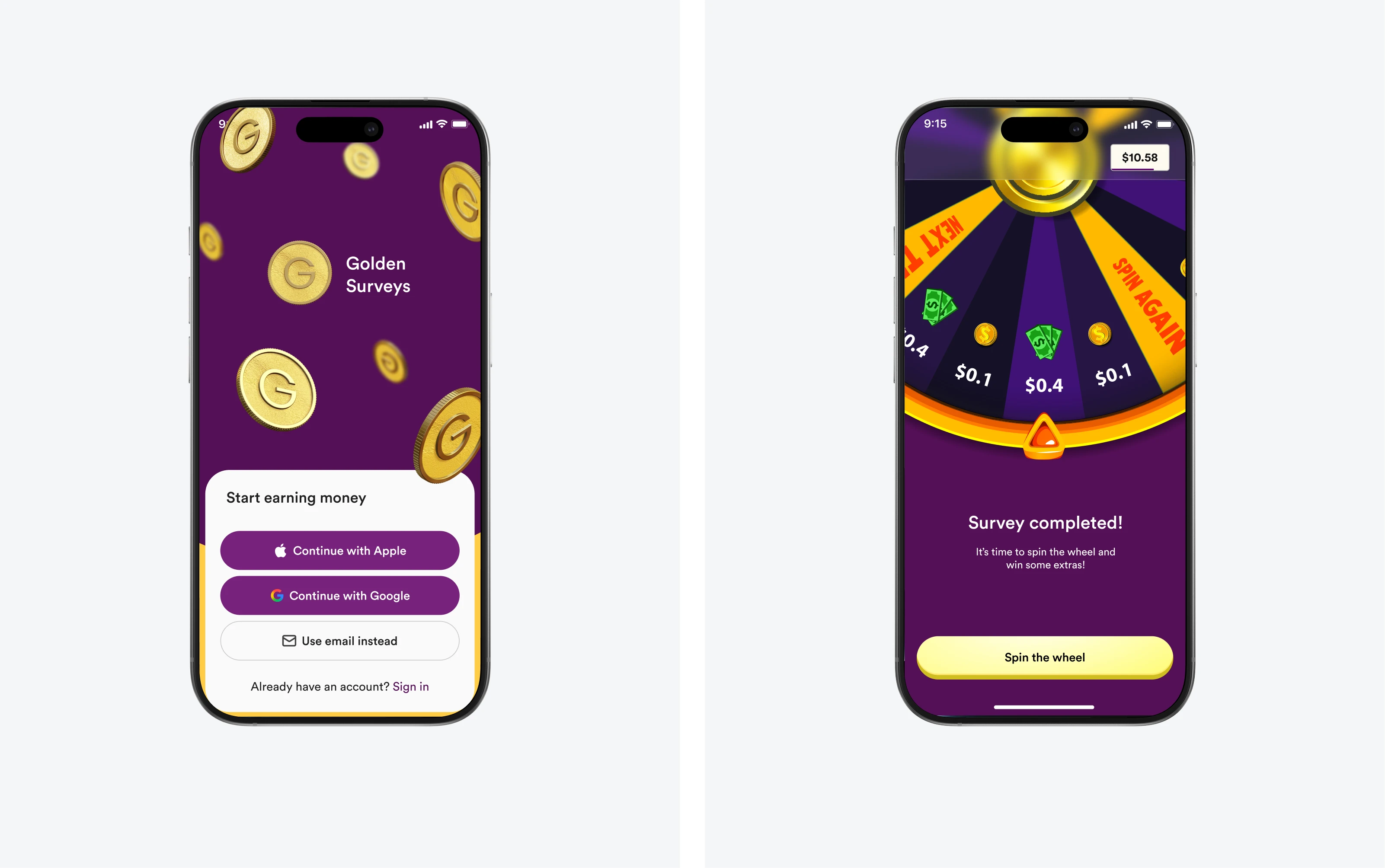
Golden Surveys: onboarding and the spin-the-wheel reward after a completed survey.
Result
After the new website launched, conversions went up 23%. The brand and the apps now work as one system, so a visitor who lands on the website recognises the same company inside every app.
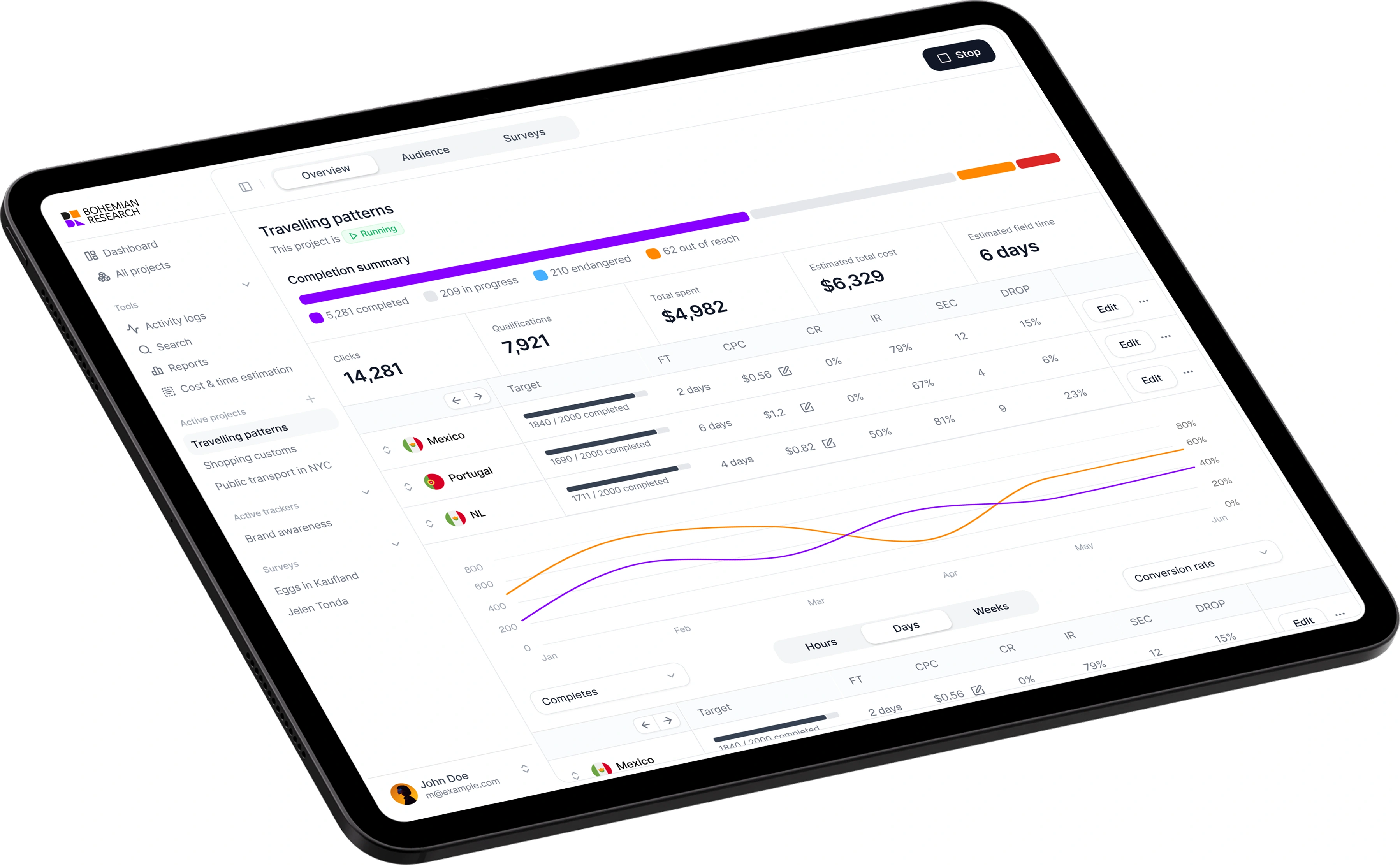
A research dashboard shown on tablet.
What I used
Figma for design and the design system, Framer for the website, and After Effects and Jitter for motion.
Like this project
Posted Oct 1, 2026
Brand, website and app design for a research panel in 80+ countries. One playful but confident system for Multipolls, RewardsRoo and Golden Surveys.
Likes
0
Views
1