United & Trained Workers Branding
UTW was an NYC-based organization focused around workers' rights, mainly in the construction industry.
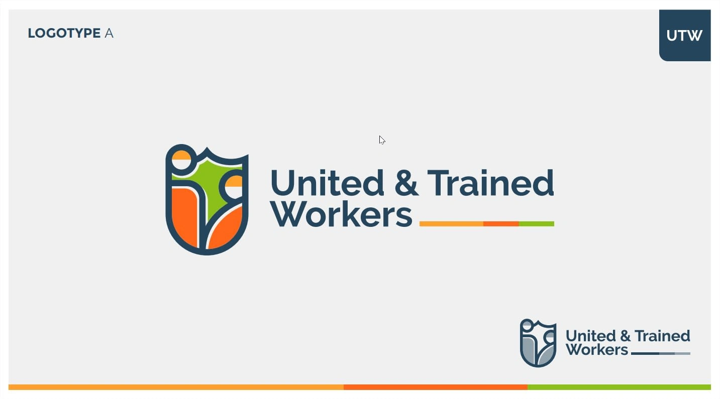
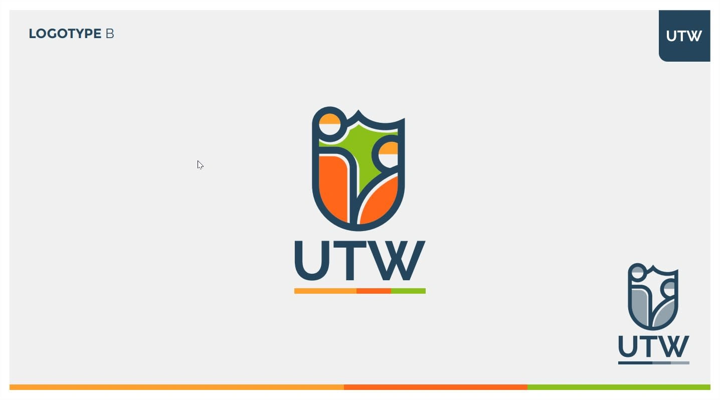
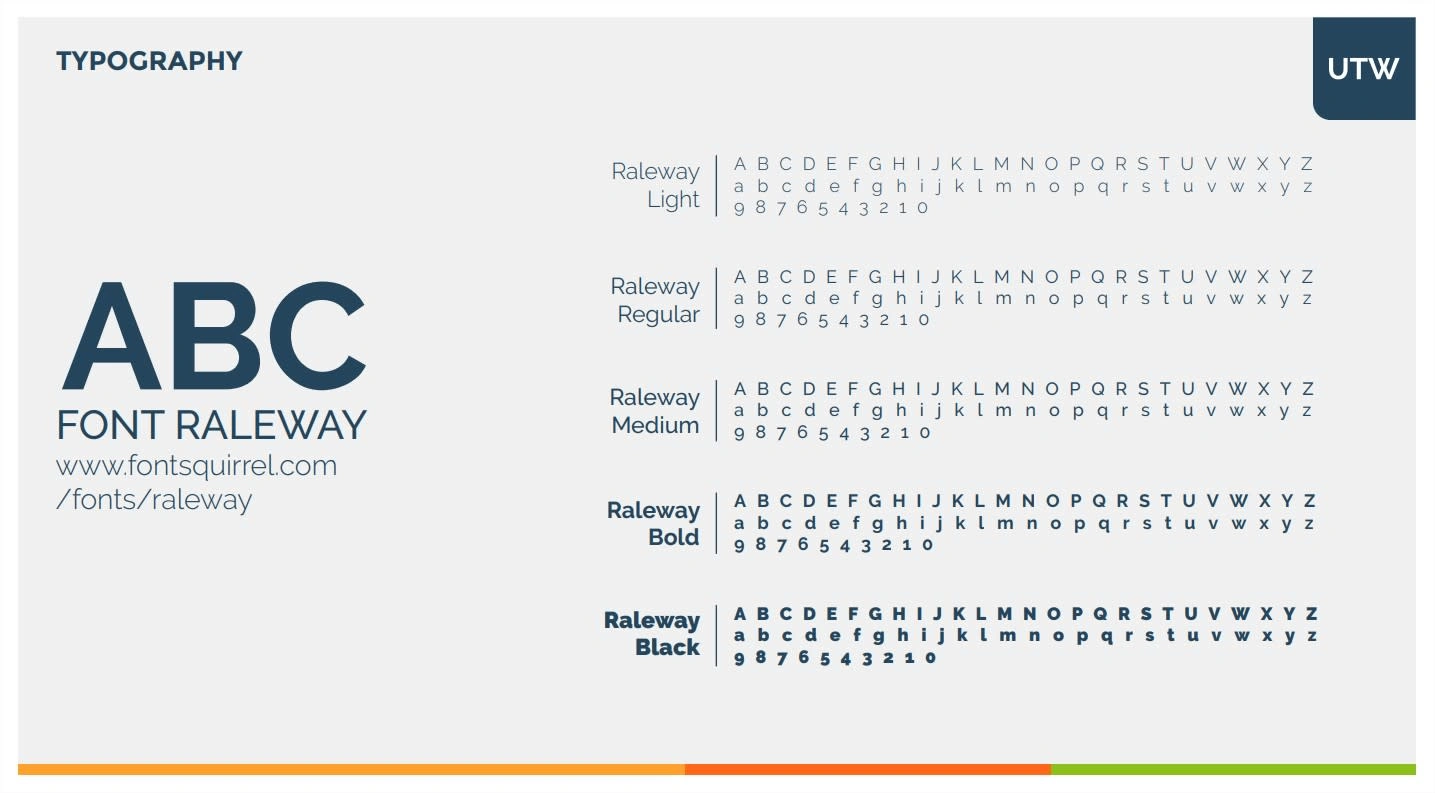
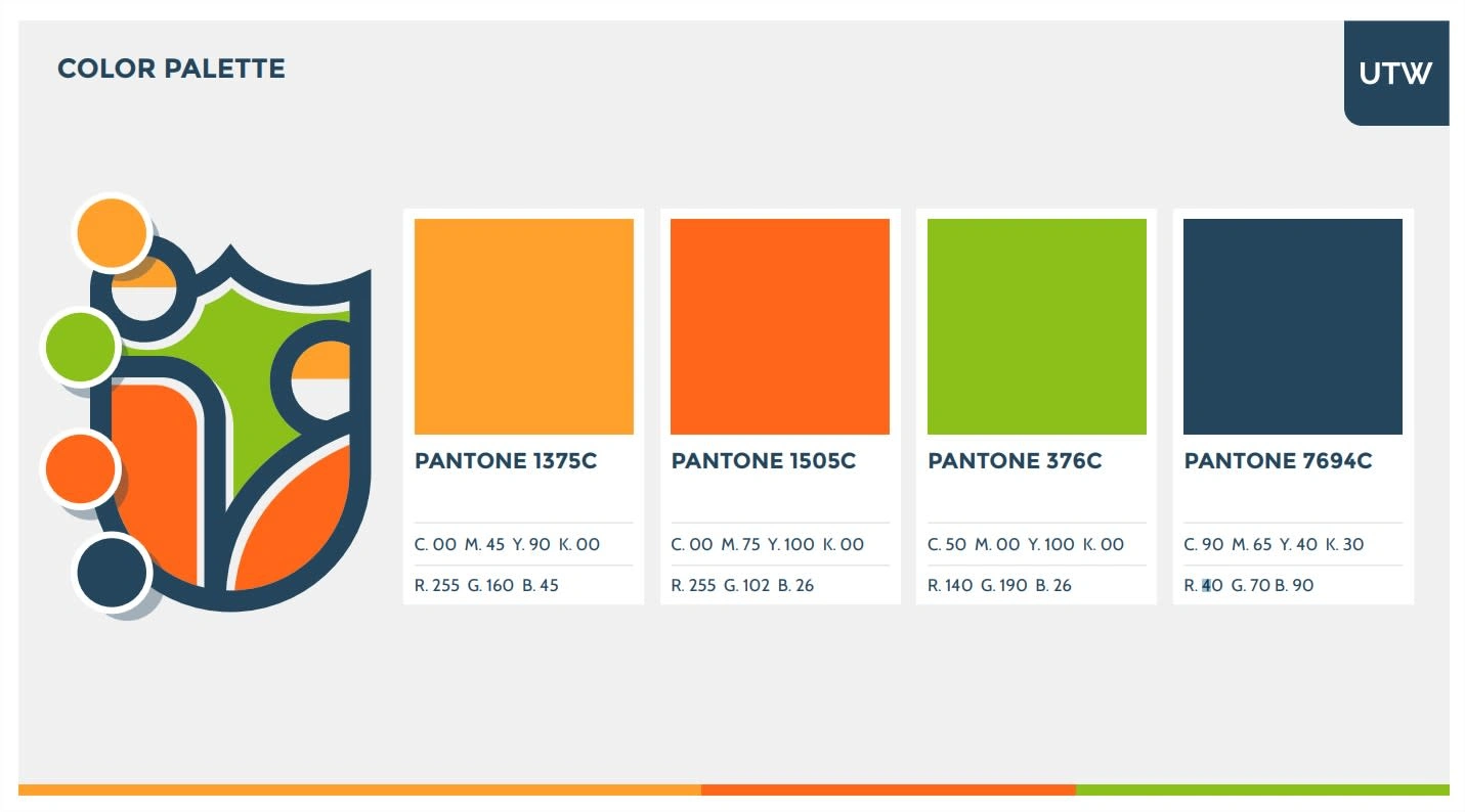
They needed a basic branding for organizational purposes, for which we developed a Logo and established a Typeface and brand colors to support their communications efforts.
The project was short-lived and didn't expand to other materials such as stationery or apparel, common for this kind of org.
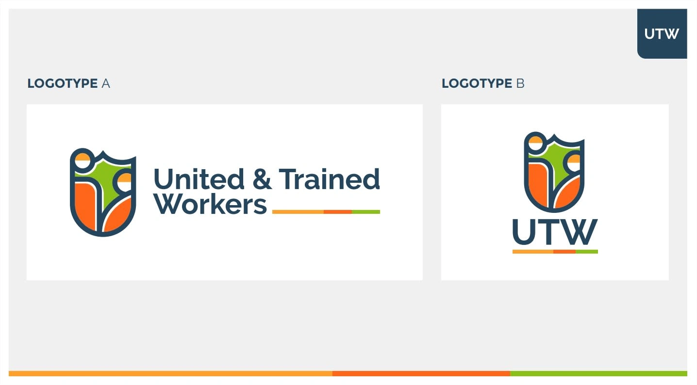
The idea for the logo was to convey the clear message of Workers and Security/Safety.
This was done with a few elements:
Green shield representing Security
Two workers of different shapes representing Diversity
Yellow helmets representing the Construction industry
The Orange color is one of the colors of New York City, which fits perfectly.
Like this project
Posted Oct 9, 2024
Simple yet effective branding for grassroots workers' organization.
Likes
0
Views
6


