Broadband & Cable TV recharge app
Simplifying the recharge flow for 20Lakh Broadband and CableTV users — GTPL KCBPL UX Case study
A freelance project of designing the entire mobile experience for GTPL users

💎 About
GTPL is a cable TV and broadband service provider.GTPL KCBPL is a sub-brand of GTPL providing service mainly in West Bengal and Odisha with a subscriber base of 20Lakhswith a mission to provide compelling, cost-effective, and technologically advanced Cable TV and Broadband Services to consumers. (GTPLKCBPL). They came to me with the need for a completely new mobile app. I was responsible for research, visual design UX design, and prototyping.
⚠️ Problem
With a huge user base, GTPL was facing issues in operations and scaling.Their plans were not known by most usersandrecharge was only possible through their web, which again wasn’t very convenient for the users. Somost users chose to call their operators and ask them to rechargefor them. This createdchaos, confusion, and corruption.
These are problems I will be addressing in this case study:
Apart from this the UI looked pretty outdated and was not a delight for users to browse through the website dashboard. A fresh new app would be much more easier to use on the go.
Note: They had no app before, this was the MVP of an app.
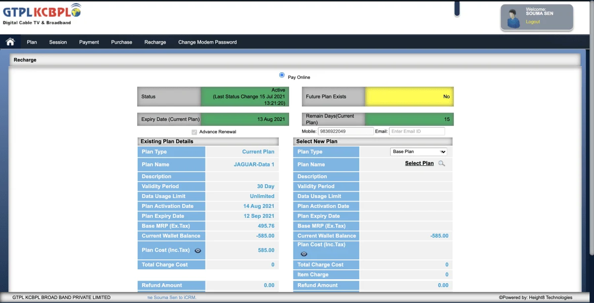
To give a bit more context, here’s how the user dashboards looked:
Broadband Dashboard & recharge flow (left to right)
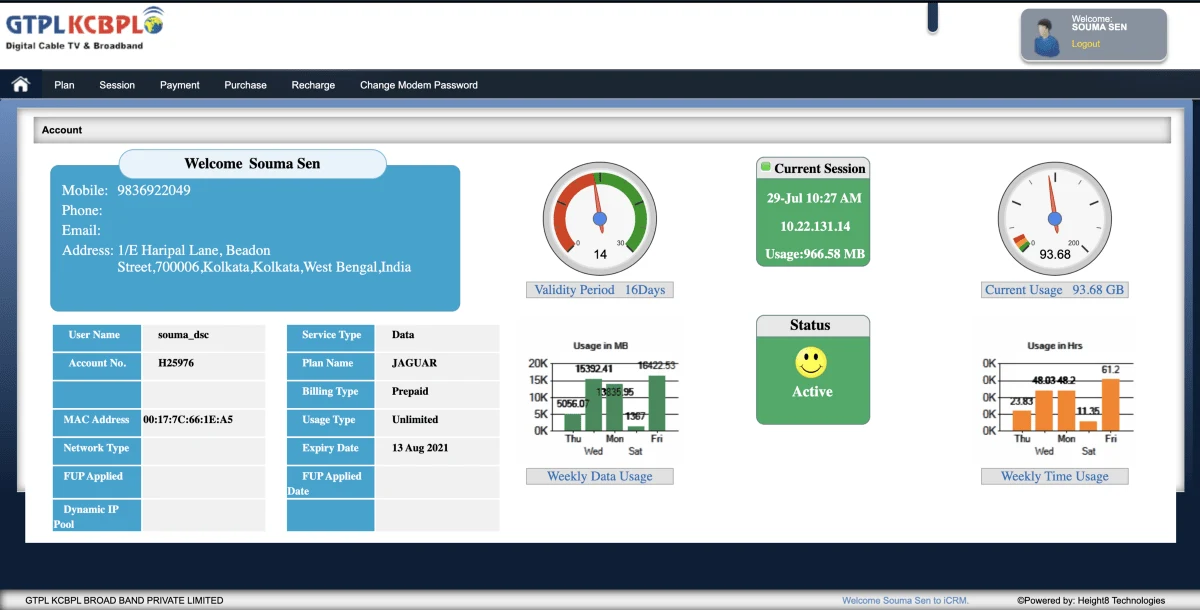
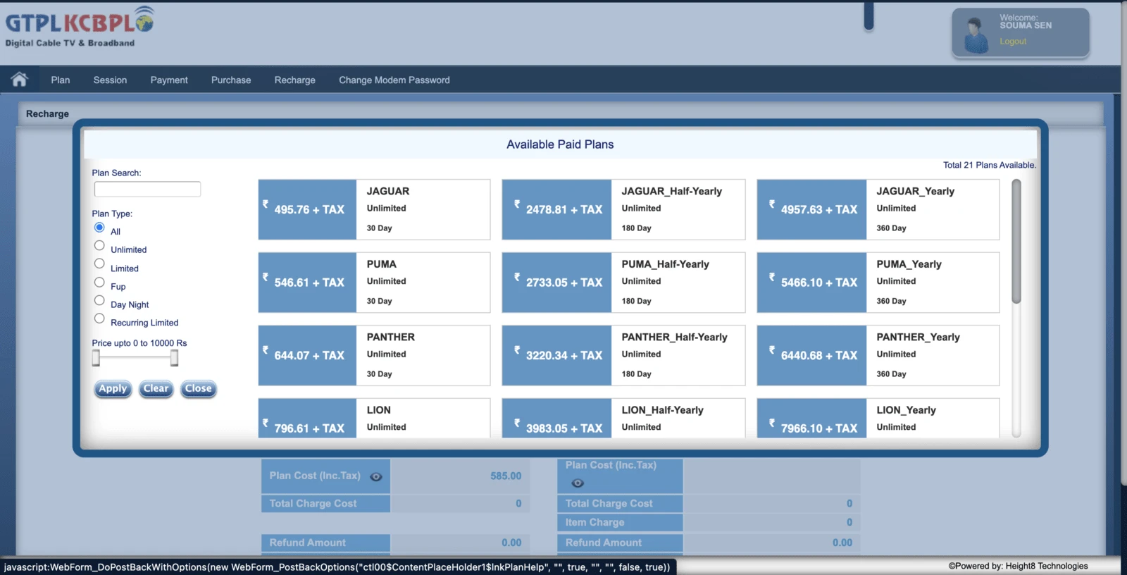
Plans for Broadband
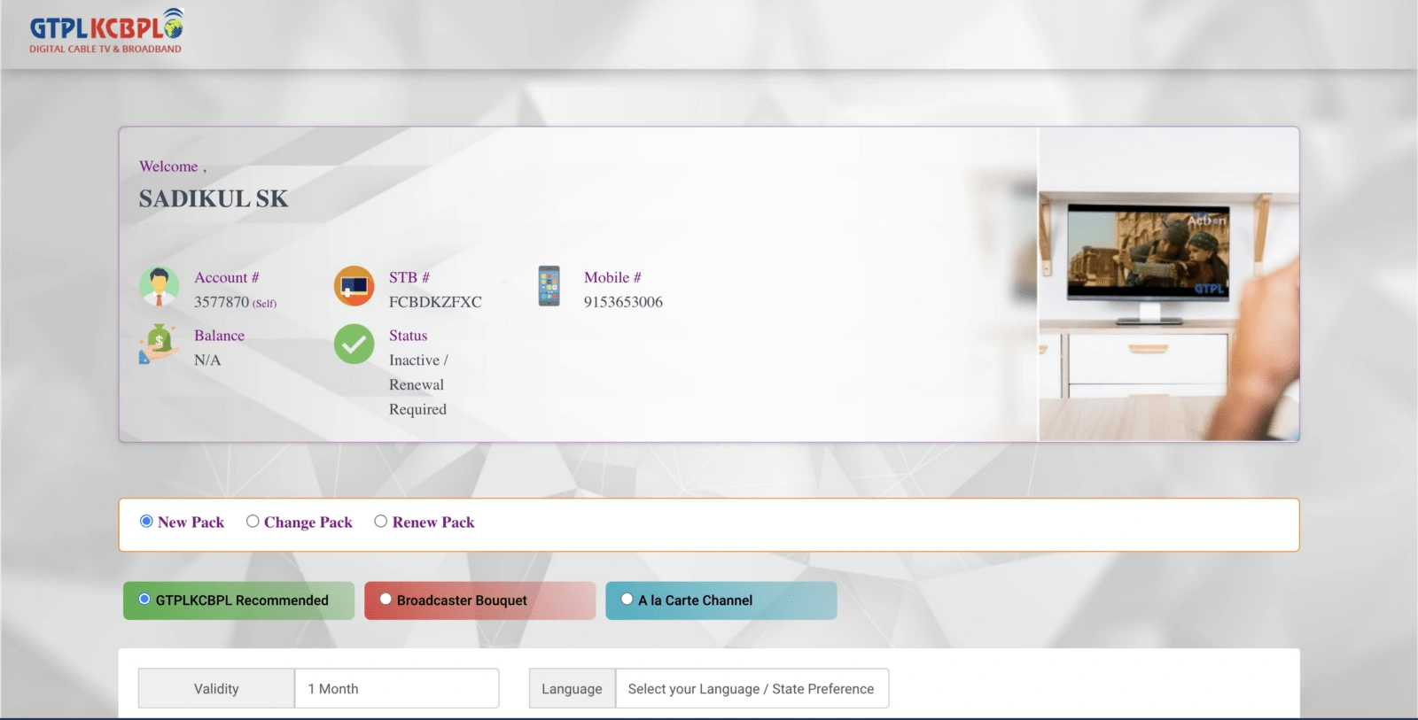
Cable TV Dashboard
👨👩👧 Audience
GTPLKCBL is focusing on Indian people based in urban areas who are mostly from age groups between24 years and 50 years,having a decent income and cable TV or broadband connections. They cater to a large variety of users ranging from working professionals, homemakers, retired individuals, etc.
Illustrations by Michael Martinelli from Figma Community

💡Ideation
We kicked off the project with an analysis phase where we (digitally) came together with the stakeholders to define goals and ideate on possible solutions and features for the app. Keeping those in mind, I went ahead with primary and secondary research. (Key observations from those are listed below) This led us to frame the goals and ideate the possible ways to reach them.
Research observations:
Users surveyed not prefer to spend more than 3–5mins on recharging their cable or broadband
Almost all the users surveyed prefer online payment and auto-renewals
Users want premade plan packages like sports packs, movie packs,s, etc
Users want contact points to be visible on the contact us page. Instead of having the headquarters number, it is beneficial to have the local operator number
For validating the above-mentioned points and taking data-driven decisions user survey was conducted and these were the results.
✨ Visual Design
The client had a desire for a clean, easy-to-use, and modern feel the app that adheres to the existing branding palette. Since the app would be used by a wide range of users from ages 24–55 so it needed to be fairly simple to use yet should give out a modern-day app feel to the younger audience.
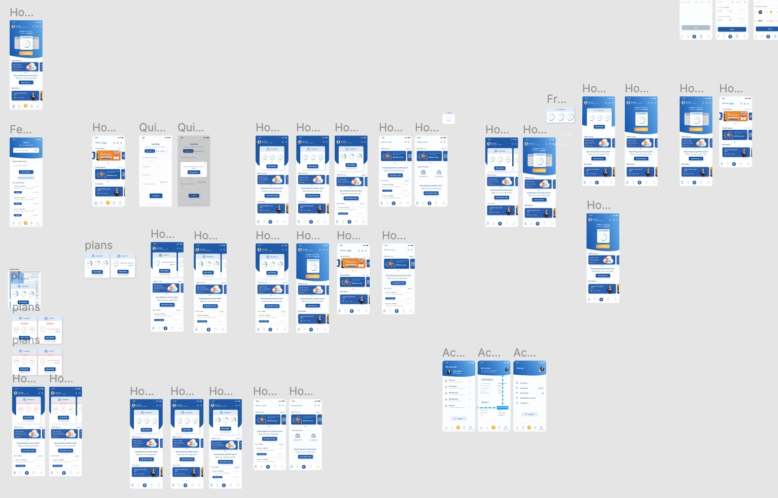
How many iterations are too many iterations? (Iterations of the home screen)
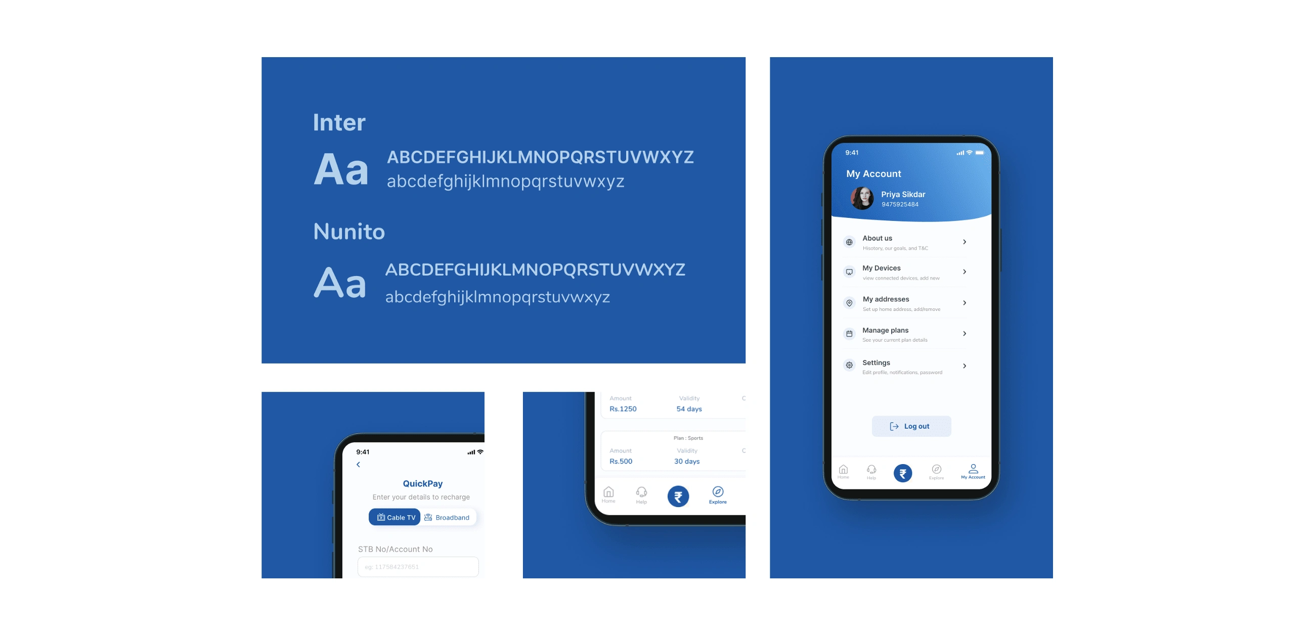
Typography
The typography needed to be clean, readable, and also easily available (non-paid). Hence I went withNunitoandIntercombination for the entire app with varying weights to create a hierarchy.
Onboarding and Sign In
Problem
The users often forgot their subscriber ID or password and needed a simple way of signing in.
To increase the User base GTPL wanted a way wherein even if they are not logged in they can access the app.
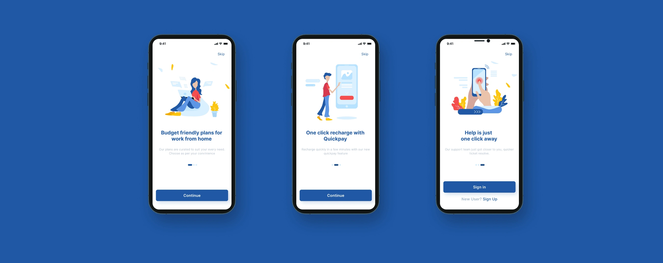
Onboarding
Explained the newly introduced in-demand features via onboarding
Added animations to gain visual interest and reduce drop-offs.
Sign In
Log in with the account number (subscriber ID) as well as mobile OTP was enabled.
If someone forgot their account number password a directing text (error state) was given to try with a mobile number.
Gave askip option so that non-users of GTPLcan also access the app.
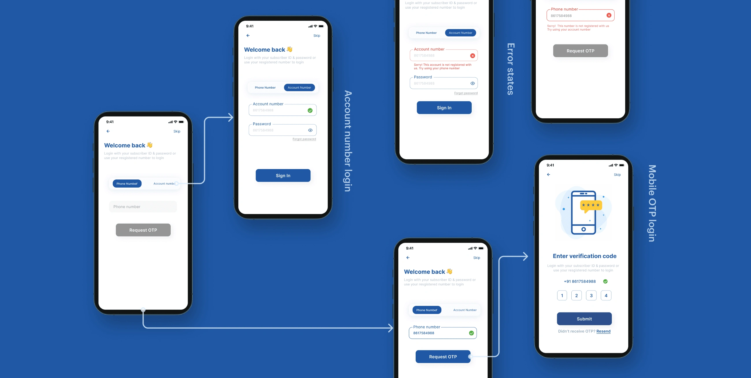
This is how the flow looked:
Navigation
With all the insights we gained from the analysis phase, I mapped out the app’s entire navigation structure — for which I also needed to take into account all the different user situations.


Homescreen
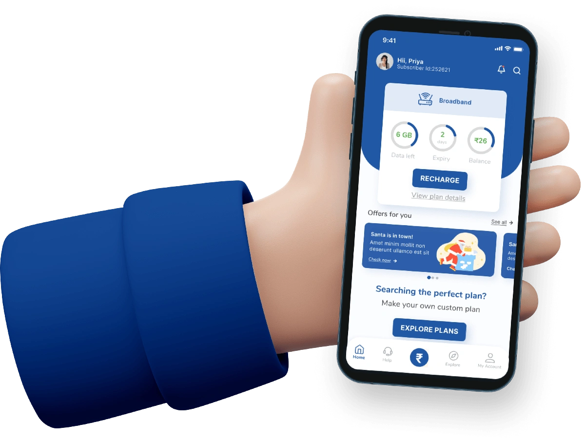
The home screen needed to cater to all kinds of users and users who have a single connection, Users who have multiple connections i.e broadband and Cable TV.
There also needs to be one guest login homepage that enables them to explore the app without being a GTPL user.

This section was made to be accessible for all: both users and non-users of GTPL.The main goal here was to show the plans at a glance in the most simplistic and consumable way possible.
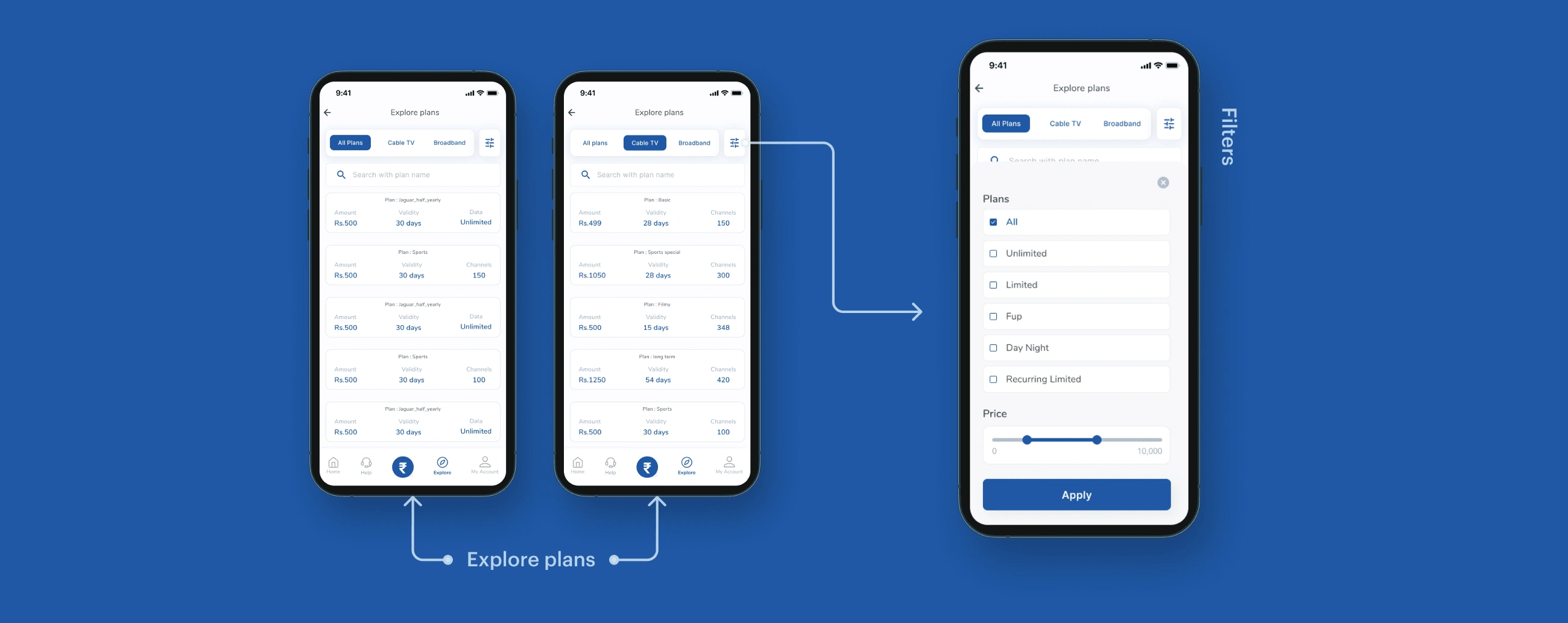
Recharge
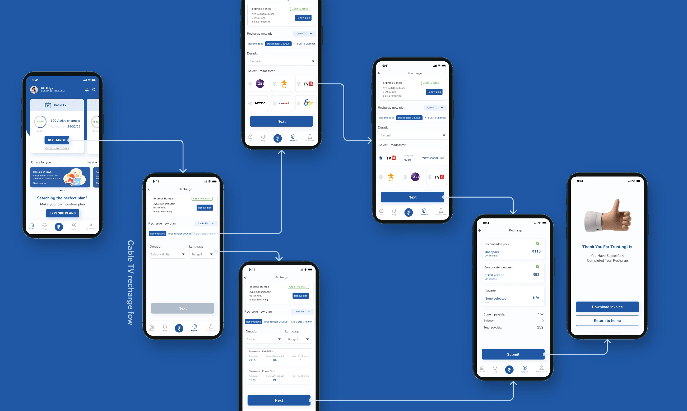
Recharge is the primary function of the subscriber app. But here there were certain constraints from the client’s side that we needed to cater to while keeping the end goals in mind. One of the major constraints was that the existing recharge flow i.e the web recharge procedure cannot be changed due to technical reasons.But with the existing flow, there were major problems. The challenge here was to keep the recharge flow technicalities the same yet bring a simplistic touch to it to solve the problems.
Problems
The existing recharge flow was too long and tiresome, the recharge process was too lengthy, and wasn’t properly assisted for the elder spectrum of the target audience.
While recharging their same current plan they were bombarded with again the plan choosing process from the start which most users considered unnecessary.
Solution:
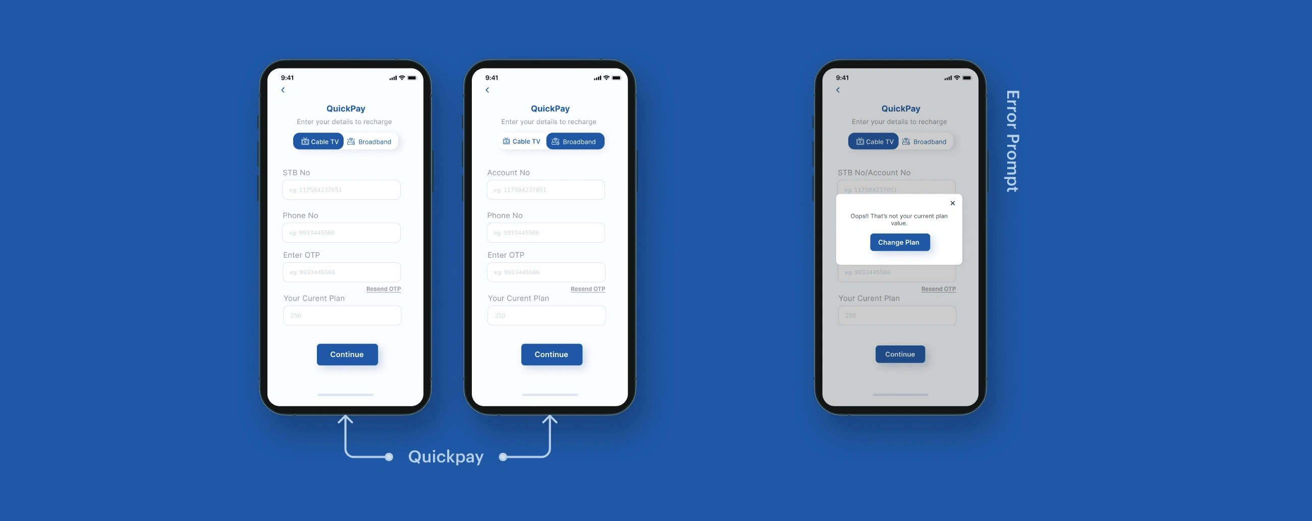
To cater to this, I came up with two pathways of recharge. One is a shorter quicker to recharge their existing plans: Quickpay. And another with the new plan choosing process.
Quickpay
Recharge (custom plan)
Cable TV
Broadband
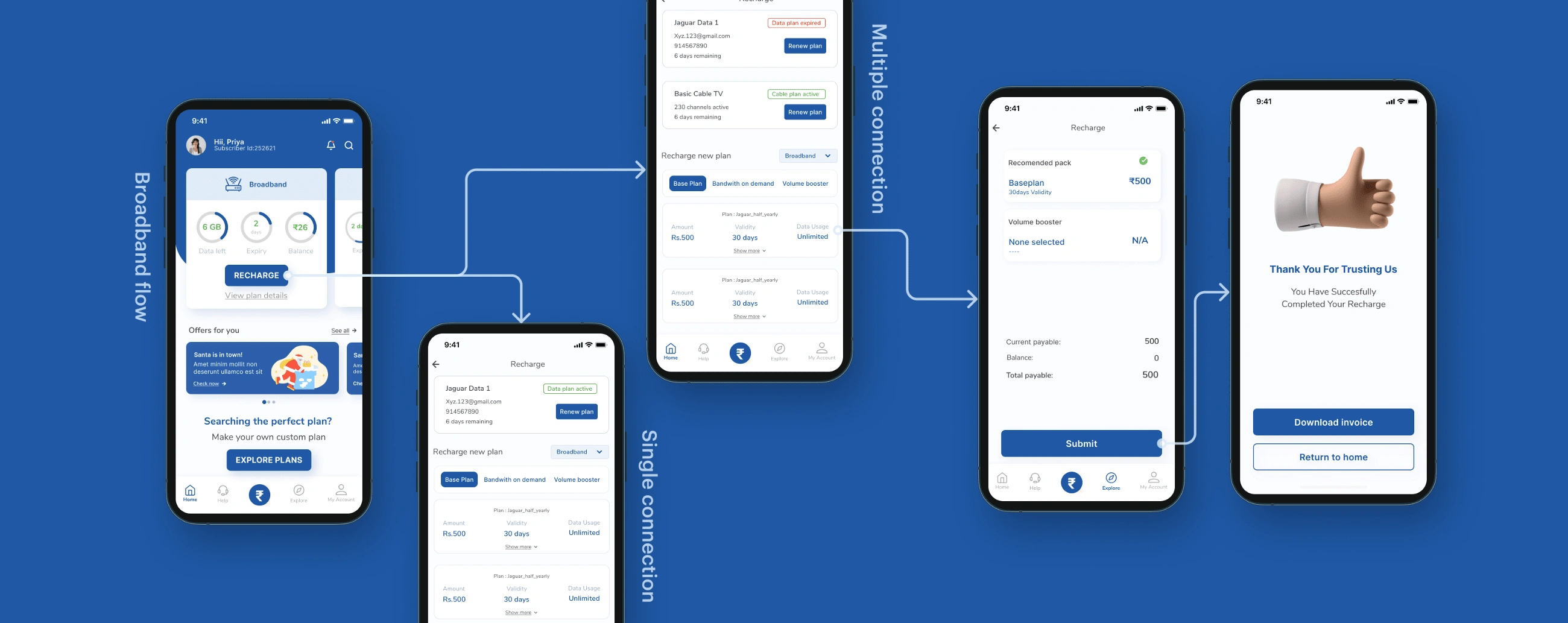
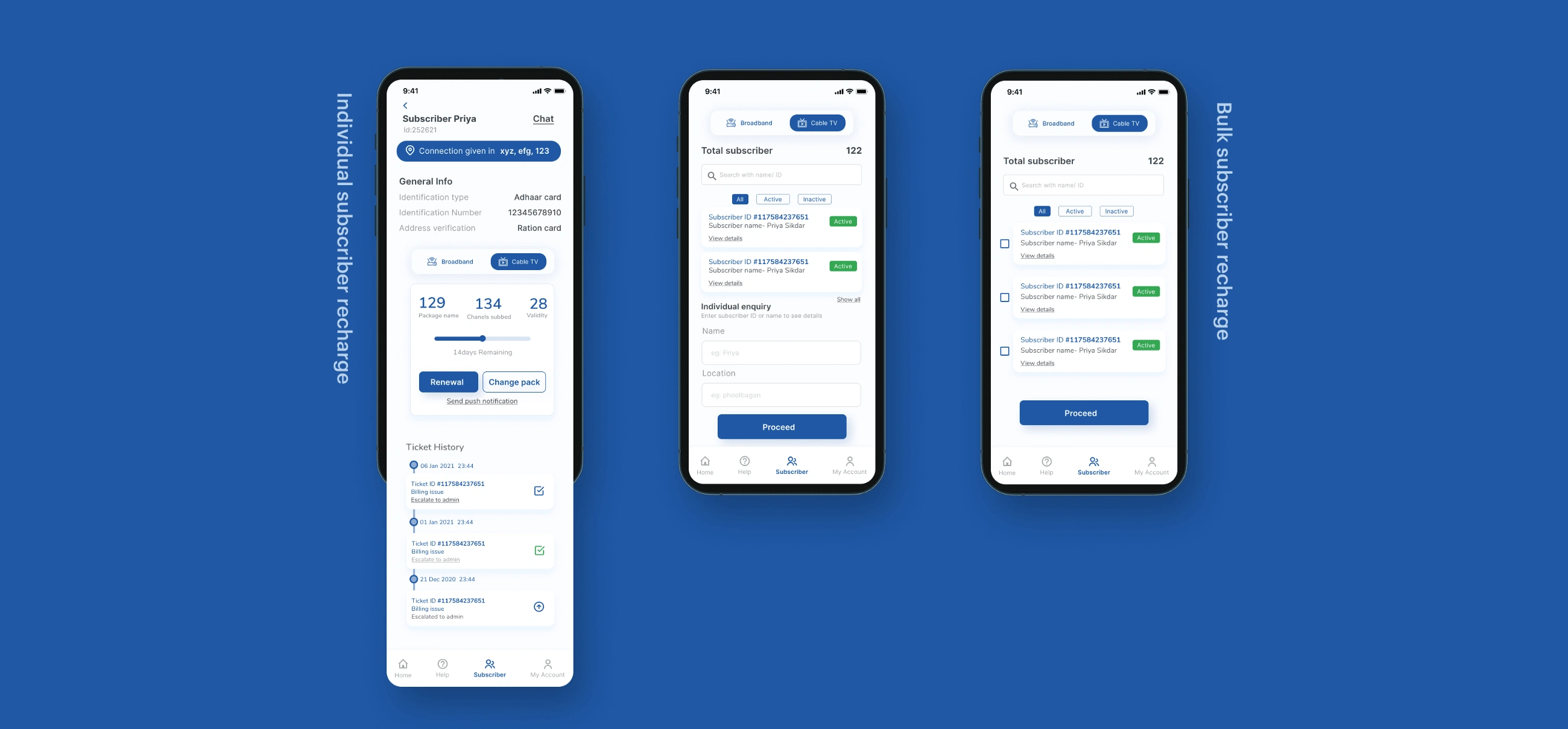
Note: According to the research done, users hence preferred to call up their operators to recharge for them. Introduced bulk recharge and individual recharge on the operator’s app too. To seamlessly connect the flow of operator and subscriber.
Help and Support
Lack of help and support contact was another major area of concern according to the users of GTPL as found in the research phase.
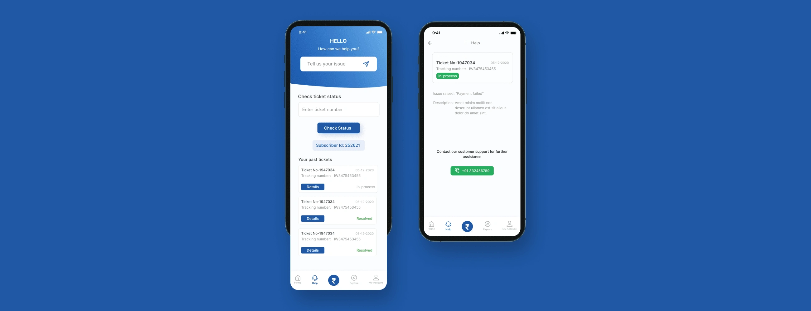
Hence introduced the ticketing system: Wherein for any concerns the subscribers raise a ticket which is reflected in the operator app. The operator sees it from their app and picks up the issue. This reduces the old traditional system of calling the operator****
As requested by the users in the research phase, introduced the respective operator contact details that is available in the subscriber area.
More
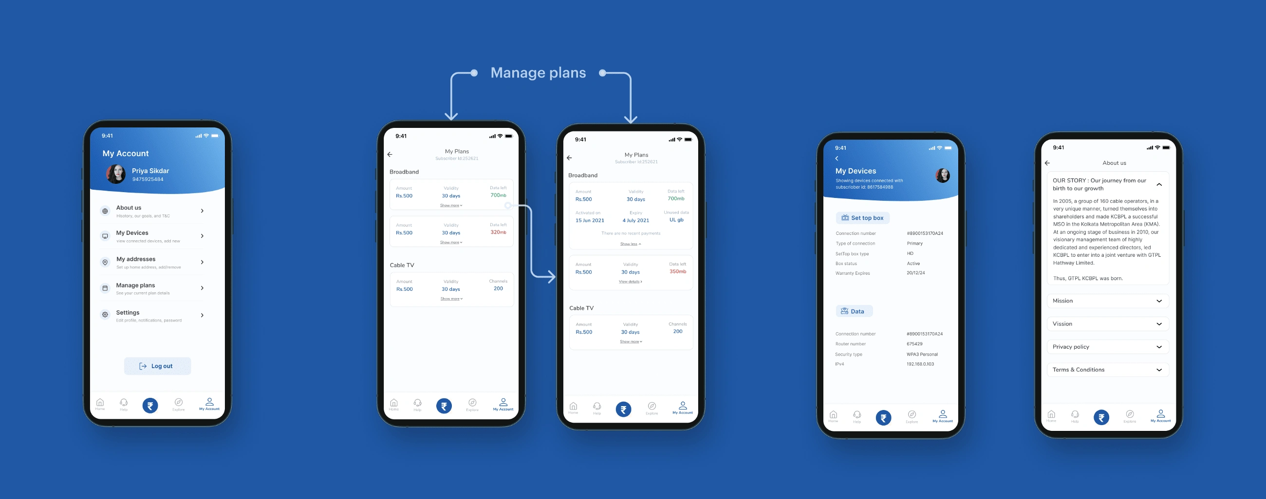
There’s a dedicated account section wherein the users can see their device details, manage their plans, and see other additional information.
Operator App
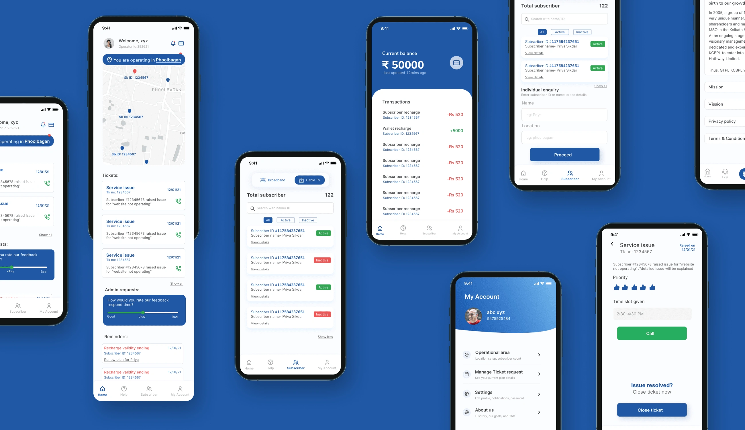
Here’s a glimpse of the operator app, the seamless system of the subscriber was possible only by the well-knitted integration of the features within the operator app.
Like this project
Posted Sep 6, 2022
Designed the entire mobile experience for GTPL's 20M users
Likes
0
Views
19

