Veltrix Fintech Consulting Website Design and Development

Al-Ameen Tijani


Veltrix: Fintech Consulting Website Design and Development
Role: Sole designer and developer (art direction, UI/UX, Figma prototyping, full Framer build)
Timeline: 3 weeks
Tools: Figma, Framer
Overview
Veltrix is a finance and strategy consultancy that helps fintech startups and growing teams validate ideas, scale products, and make data-driven decisions. Its process is simple: diagnose, audit, then build a roadmap. I designed and built the website that introduces Veltrix to founders and turns interest into booked calls.
The Challenge
Finance consulting is a trust business, and most of its websites look the same: navy blue, stock handshakes, and walls of jargon. Veltrix needed to feel sharp and modern without feeling cold.
It could read as another generic consultancy. Plenty of firms promise insights and growth. Veltrix's real difference is a clear three-step method and transparent pricing, and both needed to be easy to find.
The audience is time-poor and skeptical. Startup founders decide fast, and they distrust vague promises. The site had to show how Veltrix works and what it costs without making anyone dig.
Two actions, not twenty. The business model depends on conversations, so every section had to guide visitors toward one of two choices: View Demo or Book a Call.
Process
I started by asking what a fintech founder expects from a finance brand, then did the opposite. Three decisions shaped the direction.
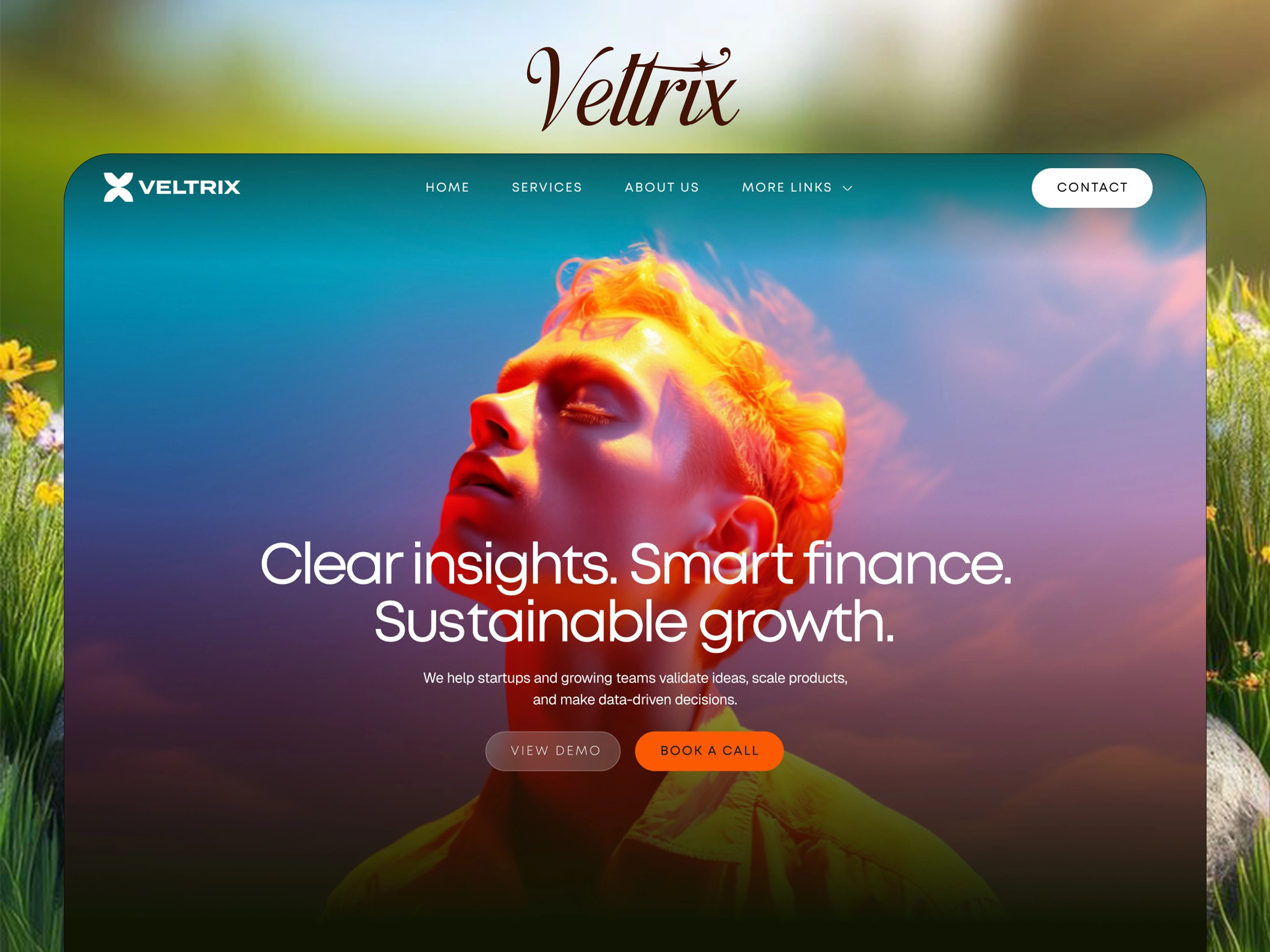
A warm, high-contrast palette. Instead of corporate blue, I built the page on near-black olive, burnt orange, and soft cream. The dark sections feel serious and focused, the cream sections give the content room to breathe, and the orange makes every action unmistakable.
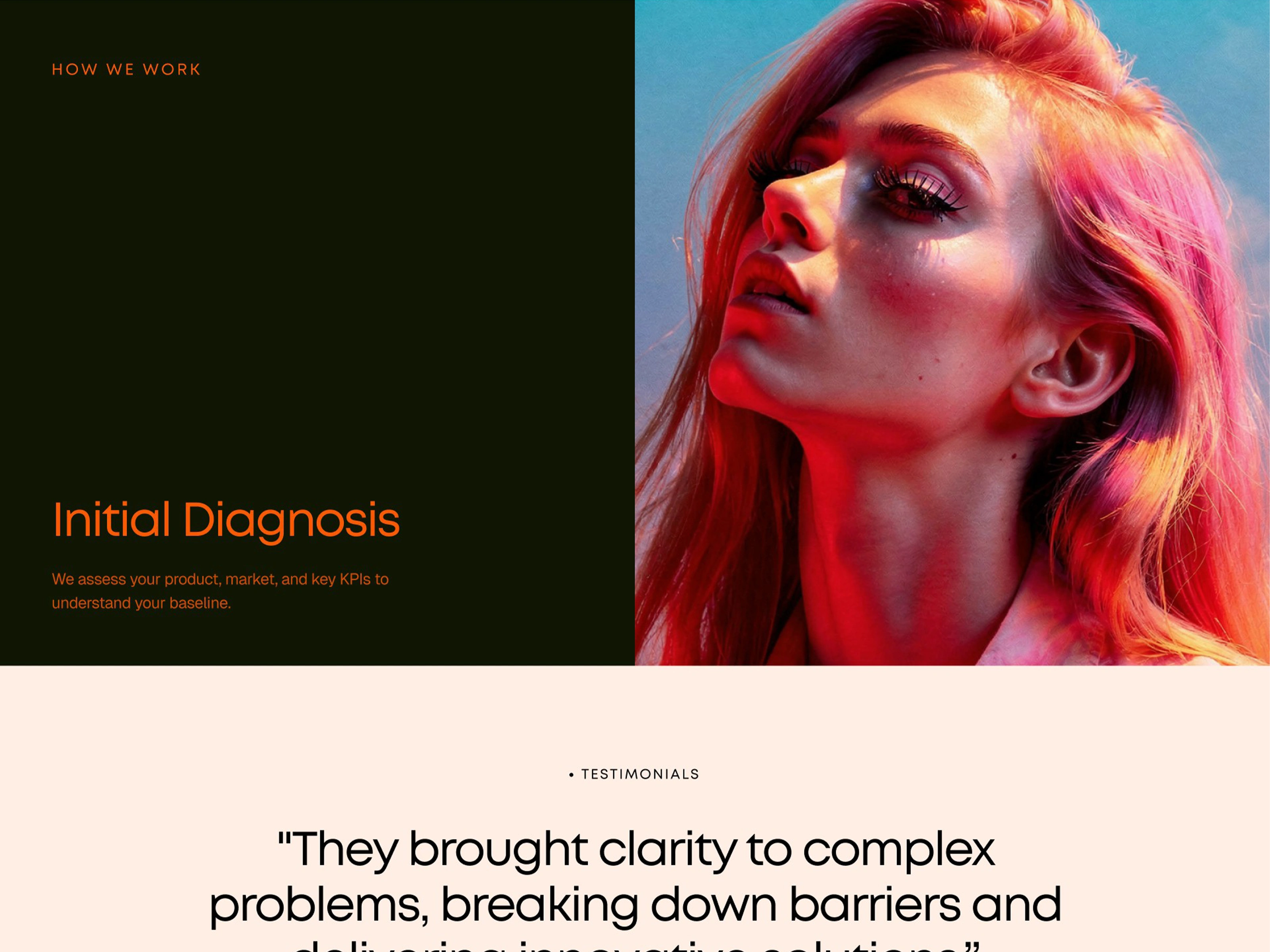
Photography with heat. I replaced stock imagery with duotone, sunset-toned portraits that glow orange and pink. They give a finance brand a human face and an optimistic mood, and they echo the orange accent used across the page.
Light, confident typography. A clean geometric sans in a light weight carries the headlines, with small uppercase labels for context. The result feels calm and expert rather than loud, which suits advice about money.
The Solution
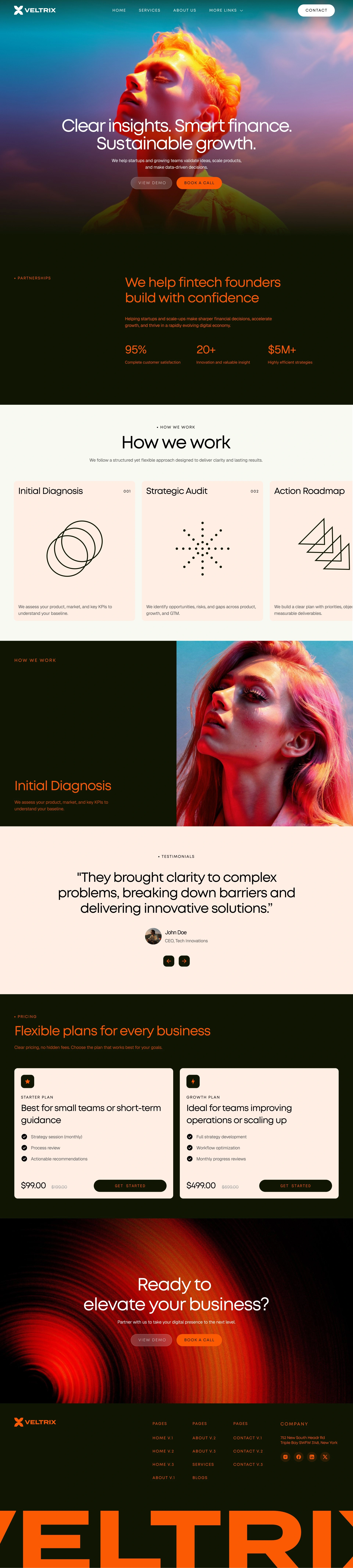
A hero that promises in three beats. "Clear insights. Smart finance. Sustainable growth." opens the page over a full-bleed portrait, with a short supporting line and two buttons: View Demo and Book a Call. The primary action is the filled orange button, so the next step is never in doubt.
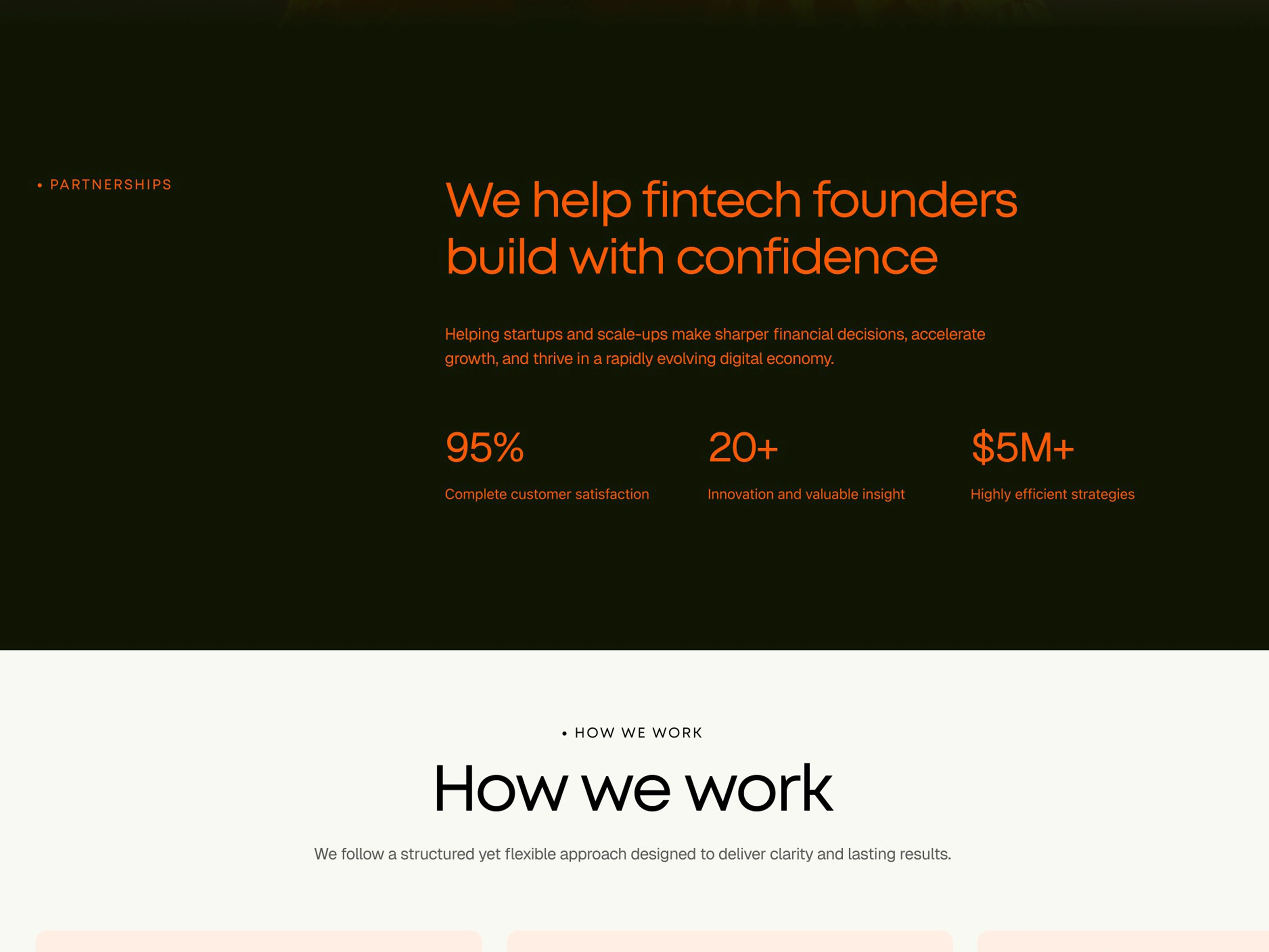
A positioning statement for the right audience. "We help fintech founders build with confidence" speaks directly to the people Veltrix serves. Three stats (95% customer satisfaction, 20+ valuable insights, and $5M+ in efficient strategies) back it up at a glance.
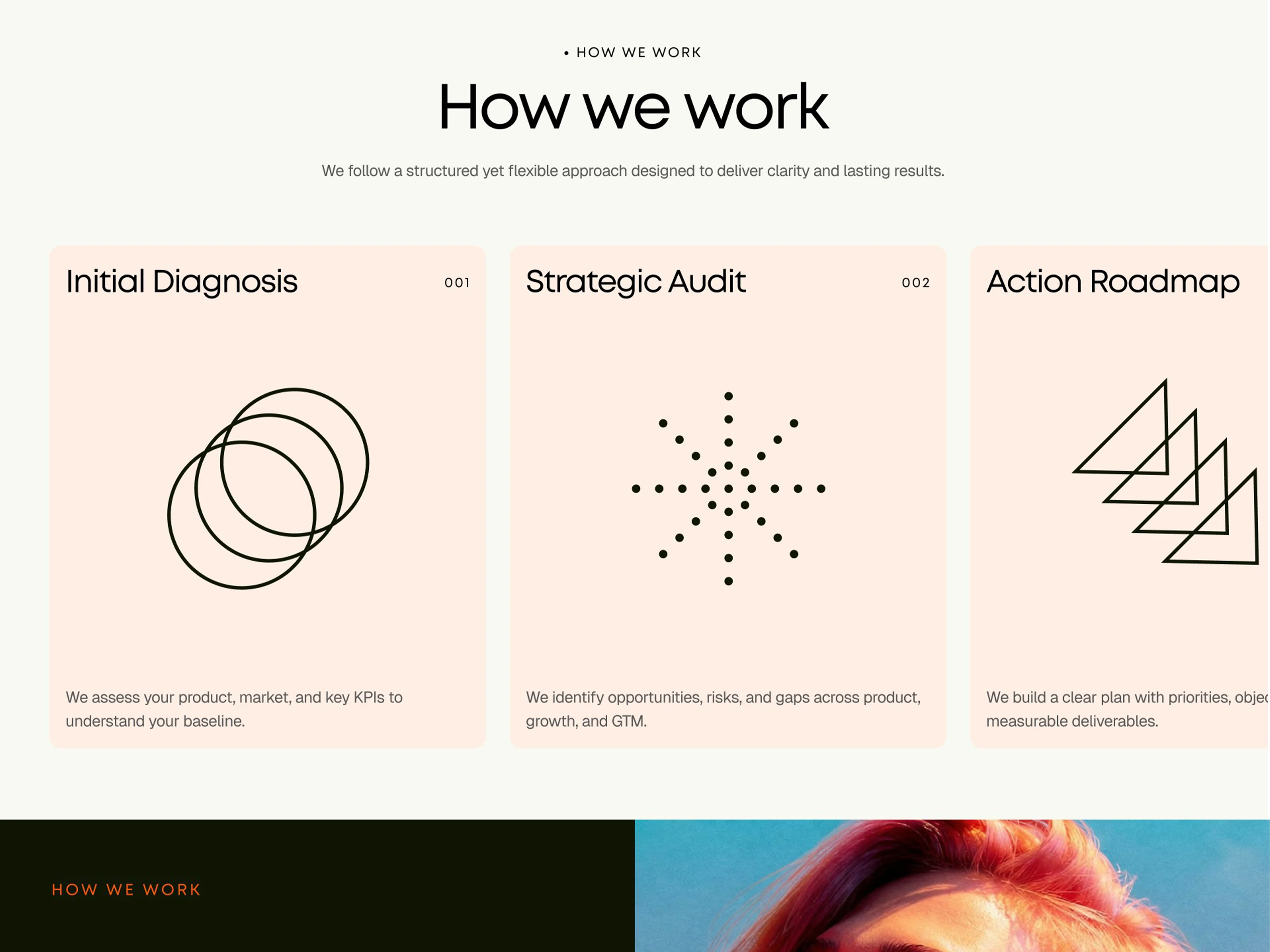
A "How we work" section that shows the method. Three cards for Initial Diagnosis, Strategic Audit, and Action Roadmap each pair a numbered label with a simple line illustration (overlapping rings, a radiating dot burst, stacked triangles) and one plain sentence. The cards scroll sideways, so the process reads like a journey.
A full-screen spotlight on step one. A split section pairs a large portrait with the "Initial Diagnosis" title, giving the first step of the method its own moment and breaking up the page with a dramatic change of scale.
Testimonial with a human face. A large centered quote sits on cream with a name, role, and simple arrow controls. It keeps proof close to the pricing, where visitors are weighing a decision.
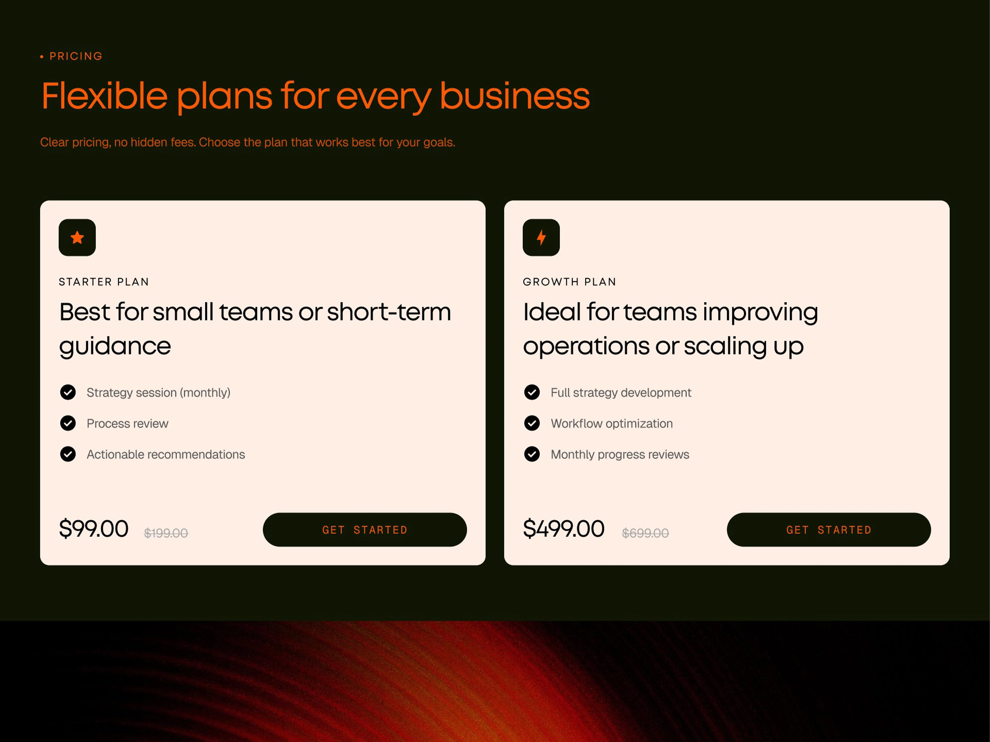
Transparent pricing. Two plans, Starter ($99) and Growth ($499), sit side by side with their original prices crossed out. Each card lists three clear features and one button. "Clear pricing, no hidden fees" is a promise the layout keeps.
A closing CTA that echoes the hero. "Ready to elevate your business?" returns to the same two buttons over a glowing concentric-ring graphic, so the page ends with the same clear choice it began with.
A footer that carries the brand. Organized link columns, contact details, and social icons sit above an oversized, cropped VELTRIX wordmark that gives the page a confident final signature.
Outcome
The site launched, giving Veltrix a distinctive identity in a crowded category and a clear path from first visit to booked call.
What I'd Highlight
The main lesson was that a trust-driven business doesn't need to look like everyone else to feel credible. Warm color, human photography, and plain language made Veltrix feel approachable without losing authority.
Showing the method and the pricing openly did more for credibility than any claim could. Once visitors could see how Veltrix works and what it costs, the copy could stay short, and every section moved them closer to Book a Call.
Like this project
Posted Nov 1, 2026
Designed and built a website that makes fintech consulting feel clear, warm, and trustworthy to startup founders, now driving discovery calls for Veltrix