Voixe Music Streaming Website Design and Development

Al-Ameen Tijani


Voixe: Website Design for an AI-Driven Music Streaming Beta
Role: Sole designer and developer (art direction, UI/UX, Figma prototyping, full Framer build)
Timeline: 4 weeks
Tools: Figma, Framer
Overview
Voixe is an AI-driven music streaming service that breaks free from the constraints of traditional genres. Listeners can analyze songs, modify them, and morph tracks across 70+ genres, all while staying connected to the platforms they already use. I designed and built the launch website that introduces Voixe and drives visitors to join the beta.
The Challenge
Voixe's idea is easy to feel and hard to explain: music that changes shape around you. The site had to make that idea land in a few seconds.
It could read as just another streaming app. Deezer, Spotify, Apple Music, and Tidal already own the category. Voixe's real difference is that songs aren't fixed. You can analyze and modify them, and that had to lead, not hide behind a feature list.
The audience expects energy, not explanation. Music-first audiences judge a brand by how it looks and moves. A clean, corporate SaaS layout would have felt like the opposite of the product.
One goal, one action. Voixe was in beta, so every section had to support a single conversion: Join Beta.

Process
I started from the brand's central idea, morphing, and asked how a static page could feel like it was shifting under you. Three decisions shaped the direction.
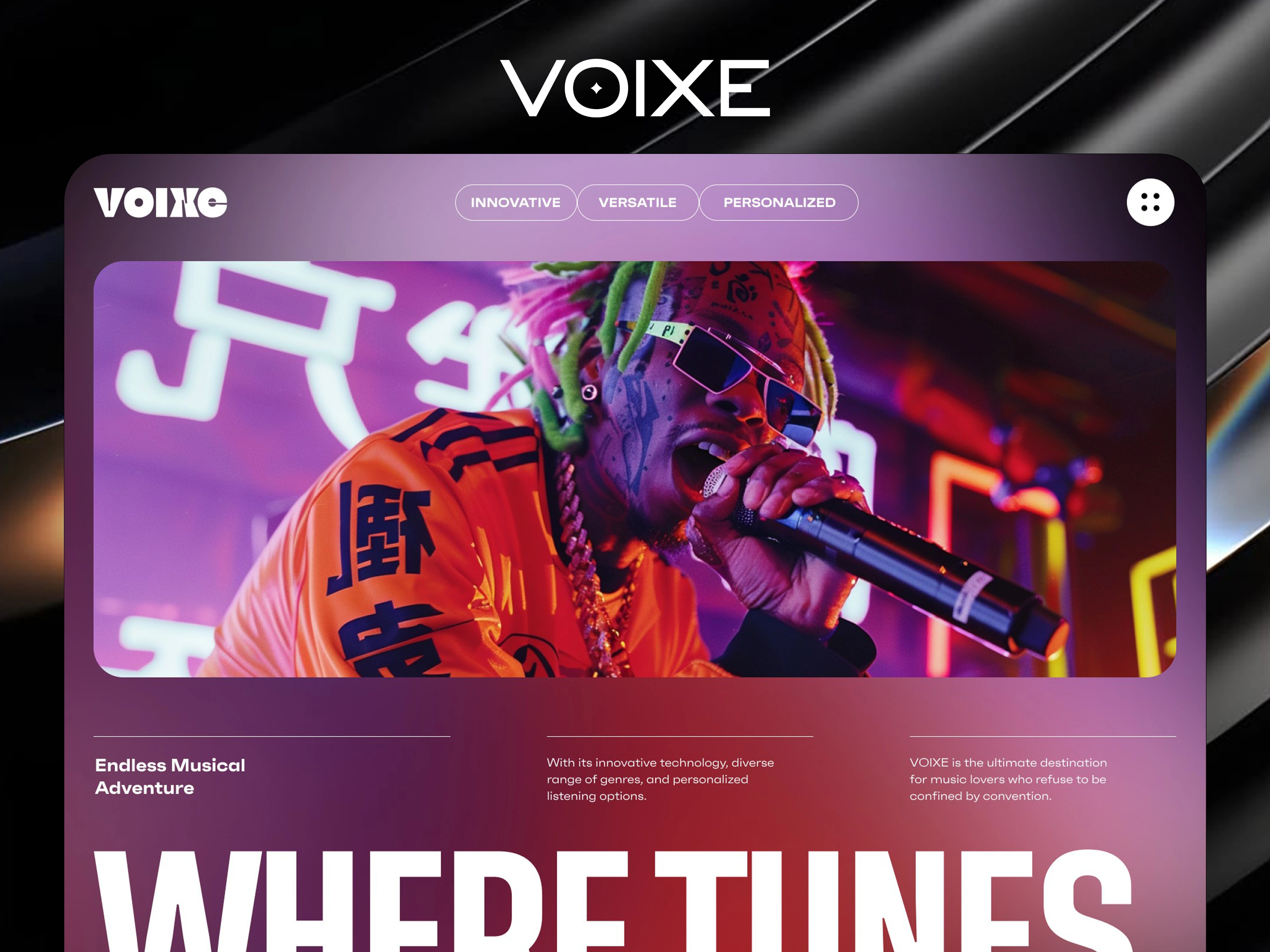
A gradient canvas that behaves like sound. Instead of flat backgrounds, I used soft, blurred color fields that drift from deep black into violet, magenta, orange, and electric blue. The page changes color as you scroll, the way a track changes mood, and each chapter gets its own atmosphere without hard section breaks.
Typography at poster scale. I paired ultra-condensed, heavy display type with small, quiet supporting copy. Headlines like "Where Tunes Morphs," "Exploring," and "Join Beta" are sized to dominate the screen, while body text stays minimal. The scale contrast gives the page its rhythm and makes the brand voice feel loud and confident.
Photography that feels like the music. I chose saturated, neon-lit portraits of fashion-forward, genre-fluid artists over generic stock imagery. The rounded image cards sit on the gradients like album art, so the audience sees themselves in the product.
The Solution
A hero that states the promise. "Where Tunes Morphs" opens the page over a full-width performer image, with three short descriptors (Innovative, Versatile, Personalized) and one primary CTA, Join Beta, within thumb reach.
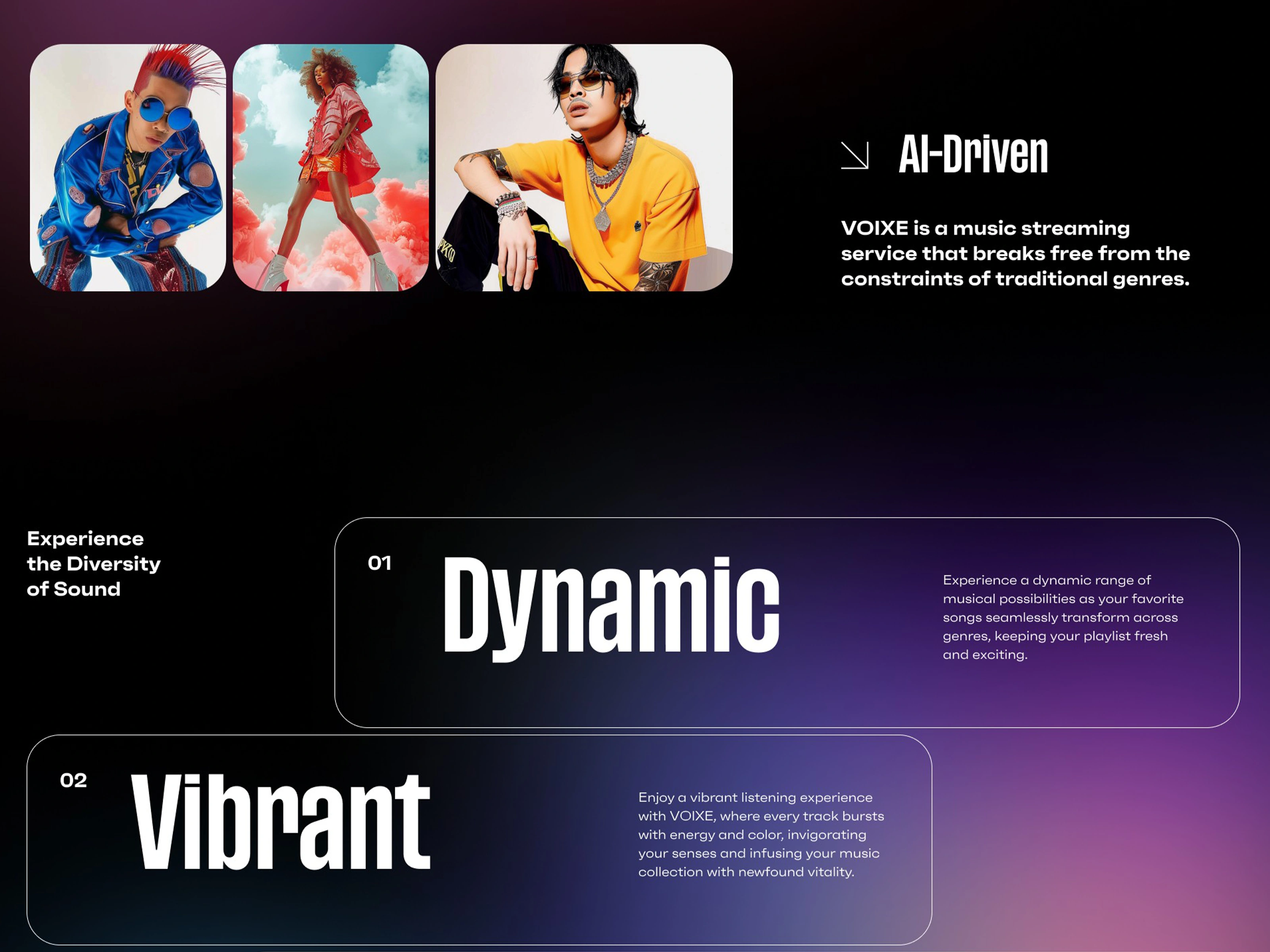
A clear positioning line. Right after the hero, "AI-Driven" sets Voixe apart in one line: a music streaming service that breaks free from the constraints of traditional genres.
Three words that carry the experience. The "Experience the Diversity of Sound" section introduces Dynamic, Vibrant, and Flexible as staggered, numbered cards, each with a single short sentence. The cards alternate between dark glass and solid white, which breaks the rhythm and keeps the scroll lively.
A feature moment with a single focus. "Analyze & Modify Selected Songs" gets its own section with a portrait, supporting imagery, and filter tags for Streaming, Playlists, and Genres. It shows the core product action without a long explanation.
A full-bleed "Exploring" statement. An oversized word that bleeds off both edges of the screen creates a pause between feature and proof, and a deliberate change of pace.
Proof in three numbers. Stat cards for 100M songs in the library, 25M tracks morphed per day, and 70+ genres available back the concept with scale at a glance, each with a small icon accent.
A human testimonial. A large pull-quote, "It's like having a DJ in my pocket, customizing my playlist to match my mood perfectly," sits beneath a full-width image. It translates the technology into a feeling.
Works with the platforms people already use. A clean logo row (Deezer, Spotify, Apple Music, SoundCloud, YouTube Music, Tidal, KKBOX, Amazon Music) answers the obvious objection, "Do I have to leave my library?", before it's asked.
A closing CTA that mirrors the opening. "Join Beta" appears at full width over a final gradient, with the tagline "Experience the Diversity of Sound" and an arrow pointing the way. The page ends where it started, with one clear action.
A structured footer. Organized columns for About Us, Projects, Members, and Platform keep the site navigable without competing with the main story.
What I'd Highlight
The main lesson was that the brand idea should shape the page itself. Because Voixe is about morphing, the site had to feel like it was morphing too. Shifting gradients, huge type, and contrasting card styles do that work better than any paragraph of copy.
Keeping the words short and the CTA singular made the experience faster to understand and easier to act on. Every section earns its place by moving the visitor one step closer to Join Beta.
Like this project
Posted Nov 1, 2026
Designed and built a launch site that makes AI-driven music morphing feel instantly exciting to genre-fluid listeners, now driving sign-ups for the Voixe beta
Likes
2
Views
2
Timeline
Feb 5, 2025 - Mar 7, 2025