LUBA TULI packaging design

Klaudia Czermak


ABOUT THE BRAND
Luba is a Polish manufacturer of wet wipes and cosmetic. The brand has introduced a new care series for children and infants from one month old. The brand encourages parents to switch from ordinary care to care that will become a daily ritual, aiming to increase family bonds between children and parents.
ABOUT THE PROJECT
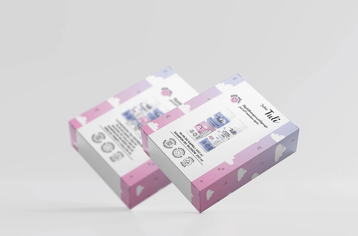
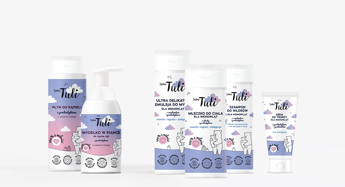
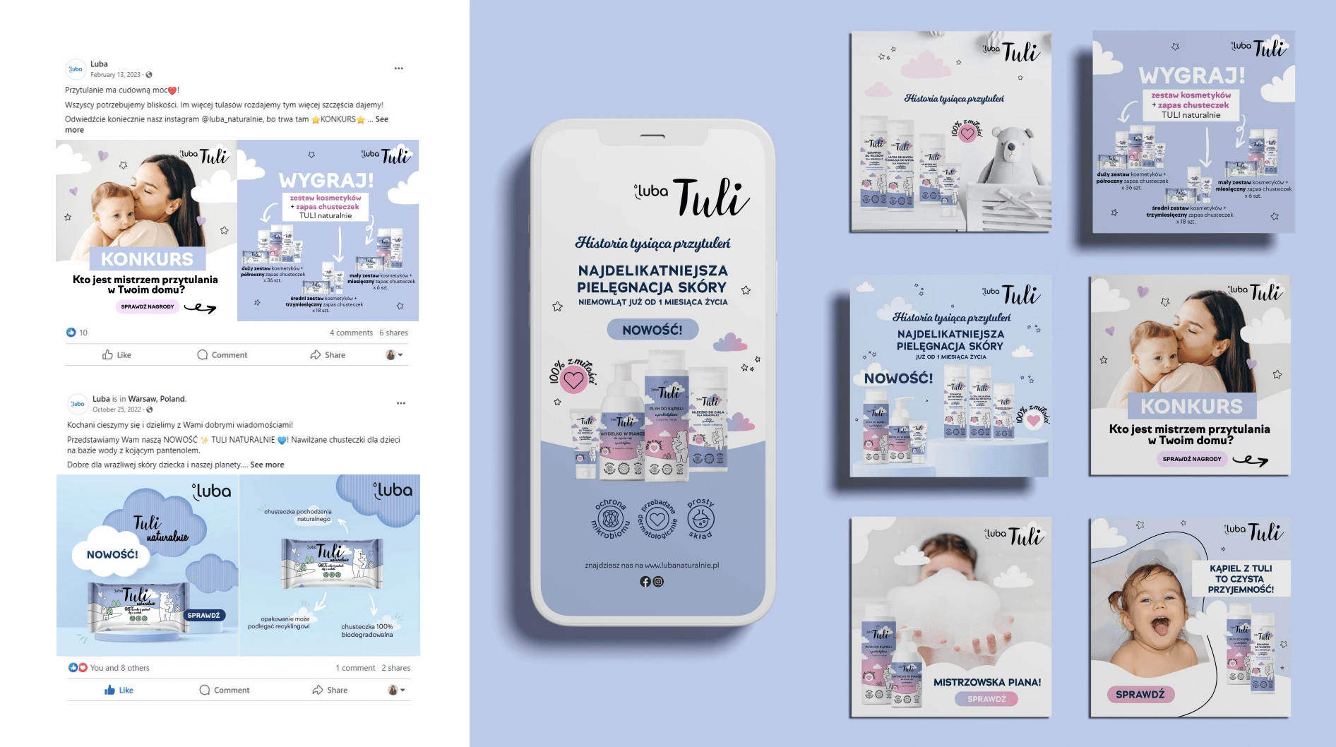
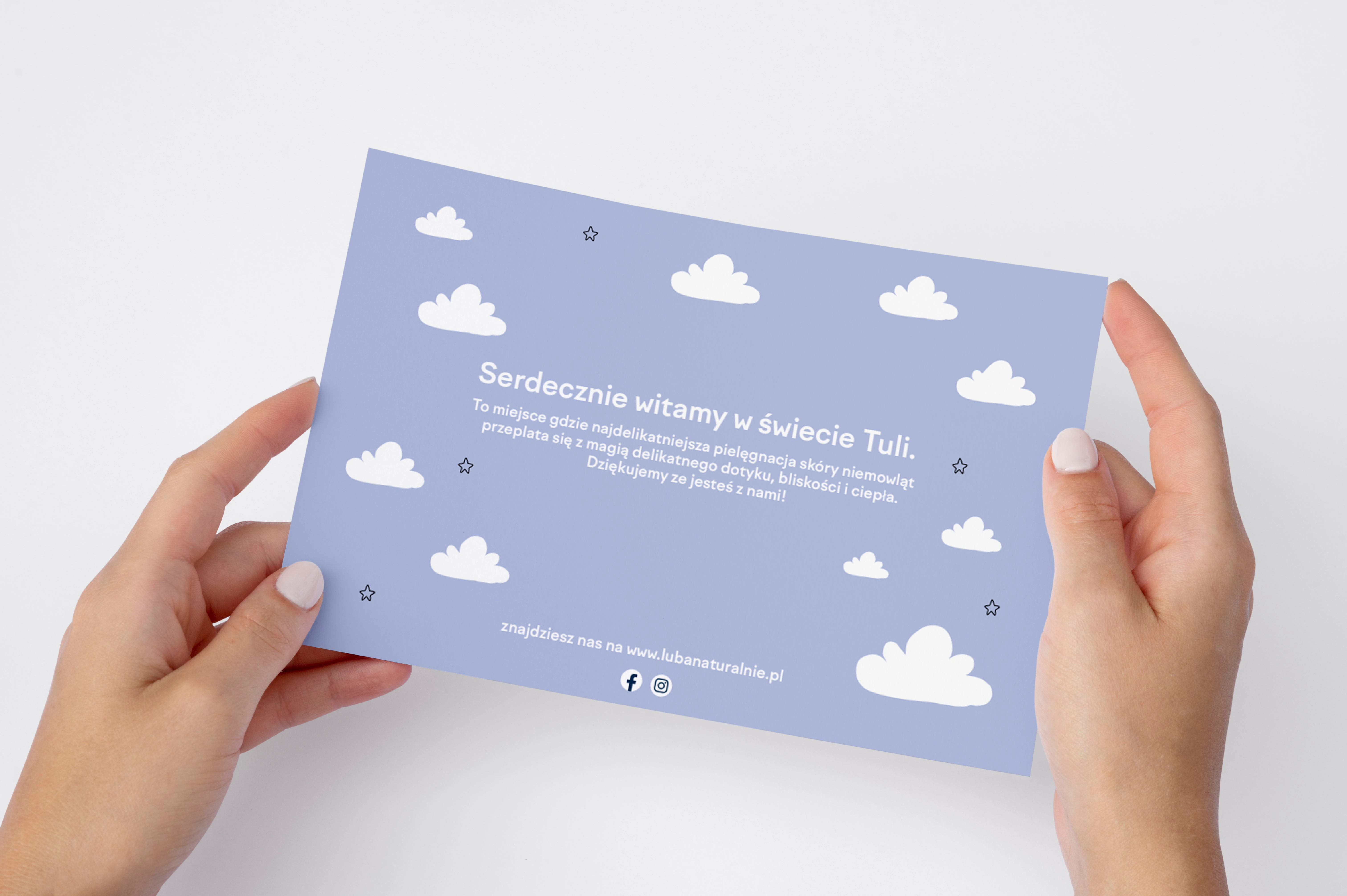
The project includes packaging designs and advertising materials for the new care series for infants and children. The aim of the project was to give the packaging a friendly and charming atmosphere while standing out on the shelf among other competitive brands. The design combines illustrations with simple, minimalist typography. The addition of a bold gradient, hand-drawn stars, and clouds aimed to give the packaging a sense of lightness and distinctiveness. The packaging fronts with the brand's distinctive bear contain product information. Luba Tuli has already used bear illustrations in their communication, so they were not changed, allowing customers to recognize the Luba Tuli series. The packaging was divided into two color groups to differentiate products for infants from those for children. The modern and aesthetic design makes the product stand out from the most commonly purchased brands.
SCOPE OF WORK
packaging design for the new line of cosmetics for infants and children from one month old
packaging sets design with a belly band
social media posts
roll-up


Like this project
Posted Feb 13, 2024
The project includes packaging designs and advertising materials for the new care series for infants and children.
Likes
0
Views
17
Clients
Luba


