Houda Yasmine Hammamet Landing Page Redesign

Yunus Adebayo


Navigation links

Hotel Landing Page Redesign
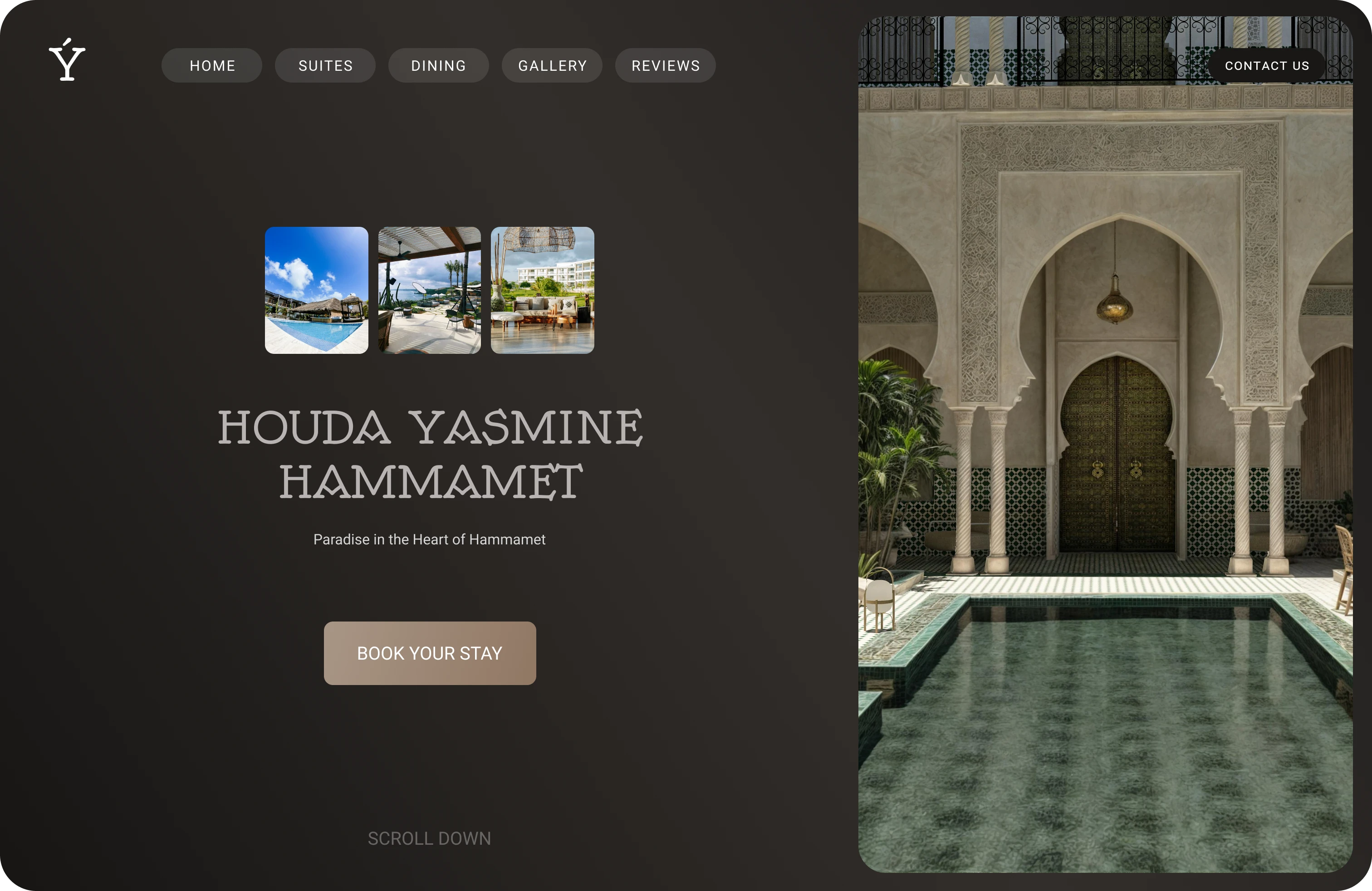
I redesigned the Houda Yasmine Hammamet landing page because the original experience did not clearly push users toward booking.
The main issue was the hero section. There was no obvious next step, and the page did not immediately communicate the feeling of the hotel.
I rebuilt the layout around one clear action: Book your stay.
The hero is intentionally simple. Strong imagery on the right to set the mood. Minimal UI on the left so the image can breathe. The headline establishes the brand, and the CTA is placed where your eye naturally lands.
I avoided clutter and secondary actions. The goal was to reduce friction and make the decision to book feel easy.
This redesign focuses on clarity, atmosphere, and conversion. No distractions. Just a calm, premium first impression that leads users straight to the booking flow.
What I worked on
Landing page redesign
Hero section layout
CTA placement and hierarchy
Like this project
Posted Dec 31, 2025
Redesigned Houda Yasmine Hammamet landing page for better bookings.
Likes
0
Views
0