So You're Sole Searching?
UI UX Design and Research Case Study:
A shoe store's push to optimize their e-commerce site
Overview
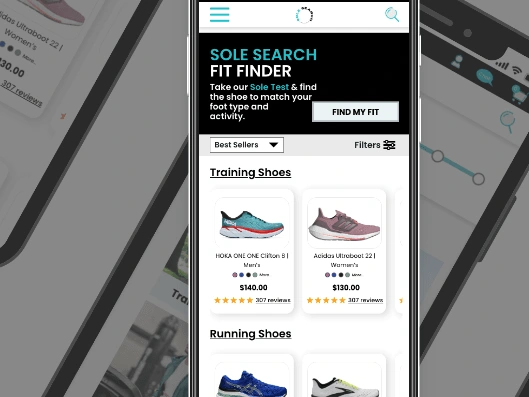
Running is considered an impact activity and finding the right running shoe is crucial to any runner's performance and recovery--at any experience level. Using the 5 phases of the design thinking process(research, analysis, ideation, prototyping, and testing), I created a running footwear e-commerce site, Sole Search.
The Challenge
Newbie and intermediate runners desire simplicity, knowledge, results, and convenience when online shopping for the best fitting running shoes.
The Solution
I'm trying to answer the question of what would be an ideal shoe e-commerce site for people that want to get a personalized approach to shoe buying without the need to head into their local department or big-box retail store.
Sole Search offers a personalized shopping experience with interactive product information, simple customer service accessibility, and an easy checkout process.
The project
This is an independent conceptual project done for practice and will not implemented.
Project Duration: April 2022 - May 2022, 5 weeks
Role: Everything lol
User & market research
Research analysis
Usability testing
Information architecture
Ideation
Prototyping
Tools : Adobe XD, Miro, Zoom, Google Forms, InVision
Introduction
LOOKING FOR RUNNING SHOES, I often overthink my decisions and spend so much time reading reviews and checking out product descriptions. And even after all of my thumb-scrolling research, my shopping frustration can lead to procrastinating on a purchase or forgetting about it until I'm out and about shopping. Why is shopping for running shoes online such a headache?
There Must Be Something There
After scouring the internet and browsing through some of my favorite sporting sites, I thought there was something missing in the online footwear world. Most of the options I came across were either too narrow in selections, to focused on pushing brand-affiliate popular items, or just broadly showcasing "you name it we have it" shoes, without providing true personalization to meet my needs.
Problem Statement
Let's Dive In
Going to my local specialty store, I received valuable feedback from staffers that actually run. My shoe recommendations were based on a gait analysis (a free assessment that tells you about your arch, pronation, and width) and this information pointed me to shoes that truly met my training needs. Although I did embrace the expertise, I'm also a millennial whose spending habits fall into the bins of convenience and comfort. Being tech-savvy, I tend to prefer online shopping.
I started brainstorming the elements of a perfect e-commerce shopping experience.
What makes online shopping successful? What functionalities are must-haves for shoppers? What are some other needs, interests, and issues that can arise when shopping for a new pair of shoes online? Especially running shoes.
Here's where my research began.
Problem Statement
Newbie and intermediate runners are frustrated with online shopping for the best fitting shoe because site aren't as personalized to their needs and there are difficulties they experience when determining whether a product is suitable for them. From the secondary research, user research findings, and customer pain points, I defined the problem questions:
How Might We...
Make online shoe shopping interesting for new and experienced runners?
Help online shoppers eliminate sizing guess work and increase their purchase confidence?
Make users feel confident they have all the information they need during checkout and after completing their purchase.
What's Out There Already?
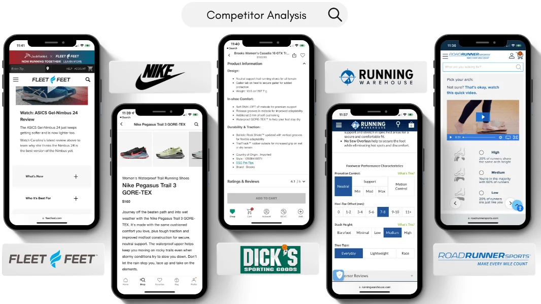
To get a holistic view of the market, a competitor analysis of 5 footwear-searching mobile stores and apps revealed that:
Most do not feature or sort products by foot type and the ones that do are poorly designed
Most do not feature a buy now option on product pages
Most do not provide information on the foot type or shoe type in product descriptions
Key features that I found from my competitor analysis included:
E-mail sign-up banners while user is on a product page
Having option to complete checkout as a guest
Organizing the checkout process so that users enters payment information after confirming their order details
Having a follow-up email to address purchase confirmations, favorited items, and items left in shopping cart.
Overall, the sites from my research were well-designed. However, with a lack a running shoe personalized shopping. followed with quick checkout option for users, this further emphasized the opportunity for a platform like Sole Search to exist.
The Making of "Sole Search"
Because I am a millennial and 67% of Millennials prefer to shop online rather than in-store, this site will target users aged 20-40 and the deliverable will be a mobile-optimized e-commerce website.
I conducted5 video user interviews, each with 16 already formatted questions, in order to obtain rich, qualitative data to understand users’ experiences with searching for new shoes. Participants included:
2 men and 3 women
Ages 28-36
Workout and/or run at least 2x a week
Frequently online shop (at least once a week)
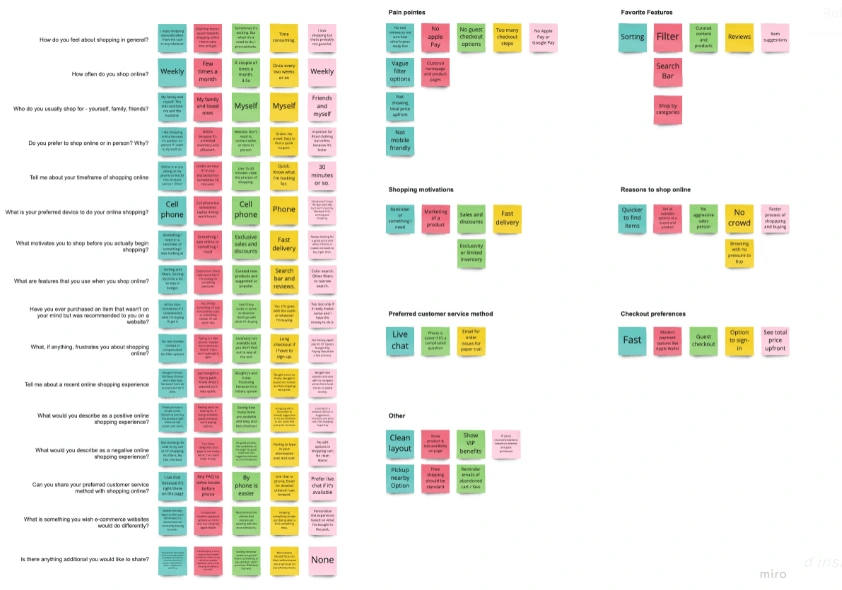
Affinity mapping was used to organize key information, phrases, quotes, and sentiments from the interviews and extract key themes between users. I revisited the map over the course of a few days, which helped to refine and clarify the themes to reflect more accurate findings.
Insights from participants included:
"Online shopping eliminates the passive aggressive salesperson that's constantly in your face in the store. I want to find my shoe, quickly, see options, and buy."
"Too many checkout steps and I'll get frustrated and just look elsewhere for the shoe."
"Having more information about who the shoe would be perfect for would help when I'm shopping for a different activity, like cross-training or trails."
Research and Users
So, who would use "Sole Search"?
The accumulation of the user research and key findings led to the creation of 2 user personas. I wanted to stick to Alexis for the primary user persona but I didn't want to exclude highlight my secondary user persona as I could see similarities of Eddie's wants and needs from my initial user interviews. Overall, the personas are a direct reflection of the collected data and showcase different types of users and their goals, frustrations, motivations, behaviors and personality. So although I stuck with Alexis moving forward as my ideal user, I did recognize that another audience--outside of my target running user--could also utilize Sole Search.
Primary User Persona
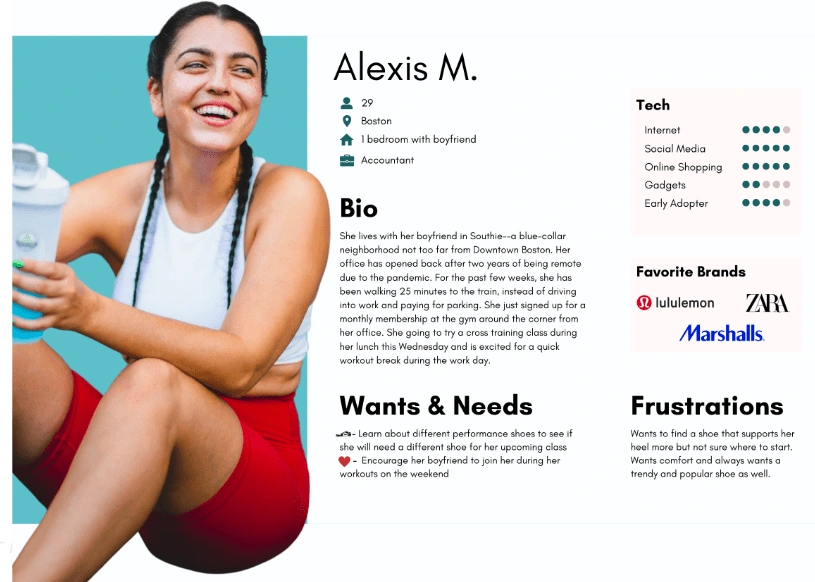
Alexis just started running more during the week and just signed up for her first 10k in a couple of months. She initially went in to a store for a running assessment and now she's struggling to find a shoe to match her needs, style, and price. Her main goal with shopping online is finding a good running shoe based on her foot type to support her during her training.
Secondary User Persona
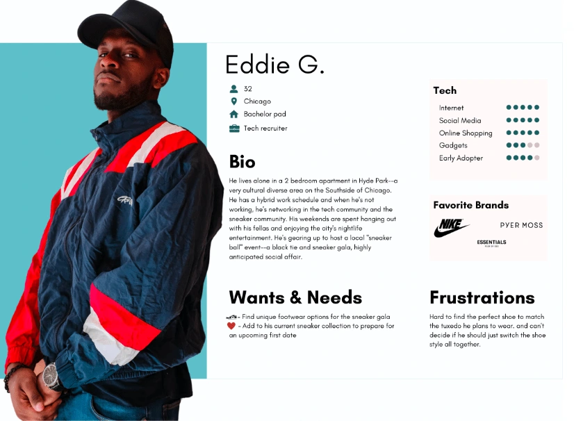
Eddie is looking a shoes--not necessarily specific to running--and color ways and shipping are important to him. He needs the perfect shoe to arrive as quickly as possible for an upcoming sneaker event. Eddie's main goal is to find a comfortable, stylish shoe in a color scheme that will complement his red and navy outfit.
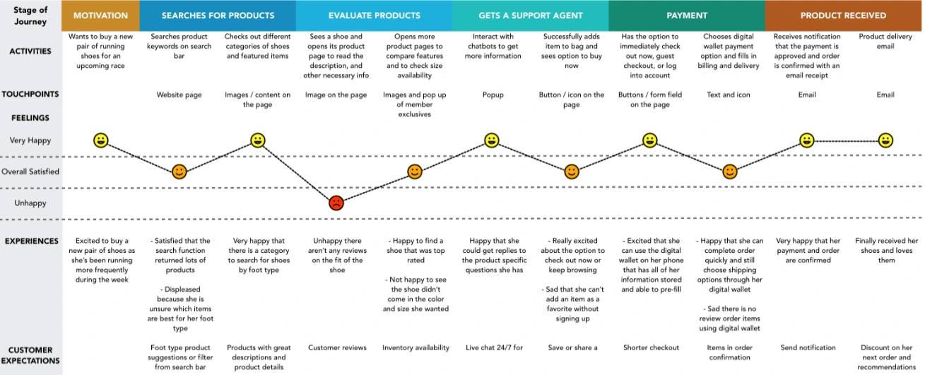
Alexis' Customer Journey
Alexis starts off excited to search for a pair of new running shoes. Who wouldn't be? But on some sites she sees too many products and on others she can't filter or find ones that match the type of shoe style she is looking for. She finally finds one based on reading a few product reviews and is excited that she can use her digital wallet for a quick guest checkout. Alexis receives her shoes in 3 days and a discount code for her next purchase.
Information Architecture
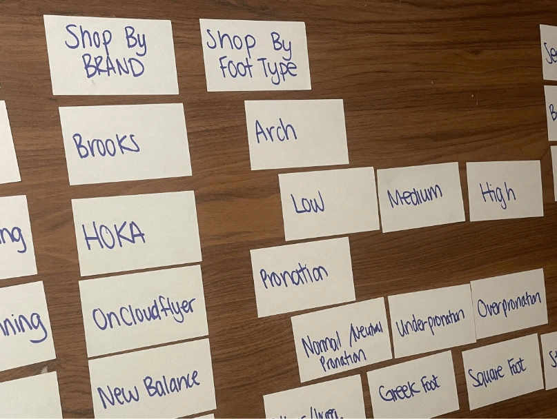
Card Sorting
Card sorting is commonly used for new information architectures and organizing products on a site. I decided to utilize actual cards in my session to help design the right categories for Sole Search. I had 2 participants organize topics into categories that make sense to them and grouped them accordingly.
It was really interesting for me to understand that most participants:
Thought that some of the categories I created were excessive and cluttering
Thought some of the categories would be more effective and efficient as search and filter options and not categories and subcategories
Desired to keep the site simple with payment options that are familiar to them like debit/credit card, gift card, Apple Pay, and installment payment services
What I wish I had done differently here is utilize an online card sorting tool like Optimal Workshop and host an open card sort to really see the website architect from the user's eyes and create organic categories. Plus, I could've shared the link to more participants to add to my efforts of generating a more efficient main navigation menu from my users' perspective.
Site Map
Once the key website content was organized during card sorting, I continued to create a detailed sitemap to serve as the guidance to design Sole Search's main pages.
Creating a sitemap was an important step in the planning process for me before my design work began. This was my first e-commerce site project, so I knew it was important for many reasons. For users, my sitemap holds value by guiding them through my site (behind the scene work), helping match my users' shopping needs to my products with ease.
For a business, sitemaps are crucial because they help search engines like Google understand the pages, products, and services of my website to display in search results.
I said all of this to say, constructing my sitemap was essential for user needs and business goals.
Storyboarding
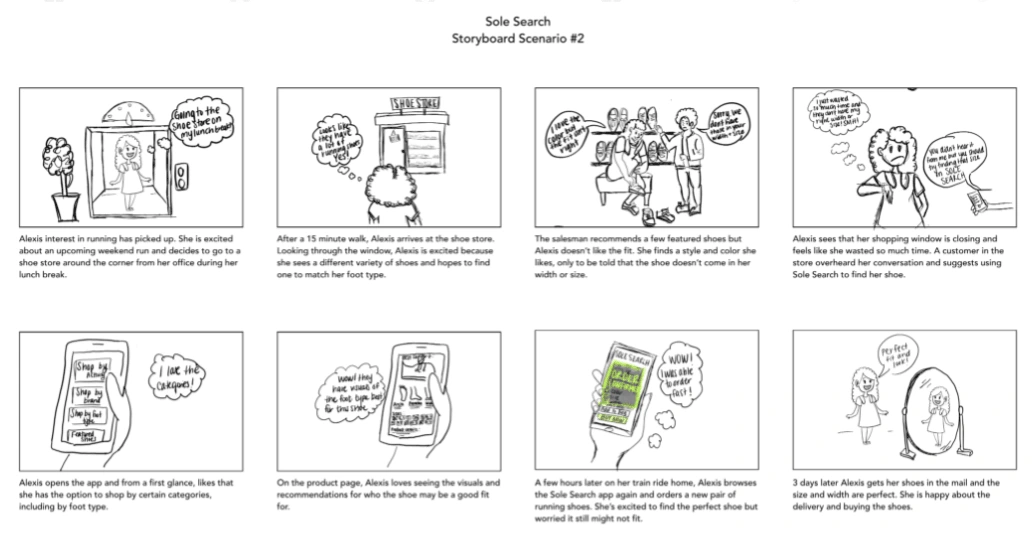
After creating my site map, my next step was to go to the drawing boards--literally. I brainstormed some scenarios and narrowed down to to the most believable, realistic, entertaining, and empathetic. I finalized on the one you see above and started illustrating it into a storyboard for better clarity on how a user would stumble upon Sole Search and utilize the site to buy a pair of shoes.
Since Alexis is an eager new runner, I thought a scenario in which she was annoyed by the lack of shoe sizes and color-ways at a store would be very relatable for users. Although she appreciated the in-person running expertise, Alexis wasn't happy about not finding the shoes she wanted. In the end, she would feel inclined to browse Sole Search for a fast and convenient way to shop running shoes that felt good and looked good.
User Flow
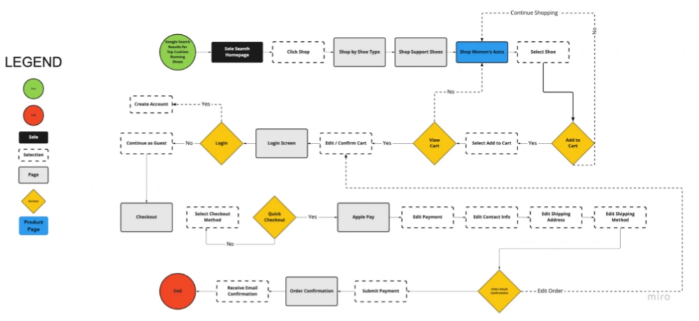
My next step was piggybacking off of my storyboard and creating a path for the task of search for a product and checking out.
Creating my user flow helped me detail the steps that I would've missed without writing it out and putting visuals to it. Many steps when shopping come natural to me--search, find, buy--because my brain is on auto-pilot when checking out online. But what about the processes and actions in between that? For instance, Alexis was ready to checkout and although I knew the steps in my head, it skipped my mind about adding the prompt to head to checkout/view cart or continue shopping.
What I really try keep top of mind when creating user flows and structuring the site's content is truly remembering that I'm designing my product with the user in mind and not for myself.
With what I learned from both the storyboard and user flow, I applied this knowledge to further the UX design for
Sole Search. Cheers to the creative part approaching!
Prototyping
Sole Search's MVP (Minimum Viable Product)
You would think the minimum in MVP, would imply that I'd be doing the minimum at this phase, but that's not even close to the truth. Since the MVP is the most efficient and effective way to get a product out to my target users, Sole Search's MVP has to include not only core features but also the other added values that that make it desirable and stand out from the competition.
My goal was to create an online shoe store highlighting the importance of finding the right fitting shoe for runners, while making the user's shopping experience a convenient and delightful one. Therefore, my MVP cannot just be another shoe store that pushes top-selling brands, but provide online shoppers personalize and the same feedback as if they were trying shoes on with a sales rep at a store.
The MVP also means that for each feature, I wouldn't be doing full fetch development, but cherry picking the necessary core elements. So the must have features, in the simplest version of Sole Search's design included:
An onboarding fitting test to suggest personalized shoe options
The ability for users to shop for running shoes based on their foot type
Incentive for users to subscribe to the site's email list
Detailed product descriptions and benefits on product pages
Digital wallet payment options for a faster guest checkout process
Prototyping
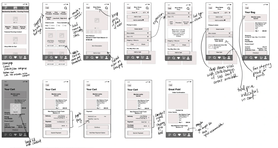
This is where the fun begins. I started to create iterations of hand-drawn sketches before diving into wire-framing and prototyping. I enjoy sketching as the first step in designing to keep me from getting too far in the weeds with details. Then translating my sketches into mid-fidelity wireframes were my next step so that I could focus on the concept of Sole Search without the colors and style that could potentially influence my users. My mid-fidelity wireframes were a basic layout and visual hierarchy of the UI design.
I explored the layout of the homepage, product search, product page, navigation bars, and checkout process on the mobile site. I also kept this iteration less detailed to minimize investing time into a design before getting users' input.
At the end of the day, I may think the design I have in mind is the best design since same-sized bicycle tires, but the design is for the user to test and what words for them. Not Jenny.
Mid-Fidelity Wireframes Usability Testing
I conducted 2 rounds of usability testing, one to assess the mid-fidelity wireframes and another for the hi-fidelity prototype. I asked users to perform tasks that aligned with the key features such as: completing the fit test, searching for running shoes, and competing a purchase.
Major Key Findings:
User prefers the option or link to complete fit test and not an automatic step to browse and shop the site
No editing on fit test, users would like the option to go back if a mistake is made
Buttons are too close on homepage and confusing; Some buttons act like filter options
Users prefer no navigation bar at bottom since the site is online and not an app
A favorites button/section on the bottom navigation bar is redundant and perhaps can be added to cart under "Saved for Later" or "Wishlist"
A static chat box to offer help on product searches and product pages
Branding
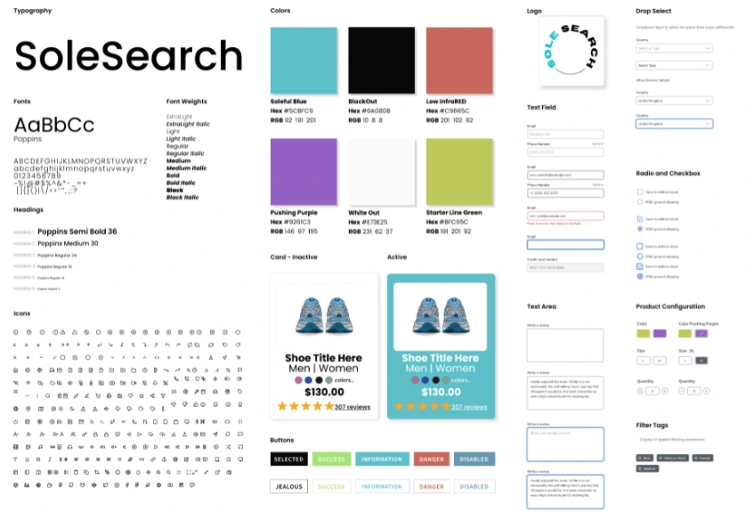
Before moving into high-fidelity wireframes, I took in the feedback from my round 1 usability testing and findings, created branding guidelines to make sure Sole Search is cohesive and targets my main users. I gathered imagery for a mood board before brainstorming Sole Search's colors and logo in order to communicate the feeling of credibility, trust and communication .
From there, I completed the font, product cards, text areas, and product configuration items and then utilized pre-existing icons and text fields from online UI kits to save time on other buttons and checkboxes.
High Fidelity Prototype
For the final round of usability testing, I wanted to be as concise and clear as possible with the user scenario and tasks. The detailed methodology and script can be found here. Overall tasks included:
You’ve just landed on Sole Search’s homepage from a Google search. Tell me what you think the site is for.
Complete the Sole Search Fit Test
Search for women's running shoes
Filter search results
Add items to cart
Checkout and complete your purchase using Apple Pay
Findings and Recommendations
I was happy to hear user feedback from the final round of usability testing with the high-fidelity prototype was not as critical as the first round. There were tweaks that users wished were different, including adding a "see more" link on the homepage to view products in each section, adding the Sole VIP banner on the homepage to encourage user sign-up early on, sharing more from experts on the importance of finding the right fit, and other add-ons that I found exciting and wish I had the time to design!
Reflection
Overall, I really enjoyed this project because it really made me put on my UX research hat. Designing e-commerce sites--mobile and or desktop--isn't as simple as I thought it would be. And perhaps I didn't think it would be simple, but I thought, it would be a bit more easier since I was so familiar with my favorite online stores. But there's a lot of organization that goes on with e-commerce sites that I have a better appreciation for now. If I could do anything additional, I would've expanded more on the research and connecting one-on-one with my target audience. I'm happy to have recruited a few associates and friends to participate in my user interviews and usability testing--all ideal users of Sole Search--but perhaps even connecting with runners on my runs (in the most non-awkward way, lol) to ask for their opinions on the ideal online shoe store.
I also wanted to stay within my 5-week timeline restraints (a timeframe that I gave myself) and not spend too much time on one thing. There's always something to enhance or to do at the end so I wanted to make sure I "closed the book" on Sole Search after my second round of usability testing. But maybe in spare time I would like to make a few changes from my findings after a couple of more projects under my belt to rate my own design progress :)
Like this project
Posted Jul 9, 2022
UI UX Design and Research Case Study: A shoe store's push to optimize their e-commerce site


