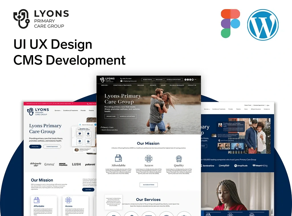
Lyons Primary Healthcare Website Design & Development
Yousuf Raza


Understanding the Human Behind the Screen: My UI/UX Philosophy
Every website I design, especially in sensitive sectors like healthcare, starts with a deep dive into understanding the user. Imagine someone searching for a new doctor or needing information about a specific health service. They're likely looking for clarity, reassurance, and easy access to vital information. My goal is to anticipate those needs and craft a digital space that feels like a friendly, knowledgeable guide.
Take, for example, a recent project for a primary healthcare provider. My process began in Figma, sketching out a user interface (UI) that was professional yet inviting. I focused on a clean, compassionate visual language, using soft tones and clear typography to build immediate trust. It's about more than just aesthetics; it's about creating a sense of calm and competence that aligns with the expectations people have for their healthcare journey. The user experience (UX) is paramount here – from the moment they arrive, patients should feel that their well-being is prioritized through thoughtful navigation and accessible information.
Bringing Designs to Life: The WordPress Development Journey
Once the design concept is refined in Figma, the magic truly begins with tailored WordPress development. This isn't about slapping together a generic template; it's about building a fully custom solution that perfectly fits the client's unique needs. For the healthcare site, this meant creating scalable content modules that allowed for easy management of services, detailed doctor profiles, and a wealth of patient resources. Think about the ease with which clinic staff can update information without needing a developer for every change – that's the power of a well-built WordPress backend.
Performance optimization is another non-negotiable aspect of my work. No one wants to wait for a slow-loading page, especially when seeking urgent health information. I meticulously optimize images, code, and server responses to ensure a smooth, fast experience for every visitor.
Designing for Everyone, Everywhere: Responsive and Accessible Websites
In today's multi-device world, a website has to look and function flawlessly whether you're viewing it on a desktop, tablet, or smartphone. My approach is always mobile-first, meaning I design for the smallest screen first and then scale up. This ensures a consistent and accessible user experience across all screen sizes. For a healthcare website, this responsiveness is crucial – patients might be looking up directions on their phone while on the go, or researching a condition from their tablet at home. My designs guarantee they'll find what they need, wherever they are.
Crafting an Aesthetic that Connects: Health-Focused Visuals
The overall aesthetic of a website plays a huge role in how it's perceived. For a healthcare provider, it's about striking a balance between minimalism and warm visuals. I aim for a polished, modern interface that avoids clutter, but also incorporates elements that promote a sense of care and professionalism. This might involve subtle use of imagery that evokes well-being, or color palettes that are calming and trustworthy. It's about creating an online environment that reflects the clinic's commitment to patient well-being, building a trusted online experience that truly connects with visitors.
Ready to Transform Your Digital Presence?
My services go beyond just pretty pictures; I focus on creating highly functional, user-centric websites that not only look great but also deliver real results. Whether you're a healthcare provider, a small business, or an e-commerce brand, I can help you craft a digital experience that resonates with your audience and achieves your goals.
Are you looking to enhance your online presence with a website that truly speaks to your audience and streamlines your operations?

Like this project
Posted May 9, 2025
Explore my UI/UX and web design journey. From Figma concepts to robust CMS development, I build stunning, user-centric websites for maximum engagement.