Built with Framer
Muve Fintech Landing Page Design

Tolulope Amao


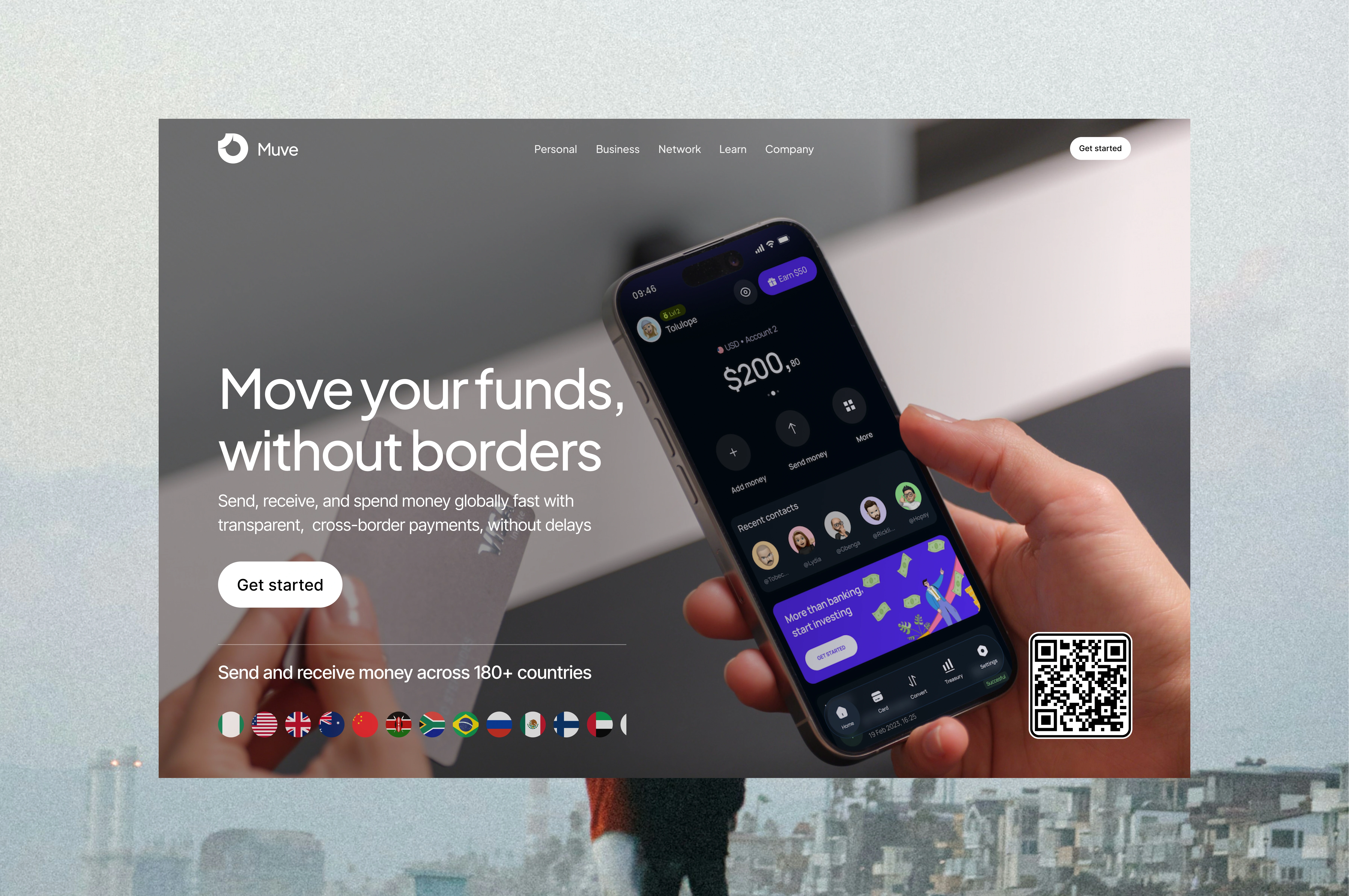
Muve — Moving Money Without Borders
A modern fintech landing page designed to make global payments feel simple, fast, and trustworthy.
Role: Product Designer / UI Designer
Industry: Fintech
Services: UX/UI Design, Web Design, Art Direction, Responsive Design
Tools: Figma, Framer
Overview
Muve is a global money movement platform designed around a simple promise: send, receive, and spend money across borders without unnecessary friction.
The challenge was to communicate the complexity of international payments through an interface that feels simple, approachable, and trustworthy.
I designed a conversion-focused landing page that combines strong product visuals, clear messaging, and a visual language inspired by modern financial products.
The Challenge
Financial products often have to explain complex services while simultaneously building trust.
For Muve, the landing page needed to quickly answer three questions:
What does Muve do?
Why should I trust it?
Why should I use it instead of another payment platform?
Rather than overwhelming users with features, I focused the experience around one clear value proposition:
Move your funds, without borders.
Design Approach
01 — Lead with the product
The hero section uses a real-world phone interaction as the primary visual anchor.
Instead of relying on abstract fintech illustrations, the product itself becomes the hero. Users can immediately see the Muve experience while the surrounding copy explains its core benefit.
This creates a direct connection between what Muve promises and what the product actually looks like.
02 — Make global feel tangible
The international nature of Muve is reinforced through the 180+ countries message and a visual row of country flags, this transforms an otherwise abstract claim into something users can immediately understand.
03 — Build trust through simplicity
The interface uses a restrained visual system with:
Minimal navigation
Large, readable typography
Strong contrast
Generous spacing
Simple CTA hierarchy
Product-focused imagery
The goal was to make the platform feel established and trustworthy without looking like a traditional bank.
Hero Experience
The hero is designed around a simple hierarchy:
Value proposition → Explanation → CTA → Proof
The headline communicates the primary benefit immediately:
“Move your funds, without borders.”
The supporting copy then clarifies the functionality, while the CTA gives users a clear next step.
The 180+ countries statement acts as an additional trust signal directly below the primary interaction.
Visual Direction
I wanted Muve to sit somewhere between traditional financial trust and modern fintech energy, the photography introduces a human element, while the dark product interface creates contrast against the softer background.
The result is a visual system that feels:
Modern · Global · Human · Secure · Premium
Outcome
The final concept creates a focused fintech landing page that communicates Muve’s value proposition within seconds.
Instead of making users understand the mechanics of international payments first, the experience starts with the outcome:
Move money globally, simply.
The design establishes a foundation that can be extended into product pages, onboarding, pricing, business solutions, and other parts of the Muve ecosystem.
My contribution
I handled the visual direction, UX structure, UI design, typography, layout, product presentation, and overall landing-page experience, translating a complex fintech proposition into a simple and conversion-focused interface.
Designed to make moving money across borders feel as effortless as sending a message.
Like this project
Posted Sep 7, 2026
A fintech landing page designed to make global money transfers feel trustworthy through bold messaging, product-led visuals, and a conversion-focused UX.
Likes
0
Views
1
Timeline
Sep 1, 2026 - Sep 6, 2026
Clients
Muve