DNA Doe Project
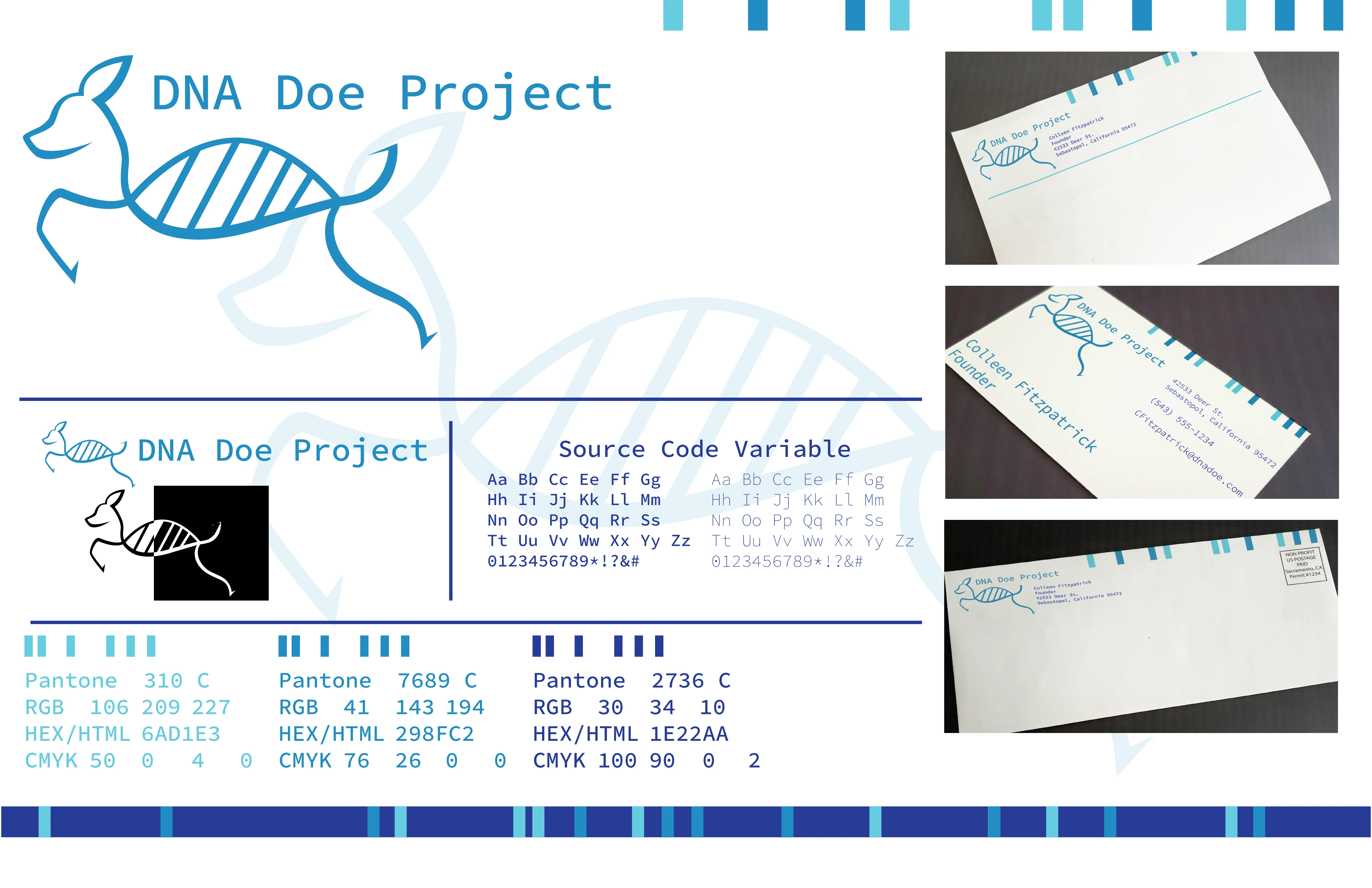
When researching for this project I made sure to approach this topic delicately. The DNA Doe Project has always been a source of respect for me due to their tireless work in order to find what they call the "Missing Missing" reunite them with their families and work to solve what exactly happened to them.
Developing this rebrand, making sure to have something respectable but also marketable in order to sell merchandise to gain funding for their cases was a challenge I was glad to face. First starting with the color palette, moving away from the stark color palette of red, black, and white was my first objective. Red and black have always been the color palette of true crime media such as shows or podcasts, often representing the violent acts that led to a person's death. The DNA Doe Project picks up after the violence or tragedy has ended, using familial genealogy to identify these persons who have not been identified in years or even decades despite law enforcement efforts. Therefore, calling for a calmer and cooler color palette seemed optimal calling for an image of the clinical calmness necessary to carry on where these cases have been left off.
The logo itself calls in the image of a doe whose body resembles a strand of DNA, a mark that could be used to represent the brand or could be used in merchandise, and brings the image of the name of the project to the viewers' memory. An effort was made to make sure the doe wasn't too round and friendly and projected a professional mature image in order to be respectful of the work of the project.

Style Guide

Brochure Outside

Brochure Inside

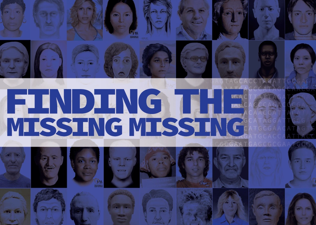
Internet Ad

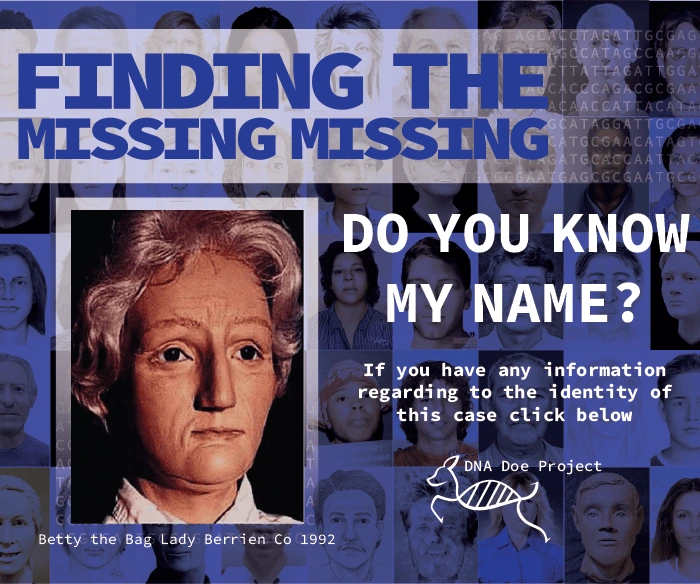
Targeted Internet AD
Like this project
Posted May 30, 2024
Rebrand of the DNA Doe Project
Likes
0
Views
6


