Built with Framer
Lumina - Calm SaaS Landing Page

Oluwatosin TheWebFramer

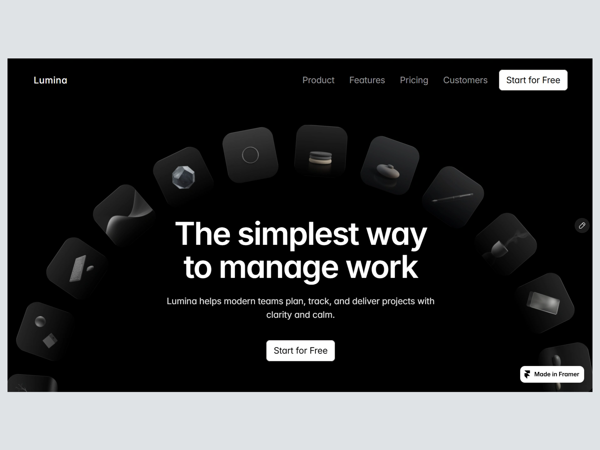
Lumina – A Calm Work Management Experience
Project Overview
Lumina is a SaaS product designed to explore a quieter, more focused approach to work management. The goal was to create a clean, elegant, and highly usable one-page experience that feels calm rather than overwhelming, something modern teams would actually enjoy using.
This project focuses on clarity, restraint, and intentional design decisions across visual direction, hierarchy, motion, and content structure.
The Challenge
Most work management tools feel noisy.
They are packed with features, competing visual elements, and constant cognitive load.
The challenge was to design a SaaS landing page that:
Communicates clarity and calm
Feels premium and trustworthy
Avoids typical SaaS visual clutter
Still converts and guides the user effectively
The Goal
Design a complete one-page website that positions Lumina as:
“The simplest way to manage work.”
The experience needed to feel intentional, modern, and refined, suitable for a high-level product piece.
Design Direction
The visual direction was inspired by a modern presentation style:
Pure black backgrounds
Generous whitespace
Restrained typography
Muted gray hierarchy
Soft warm accents
Minimal and cinematic atmosphere
The entire site follows a strict spacing, type, and color system to maintain consistency.
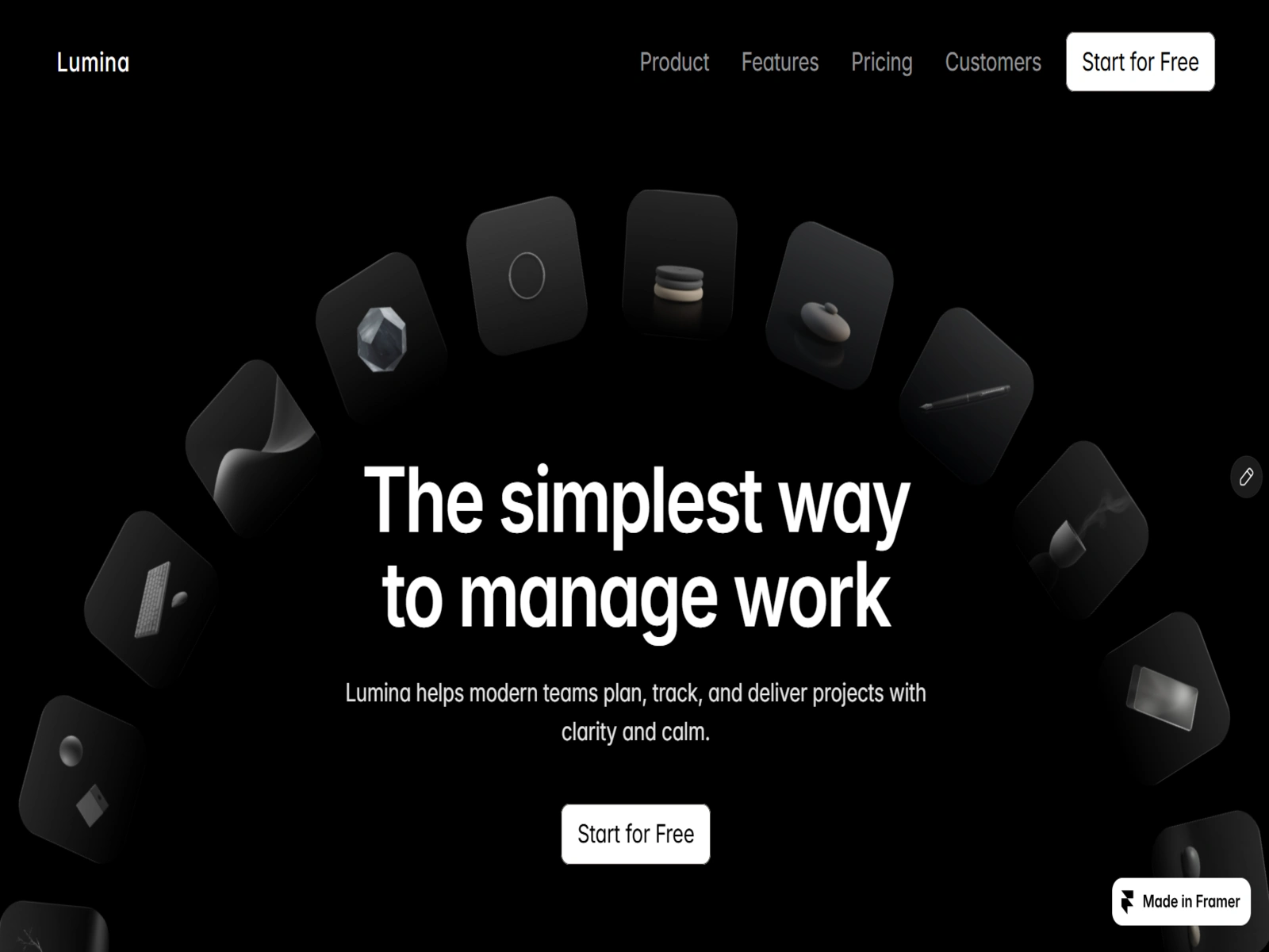
Hero Section
Information Architecture
The page follows a clear narrative flow:
Hero
Problem
Solution
Features
Social Proof
Pricing
Final CTA
Footer
Each section was designed to answer the next logical question in the user’s mind.
Key Design Decisions
Typography
A clean hierarchy was established using consistent sizing, weight, and muted secondary text to create calm readability.
Color
Pure black (#000000) as the base, with soft charcoal surfaces and muted gray text. Accents were kept extremely restrained.
Components
Cards and interactive elements were treated with soft elevation and subtle noise textures instead of heavy shadows or bright colors.
Motion
Animations were kept slow and purposeful, mainly fade-ups and gentle transitions to support the calm tone.
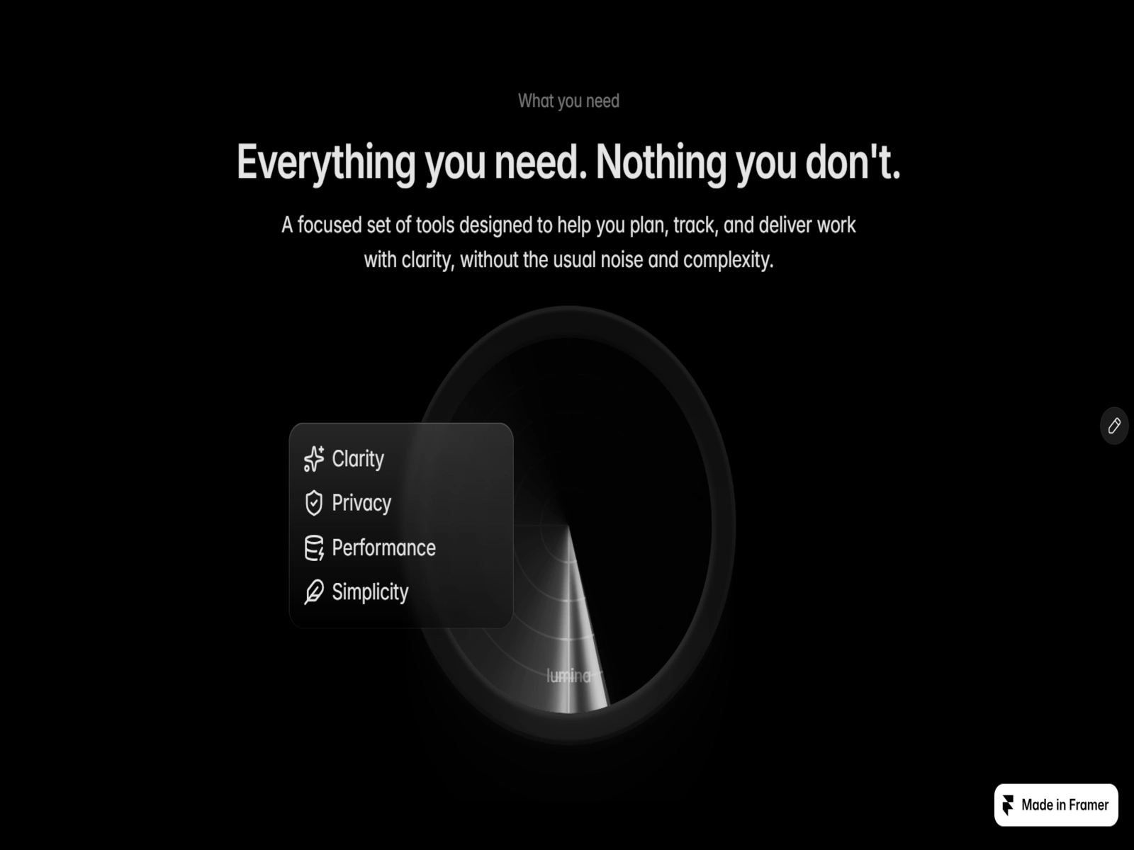
Product Showcase
A custom dashboard visual was created to demonstrate the product in use. The interface was designed to feel light, organized, and free from unnecessary UI noise.
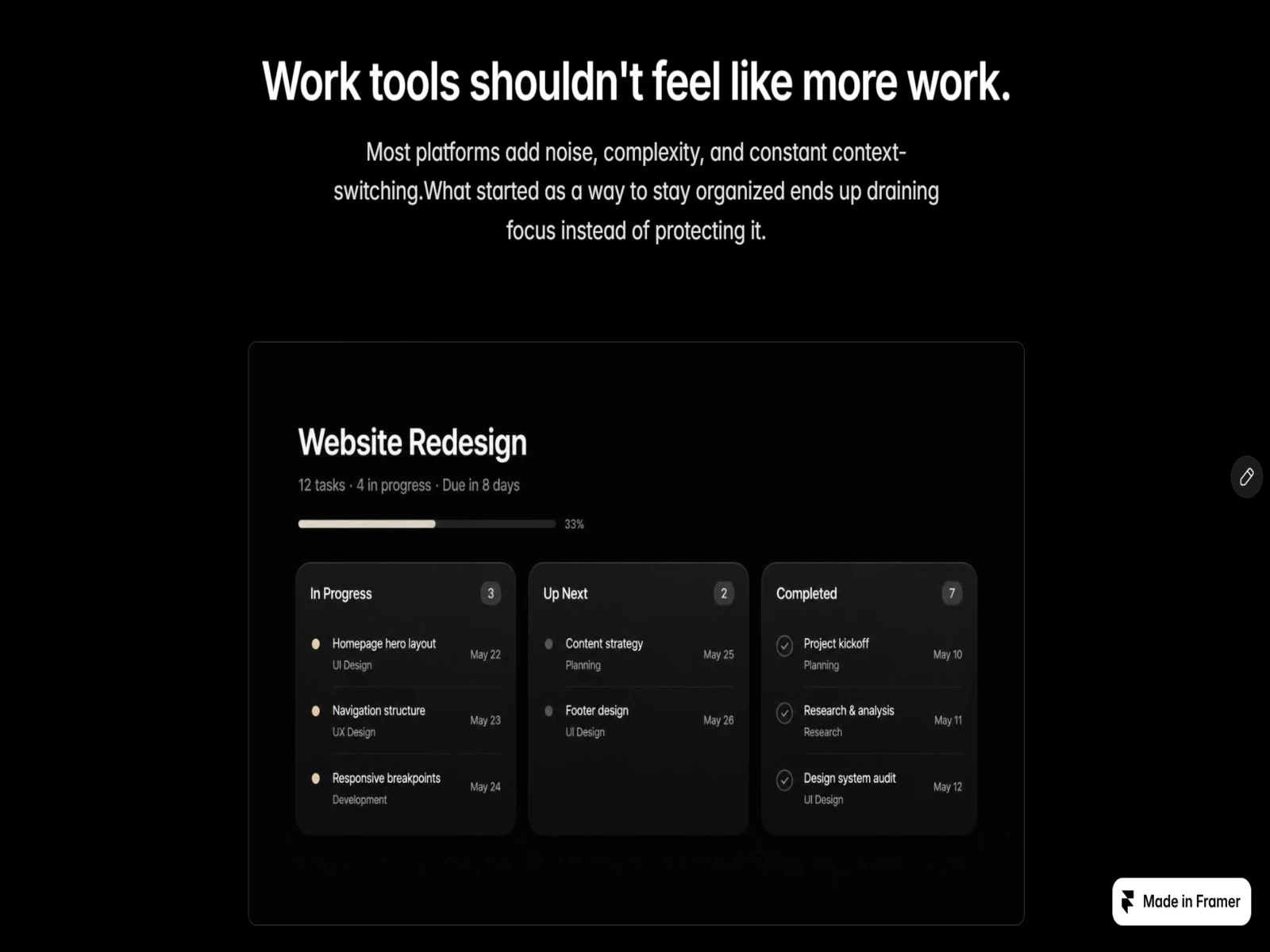
Lumina Dashboard
Social Proof & Pricing
Social proof was treated quietly, using abstract logos and short testimonials.
Pricing was kept transparent and simple, with clear hierarchy between Free, Pro, and Enterprise plans.
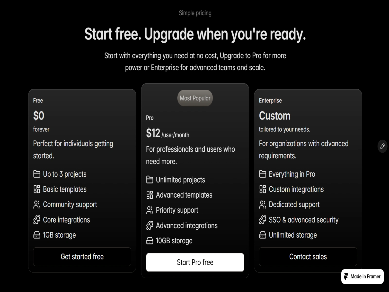
Lumina Pricing Section
Outcome
The final result is a cohesive, elegant one-page SaaS experience that prioritizes clarity over complexity. Every section was designed with intention, from visual hierarchy to content flow and interaction details.
Reflection
The biggest learning from this project was the power of restraint.
Removing unnecessary elements made the important ones stronger. Designing calm interfaces requires just as much intention as designing complex ones.
Visit the live site:
Like this project
Posted Oct 19, 2026
Designed a calm, clear one-page site for Lumina's work management SaaS product.
Likes
1
Views
0