CapitalFlow Landing Page Design
Parallel Lab
Client: CapitalFlow
Project Type: Landing Page Website Design
Team: Parallel Lab
Year: 2025
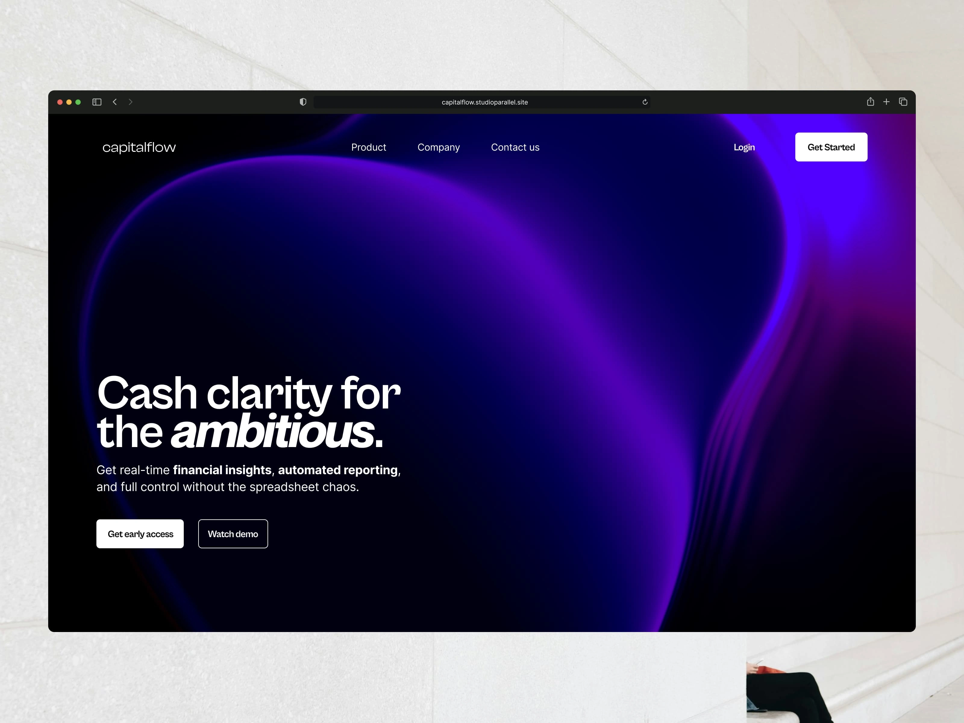
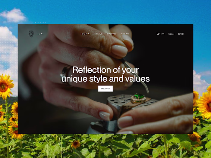
Hero section design of Capital Flow
Project Overview
CapitalFlow is a fintech tool helping startup founders manage spend, optimize idle cash, and stay compliant — all in one dashboard. The goal was to create a compelling one-page website that would introduce CapitalFlow to early-stage founders, spark curiosity, and build credibility with a product still in stealth mode.
🎯 The Challenge
Design a landing page that:
Clearly communicates a complex, multi-part product
Earns trust from finance-savvy startup founders
Feels modern, premium, and tech-forward (like Finna HQ or Mercury)
Functions beautifully in dark mode
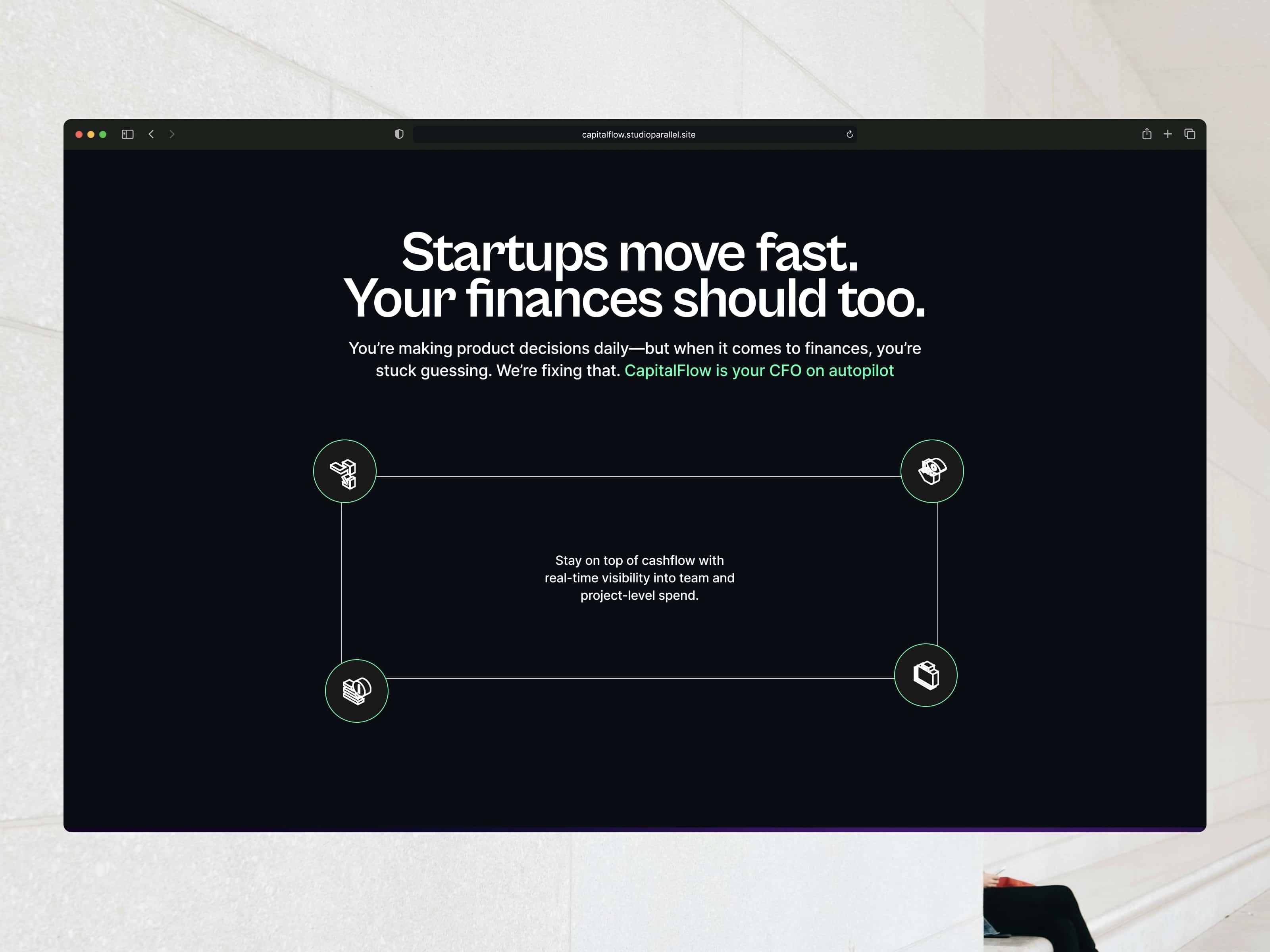
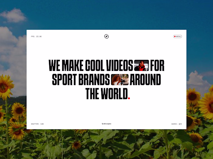
A section of the website
Our Approach
We leaned into storytelling and structure. The visual and content strategy was built around clarity and momentum — with each scroll pulling the user deeper into what CapitalFlow solves.
Design Principles:
A sleek dark-mode UI to match fintech expectations
Typography-led layout using Clash Display for character and Cabinet Grotesk for clarity
Icon-based visual language to simplify complex concepts
Scroll flow designed to mirror the product journey: Problem → Solution → Proof → Action
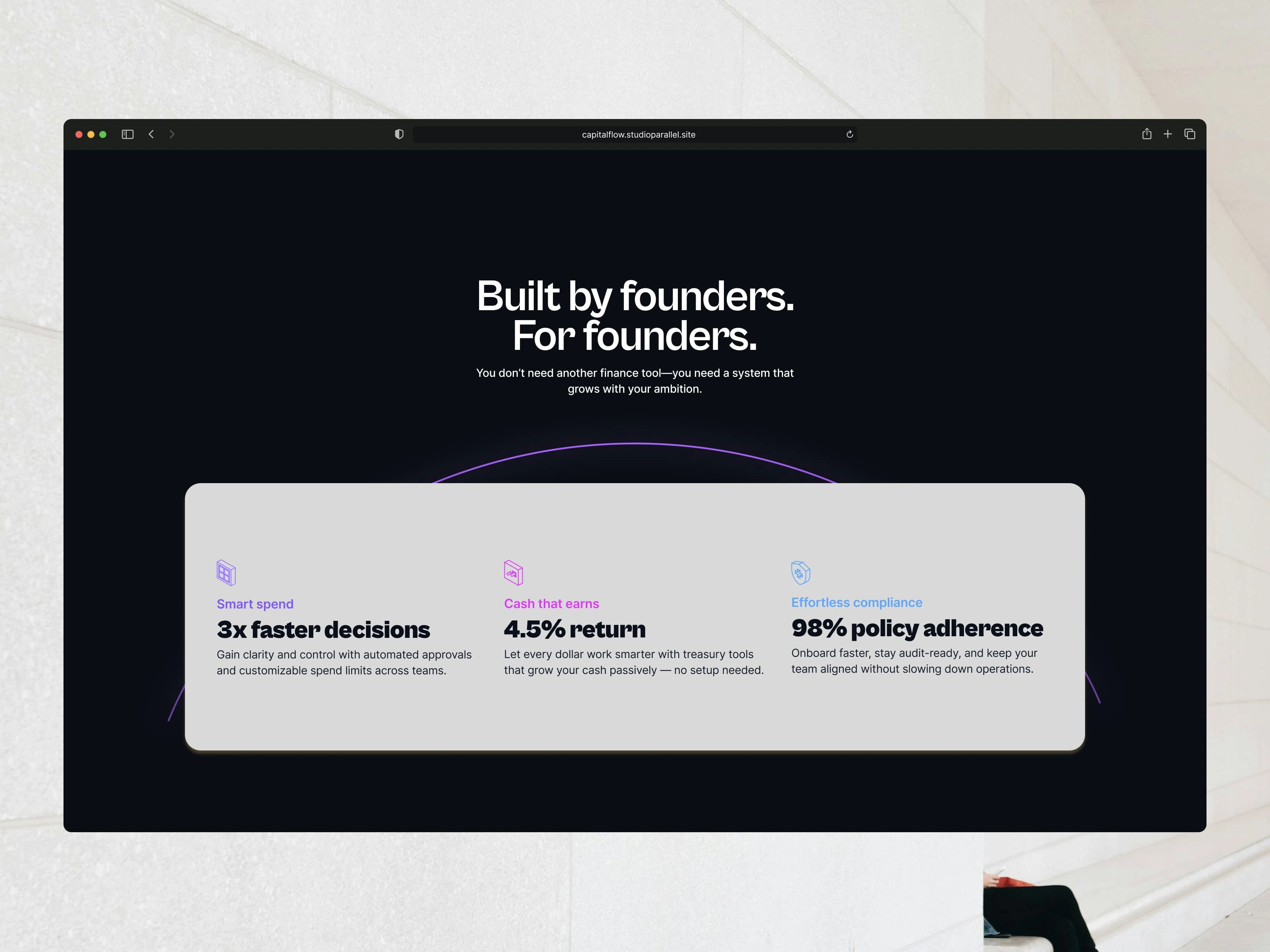
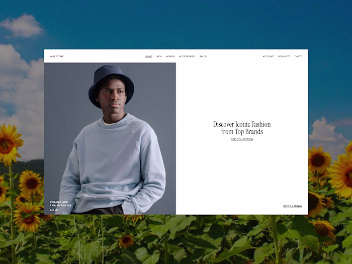
A section of the website
📐 Key Sections
Hero: Sharp headline that hits the founder's pain point immediately
Problem-Solution Breakdown: Flipping pain into clarity with clean visuals
“Why CapitalFlow”: Motion-inspired storytelling that simplifies workflows
Testimonials: Built trust with imagined but credible founder voices
Call to Action: Simple and confident, reinforcing stealth mode positioning
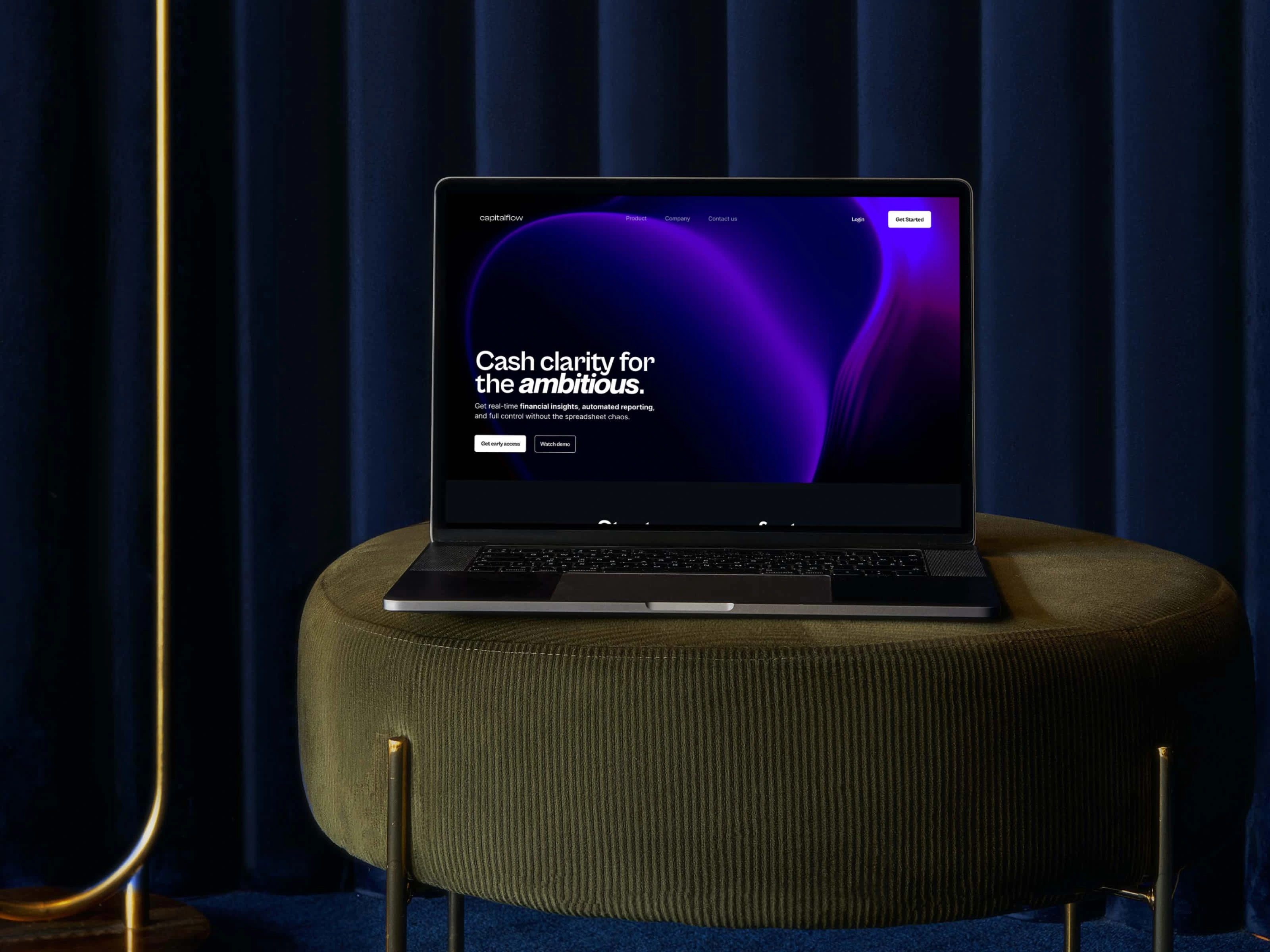
Mockup of the hero section of CapitalFlow website
💡 Outcome
Though still in pre-launch, the CapitalFlow site is already being used for investor pitches, waitlist signups, and early onboarding conversations. The site feels confident yet curious — setting the tone for a tool founders will trust with their money.
Like this project
Posted May 3, 2025
Designed a sleek, dark-mode landing page for CapitalFlow — a fintech tool for startups. Focused on clarity, trust, and conversion-driven storytelling.
Likes
4
Views
30
Timeline
Apr 13, 2025 - Apr 26, 2025