Graphic Designer at PeopleInsight by HireRoad
Hannah Mangum
PeopleInsight by HireRoad is a cost-effective people analytics solution built for lean HR teams.
🧠 Creative Role & Responsibilities
I joined PeopleInsight as the company’s first in-house Graphic Designer. My role spanned strategy, creative direction, and hands-on design. Working with a lean marketing team, I acted as the central brand steward, making sure every visual touchpoint aligned with PeopleInsight's brand identity and supported marketing and product initiatives.
I worked on a variety of projects in this role including:
Logo & brand identity
Website design
Marketing materials: Ebooks, white papers, case studies
Sales enablement materials: pitch decks, sales sheets, event collateral
Demo/explainer videos
Digital ads/social media imagery
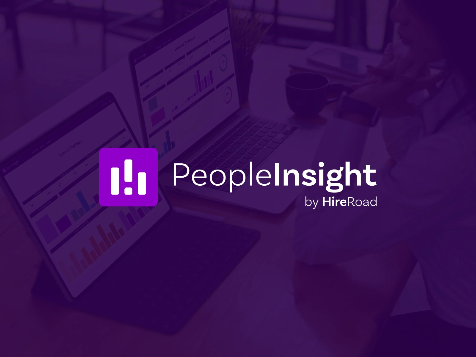
1 - Logo & Brand Identity Refresh
Redesigned the company logo and evolved the brand identity to create a cohesive, modern visual system. The goal was to portray analytics and growth within the logo to better reflect PeopleInsight’s values and positioning. Using the primary inspiration of the bar graph (analytics), the new logo also suggests forward movement. Finally, as a subtle nod to PeopleInsight's parent company, HireRoad, the letter H appears in the negative space.
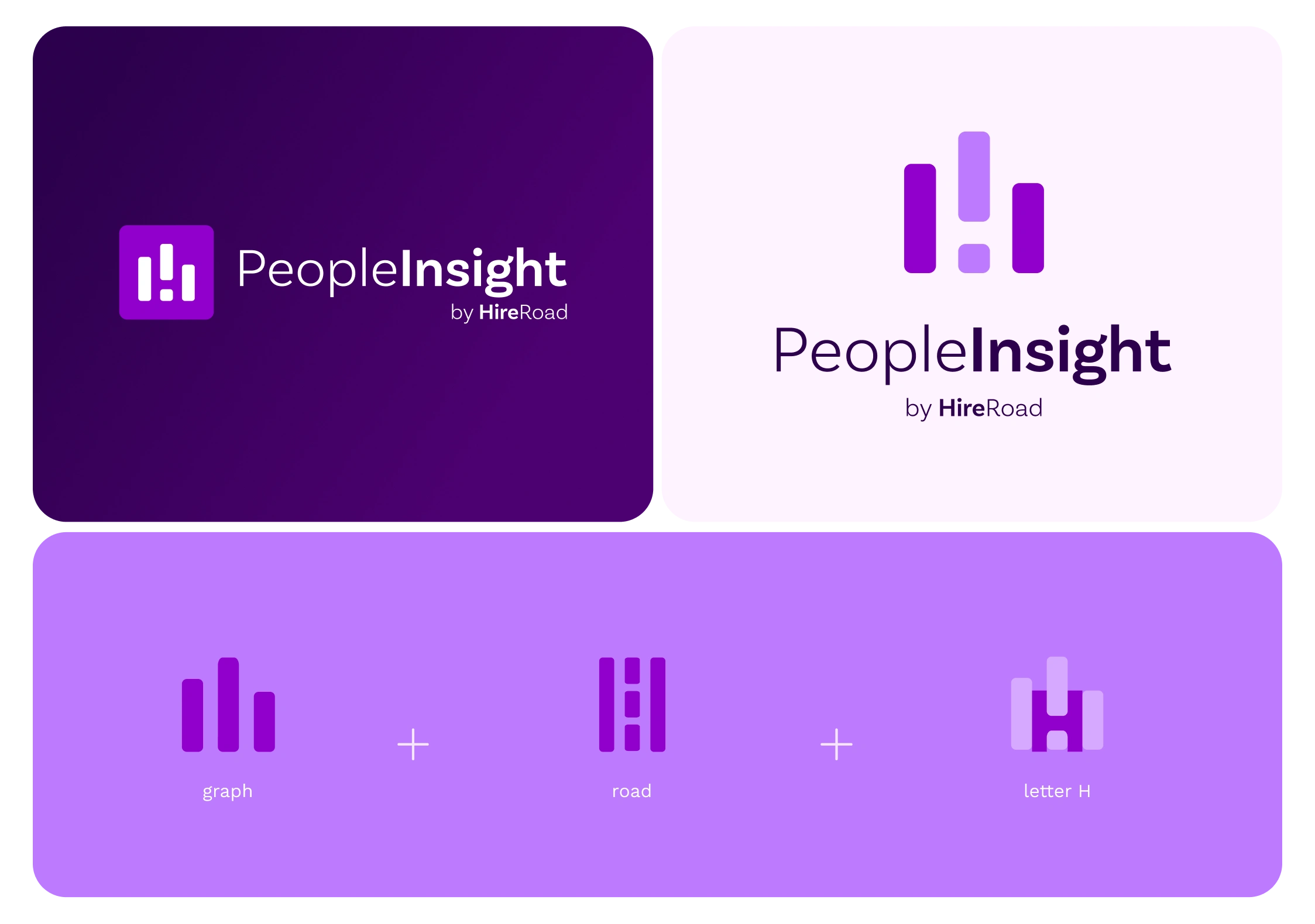
Logo System/Inspiration
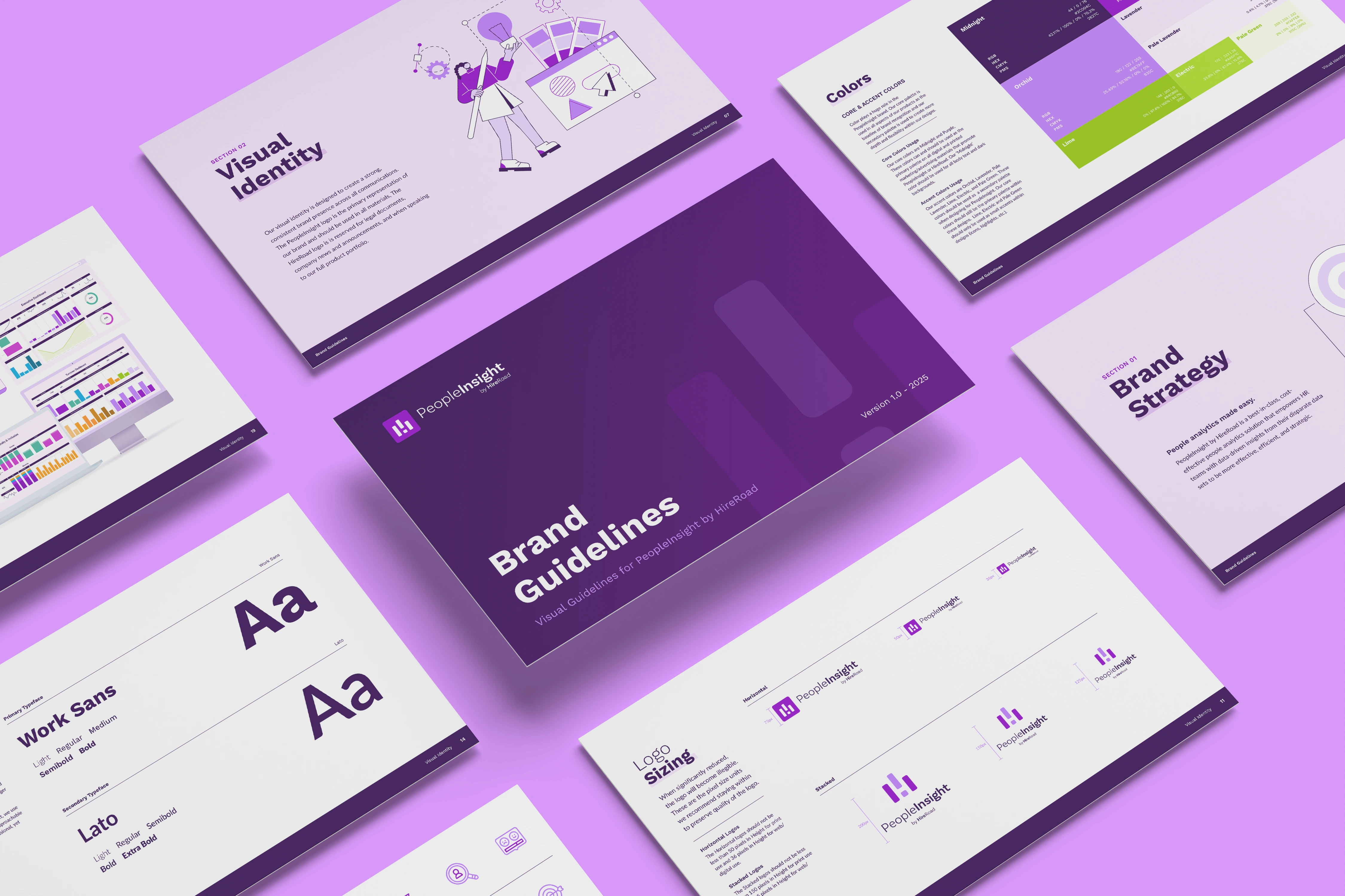
Brand Guidelines
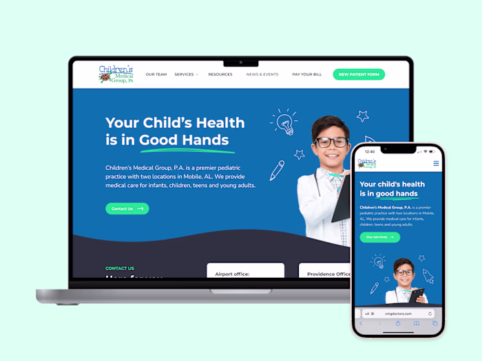
2 - Website Design
After establishing the new brand identity system, it was time to implement it. I led the redesign of the website from concept to launch: prototyping in Figma, iterating designs based on feedback, and building the final site in WordPress with Elementor Pro.
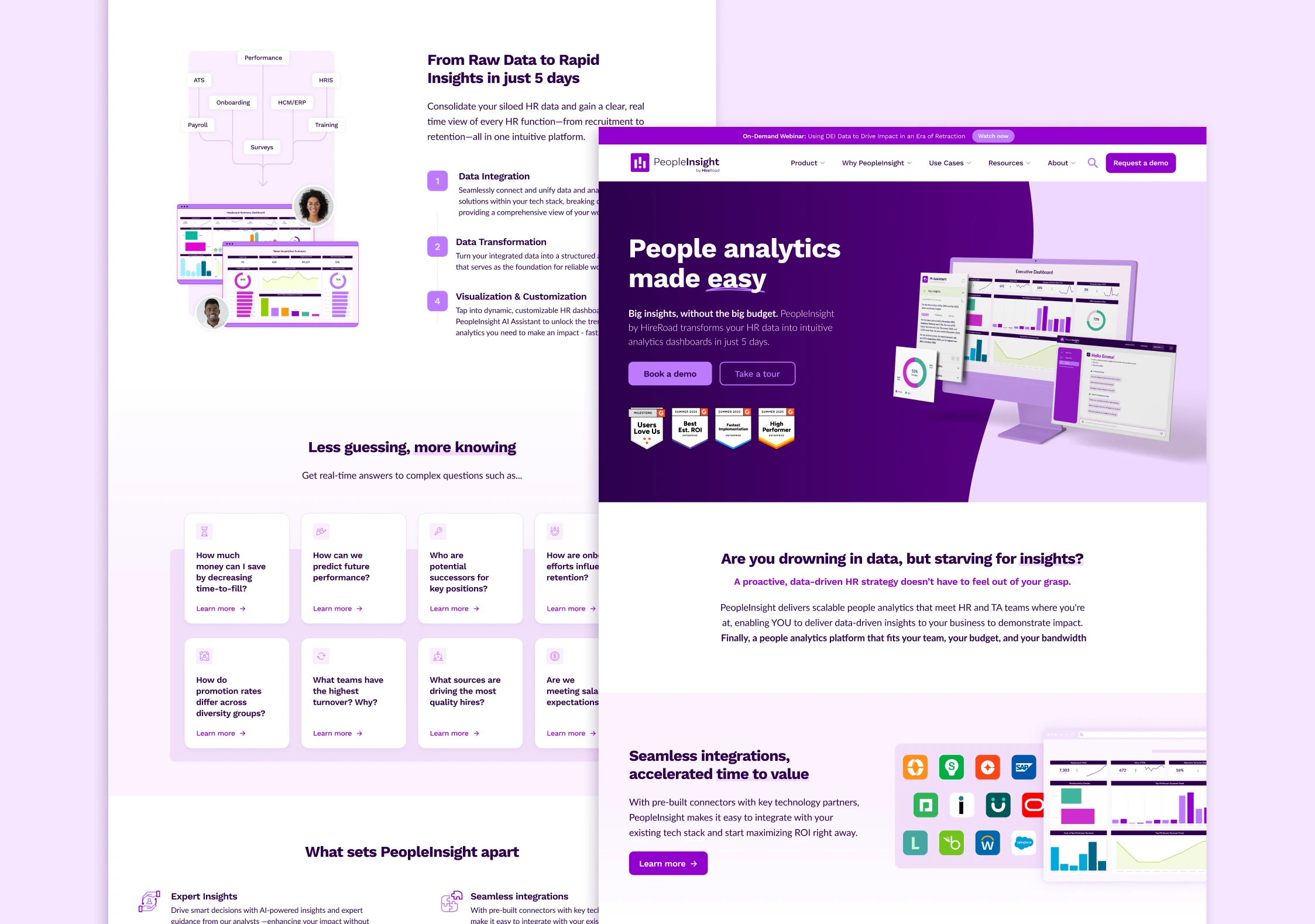
Home page
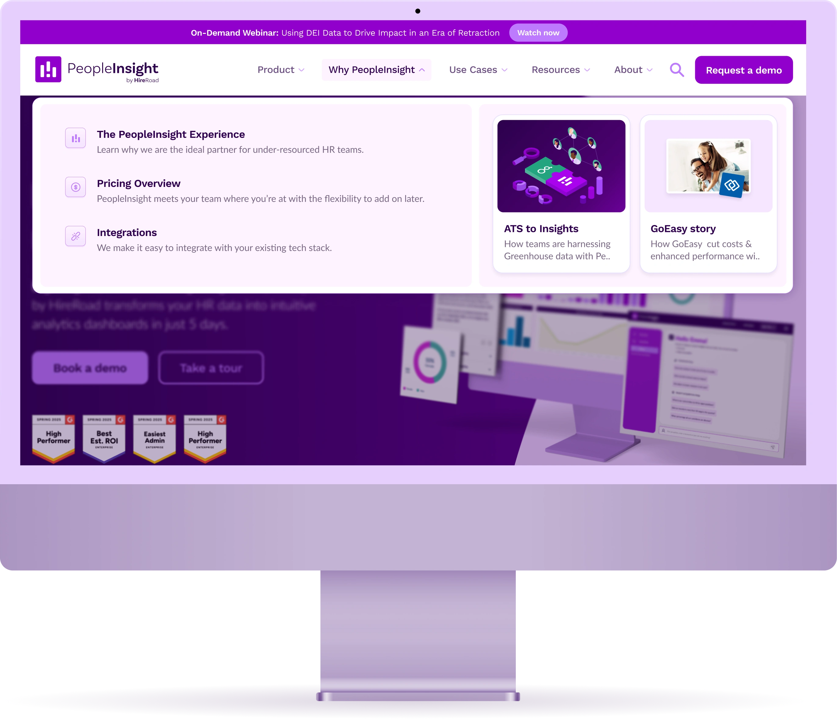
Navigation
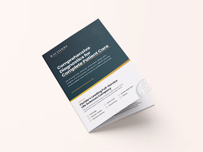
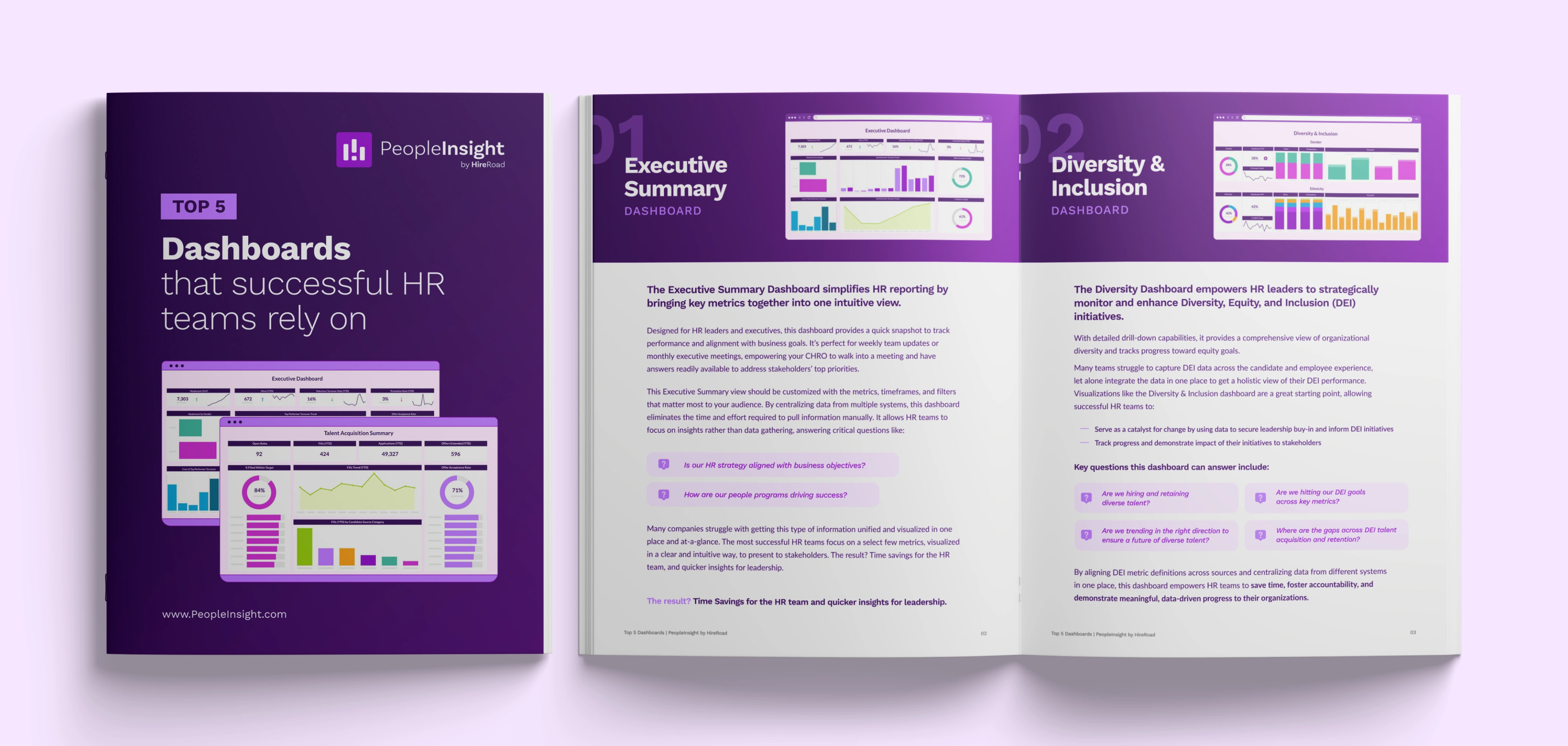
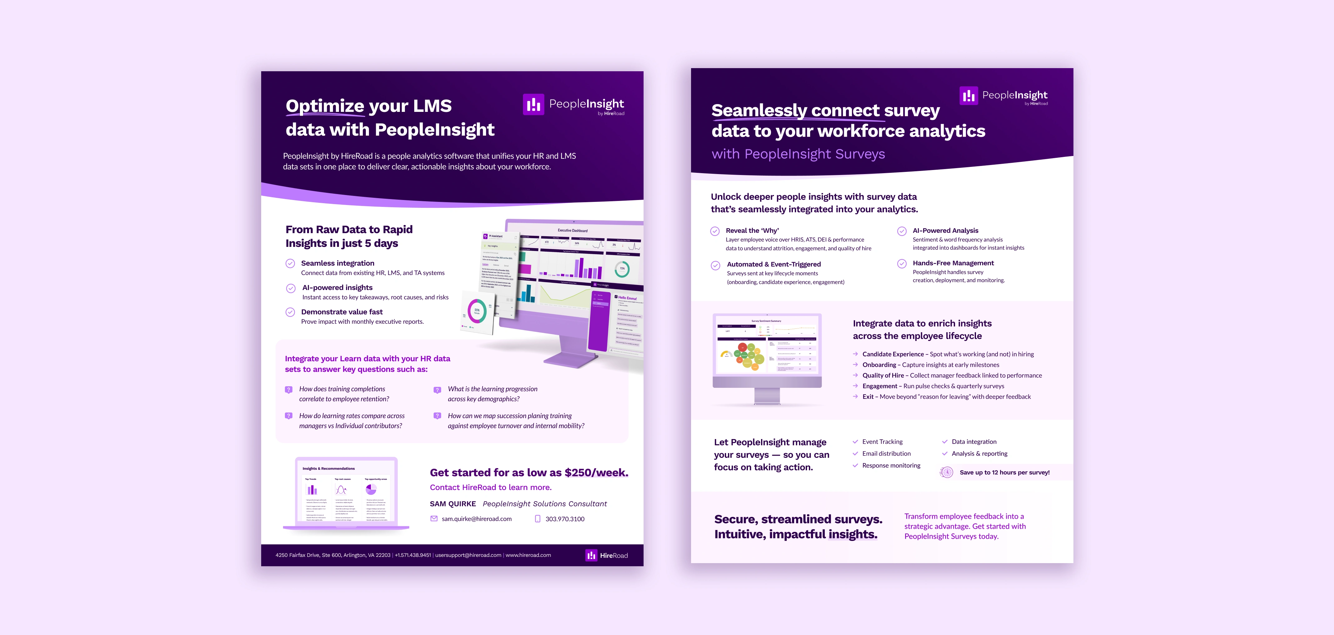
3 - Marketing Materials
Developed high-impact marketing materials, including ebooks, reports, and case studies, to support lead generation, education, and brand authority.
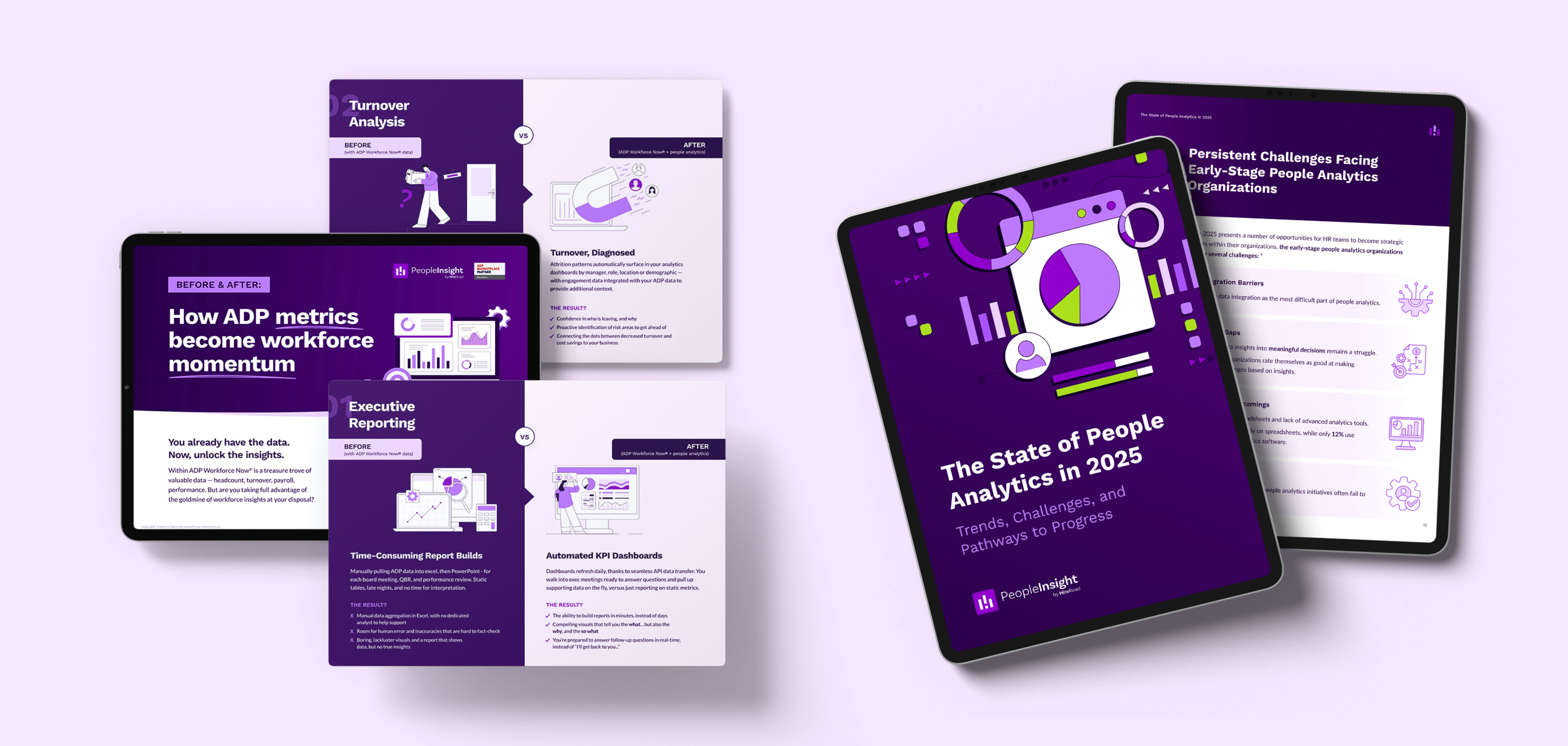
Infographics/Reports
Ebooks
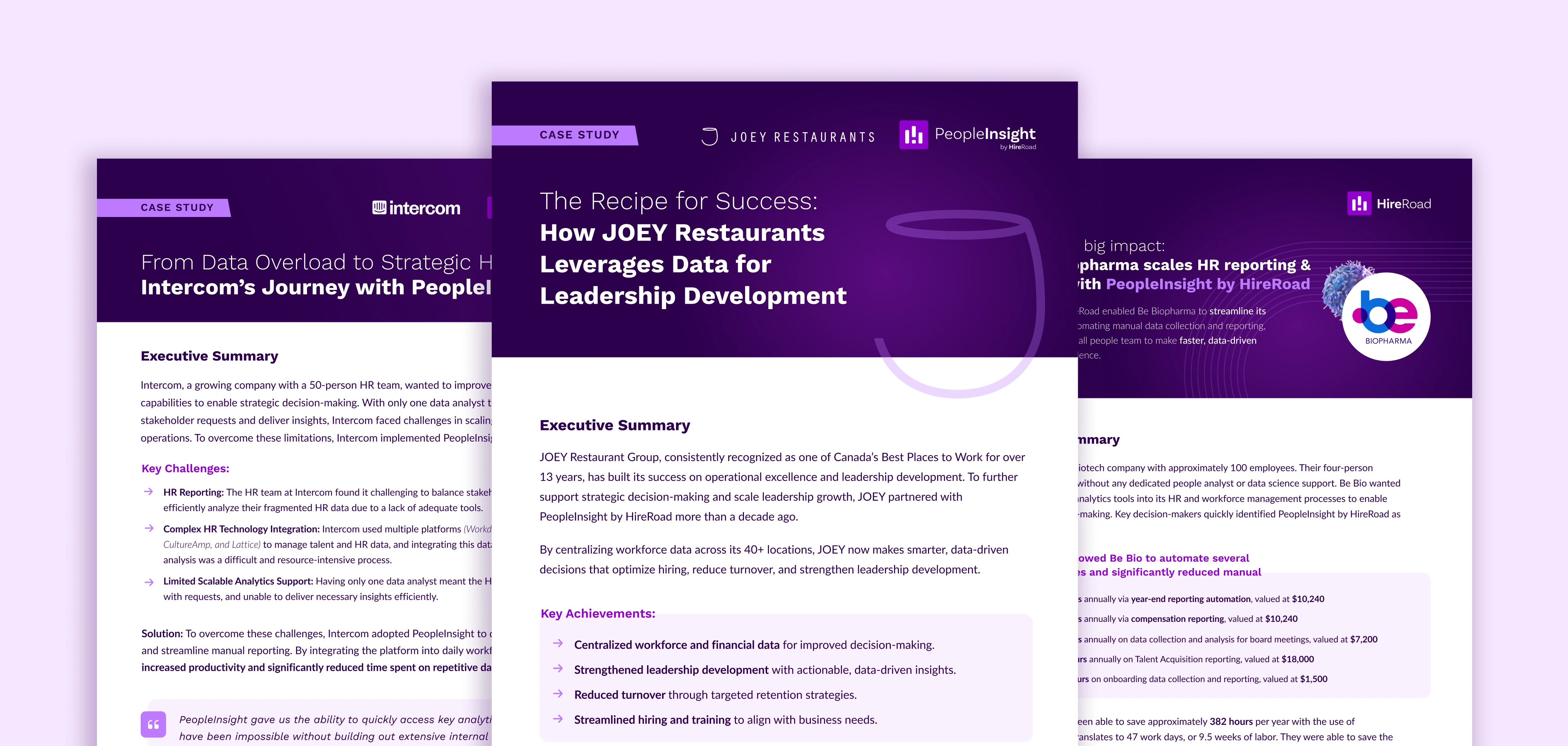
Case Studies
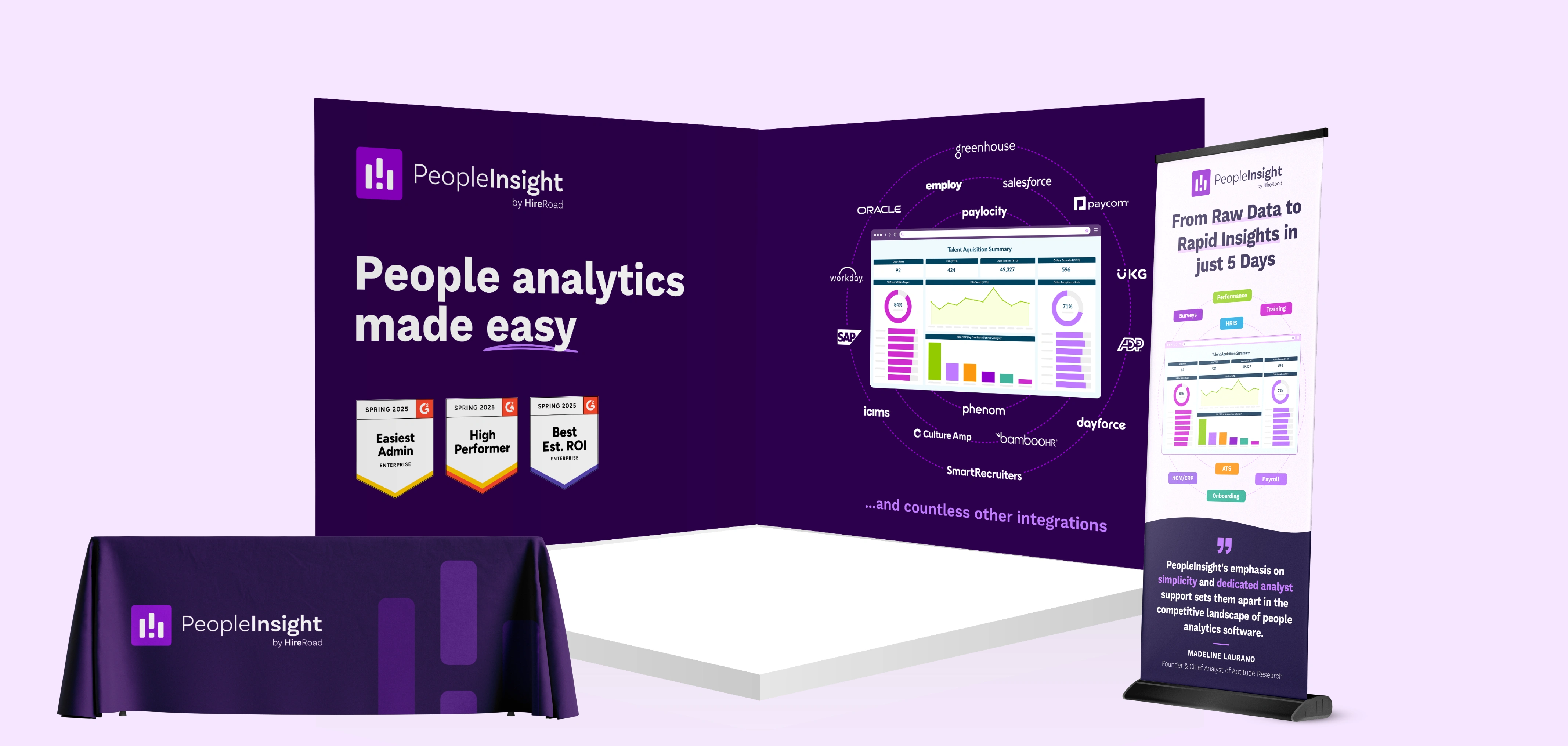
4 - Sales Enablement Materials
Designed high-impact sales sheets, proposal and pitch decks for cross-functional teams, along with branded event and trade show environments including booth spaces, backdrops, banners, and large-format graphics.
Sales Deck
Sales Sheets
Trade Show Booth
5 - Demo/Explainer Videos
Crafted motion-driven stories across explainer videos, product demos, short-form content, and custom intro/outro animations—bringing ideas to life through thoughtful storytelling and design.
Promo Video
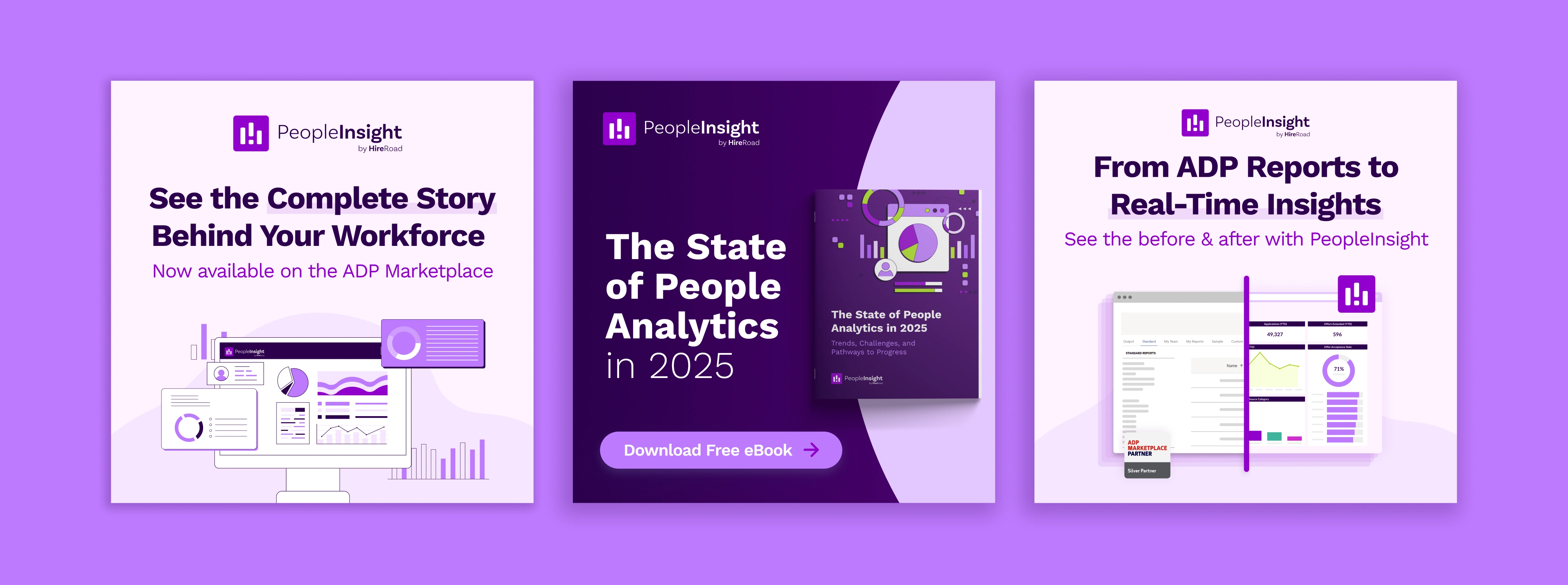
6 - Digital Ads/Social Media Assets
Developed digital ad creative, including display ads and social media visuals, to support campaign goals and increase brand visibility.
Display Ads
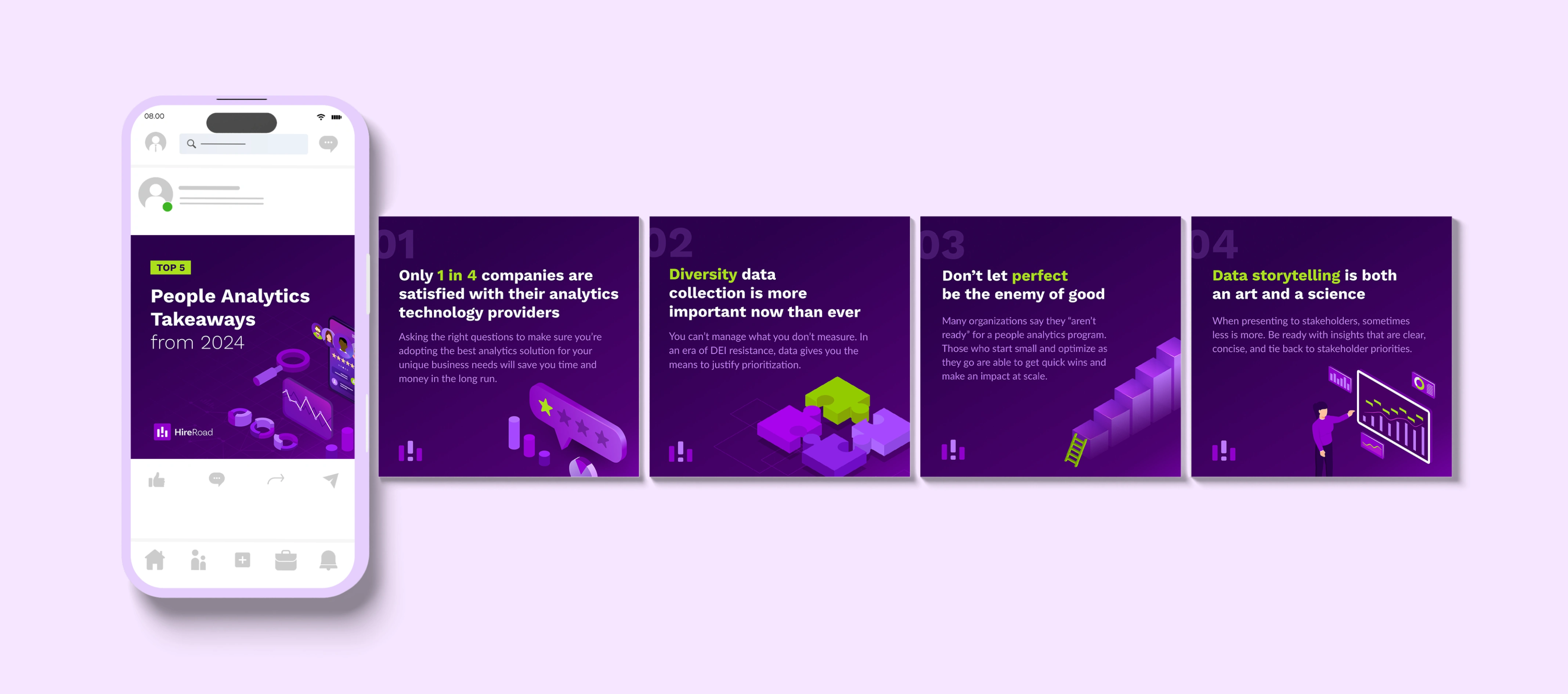
Social Carousel
🌱 What I've Learned
This role pushed me to operate at a brand leadership level, not just a design level. I learned how to balance speed with structure, build systems that scale, and protect the integrity of the brand while also supporting high-volume content across digital and physical touchpoints.
It strengthened my ability to:
Own and drive end-to-end brand and creative processes
Lead brand thinking across cross-functional teams
Switch gears easily and work on various types of projects at one time.
Like this project
Posted Jan 10, 2026
Designed cohesive brand experiences for PeopleInsight across digital and physical touchpoints.