Bold Visual Identity for F Mag
Philippe Halaburda
F Mag’s identity positions it as a bold, forward-thinking fashion publication. Its strong branding ensures instant recognition, making it a must-read for trendsetters.
The client sought a distinctive and instantly recognizable visual identity for F Mag, Le Magazine
Ultra-feminin, a new lifestyle and fashion magazine.
The goal was to craft an image that would position the publication as a leading trend authority,
modern, bold, and effortlessly stylish.
I designed F Mag’s identity to be as bold and striking as the fashion world it represents:
- My approach was rooted in high-contrast visuals, using black-and-white imagery with deep,
intense grays to create a sense of drama and sophistication.
- This aesthetic choice reinforces the magazine’s modern editorial edge, making each spread iconic
and timeless.
- The typography follows the same philosophy to establish a distinctive, high-fashion look—a potent mix
of refined serifs and bold sans-serifs.
- The layout is intentionally minimalist yet structured, allowing the striking photography
to take center stage while maintaining balance and luxury.
- This visual approach ensures that F Mag stands out as a trendsetting, high-impact publication,
immediately recognizable for its bold artistic direction and editorial sophistication.
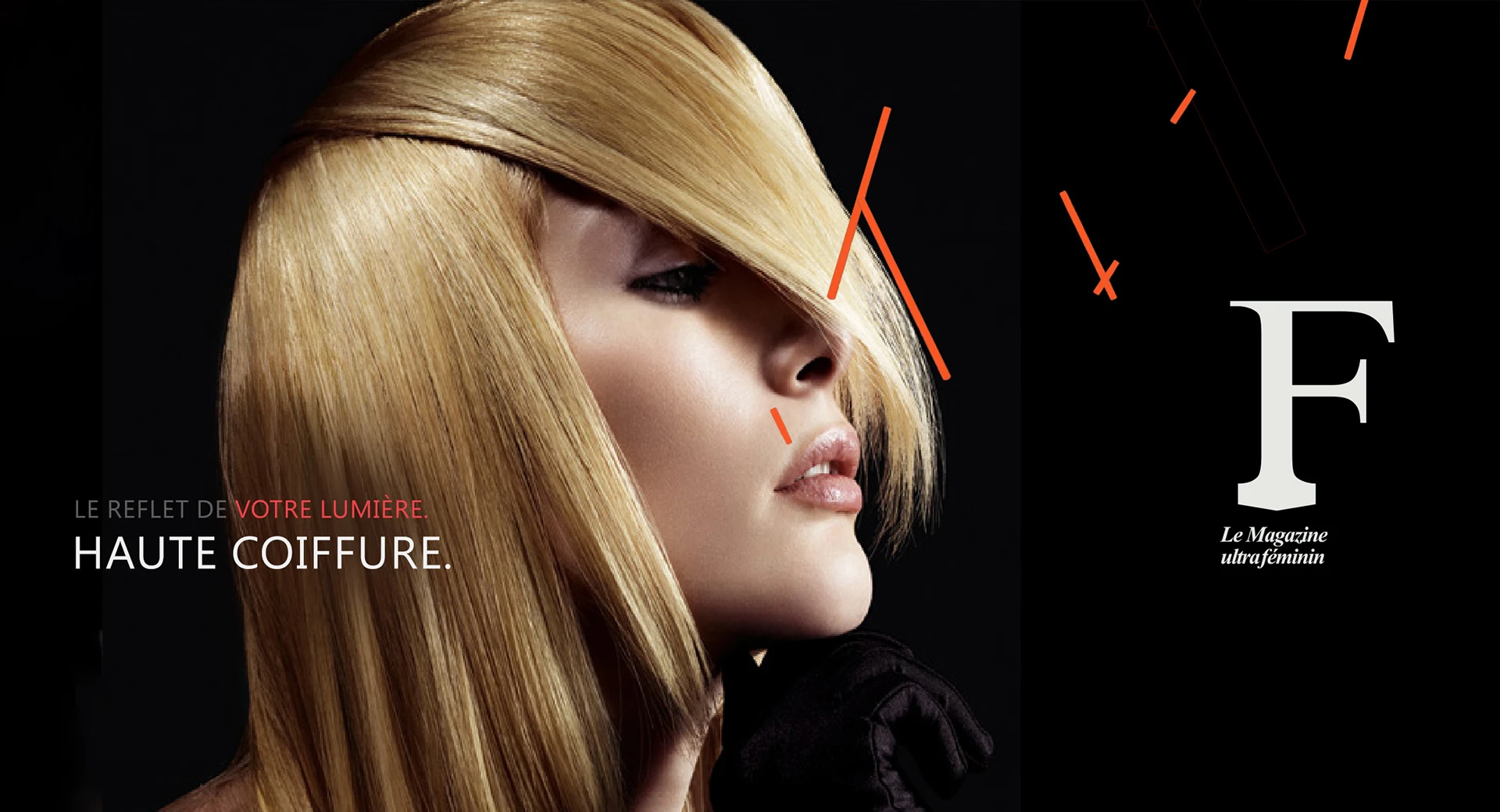
LOGOTYPE: A BOLD IDENTITY FOR A TREND-DEFINING FASHION MAGAZINE
The logotype was designed to be iconic and versatile, ensuring adaptability across print, digital, and social media platforms.
The layout structure creates a strong visual hierarchy, instantly engaging content while maintaining a sleek, high-end appeal.
To achieve this, I developed a branding system that balances high fashion aesthetics with an editorial edge:
- Typography: A blend of refined serif and bold sans-serif fonts to evoke sophistication and modernity.
- Color Palette: A striking yet adaptable tone selection that complements fashion photography
and editorial content.
- Graphic Elements: Minimalist yet dynamic layouts highlighting the magazine’s trend-driven essence.
- Photos: Black-and-white imagery with deep, intense grays to create a sense of drama and sophistication.
Covers design: the bold edit
These F MAG covers use bold black-and-white portraits, sharp red accents, and oversized typography to express a powerful, unapologetic vision of femininity.
Striking crops and graphic patterns elevate fashion into a visual statement—minimal yet impactful.
Concept Breakdown: EMOTIVE STORYTELLING
This visual set for F Magazine explores femininity through the lens of cultural codes, intimacy, and subversion.
The concept mixes high fashion, candid snapshots, and editorial polish to reflect multiple identities and moods: playful, raw, vulnerable, and confident.
It’s a mood board of modern femininity—fragmented yet powerful, intimate yet performative.
Concept Breakdown 1: form, focus & feminity
The design uses bold composition to elevate beauty as art.
Graphic elements like the oversized “F,” directional lines and tight crops create rhythm and structure.
High-contrast imagery paired with minimal color accents reinforces a refined, avant-garde tone—expressing the magazine’s unapologetically feminine and editorial voice.
Concept Breakdown 2: gloss & geometry
This series elevates accessories into sculptural icons.
Jewelry, heels, and bags are photographed as high-design objects, glossy, graphic, and isolated on white
to evoke luxury minimalism.
Sharp lighting and bold shadows highlight textures, while clean typography and strategic placement
of the “F” identity anchor, each spread with editorial strength.
The result is a layout that feels both tactile and aspirational, where fashion is form, and each item becomes
a statement.
These two icons serve as elegant visual markers within F Magazine, each tied to a specific editorial theme:
- Left Icon: P stands for Portrait or Profile.
Its sharp, structured design suggests in-depth features and personality-driven content.
- Right Icon: F Represents Focus.
Its fluid, layered strokes evoke style, movement, and visual storytelling.
DEVELOPED THE BRAND FROM THE GROUND UP
aligning F Mag with a modern, digitally savvy audience
DESIGNED ORIGINAL LAYOUTS & TEMPLATES
that boosted reader engagement, leading to a 20% increase in time spent per article
STRENGTHENED VISUAL STORYTELLING
across print and digital platforms, enhancing brand recognition
SUPPORTED SPECIAL EDITIONS
contributing to a 15% rise in subscription renewals
BUILT A FLEXIBLE DESIGN SYSTEM
to scale new sections without losing cohesion
Like this project
Posted Jul 22, 2025
Crafted a bold, recognizable visual identity for F Mag, a new lifestyle and fashion magazine.