Web App - Redesign
0
UX Designer
UI Designer

Figma

Sketch
I worked on the redesign of an e-learning platform, with the goal of creating a more modern and engaging user experience for students. The project involved extensive research, user testing, and design iterations, but is currently on hold.
About project
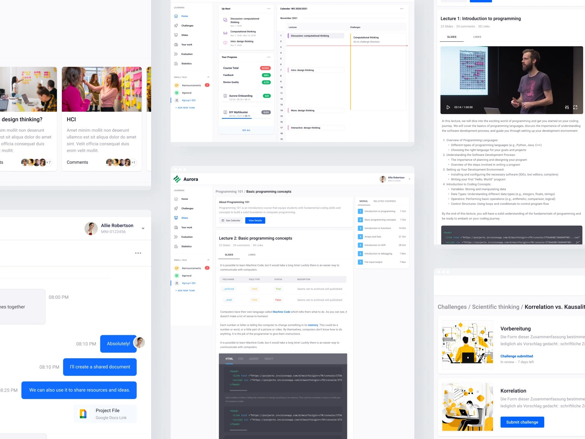
I had the opportunity to work on a challenging and exciting project to redesign an e-learning platform Aurora for TU Wien. The goal of the project was to create a more user-friendly and engaging platform that would make learning more accessible and enjoyable for students.
Say goodbye to boring and monotonous e-learning experiences and say hello to a platform that makes education easy, convenient, and downright enjoyable. Get ready to embark on a learning journey like never before, as Aurora takes online learning to new heights with its modern and engaging design principles.
Research
The project involved conducting extensive research into user needs and behavior, as well as analyzing existing data to identify pain points and opportunities for improvement.
I conducted a comprehensive survey to gain valuable insights into the preferences of students regarding educational interfaces. The primary objective was to understand the specific features and functionalities that students desire in their educational tools, with a particular focus on the interfaces used at TU Wien. The survey also aimed to explore the mental models students have when interacting with educational interfaces and gather feedback on the current state of the art in this domain.
Short overview of the survey, just to get a taste:
The findings and feedback obtained from the survey will play a crucial role in informing the design decisions for my project, ensuring that the resulting educational interfaces are tailored to meet the needs and expectations of students effectively.
Navigation reorganisation
No more getting lost in the virtual maze! The redesigned Aurora boasts a clean and intuitive navigation system that makes exploring and accessing courses, modules, and resources a breeze. With a well-structured menu and crystal-clear labeling, students can effortlessly navigate through the platform.
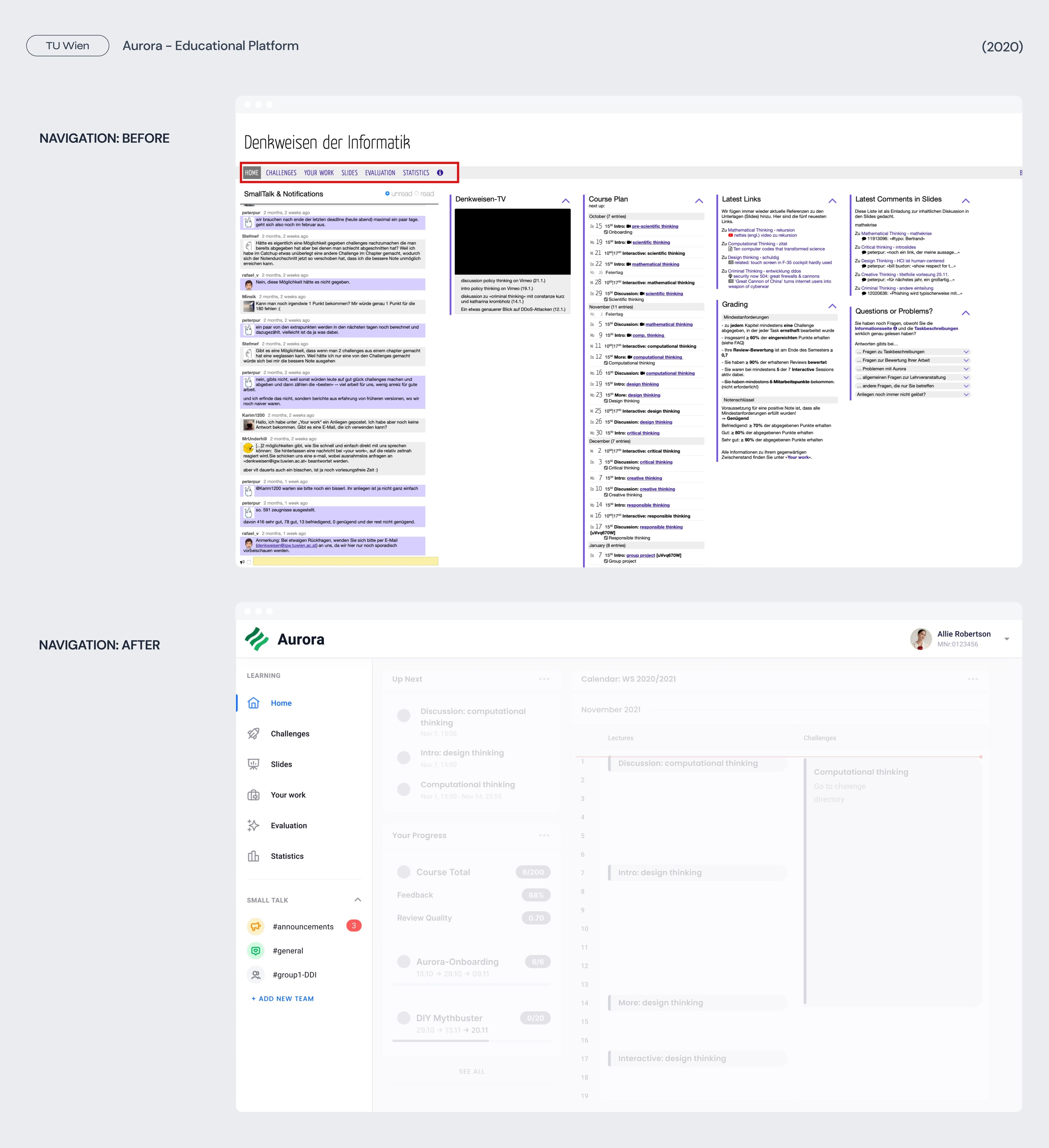
Home and calendar view
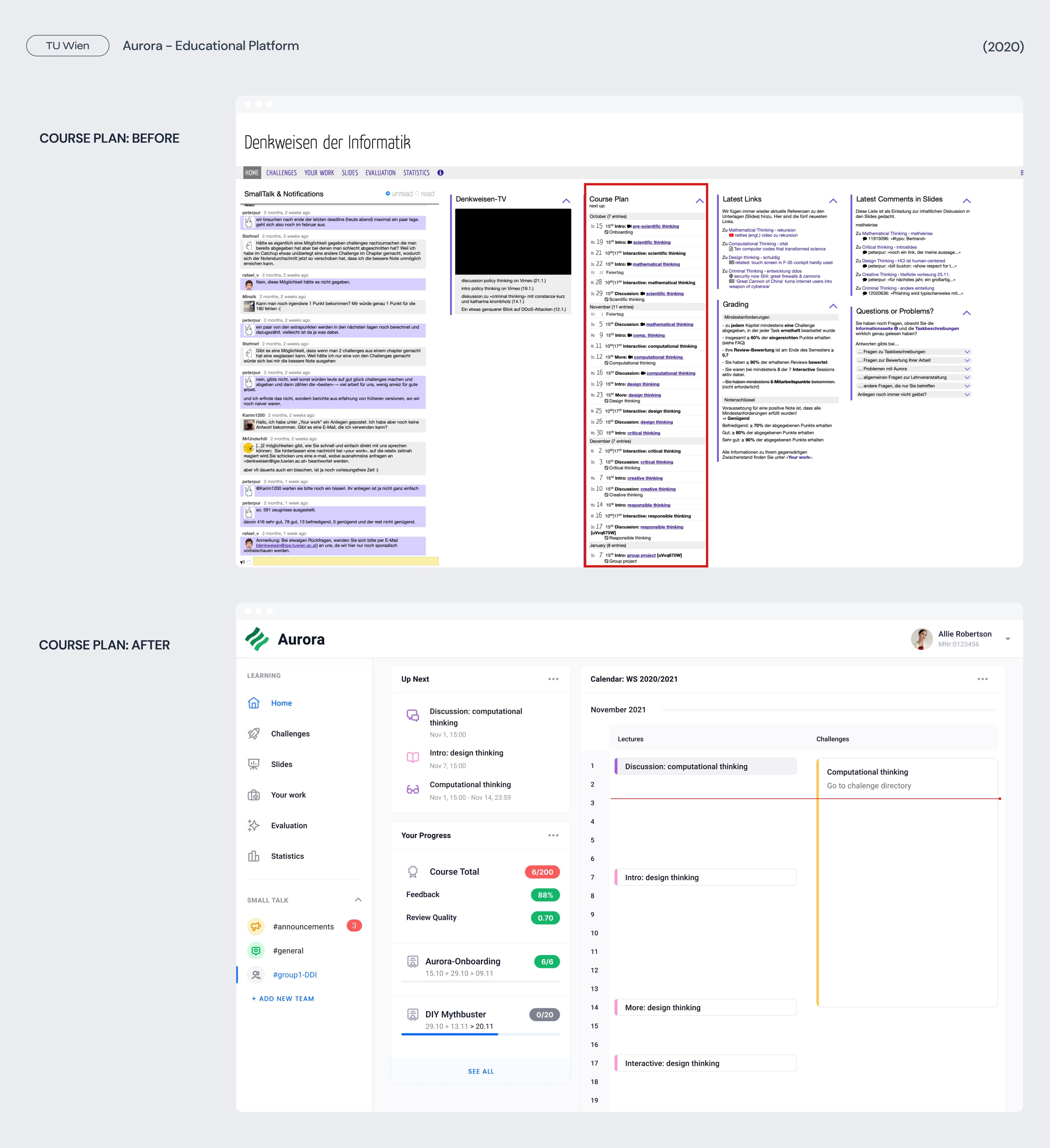
Aurora greets users with a seamless onboarding experience that introduces them to the platform's incredible features and exciting benefits. Get ready to simplify e-learning, enhance collaboration, and unlock the true potential of lifelong learning.It is crucial to understand the importance of keeping track of study process and staying on top of deadlines and timelines. That's why I've incorporated a comprehensive calendar and course overview feature to provide you with a clear roadmap of learning journey.
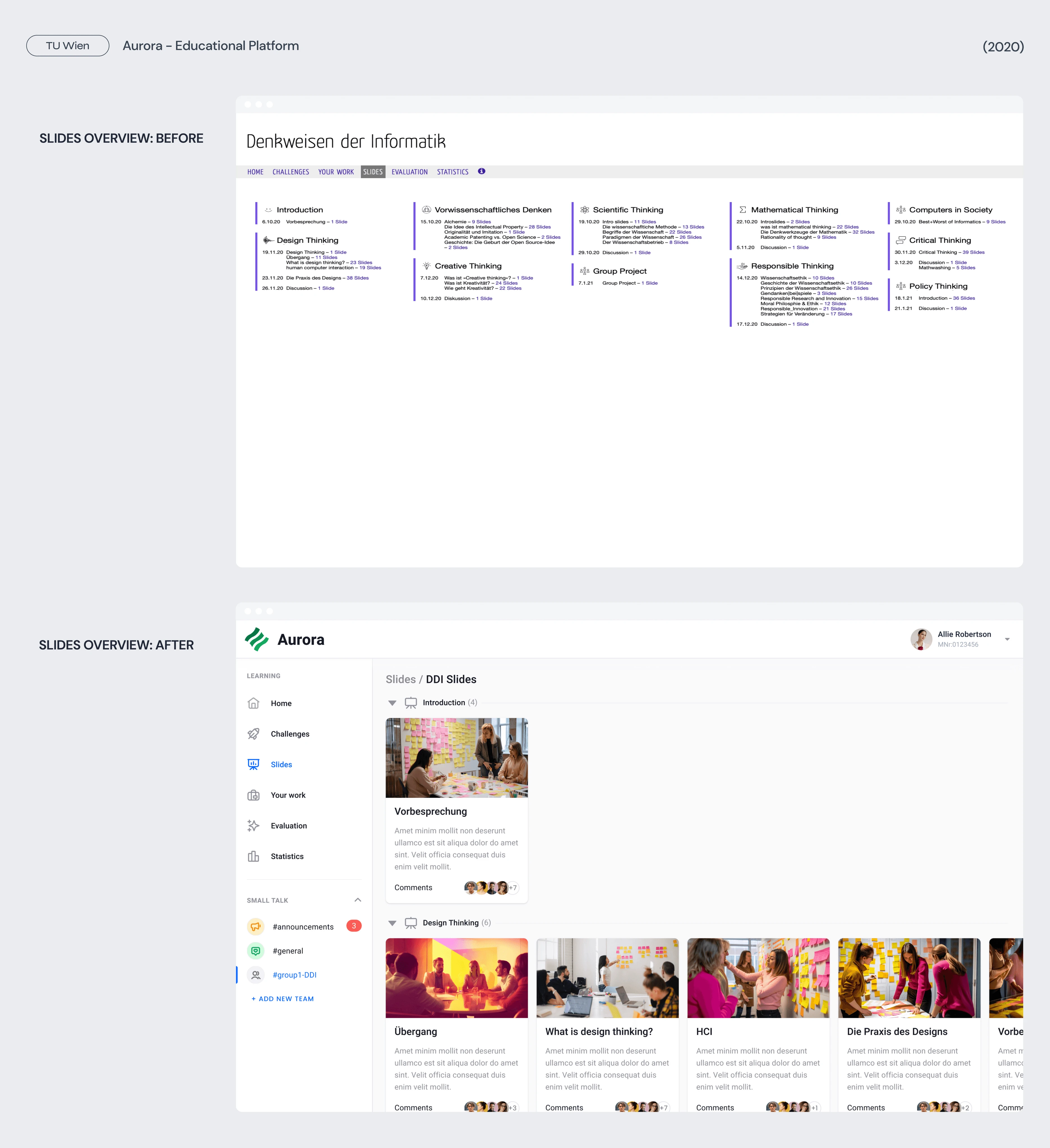
Slides overview
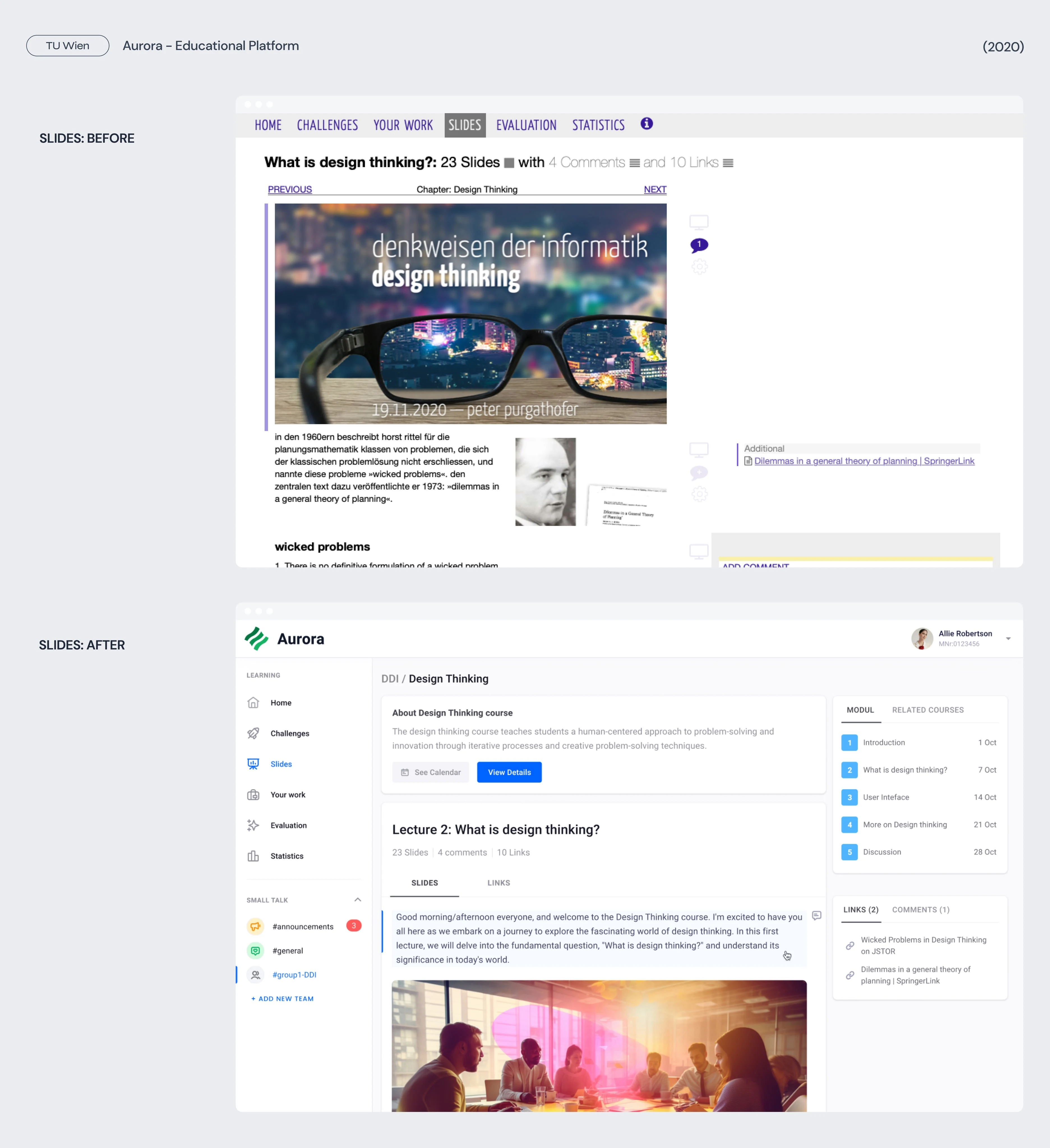
The Slides Overview page allows you to track the progress effortlessly. With a glance, the user can see which slides they've conquered and which ones are yet to be explored. It's like having a personal roadmap to guide them on learning journey.
Slides
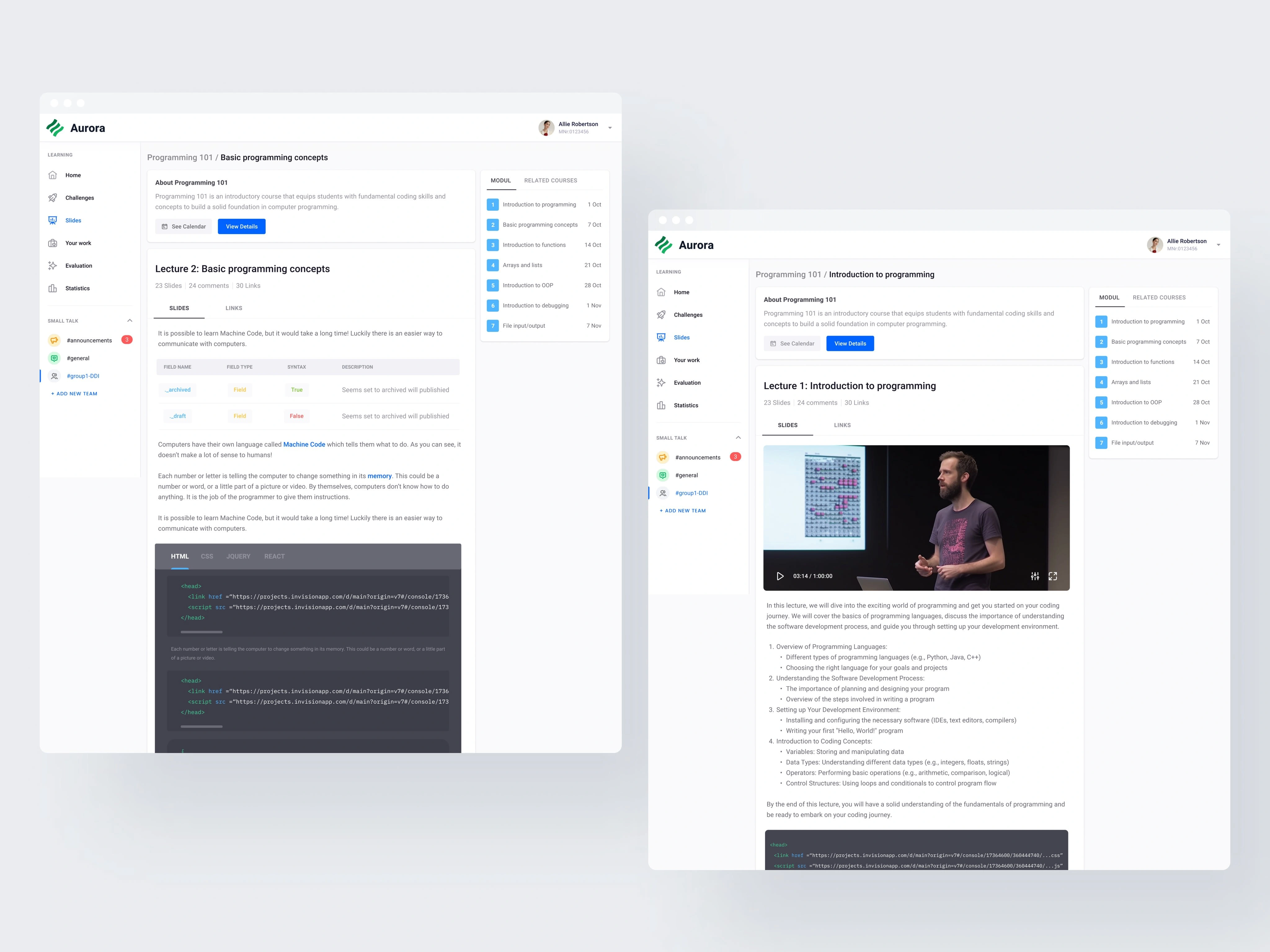
Each course in Aurora is accompanied by carefully-crafted slides that bring the content to life. Say goodbye to endless paragraphs and hello to engaging visuals, captivating imagery, and carefully crafted infographics. Whether user is exploring complex concepts or diving into real-life case studies, the course slides will make their learning journey a true delight.
Challenges
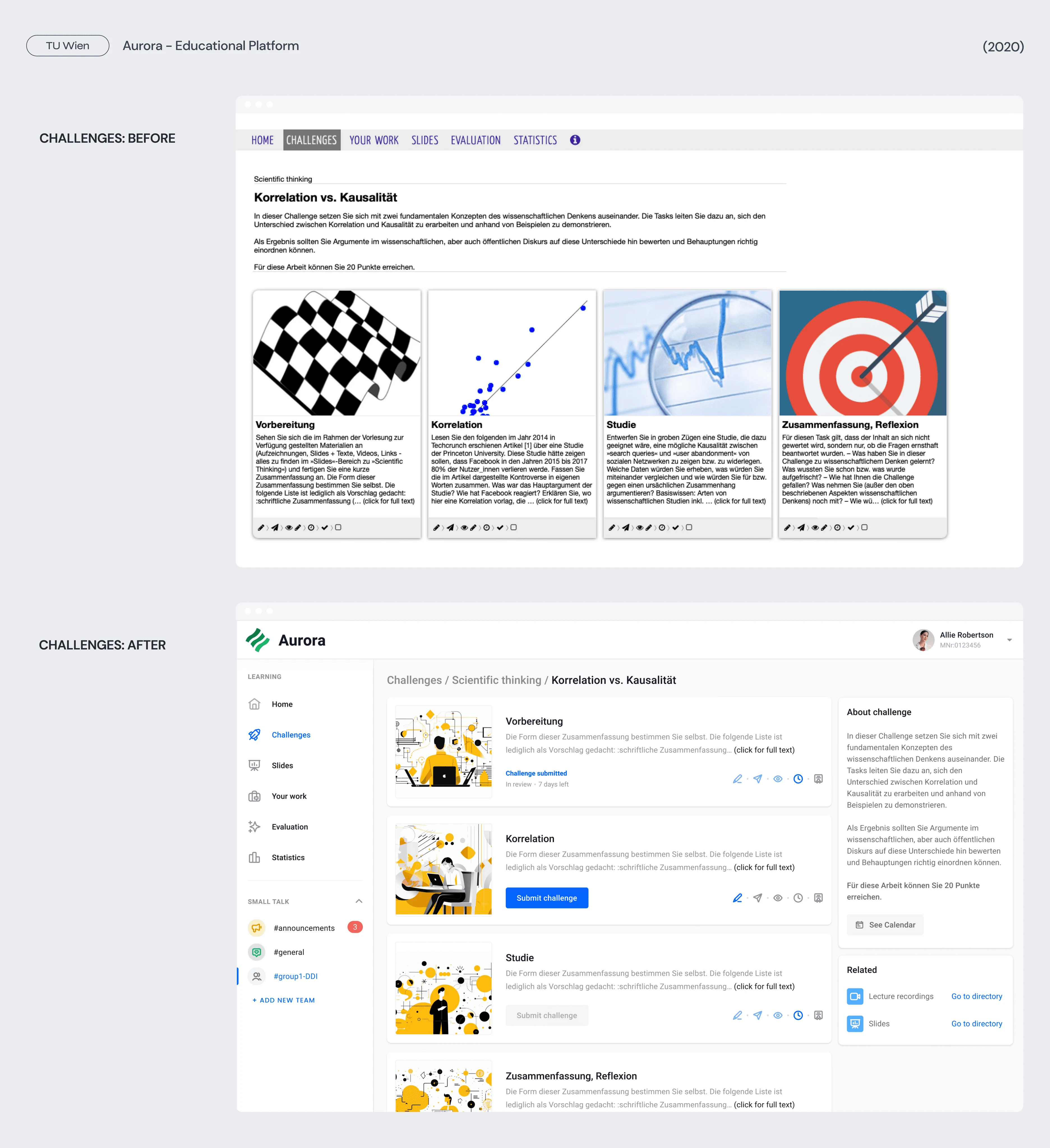
Aurora presents content in a captivating and interactive manner. It leverages multimedia elements such as videos, interactive quizzes, and gamified learning activities to keep users engaged and motivated throughout their learning journey.
Small talk
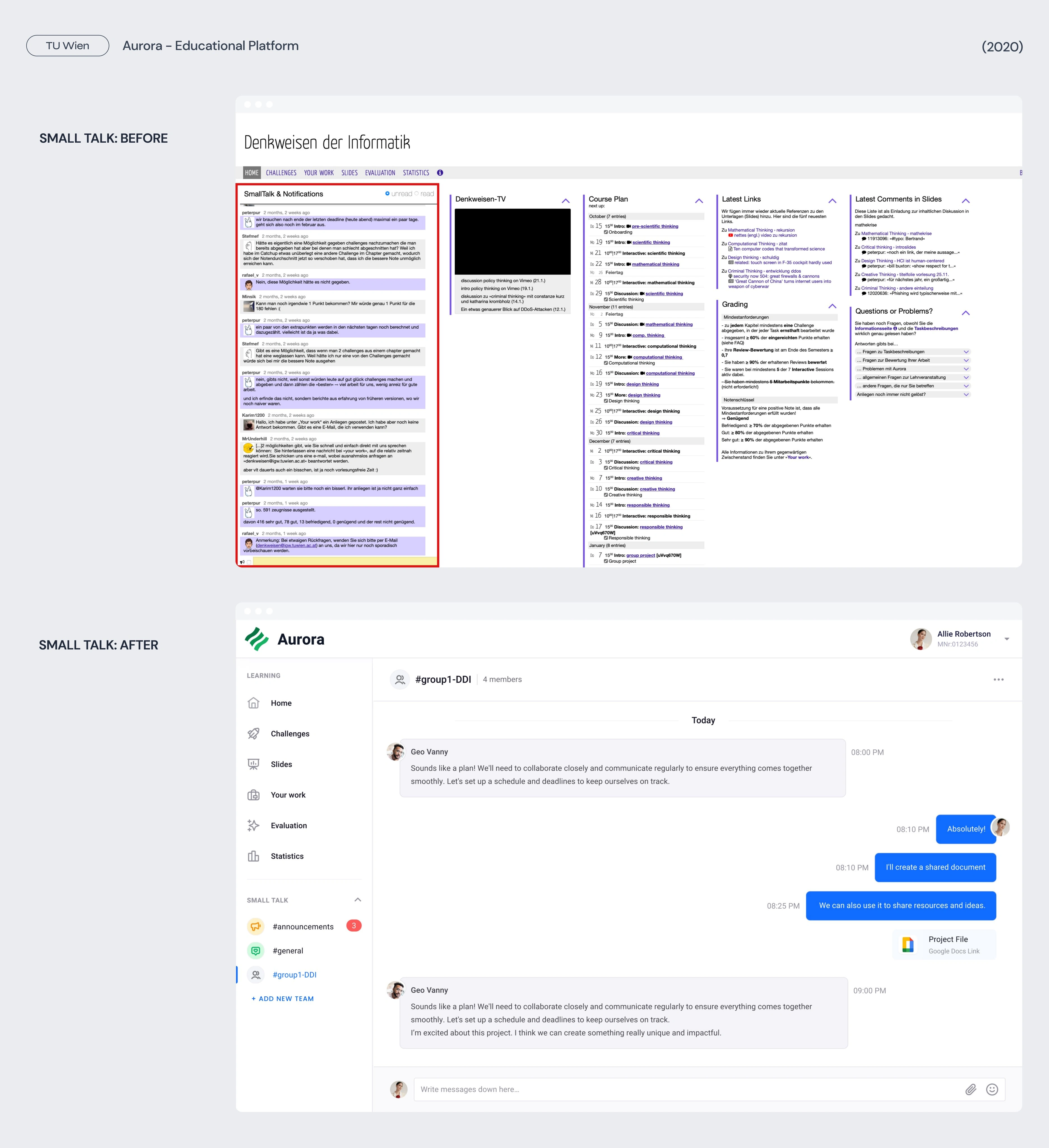
Aurora fosters collaboration among learners through features like discussion forums, group projects, and peer-to-peer learning. Users can connect with fellow learners, share insights, and participate in collaborative activities, enhancing the overall learning experience.
Like this project
0
Posted Sep 21, 2023
I worked on the redesign of an e-learning platform, with the goal of creating a more modern and engaging user experience for students.
Likes
0
Views
21
Tags

UX Designer
UI Designer

Figma

Sketch


