Moveklub — Logo Design & Brand Identity

Dima Grey


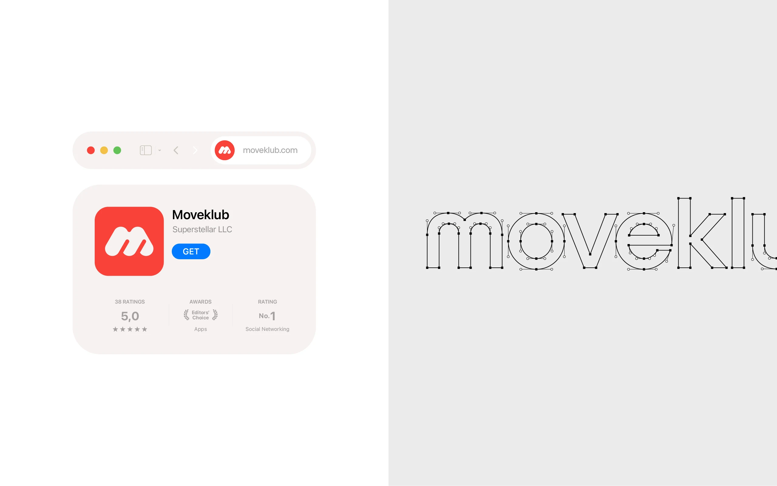
Moveklub
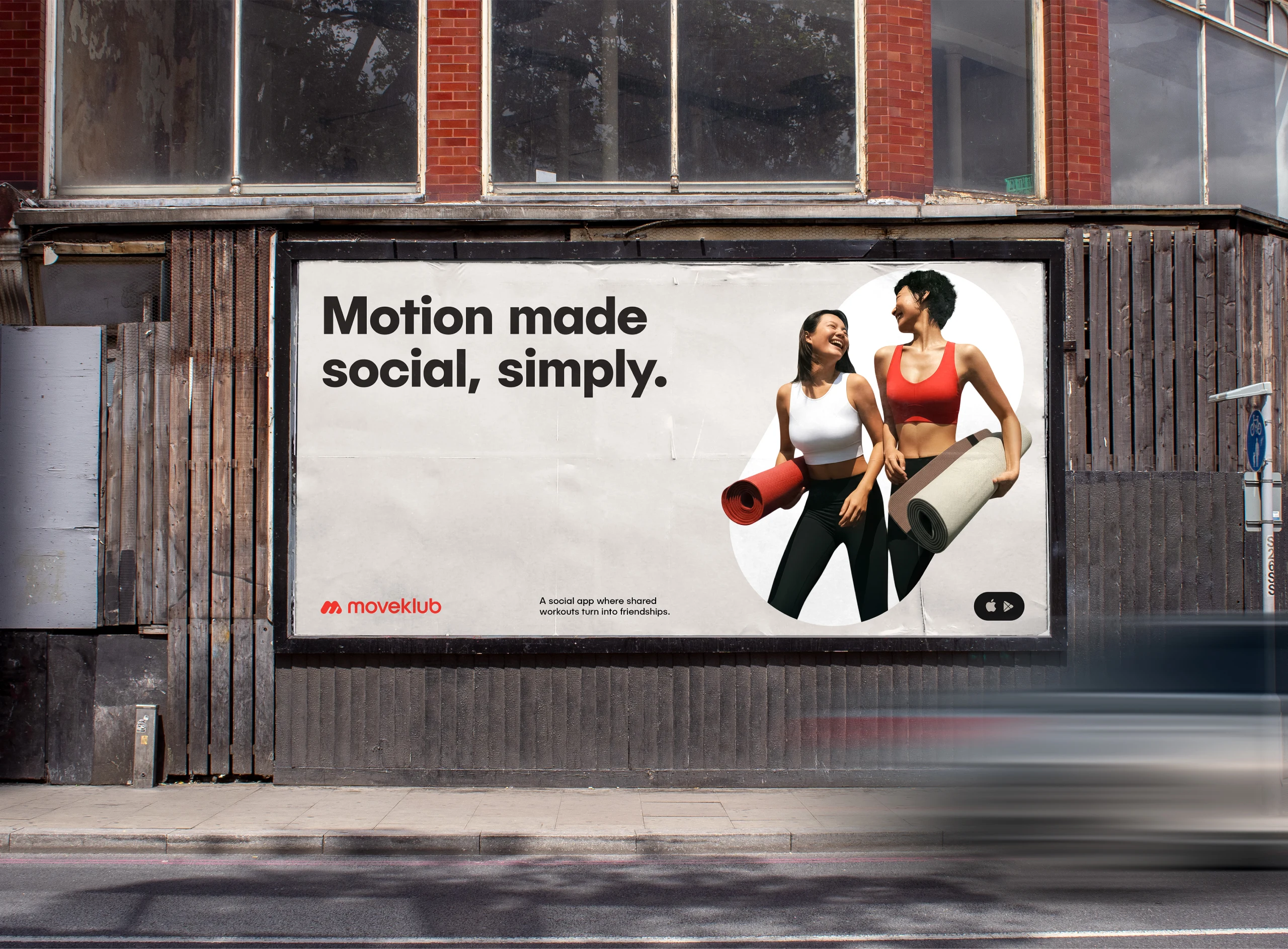
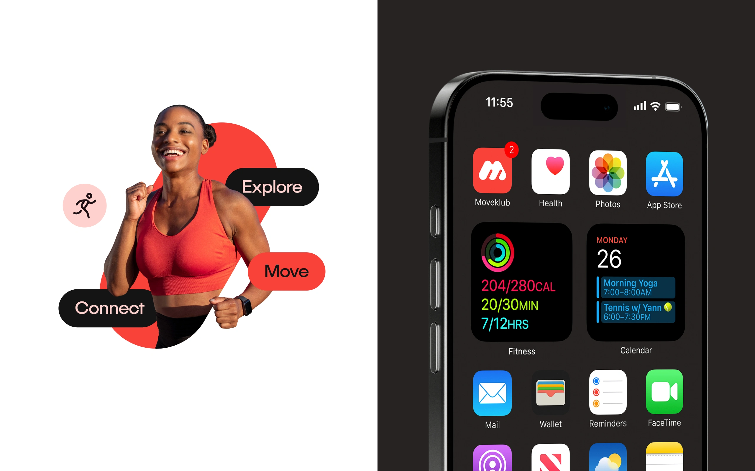
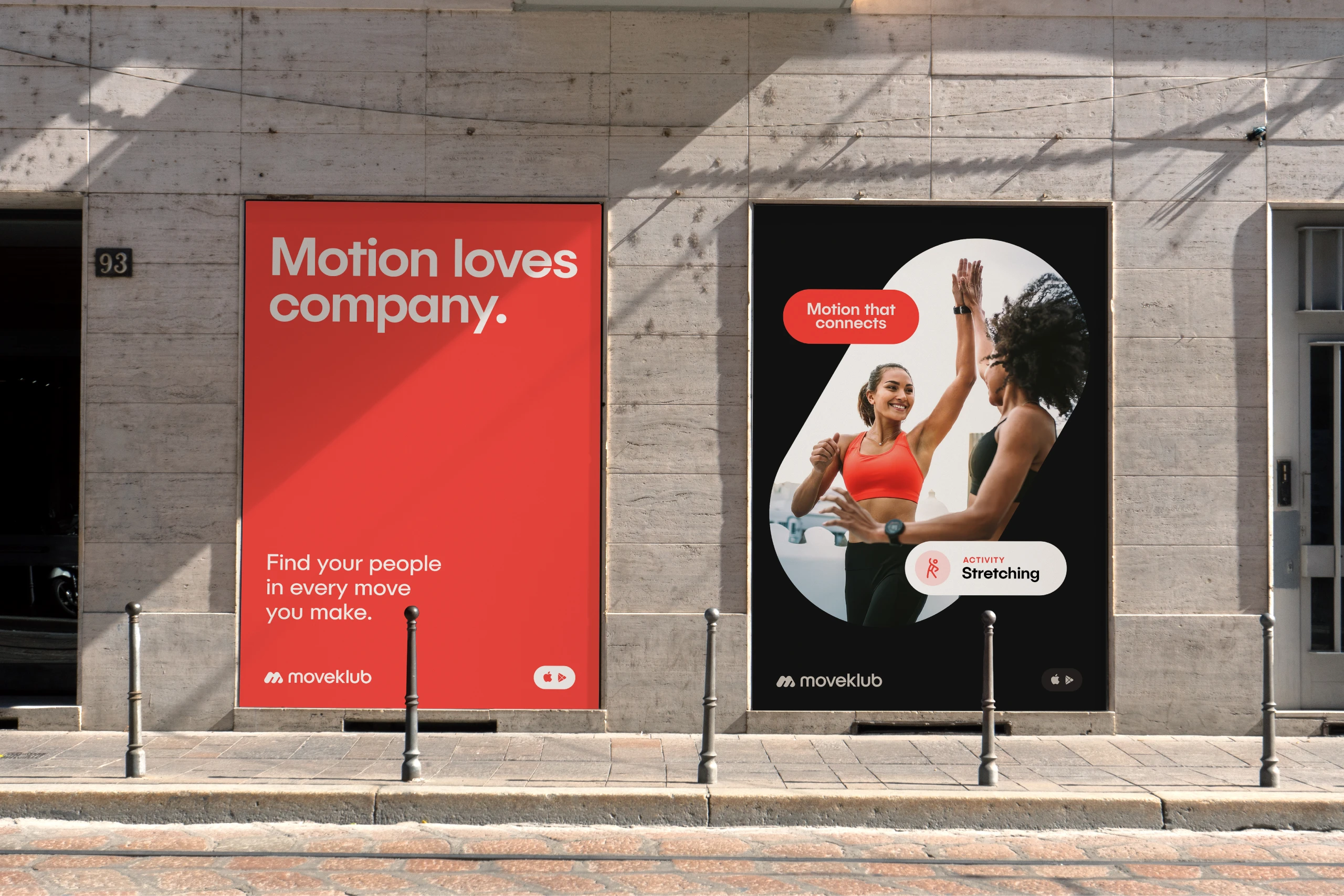
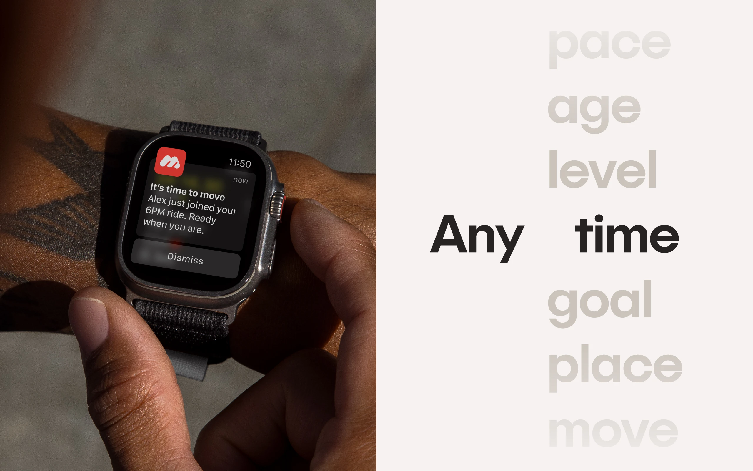
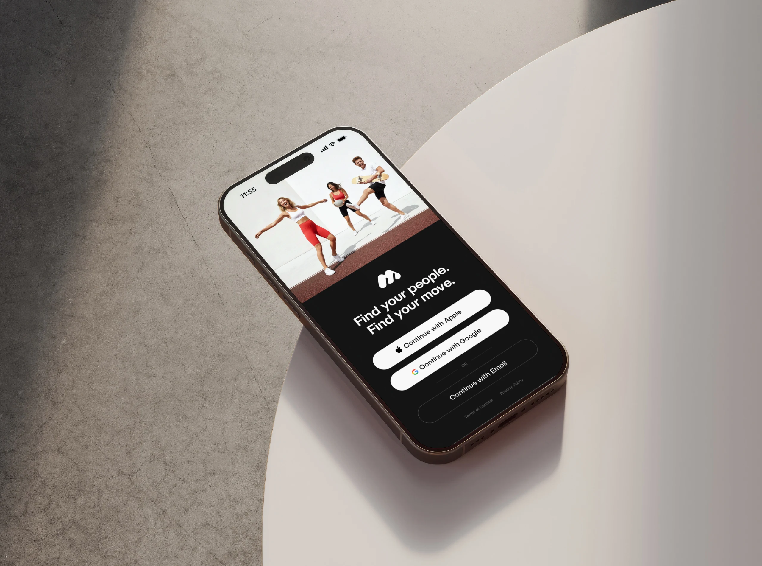
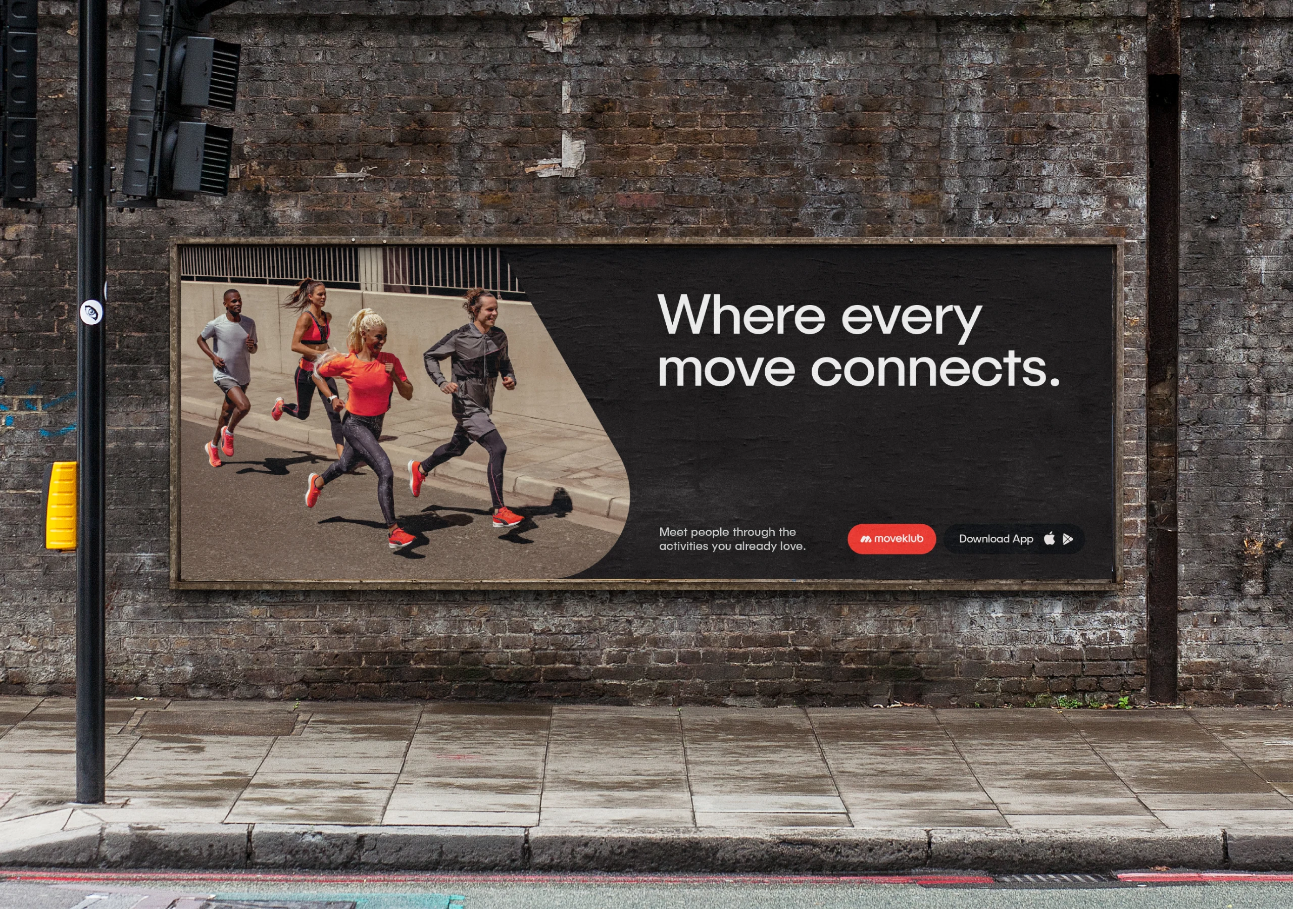
A social app for people who don’t want to move alone. It turns runs, walks, rides and stretches into reasons to meet, so being active feels less like a chore and more like catching up with friends.
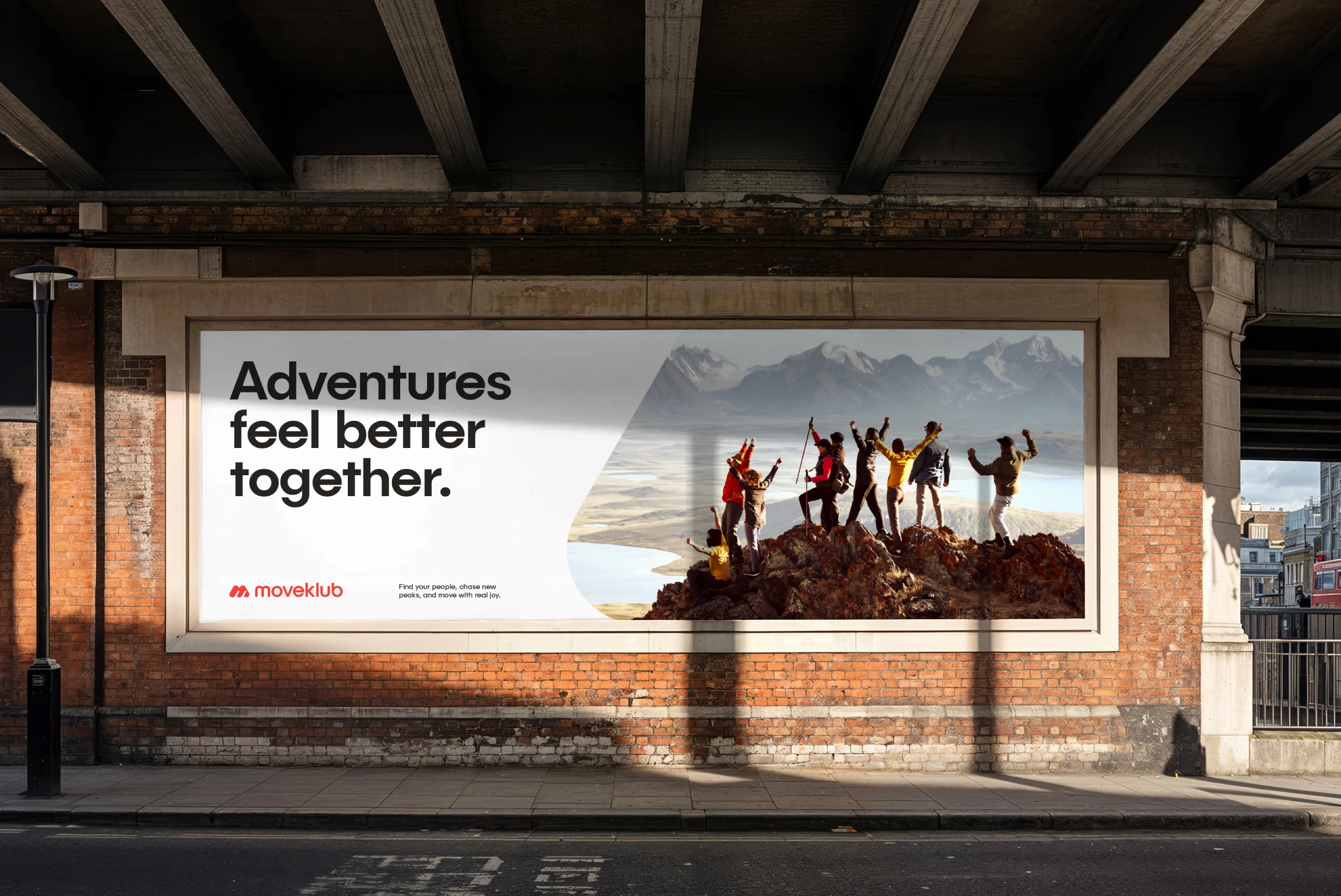
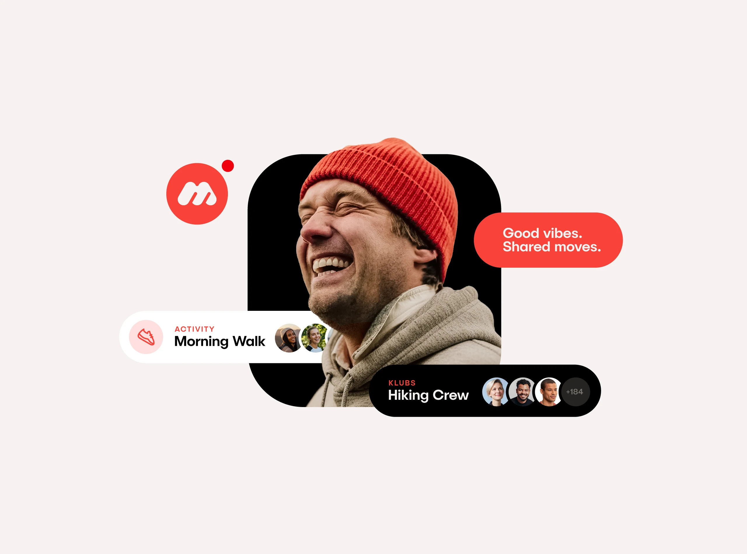
Join intimate activities that feel like small plans among friends, and explore larger Klubs that gather people in the same city around the way they like to move — yoga, cycling, pilates, hiking and everything in between. Together, they shape a friendly rhythm of faces, places and habits that make it easier to stay active and stay connected.
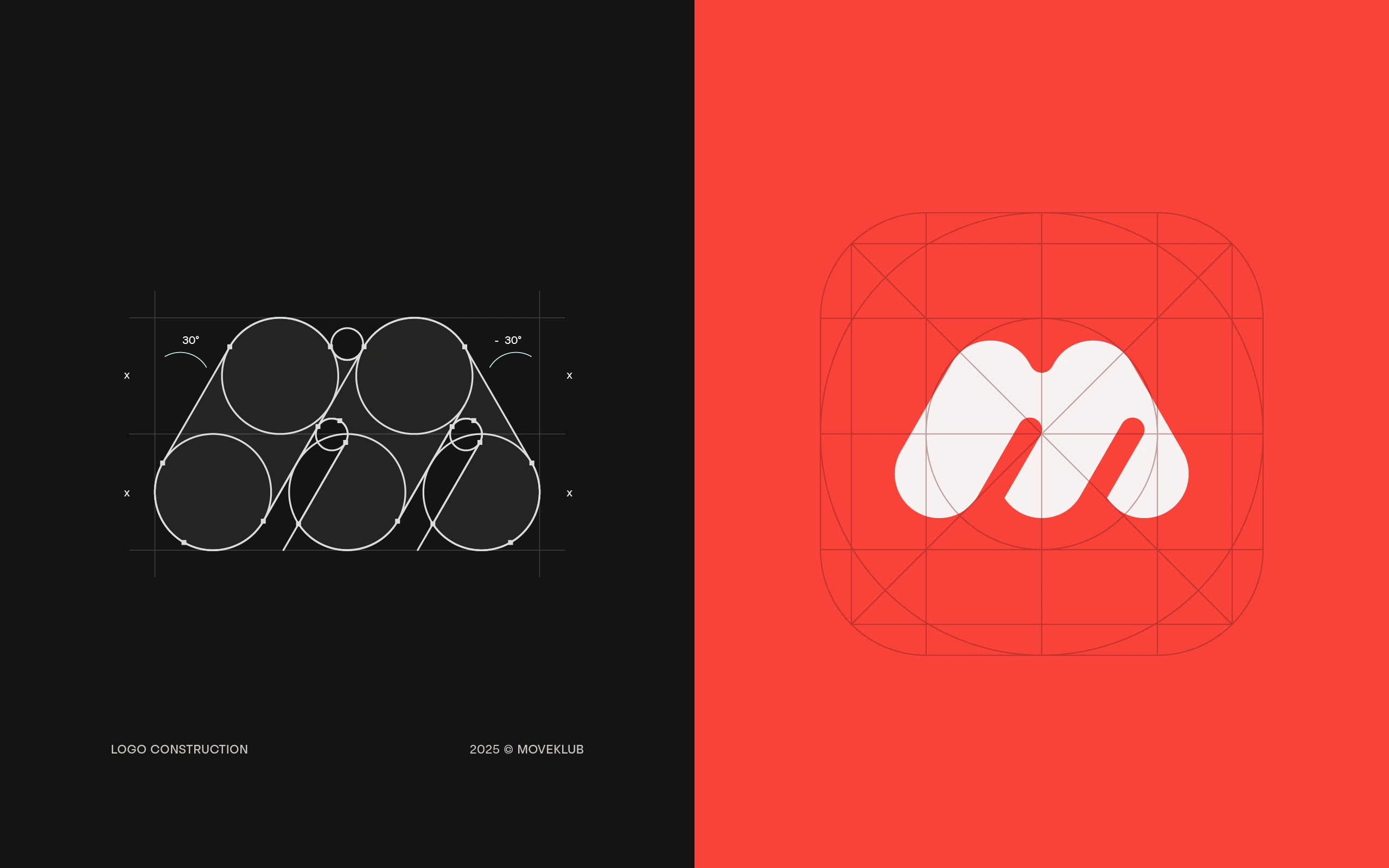
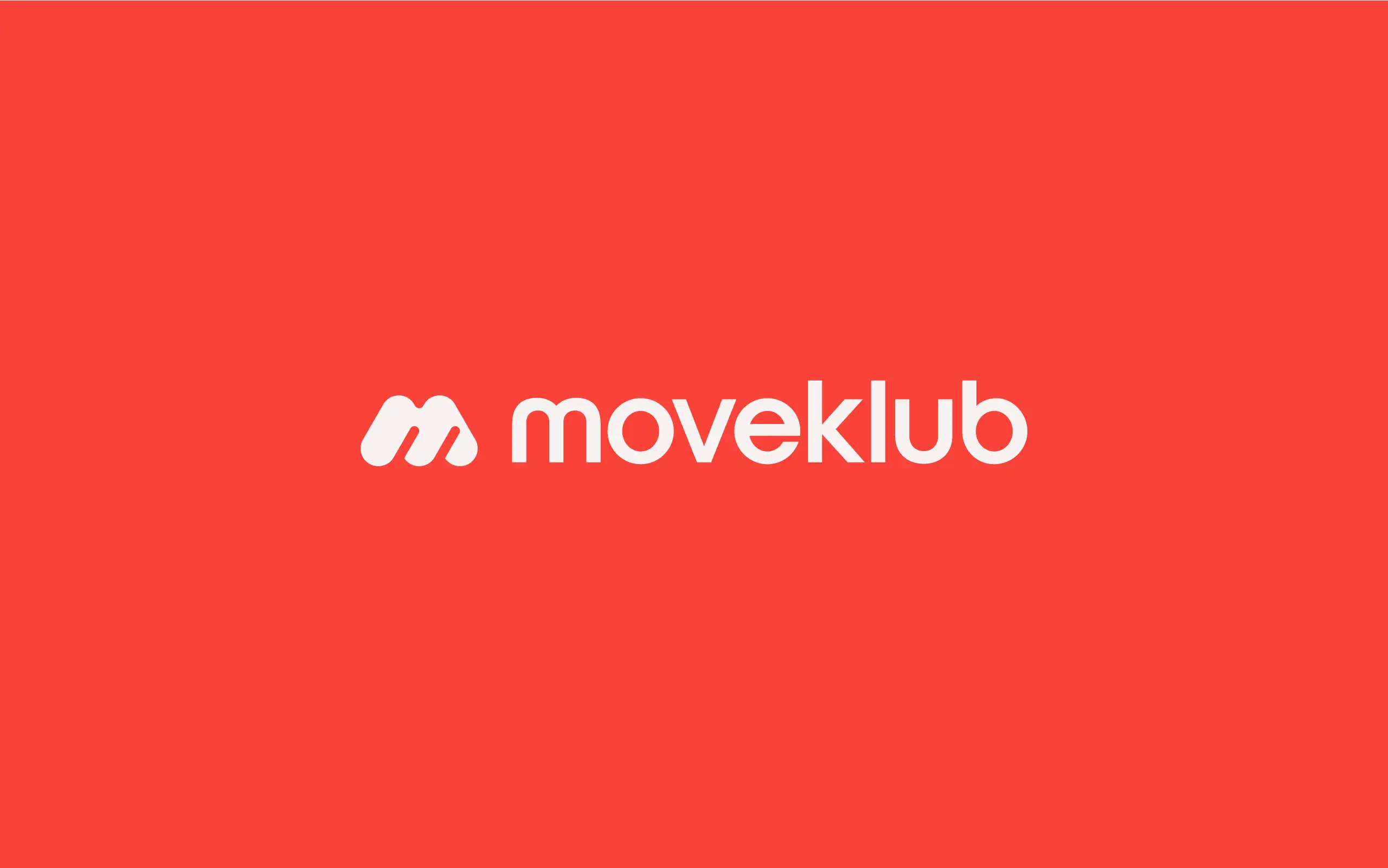
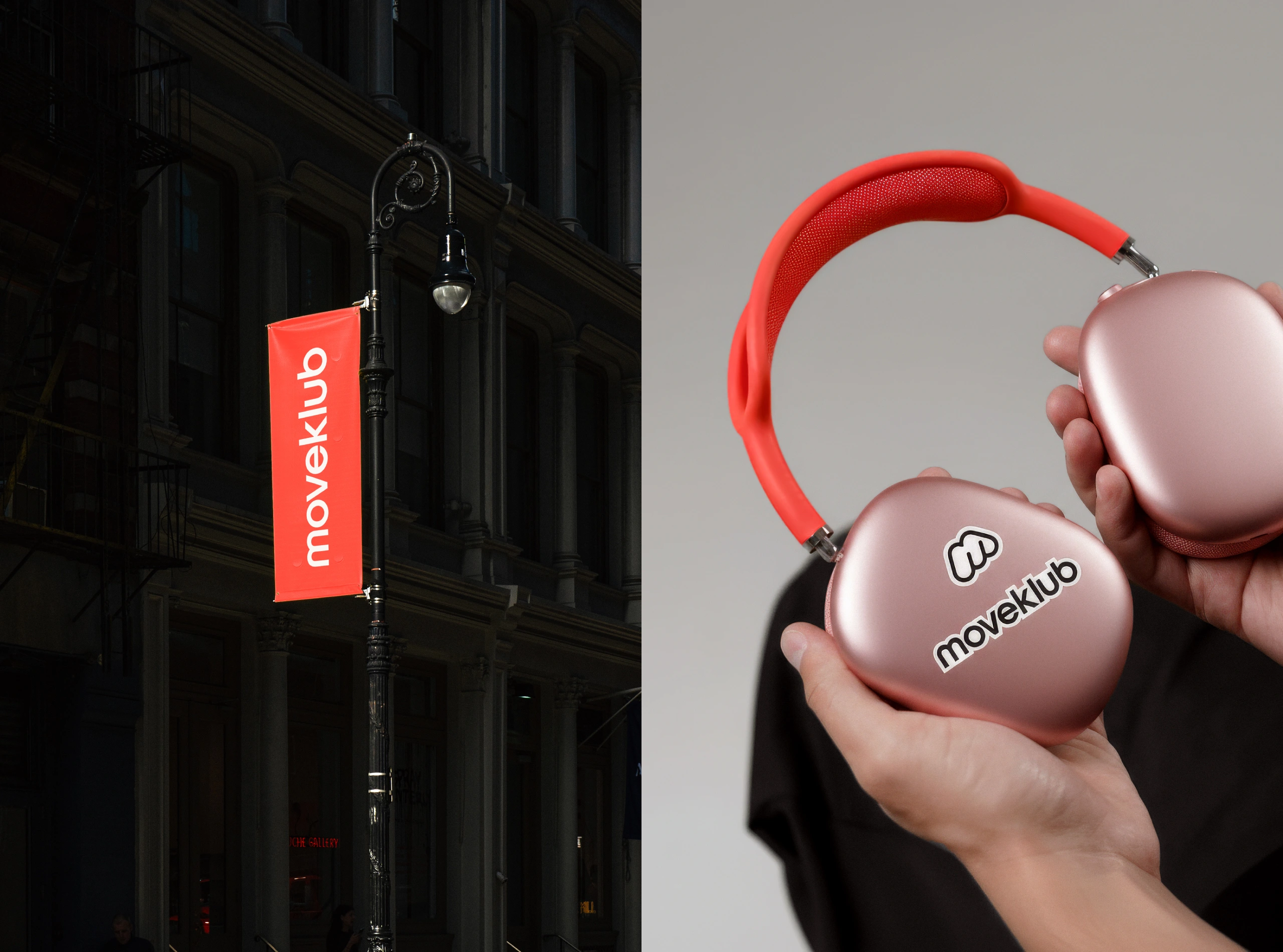
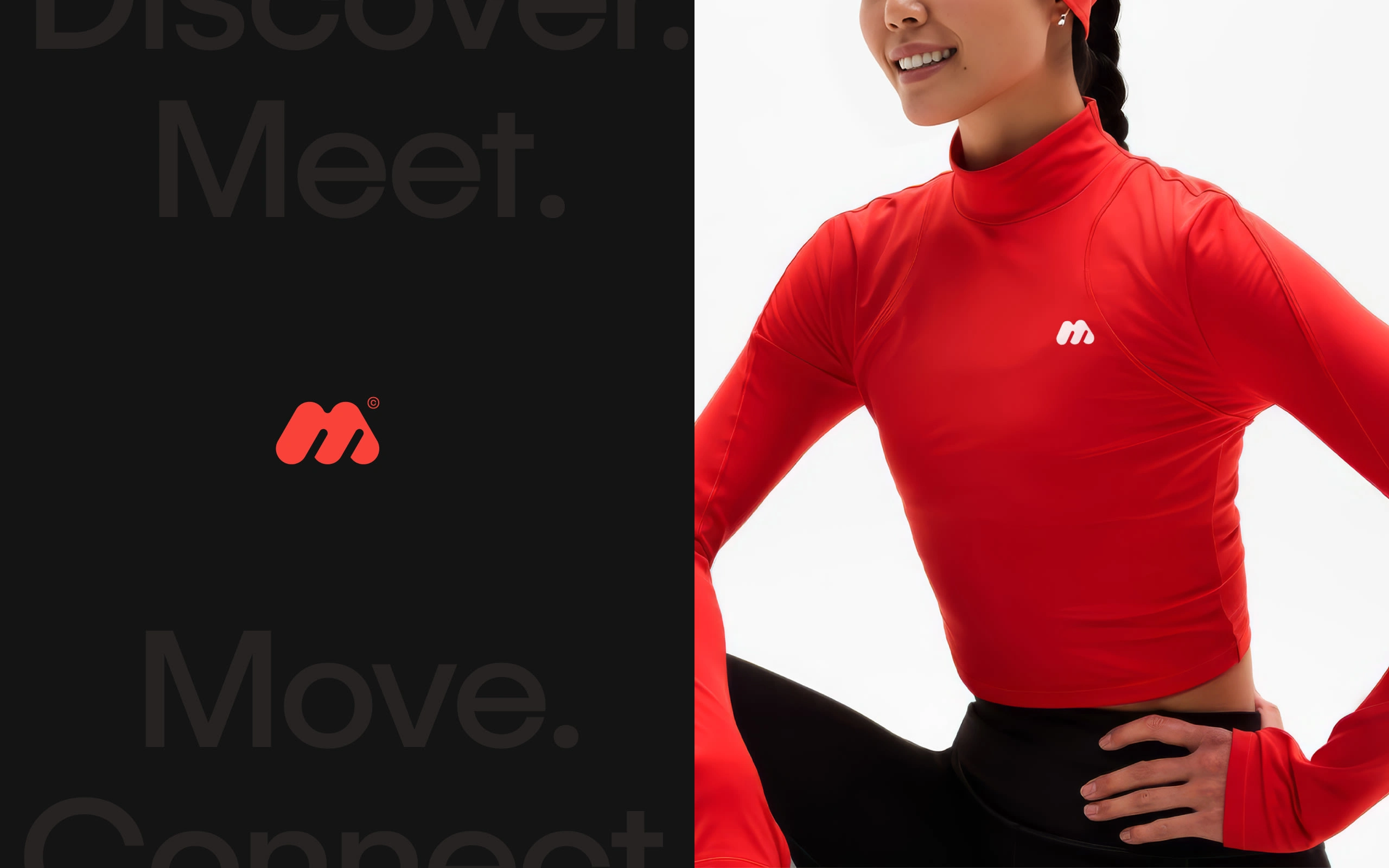
The logo carries that same spirit. A bold, forward-leaning M gives the brand its sense of motion and momentum, while the rounded shapes keep it soft and welcoming. Three arches sit side by side, almost like people moving together, simple, warm and full of quiet energy.
Brand Identity
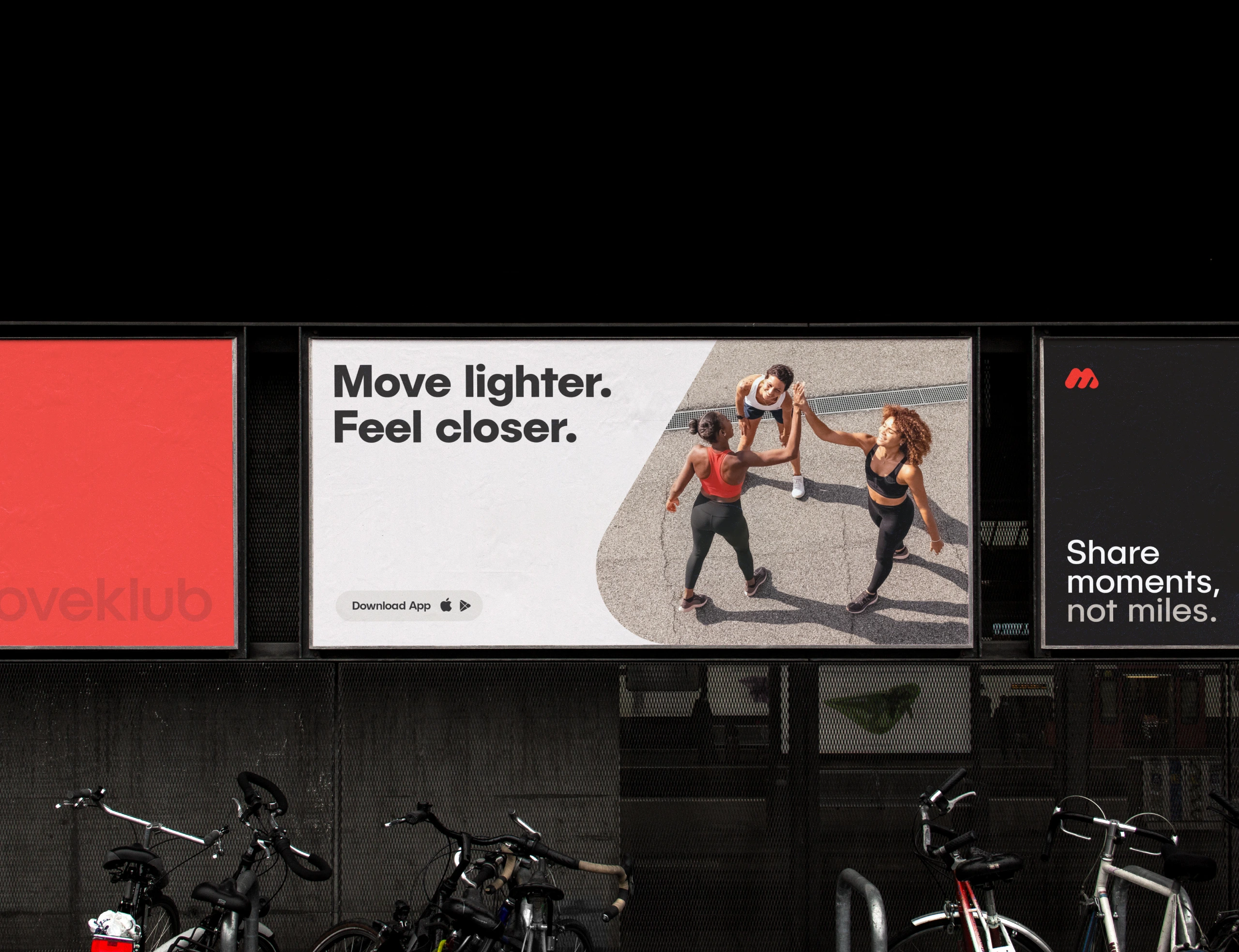
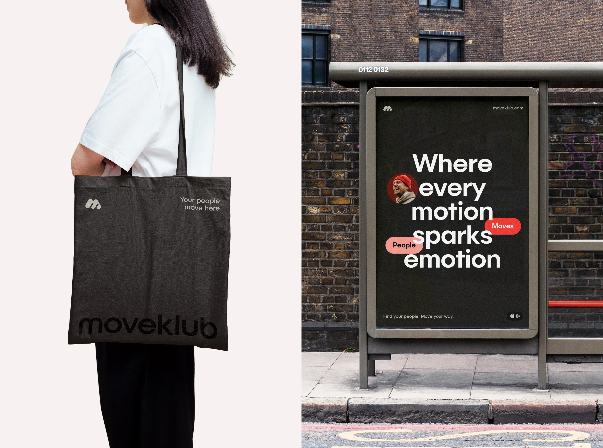
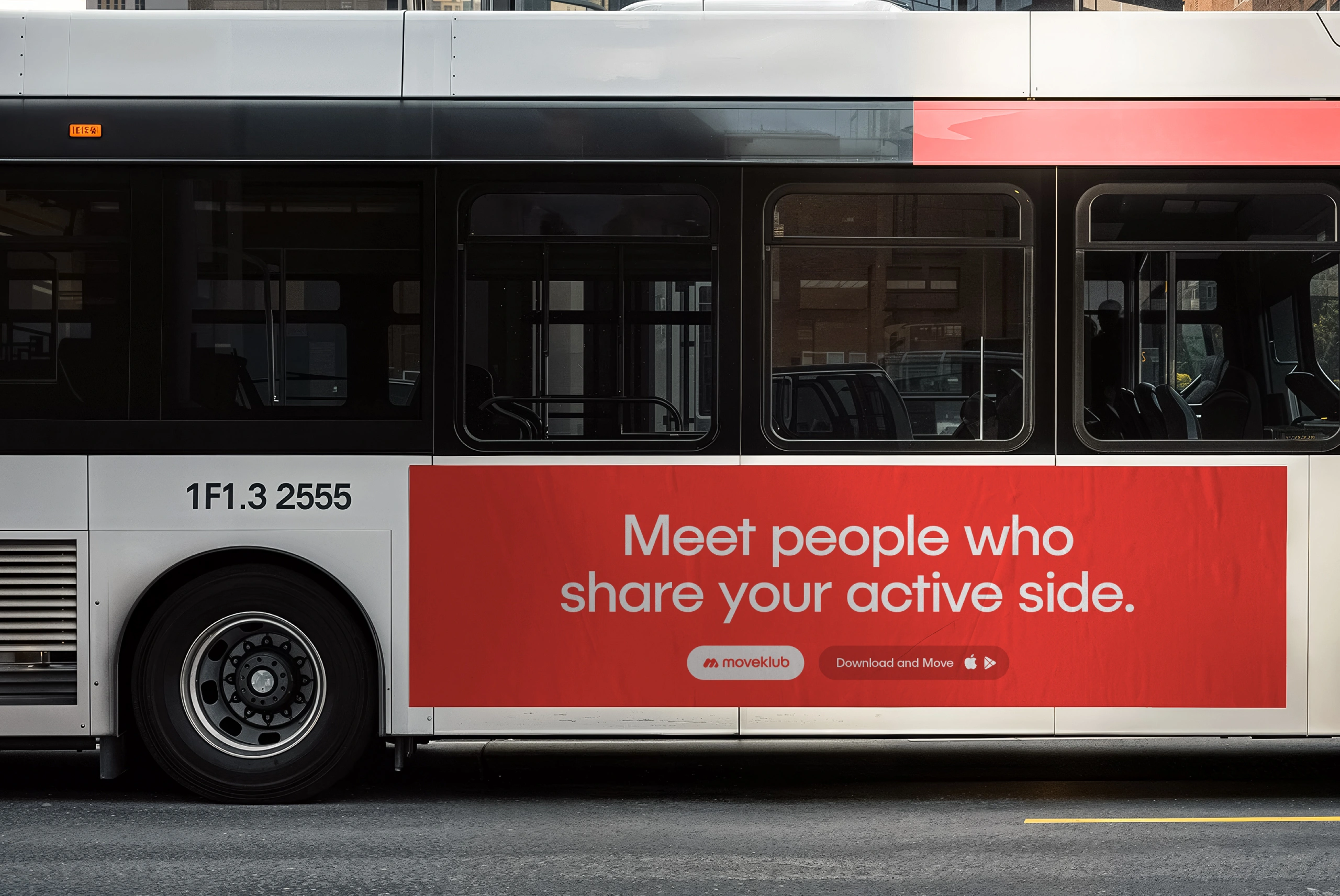
Moveklub’s visual identity is designed to feel open and human. Nothing crowded, nothing shouting. Just a calm, confident system that lets people and movement stay at the center.
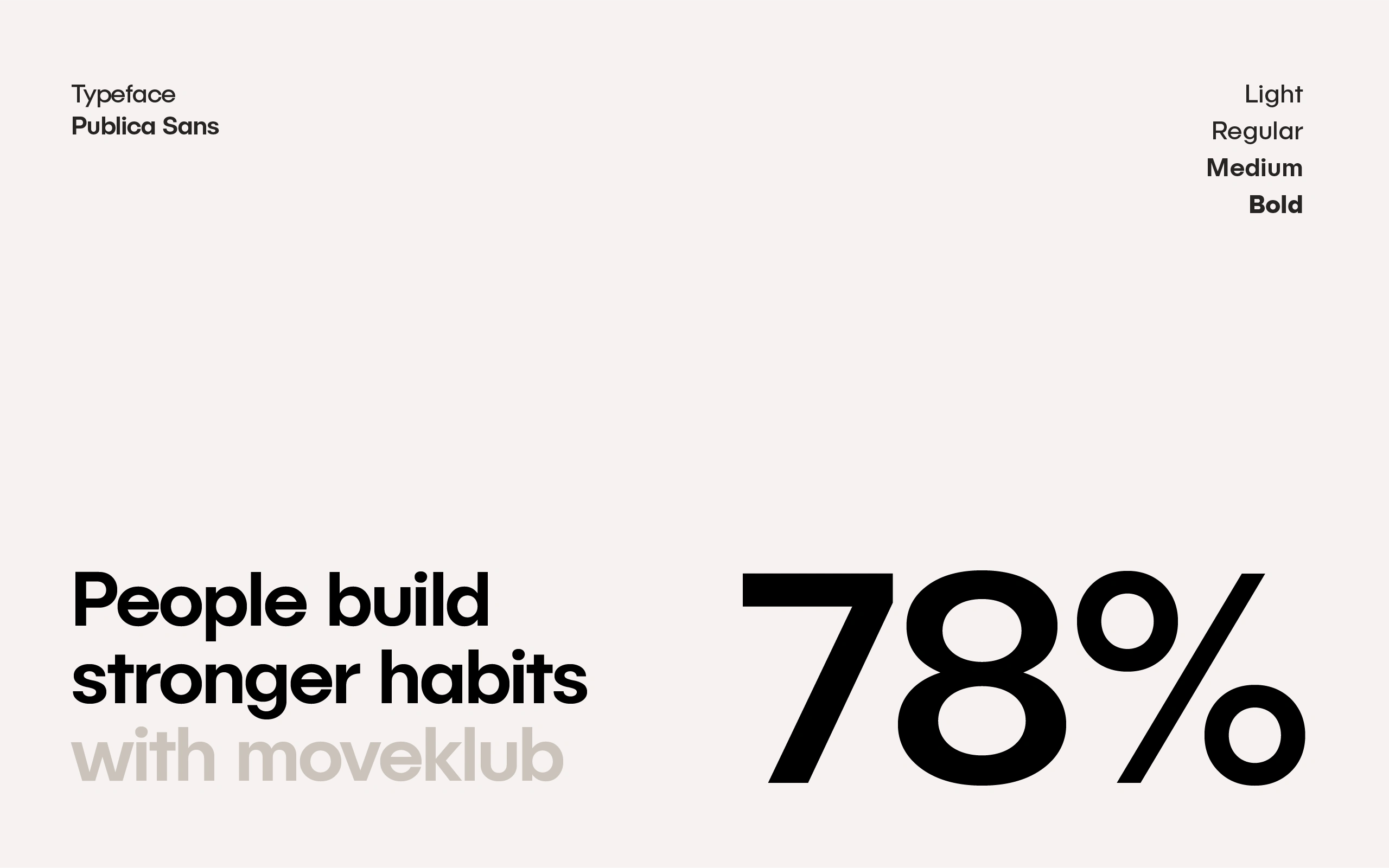
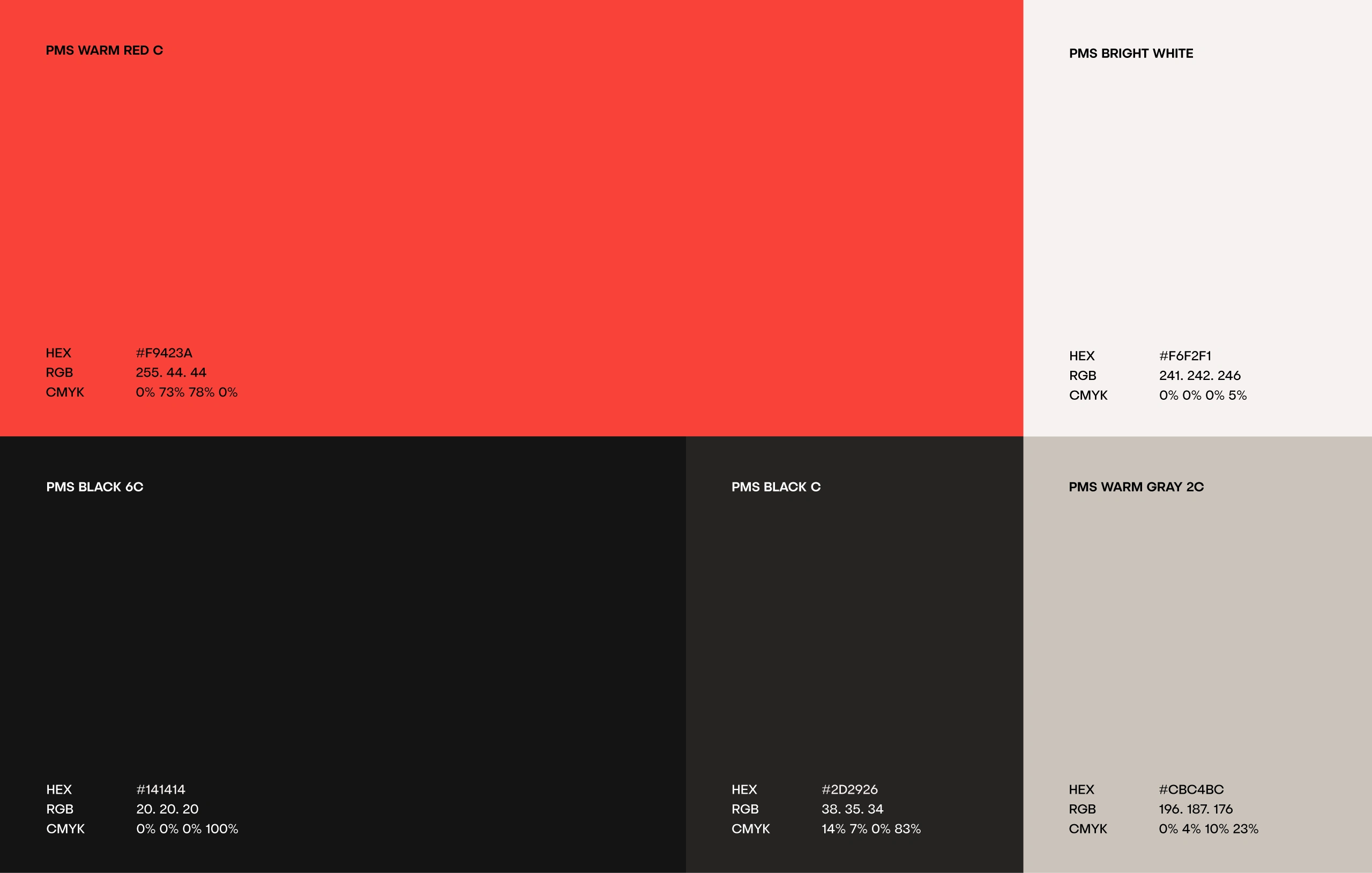
The colors bring warmth and energy. The typography is clean and modern, with a softness that makes every message feel approachable. The rounded shapes help everything breathe, giving the brand a sense of ease and flow.
Most of all, the identity aims to feel personal. It carries the emotion of shared moments, the spark of meeting someone new, and the lightness that comes from moving together. It’s not trying to decorate movement. It’s trying to reflect how good it feels.
The result is a visual world that feels friendly and clear. A system that brings people in, encourages connection, and quietly supports the idea at the heart of Moveklub: movement feels better when it’s shared.
Like this project
Posted Nov 18, 2025
A bold, friendly identity for Moveklub, a social app that brings people together through movement. Designed to feel energetic, modern, and deeply human.