FLEX FITNESS — Visual Identity

MAHRUS OLOSO


Brand Overview
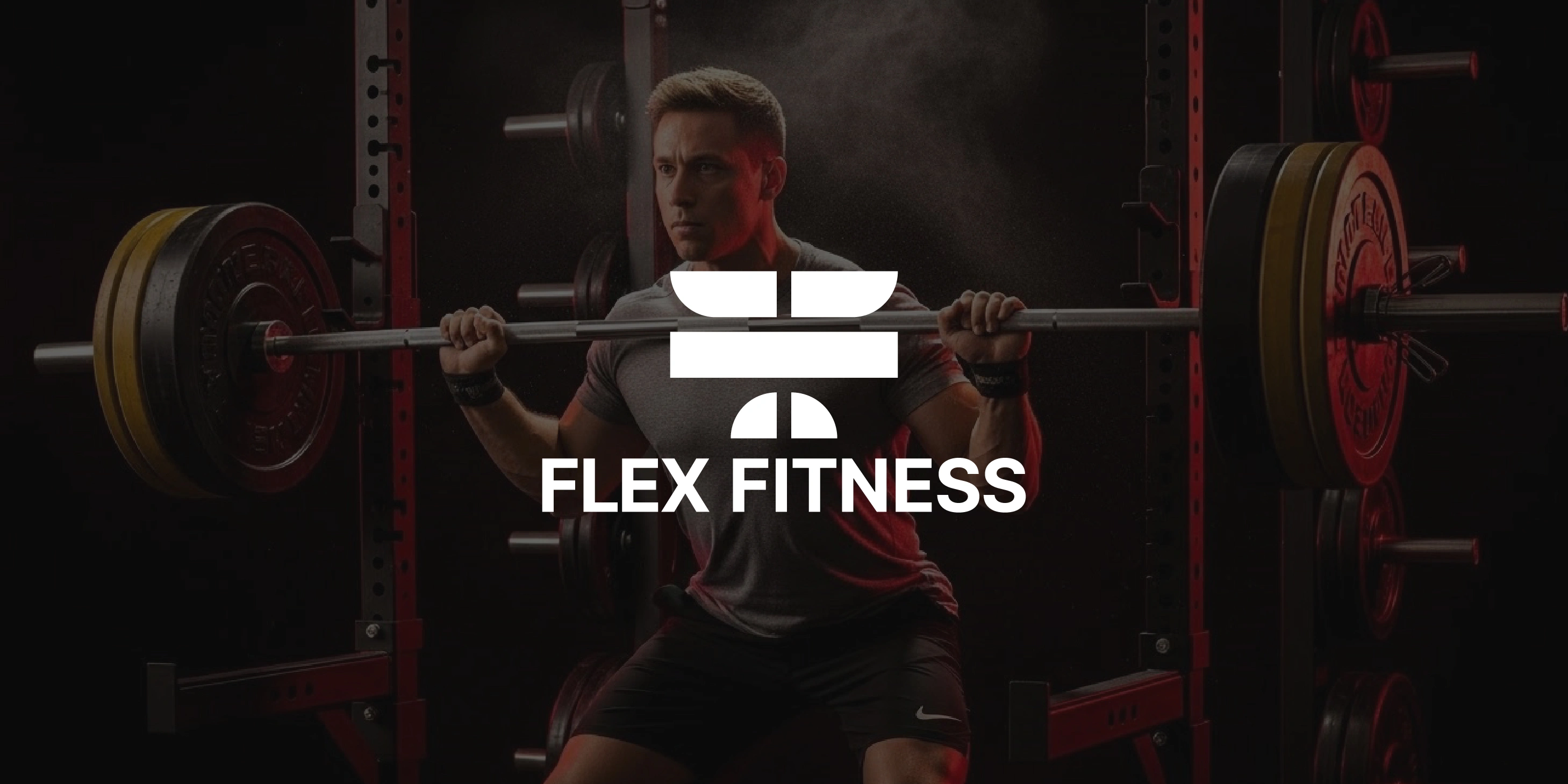
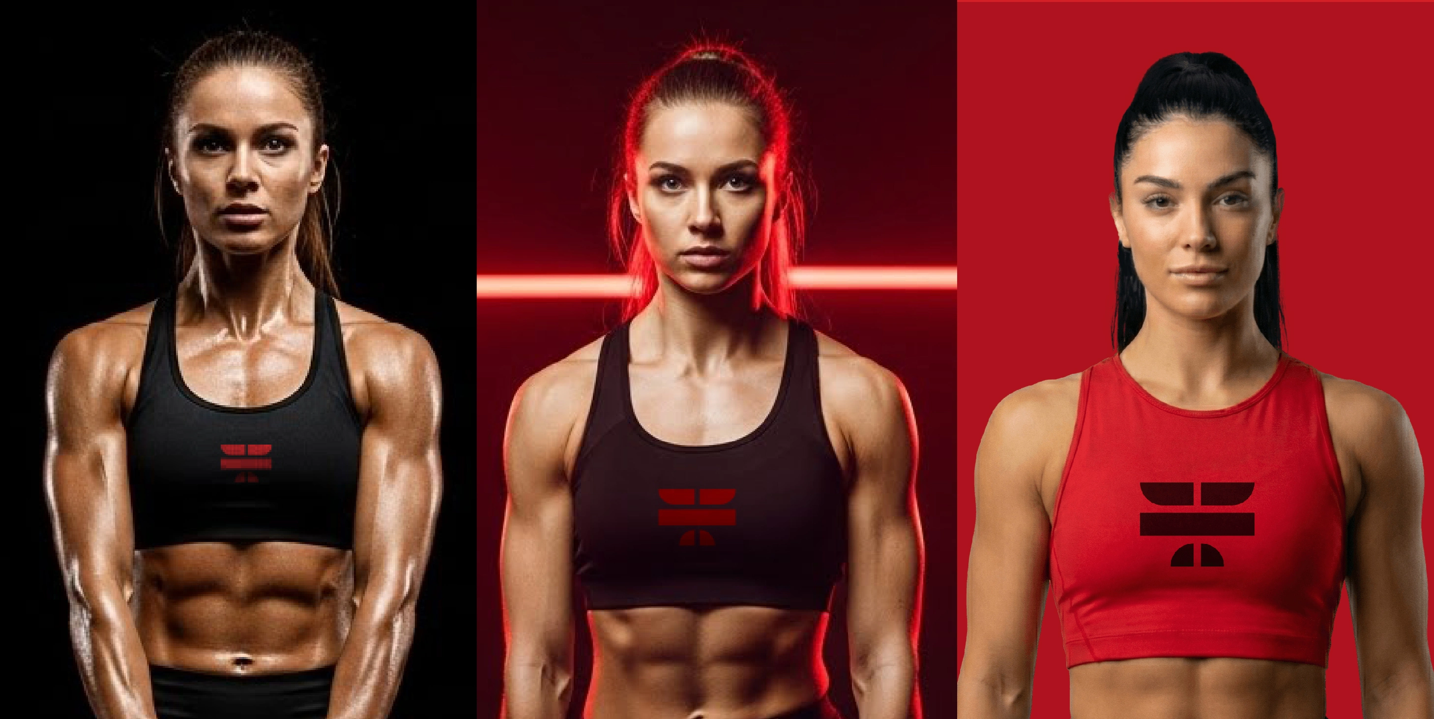
Flex Fitness is a high-performance training brand built around the principles of discipline, balance, and transformation. The brand exists for athletes and everyday individuals pushing past limits — people who believe that strength is earned through consistency.
The core idea behind the identity is simple:
Strength has a shape.
And Flex Fitness embodies that shape visually, physically, and mentally.
The brand mark becomes a metaphor for the training journey: the moment where effort and discipline meet, forming a stronger version of yourself rep after rep.
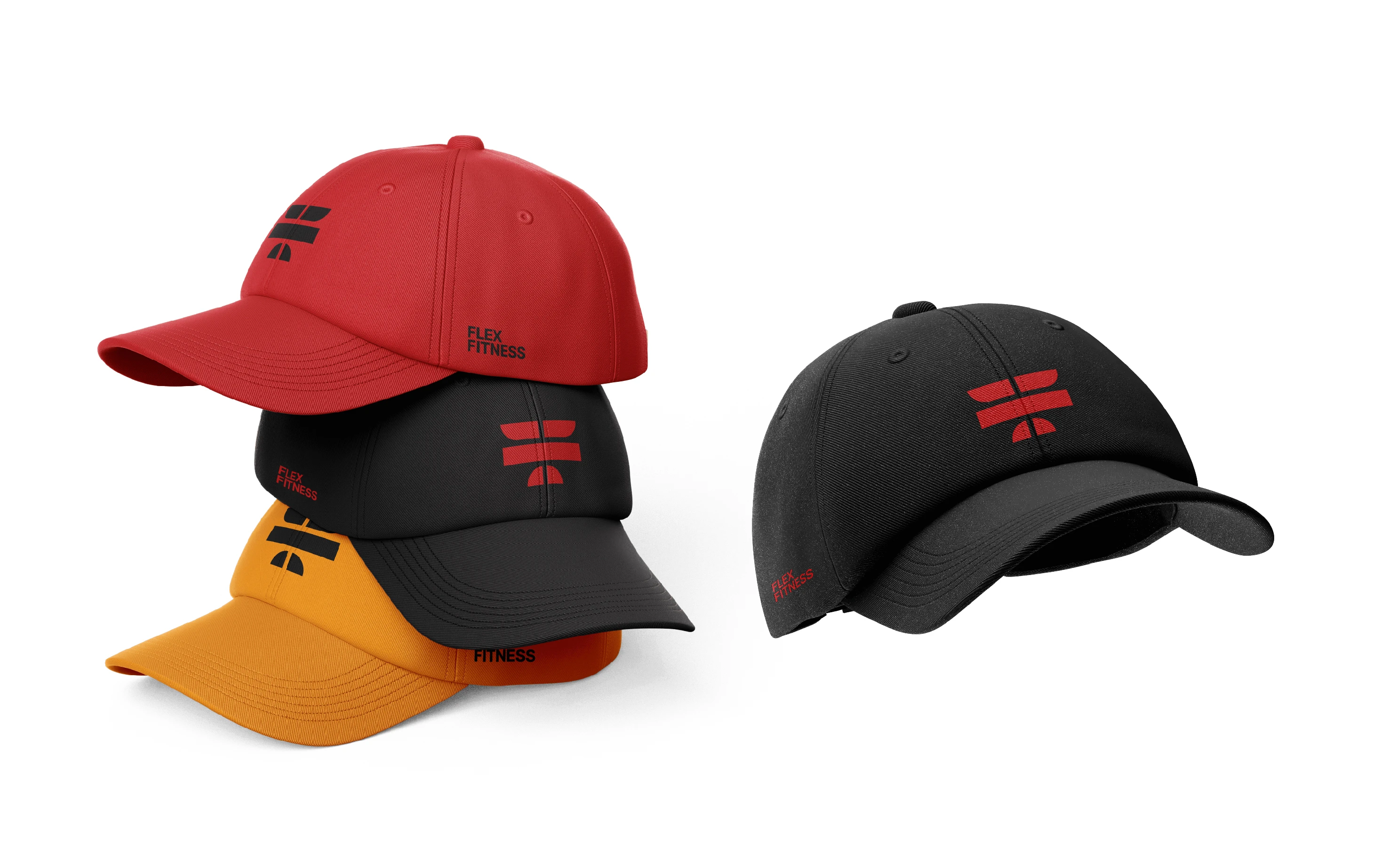
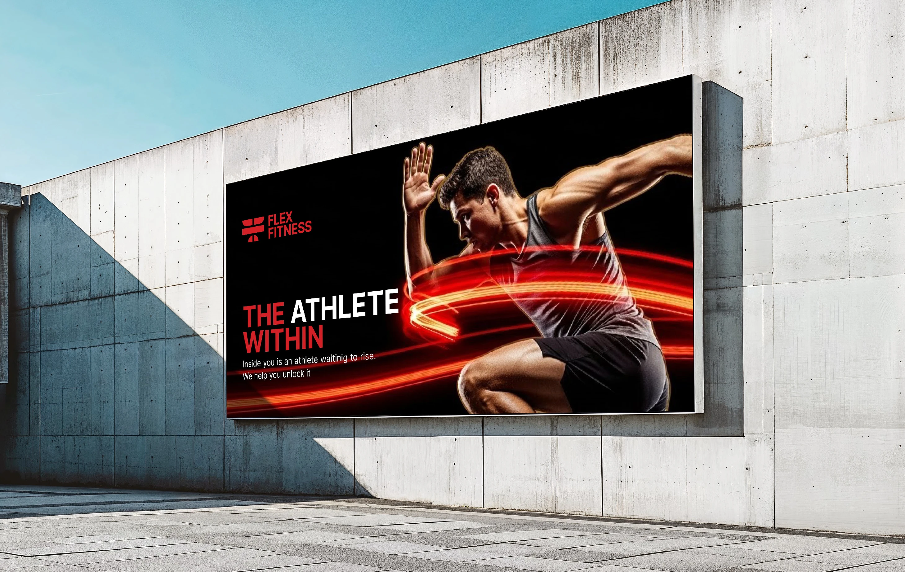
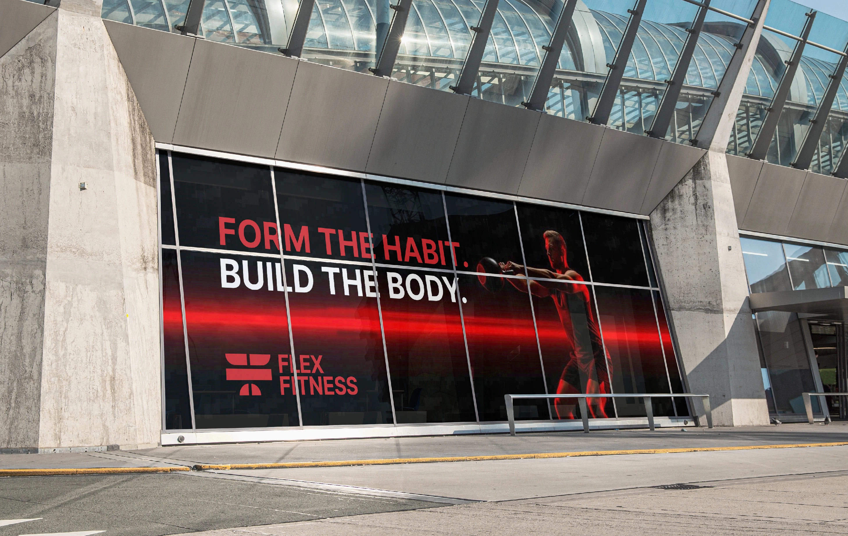
The entire identity system — from typography to color to image direction reinforces this idea of progress through intentional movement.
Elevate Your Brand with a High-End Logo & Brand Identity - Click Here
Need a Fast Response? Just contact me directly on Whatsapp
Brand Strategy
The essence of the brand is strength, discipline, and transformation. The strategy focuses on the rhythm of training: lift, hold, release, and repeat. This rhythm guided the visual direction and the overall design system.
The brand personality is strong yet controlled, energetic but intentional.
Flex Fitness promises to help people move with purpose and build strength through consistency.
Logo Concept & Story
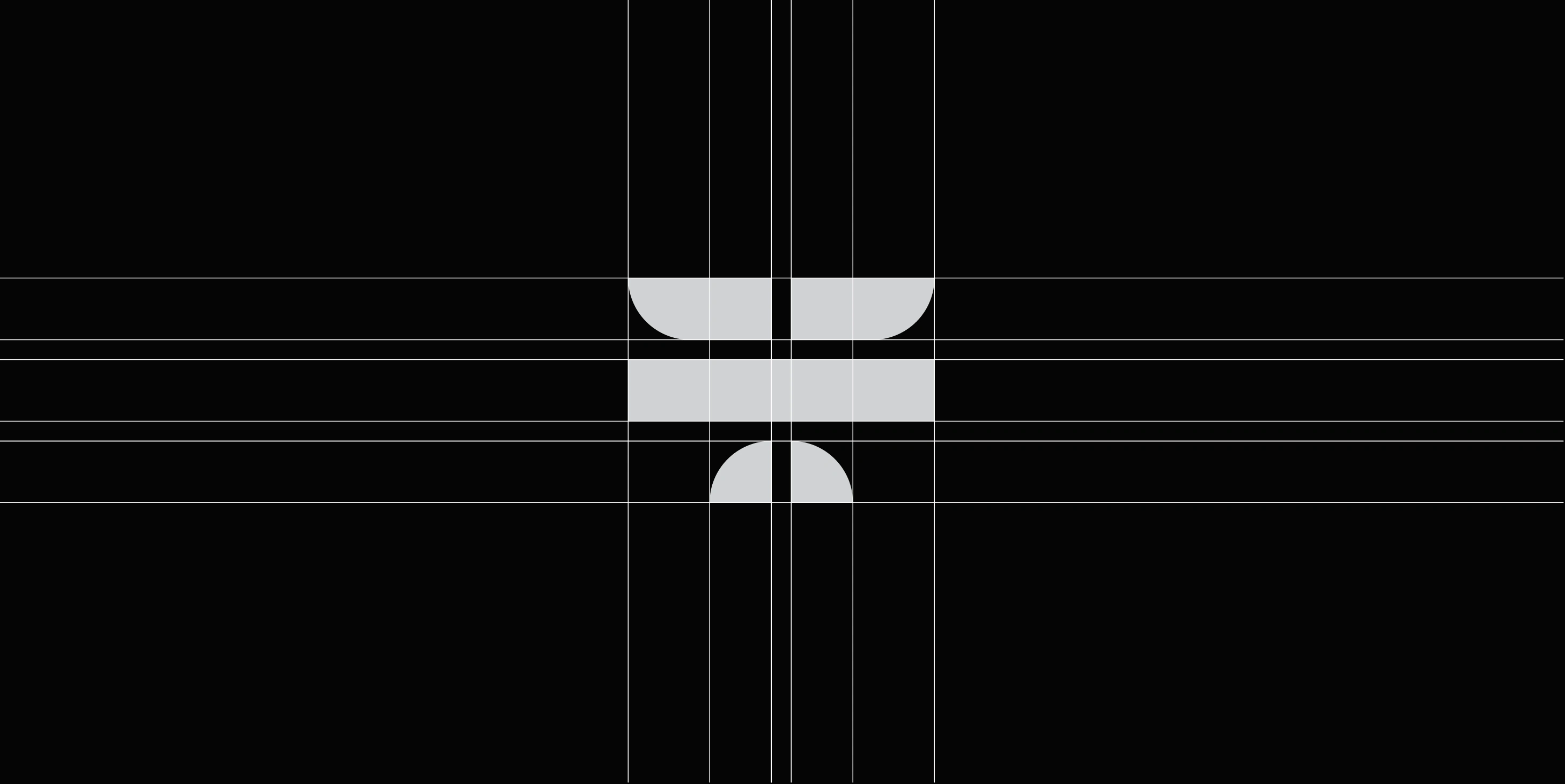
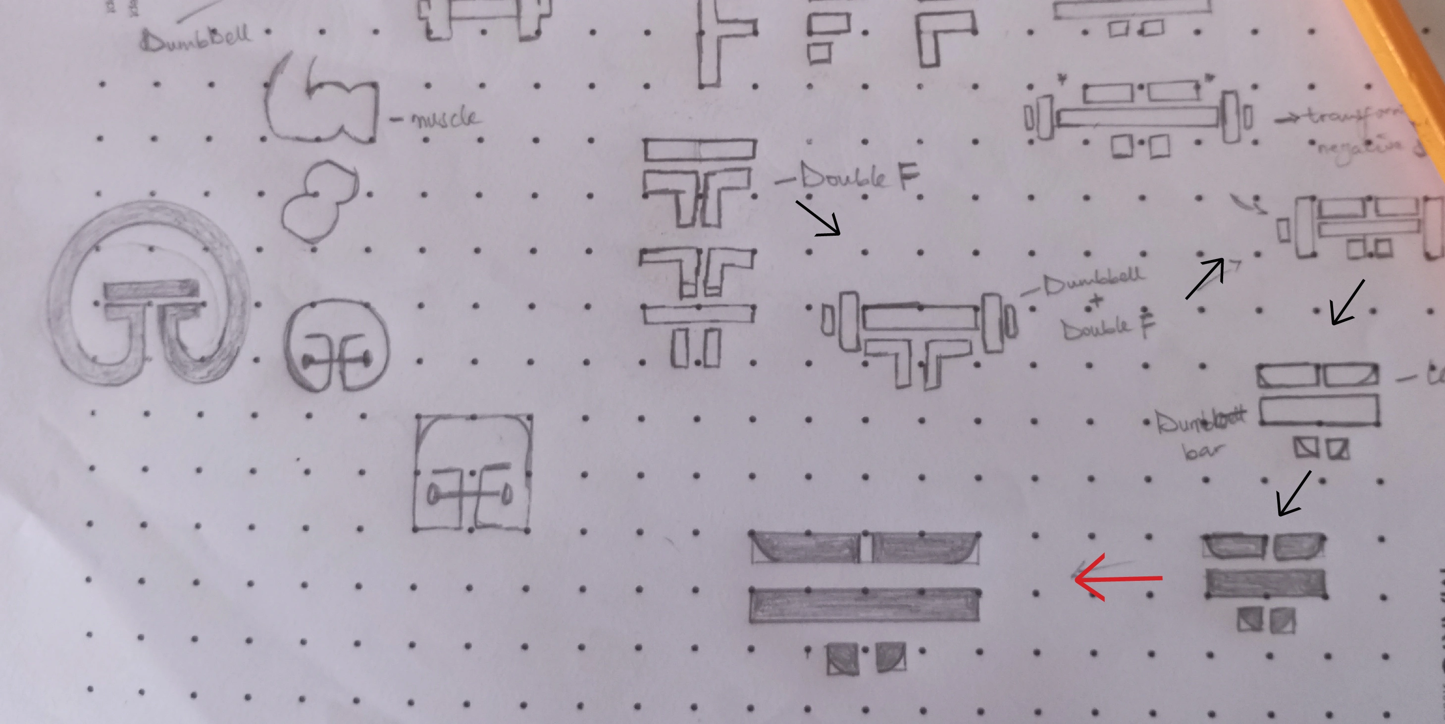
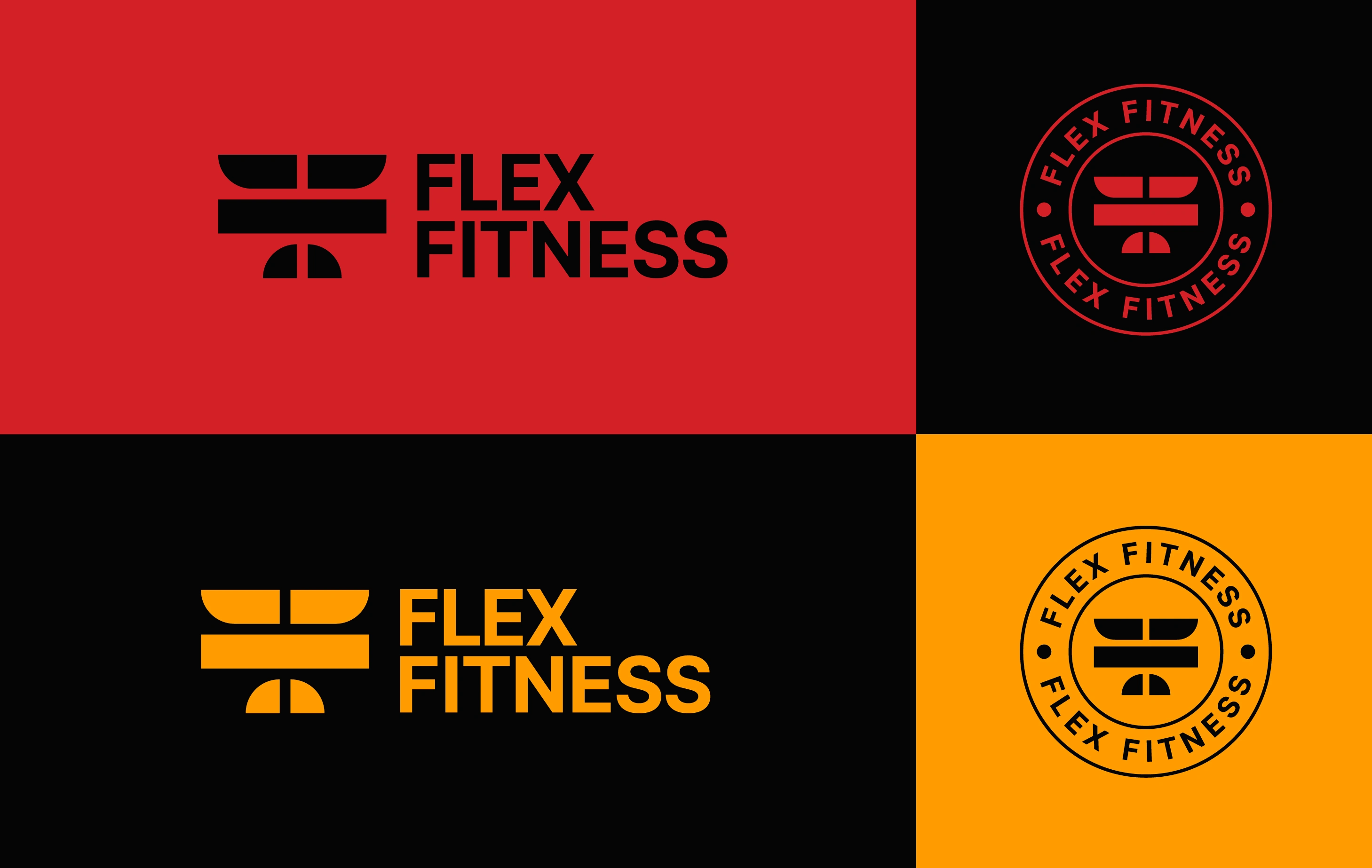
The logo started with the letter F, but it evolved into a more symbolic structure.
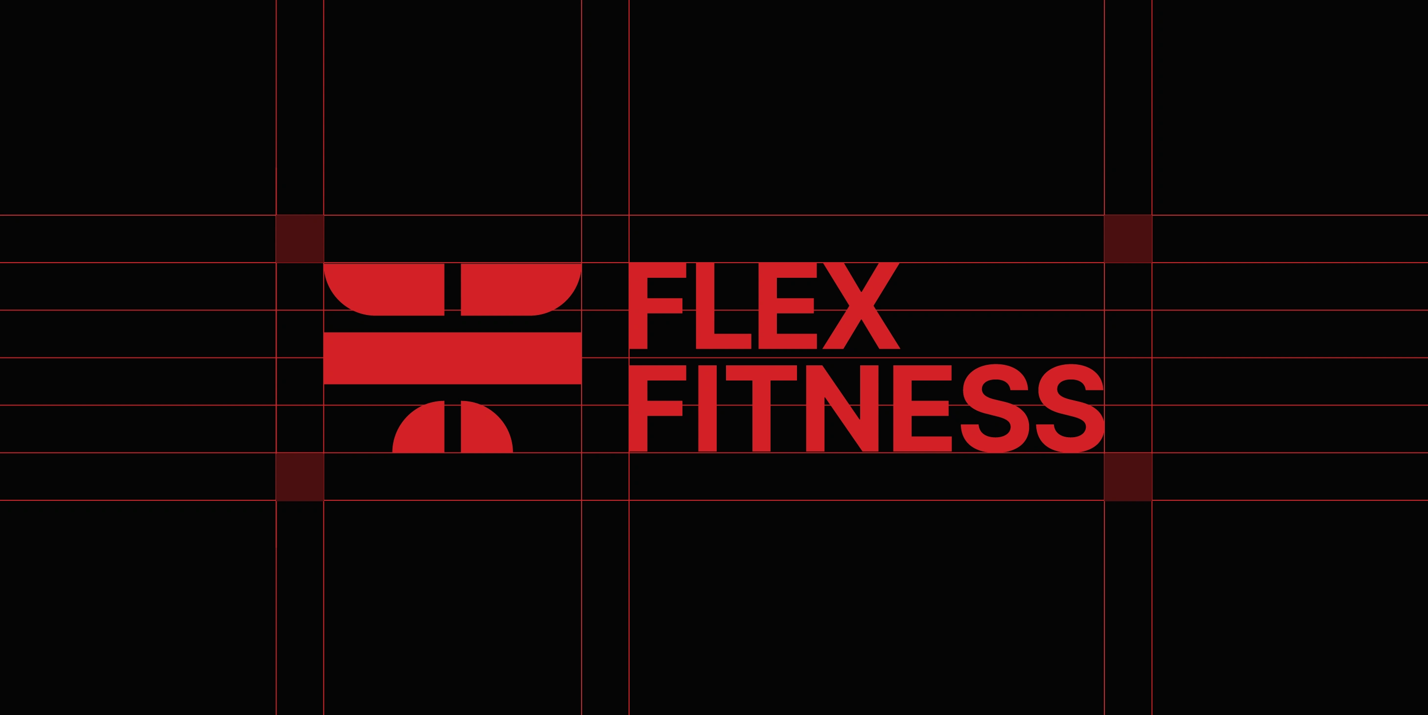
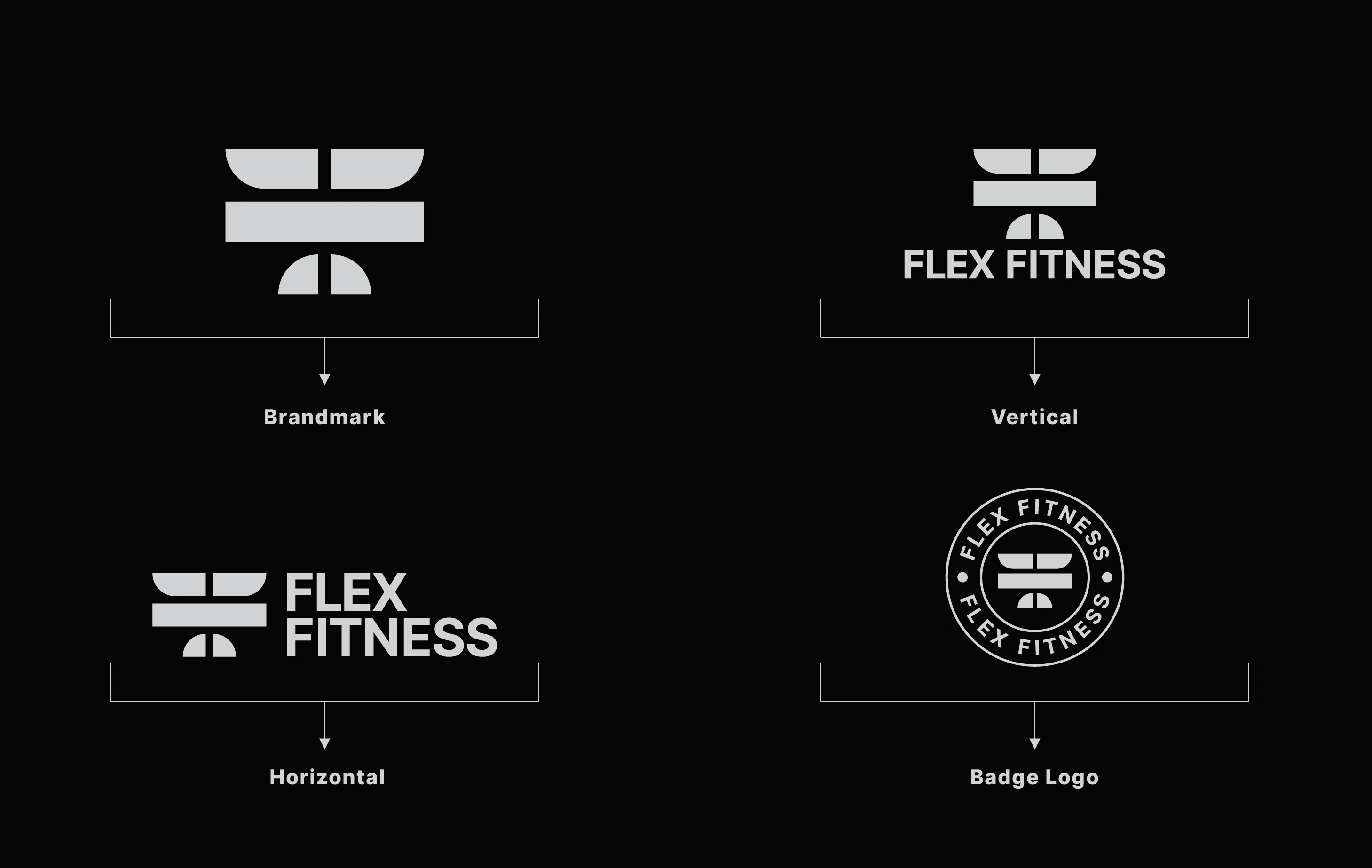
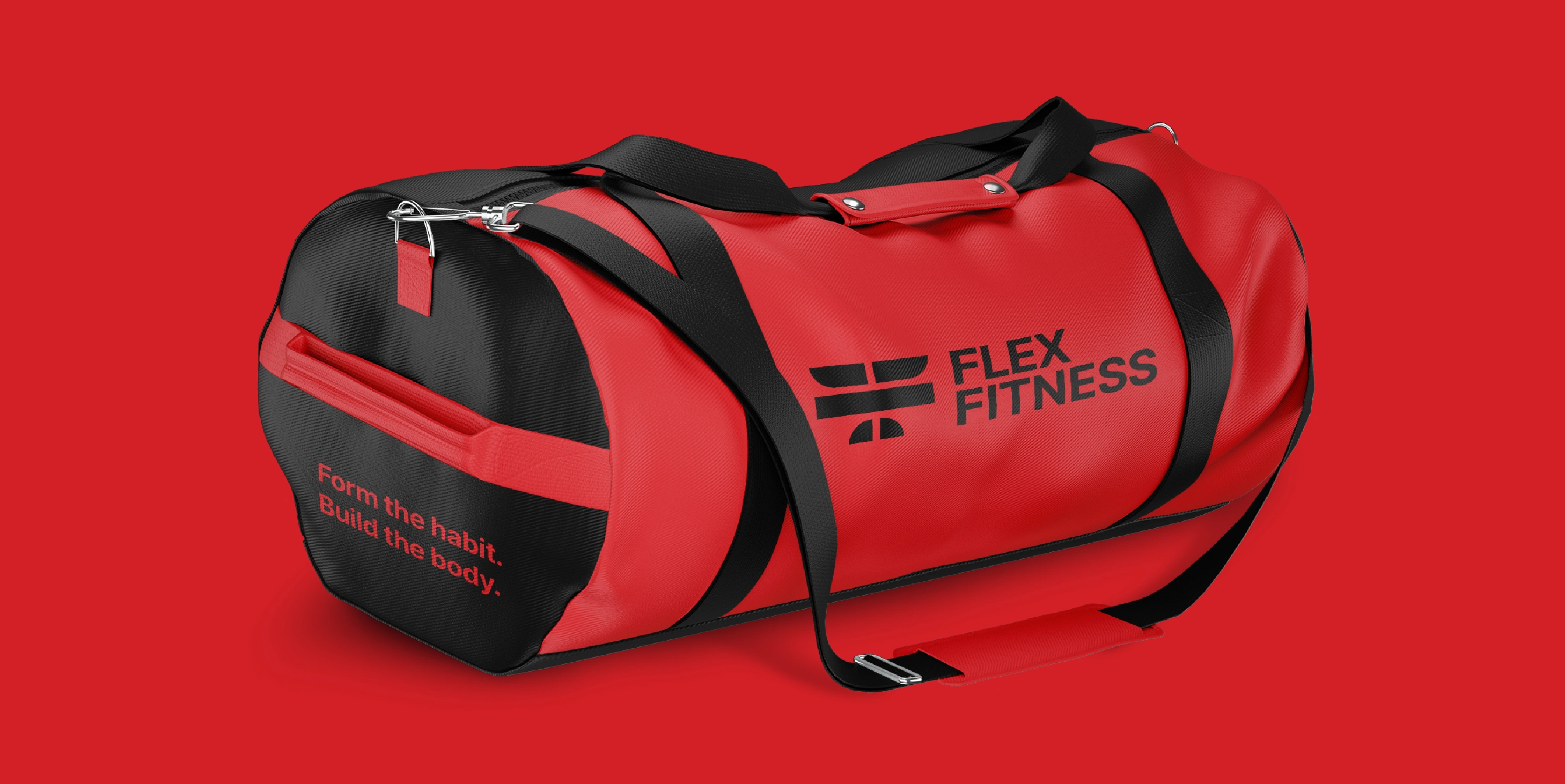
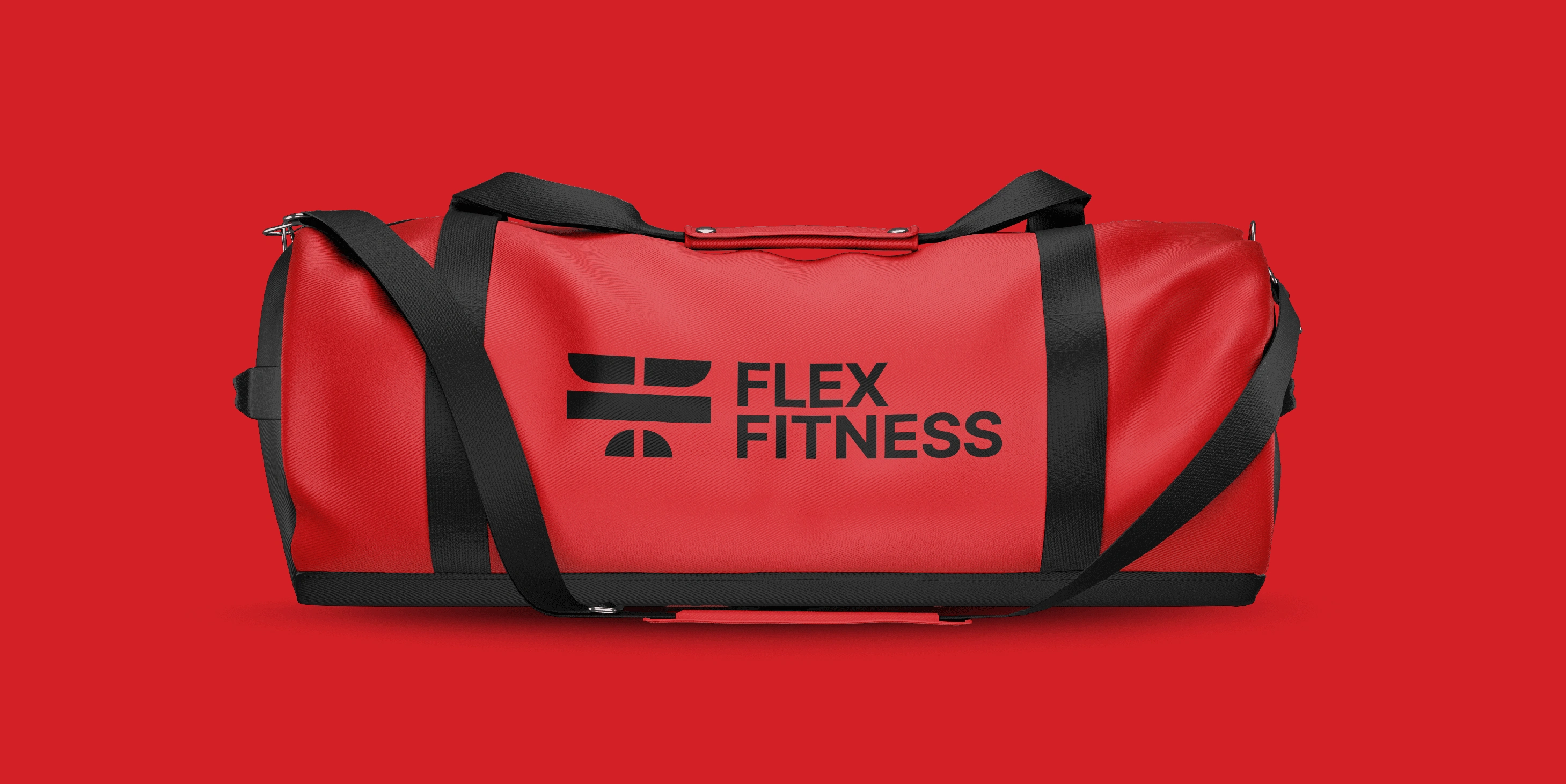
I mirrored the F into two forms, creating balance and direction. These forms are connected by a central bar inspired by a dumbbell or barbell. The bar represents the foundation of strength training and the discipline behind it.
The final symbol feels grounded, unbreakable, and ready to be lifted. It reflects the athlete’s mindset: focused, consistent, and built through effort.
The mark also mirrors the rhythm of training — the lift, the hold, and the release. It visually represents the journey from effort to progress and from discipline to power.
Brand Color System
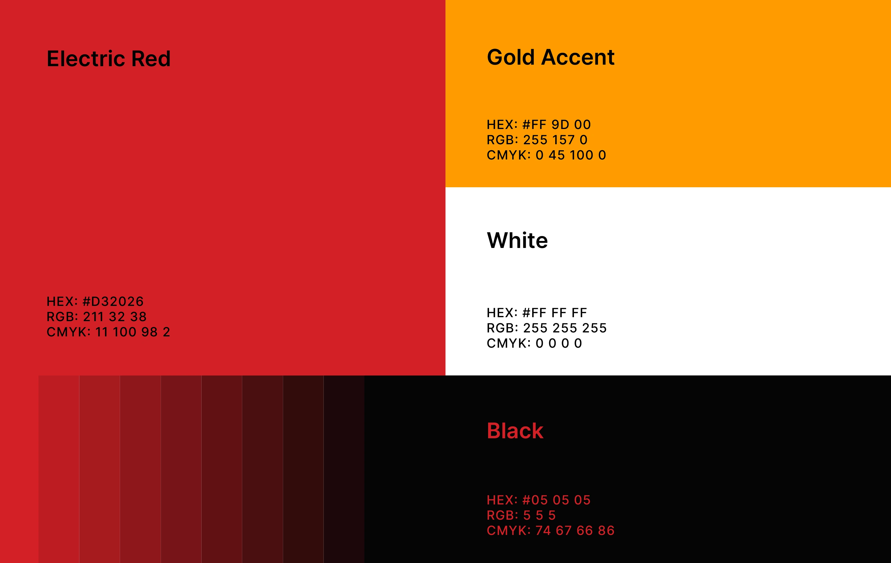
The color palette for Flex Fitness was crafted to express raw strength, precision, and the intensity of disciplined training. Every color carries a purpose and supports the brand’s message of pushing beyond limits.
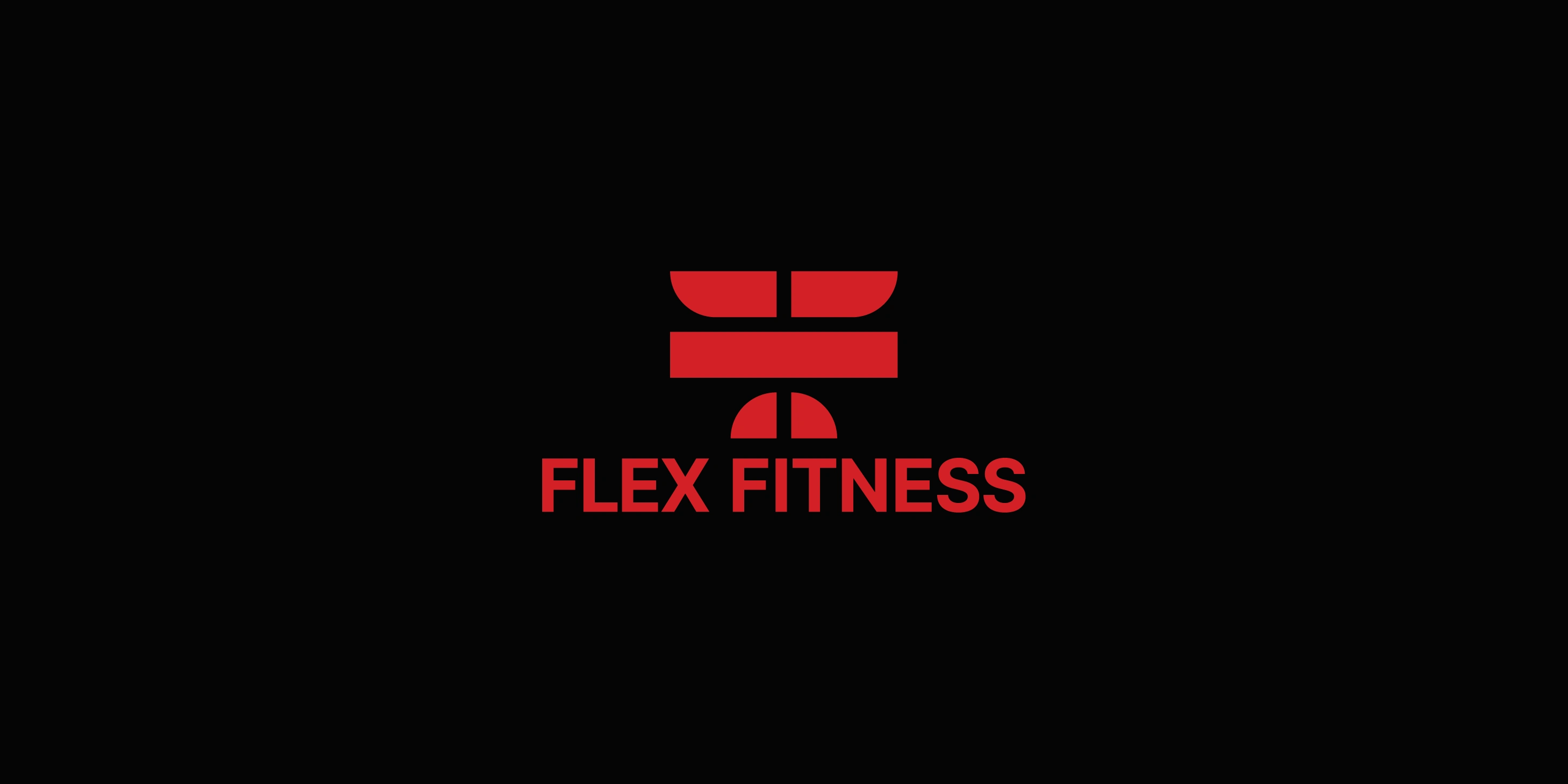
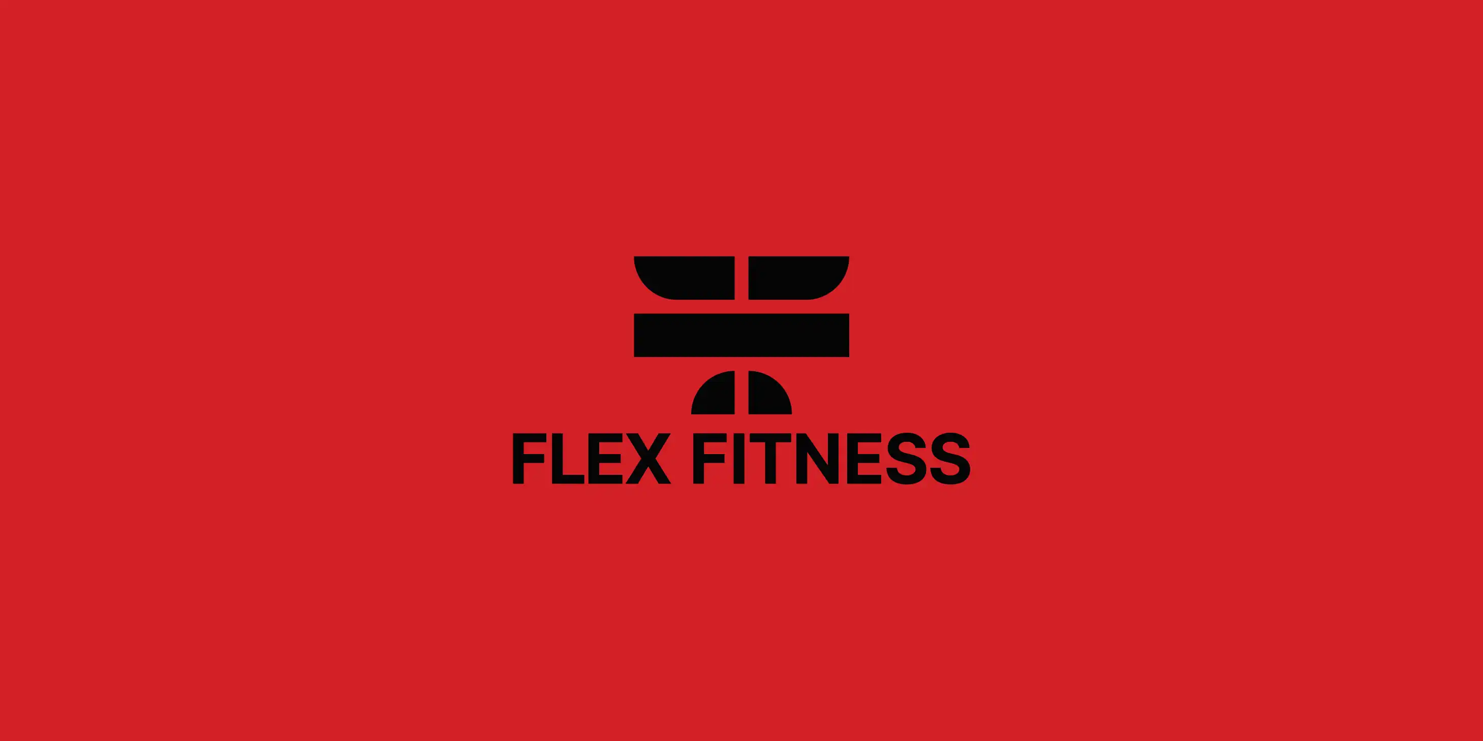
Black (#050505) forms the backbone of the palette. It represents focus, grit, and the unshakeable discipline every athlete builds over time. The black tone creates a strong visual base that feels modern, bold, and uncompromising. It also allows other colors in the palette to pop with clarity and punch.
Electric Red (#D32026) adds motion, drive, and energy to the identity. It symbolizes heat, speed, and the adrenaline that comes from powered performance. Red becomes the emotional trigger of the palette — the reminder that strength is earned, not given.
Gold Accent (#FF9D00) appears as a symbol of growth and achievement. It represents progress, discipline, and the reward that comes from showing up consistently. The color is used sparingly to highlight key information.
White (#FFFFFF) provides balance and clarity, creating clean contrast and helping the bold colors stand out.
Together, these colors build a confident and energetic visual identity that reflects the journey of strength and transformation.
Brand Typography
Flex Fitness uses Inter as its primary typeface.
Inter was selected because it offers the perfect balance between modern geometry and functional clarity. The clean structure of Inter gives the brand a professional and contemporary appearance. Its letterforms are simple, stable, and highly legible, making it ideal for both digital and physical environments. Whether used in large headlines or small captions, the typeface maintains sharp readability and visual consistency.
Inter’s geometric style complements the strong, angular shapes of the logo. It brings balance to the visual identity by providing a calm and controlled contrast to the boldness of the symbol. The typeface feels focused and intentional, much like the training principles behind the brand.
Brand Pattern
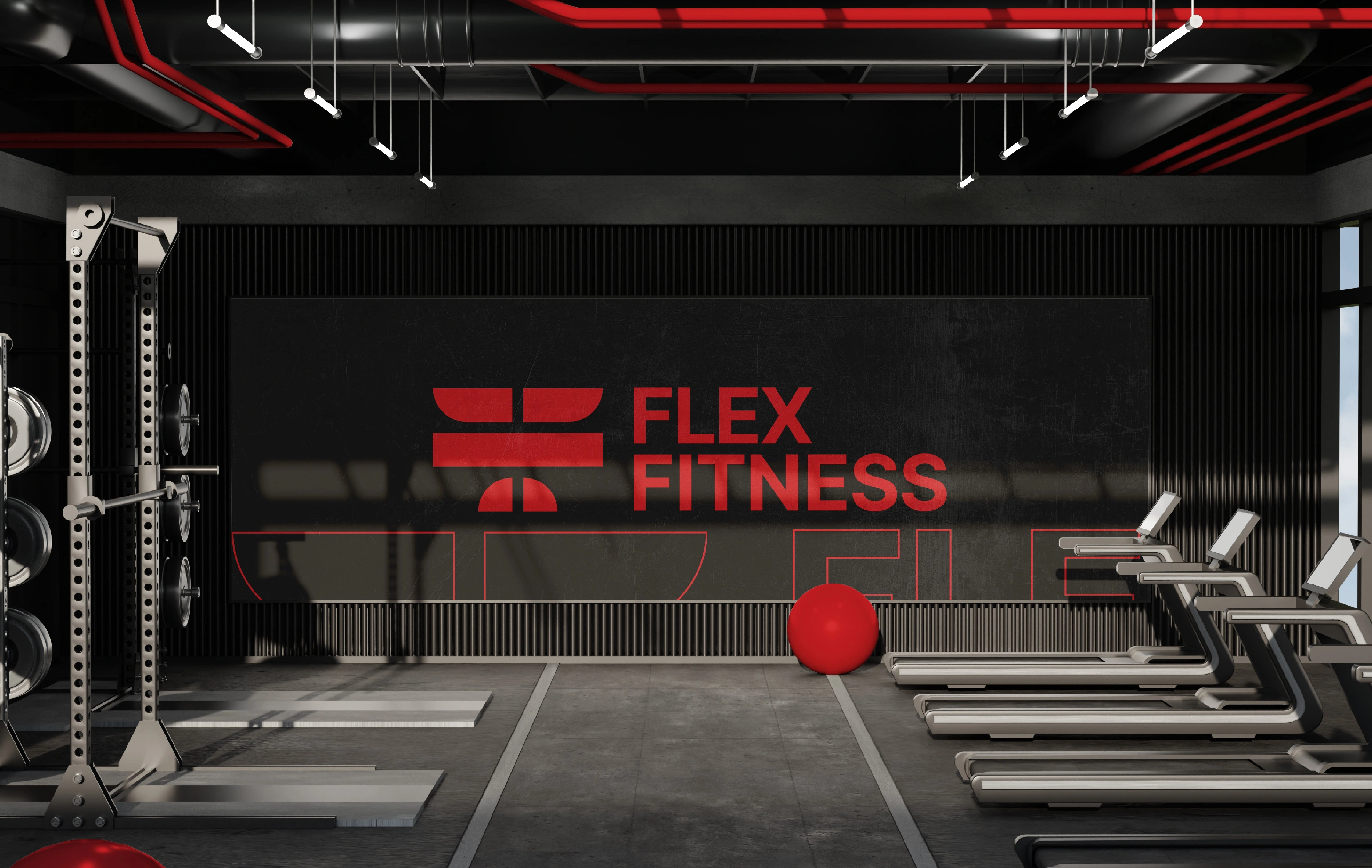
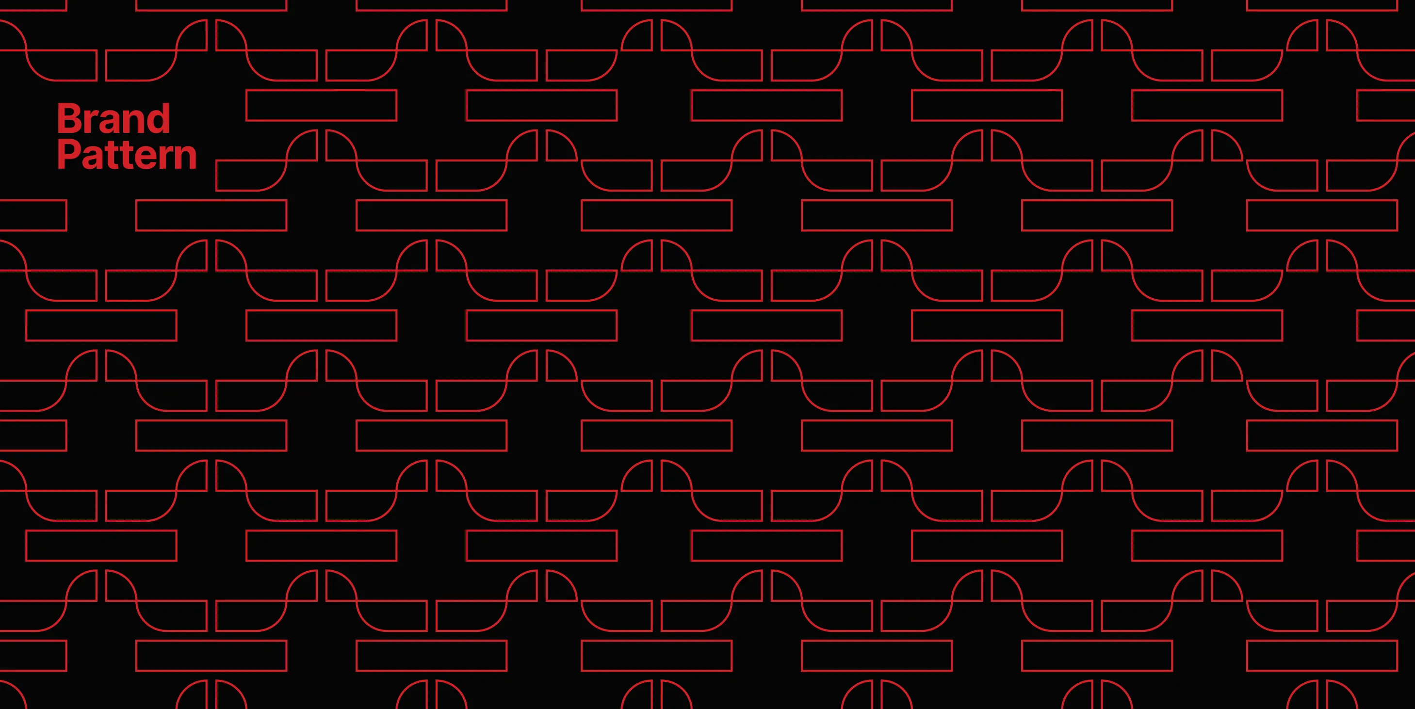
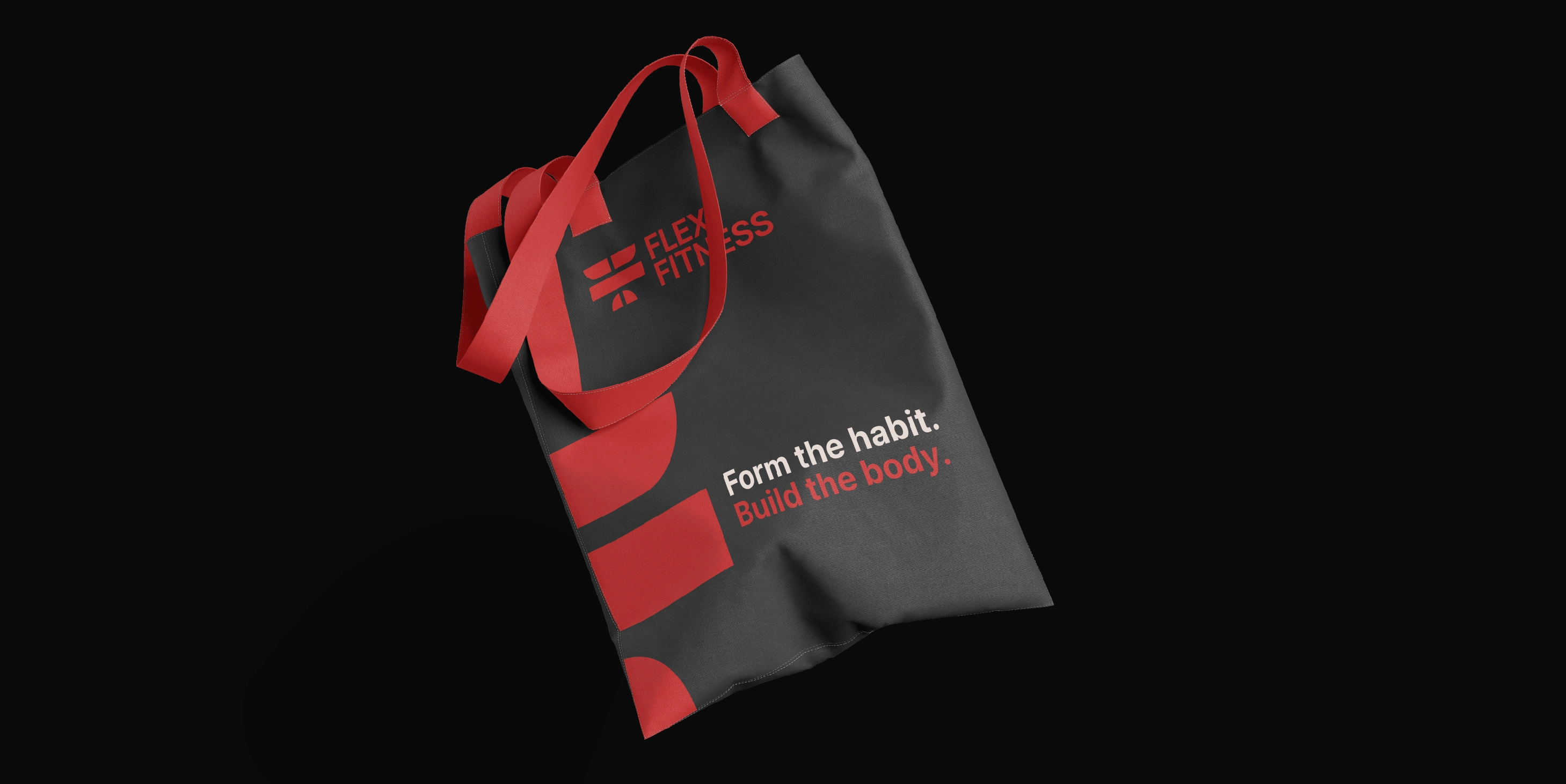
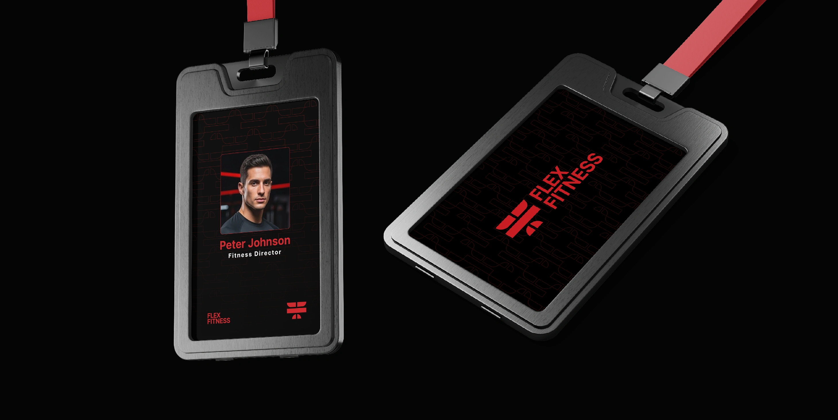
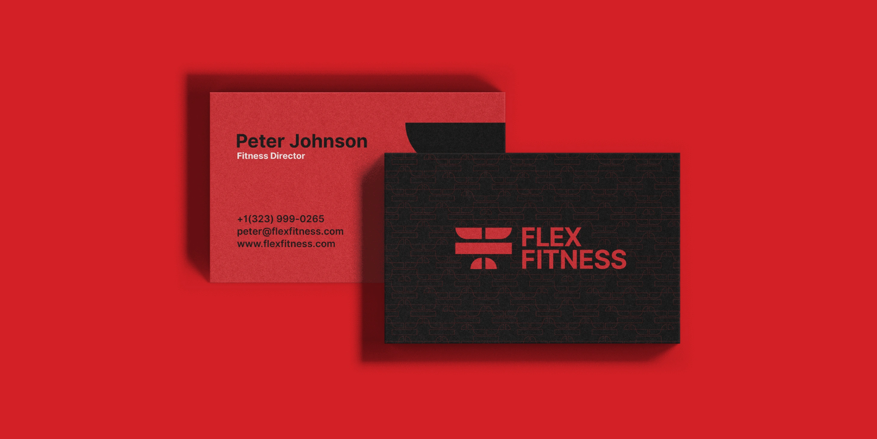
The Flex Fitness pattern is built from the core logo shapes, repeating the mirrored “F” and barbell-inspired forms. It creates a rhythm that reflects movement, discipline, and the steady repetition found in strength training.
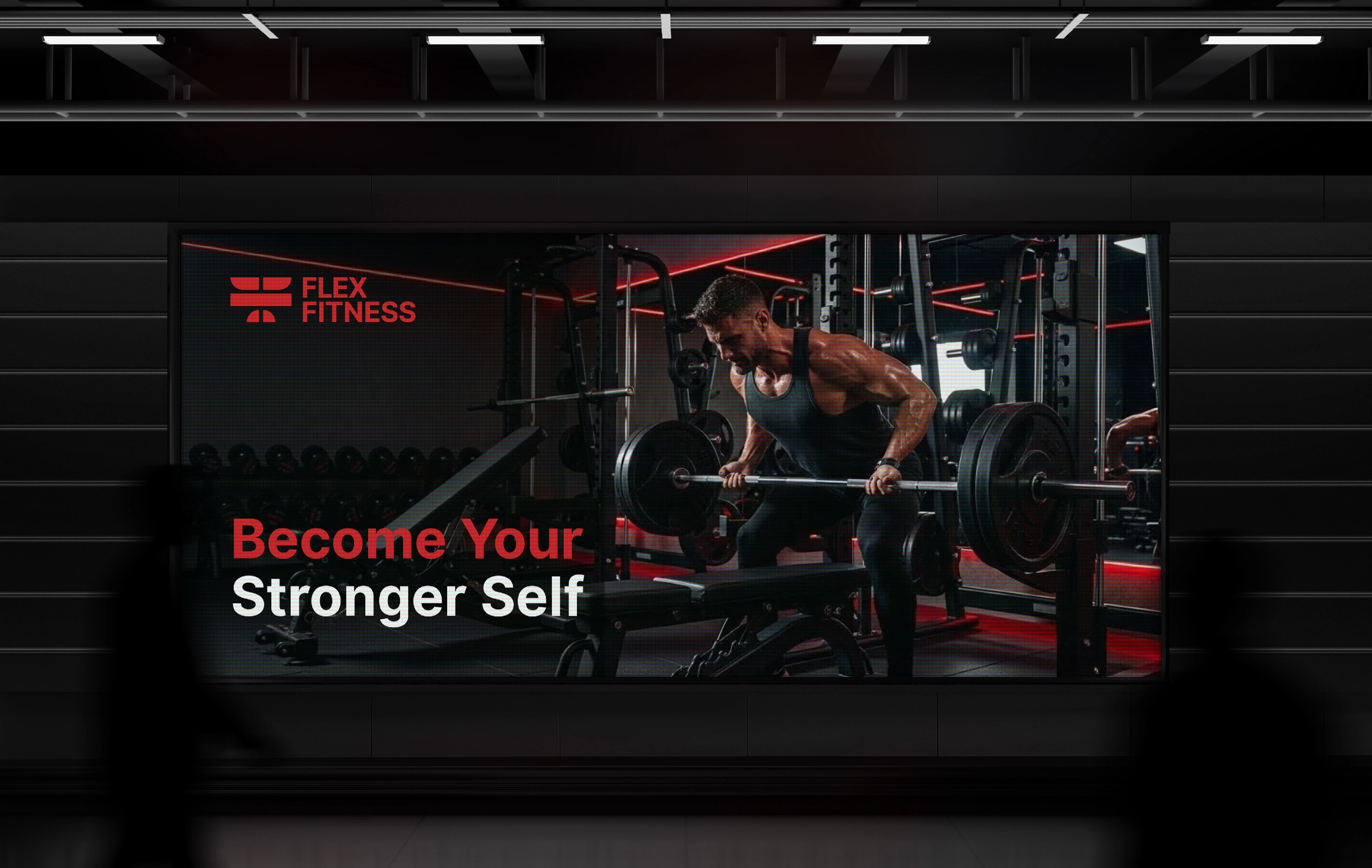
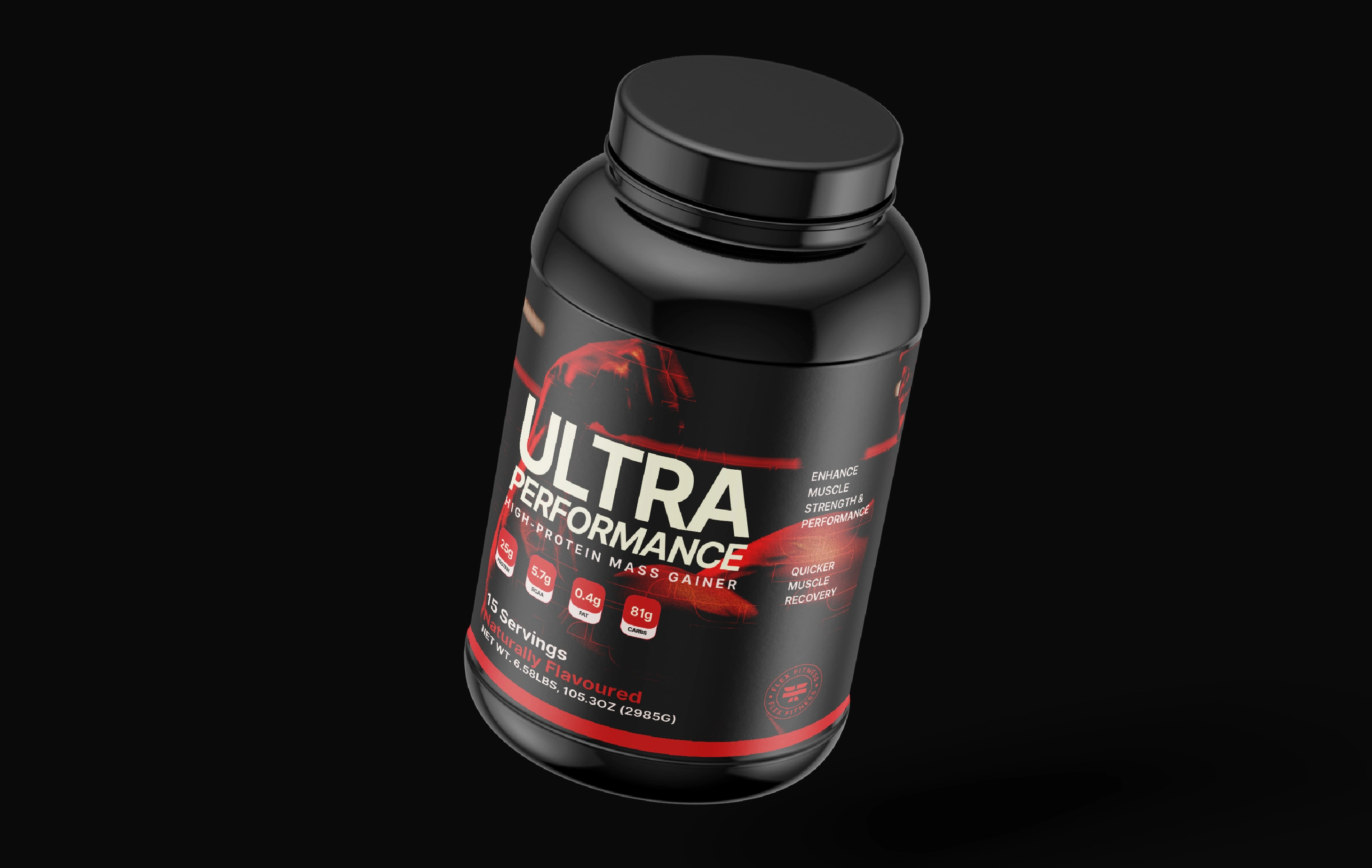
The thin red lines on a deep black background reinforce the brand’s bold, energetic personality.
This pattern becomes a versatile visual asset across touchpoints, adding consistency while carrying the brand’s message of power, focus, and progress.
THANKS FOR VIEWING!
Let’s turn your vision into impact:
Like this project
Posted Sep 21, 2026