Nutheorie: Evolving the User Experience for the Next-Gen Drivers

Anastasiia Barbashyna


Nutheorie: Evolving the User Experience for the Next-Gen Drivers
Let’s be honest. Studying for a driving theory test isn’t exactly thrilling. Pages of dry rules, endless road signs, and tricky multiple-choice questions—it’s the kind of thing people put off until the last minute.
Learning to drive in the Netherlands wasn’t just about memorizing road signs—it was an experience. Nutheorie already had the perfect mix of engaging lessons, humor, and dynamic teaching methods that made studying actually enjoyable.
But what if we could take it further? What if students didn’t just study, but felt the progress—visually, interactively, and with real motivation to keep pushing forward?
That’s where I stepped in. Not to fix, but to elevate.
Impact
At the end of the day, this wasn’t just about improving a product—it was about making learning feel like progress, not a chore.
🚀 Increased repeat test purchases
Gamification wasn’t just a gimmick—it worked. Users kept coming back, eager to level up their cars, improve their scores, and unlock new rewards. More tests taken meant better preparation, stronger engagement, and ultimately, higher success rates.
💳 Checkout friction reduced
Booking an exam used to be a tedious process with too many steps. By streamlining the flow, simplifying date selection, and removing unnecessary fields, we made it effortless. Less confusion, fewer drop-offs, and faster bookings.
🏆 A stronger brand experience
Beyond UX improvements, the entire platform got a visual refresh. A more intuitive homepage, engaging illustrations, and a clean, modern UI finally brought Nutheorie’s high-energy approach to life. The brand no longer just felt functional—it felt exciting.
🔍 The Challenge: Not Just Learning, But Engagement
Nutheorie already had the right vibe. But there was a missing piece — something that would make students want to practice more, book more tests, and actually enjoy the journey.
📌 Here’s what we needed to solve:
🚗 More motivation to keep practicing. The lessons were engaging, but what if practice exams were too?
🛒 A checkout that didn’t feel like a chore. Too many steps. Too much friction. Let’s smooth it out.
📱 A mobile-first experience. Most students were on their phones—so the experience needed to feel effortless there first.
This wasn’t about fixing Nutheorie. It was about amplifying what already worked and making the experience as seamless as the lessons themselves.
🎮 The Learning experience: Gamification meets Upselling
Studying should feel like driving, not a test.
So we gave students cars.
The idea was simple: every test you passed, your car stayed in top condition.
Score 100%? Your ride looks flawless.
80%? Some scratches.
60%? A dented hood.
40% or lower? Flat tires. Shattered glass. Total wreck.
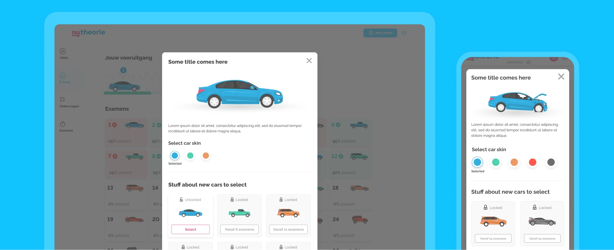
Car unlock/Upsell
And it didn’t stop there.
Want a better car? Unlock it by buying 15 extra practice exams. Now, instead of just seeing a percentage score, users felt their progress—visually, tangibly, and with a little competitive push.
Then came the fuel station.
What’s the point of a car if you can’t keep driving? At the bottom of every test screen, we added a fuel-up option—buying more tests not only unlocked cooler rides (pickups, sports cars, trucks), but also came with bulk discounts. The more you bought, the cheaper each test became.
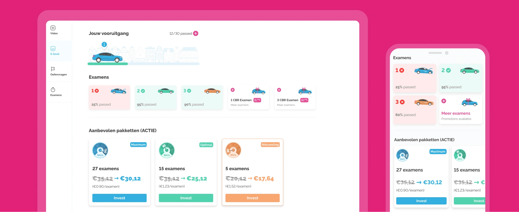
Nutheorie: Driving test exams upsell
And just like that, we turned studying into strategy.
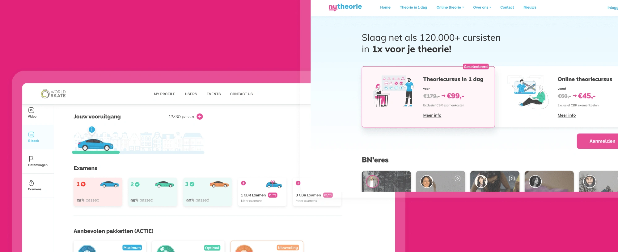
🏠 Reimagining the Homepage: Speak Their Language
Most young people don’t want to spend hours comparing options, reading walls of text, or figuring out a confusing interface. They want clarity, speed, and a visual experience that instantly makes sense.
The old homepage? It wasn’t bad—but it wasn’t built for them.
So we redesigned it from the ground up to match the way young users think and interact online.
🎯 What changed?
More visuals, fewer words. Instead of long descriptions, we introduced clean, bold illustrations that instantly communicated what Nutheorie offered.
Instant course selection. Users could now choose an online or offline course in one click, instead of navigating multiple pages.
Nutheorie: Old vs New Hero UX/UI
By removing friction, making the experience more intuitive, and focusing on visuals over cluttered text, we created a homepage that felt fresh, modern, and built for the people actually using it.
And with a clearer, more engaging entry point—more users clicked through, signed up faster, and spent less time second-guessing.
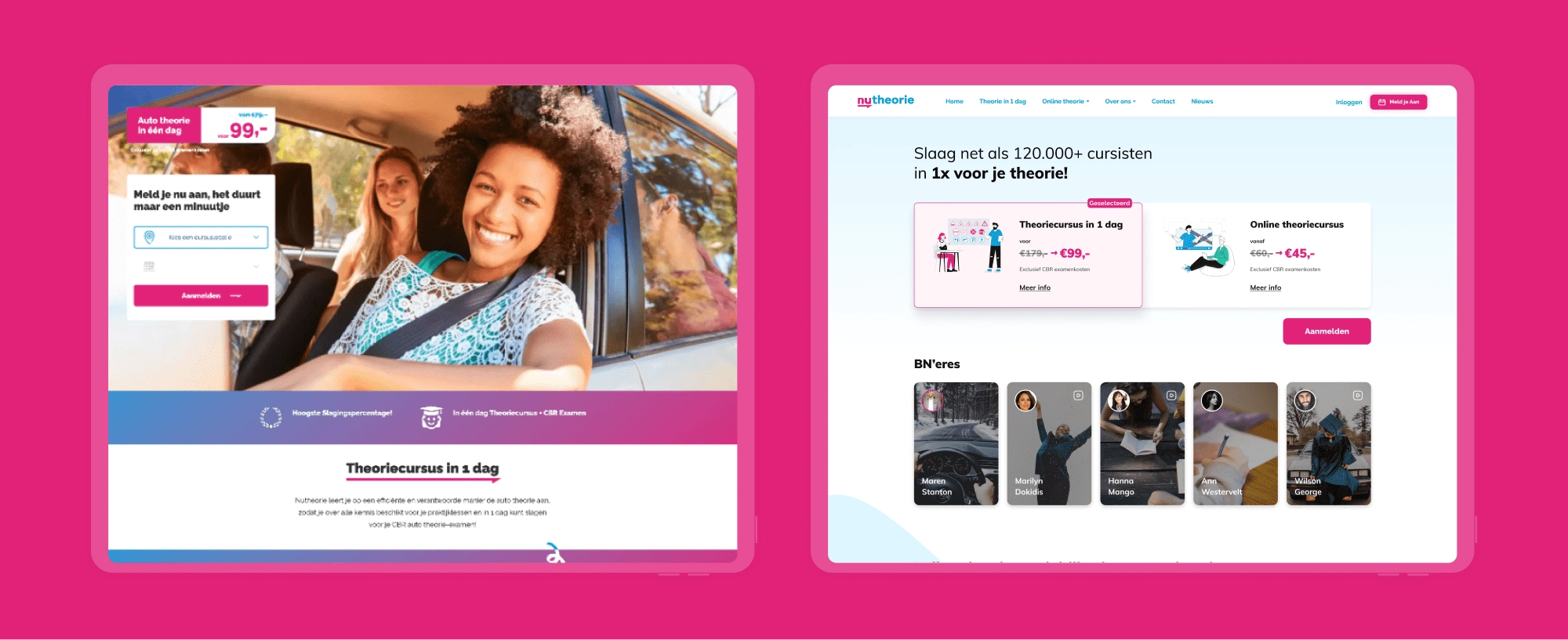
🛒 Checkout: From Tedious to Effortless
Through analyzing user behavior, I identified that most students struggled with selecting an exam date. Instead of making them scroll endlessly, we introduced an automated suggestion system that highlighted the best available options. This reduced cognitive overload and sped up decision-making.
We cut unnecessary fields. No need for users to enter private info they could add later.
We simplified date selection. Instead of overwhelming users with every possible date, we showed only the best available slots.
We redesigned the homepage. Now, users could instantly choose between online or offline courses with one click—removing an extra checkout step.
No distractions. No friction. Just fast, intuitive booking.
Nutheorie: Registration/Check out path. Old vs New
Achievements & Takeaways
This wasn’t just about making things look better—it was about pushing for better experiences in a system that resisted change. Every decision had to be fought for, debated, and justified, and sometimes it felt like an uphill battle. But in the end, that fight was worth it.
Convincing the team to embrace gamification? Not easy. Simplifying checkout when every extra step seemed “necessary”? A challenge.Shifting the homepage focus to what actually mattered for users? Took work. But seeing the final result—a platform that felt natural, smooth, and engaging—that was the real win.
I didn’t just design a UI. I reshaped how users interacted with learning. And I learned something too—good design doesn’t happen in a vacuum. It happens when you push, defend, and prove why every detail matters.
Like this project
Posted Feb 19, 2025
Redesigned the learning experience with a gamification-based upsell and optimized the checkout flow, focusing on mobile-first users.
Likes
0
Views
17


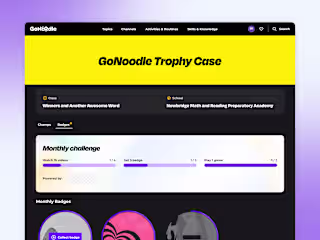
GoNoodle – Gamification System for Kids
SuperNoodle: Crafting a Scalable Brand Design