youth organizing insititute branding.
Victor Morales Becerra
YOI channels energy of bubbling vibrance and curiosity for problem-solving with a flat, clean, and simple visual approach. The YOI brand has a playful essence but should not drift into the realm of childish or cartoon-like. YOI is a grounds for young people to build new futures, engage their communities, share, and accumulate knowledge.
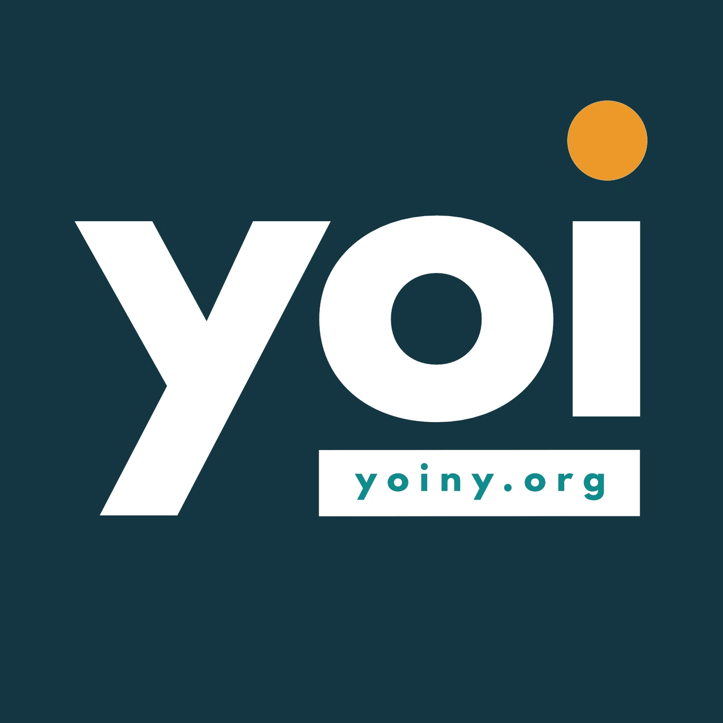
The Youth Organizing Institute logo when used, serves the function of being a stabilizing presence, visually, amongst the other elements on the page. It’s bold typeface and solid colors are simple and solidify the “YOI” brand in the eyes and mind of the viewer.
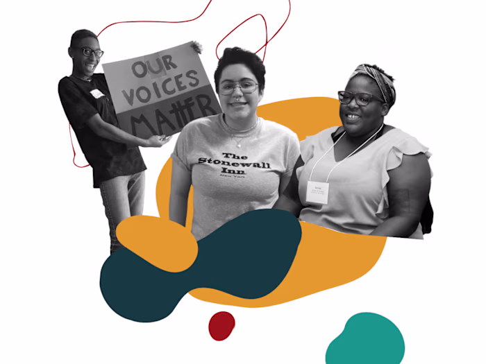
YOI is an organization focused on providing young people with the skills, tools, and knowledge necessary to help them affect their communities and build the futures they want to live in. This constructive visionary narrative behind YOI inspires the use of shapes in the organization’s visual identity.
The shapes you’ll see in YOI branded assets are generally organic shapes and lines—curved, soft, amorphous, spiraling, etc. — as opposed to sharp angles or geometric figures.
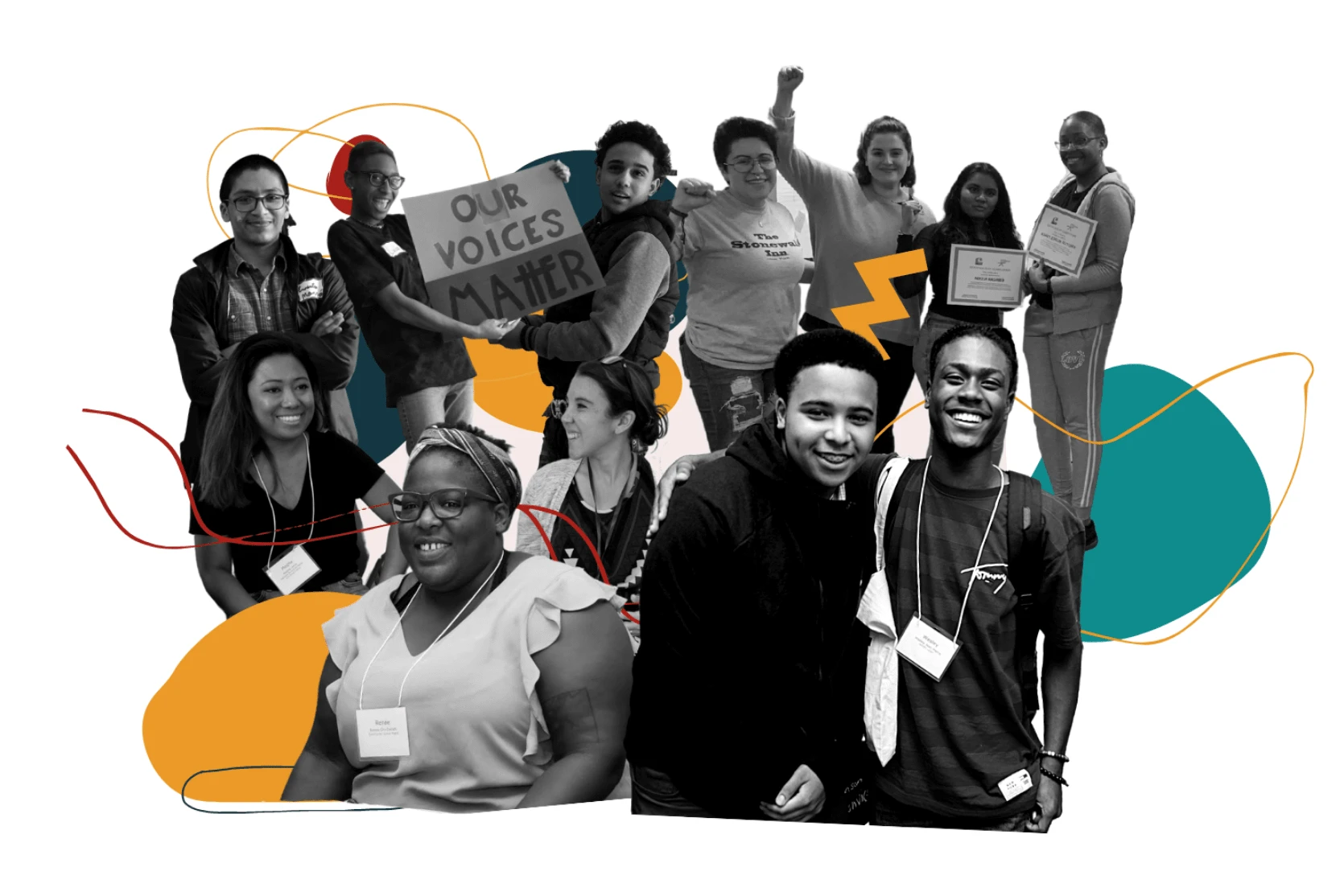
This serves to complement the YOI logo or other boxy/sharp elements, so that when used together, the resulting visuals are not full of harsh angles. Instead we will have a solid ‘grounding’ presence (YOI logo etc.) and the softer, brighter elements brought by the blobs, circles, and lines which might be used in conjunction.
Conceptually, these organic lines and shapes offer a visual representation of the ideas and practice driving YOI— community continually changing/taking shape (circles, blobs, etc.) and exploration, learning and navigating obstacles (lines, spirals, etc.).
Like this project
Posted Aug 5, 2022
yoi is a grounds for young people to build new futures, engage their communities, share, and accumulate knowledge