BrandKit Guideline Template
Crafted Design
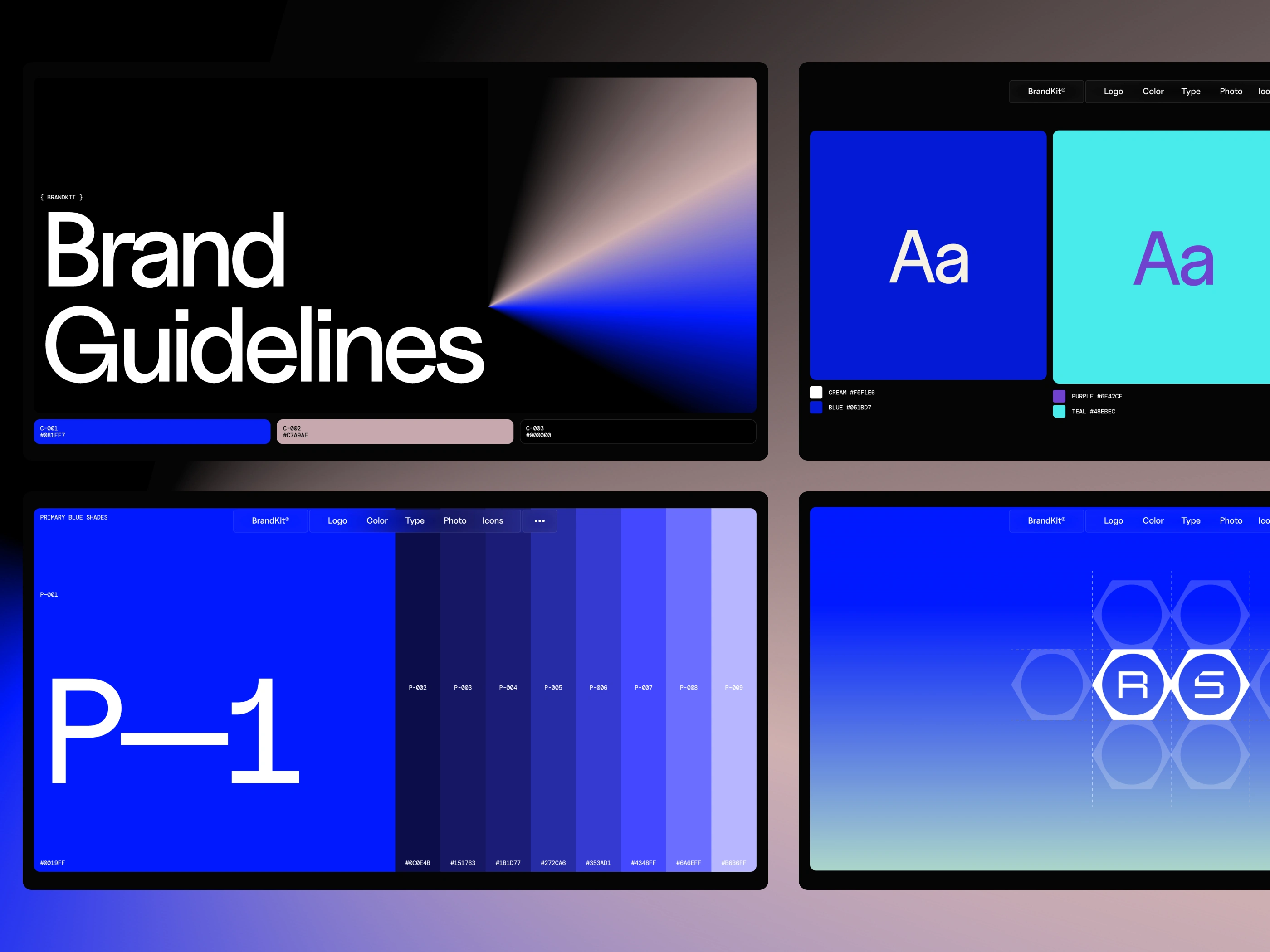
BrandKit®
BrandKit is a modern brand guideline template for Framer—built to help teams organize, document, and share their brand clearly and consistently.
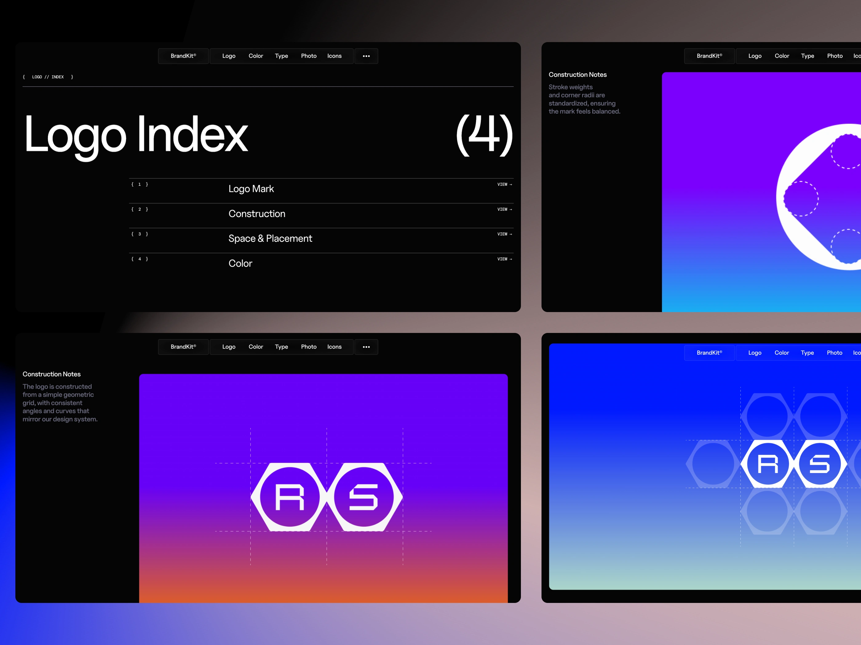
Logo
Our logo is the brand’s most recognizable shortcut—one mark that carries our personality, credibility, and intent at a glance. It should always feel confident and consistent, whether it’s on a tiny app icon, a product label, or a billboard. This section outlines how to use the logo correctly (and when not to), so every touchpoint reinforces the same clear, unmistakable identity.
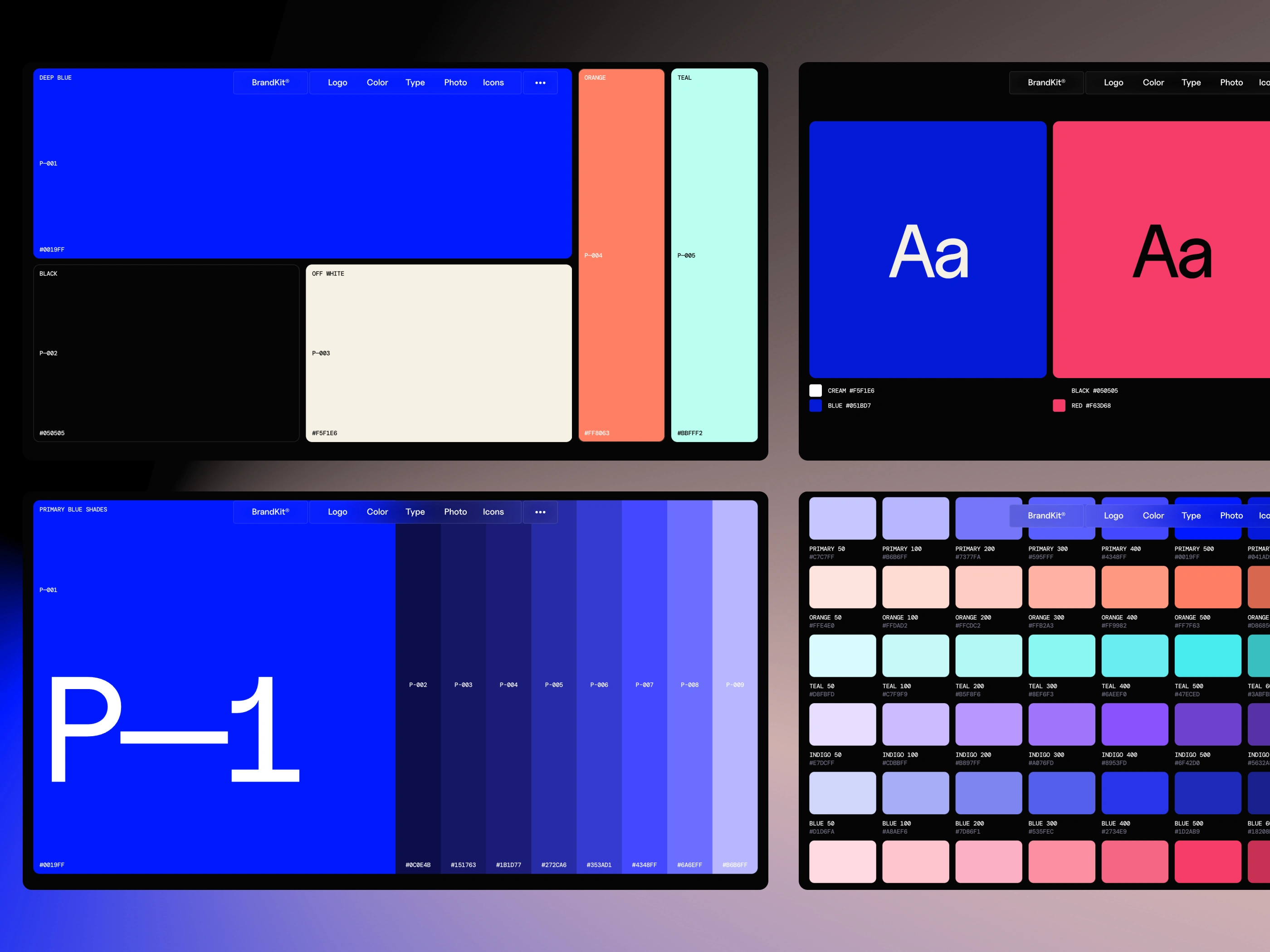
Color
Color is one of the fastest ways our brand is recognized—it sets the mood before a single word is read. Our palette is designed to feel confident and modern: bold enough to stand out, restrained enough to stay timeless. This section defines our core colors, supporting tones, and usage rules so every screen, slide, and surface looks unmistakably like us.
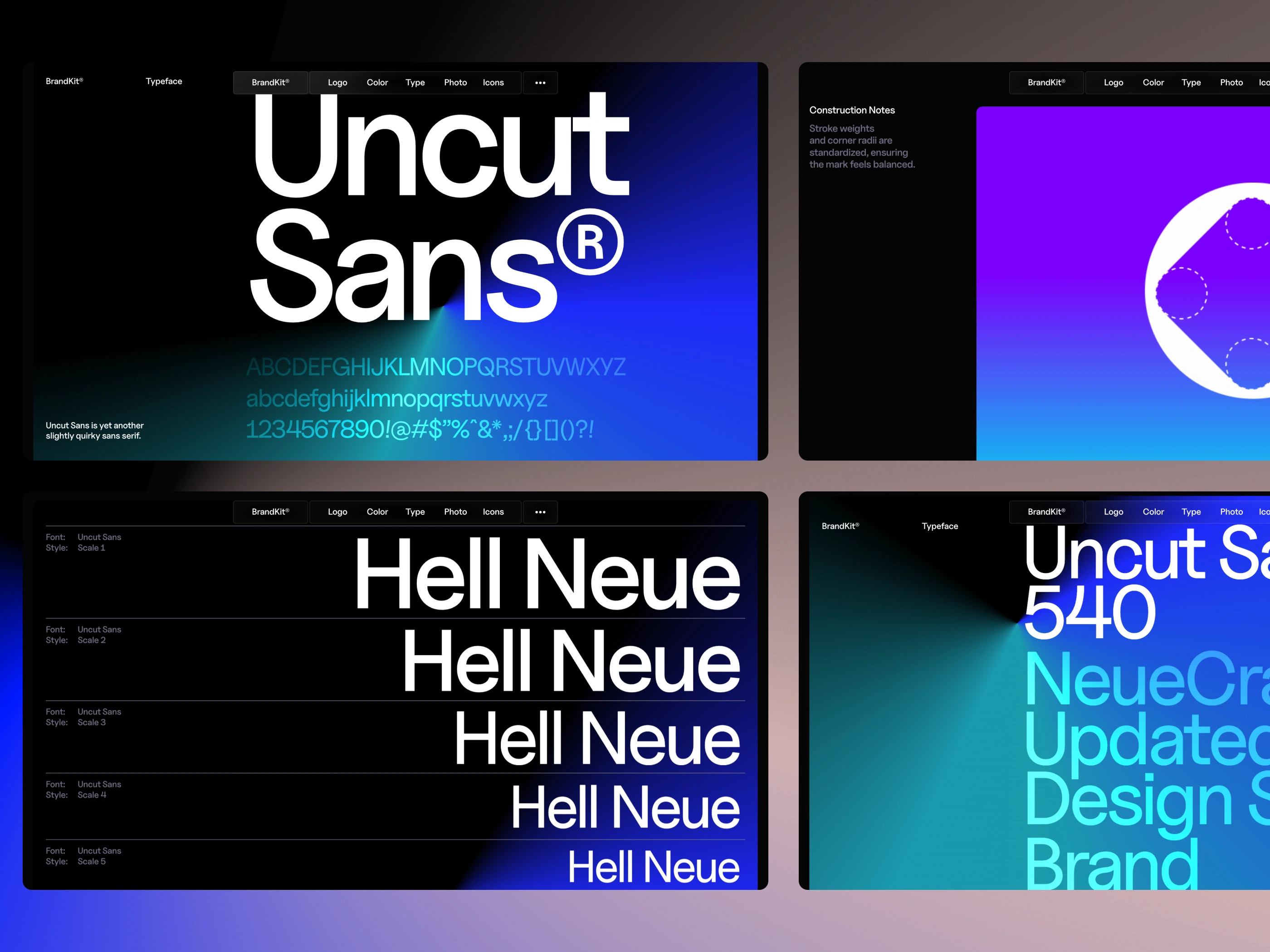
Typography
Typography is the brand’s voice in written form—it shapes how confident, modern, and trustworthy we feel before anyone reads the message. Our type system is built for clarity and character: strong hierarchy, generous spacing, and a calm rhythm that works across product UI, marketing, and long-form content. This section defines our fonts, sizing, and usage rules so every headline and paragraph feels unmistakably on-brand.
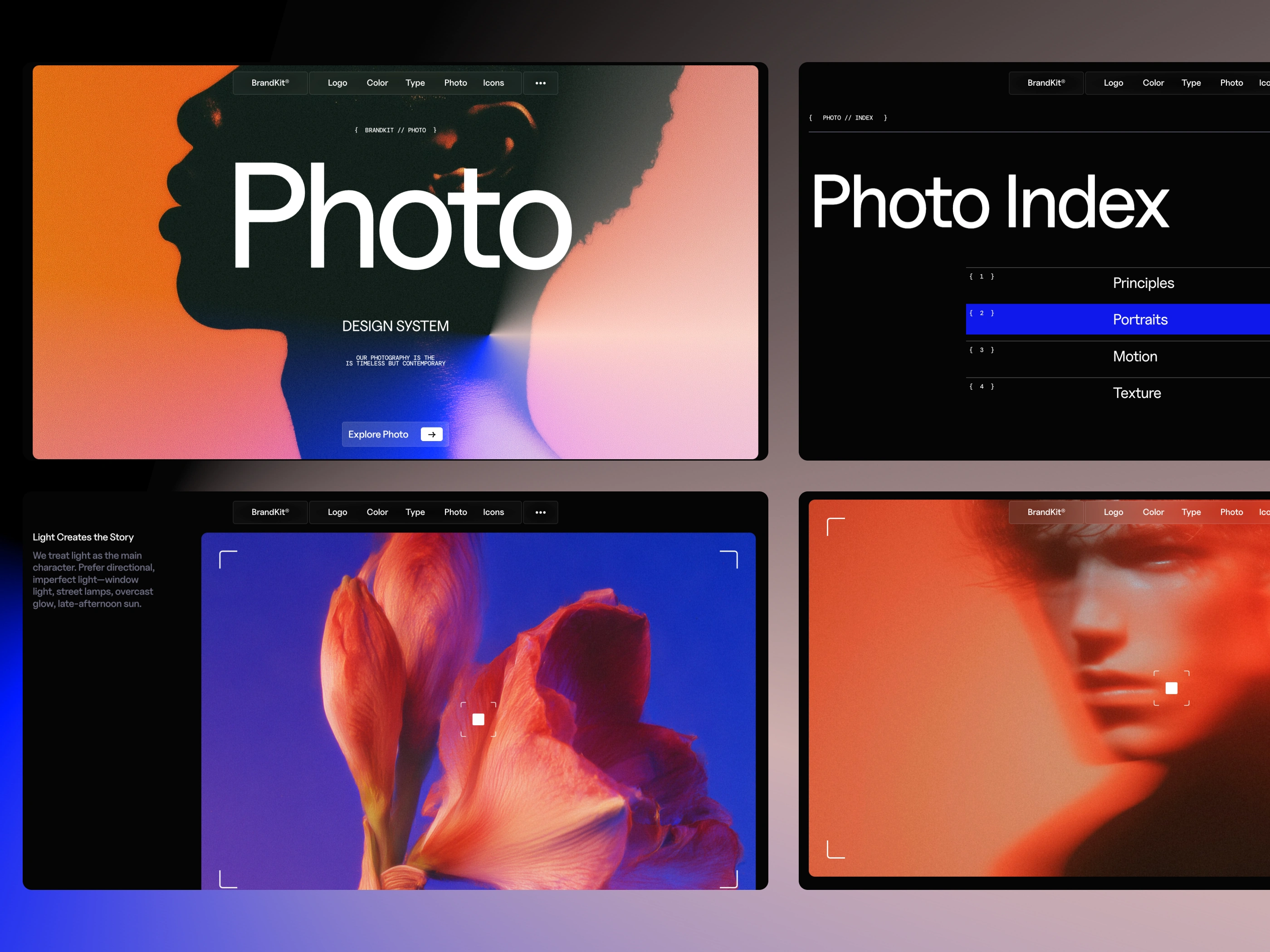
Photography
Photography is where the brand feels most human—it’s how we show mood, texture, and real-world credibility. Our visual style is grounded and intentional: natural light, honest moments, and compositions that feel calm but confident. This section defines the look and principles behind our imagery so every photo—product, people, or place—still feels like it came from the same world.
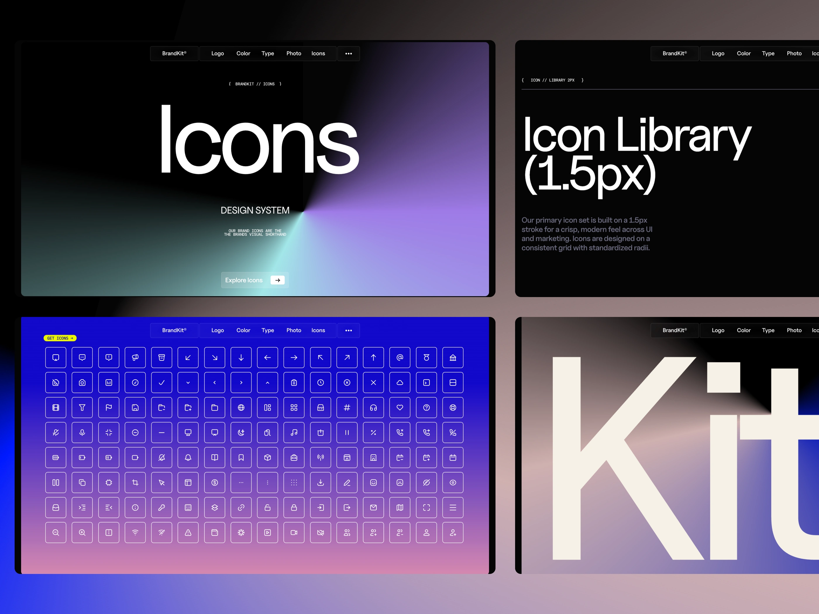
Iconography
Iconography is the brand’s visual shorthand—small symbols that add clarity, speed, and personality without needing explanation. Our icons are designed to feel precise and consistent: simple shapes, confident geometry, and just enough character to be recognizable at a glance. This section defines how icons are drawn and used so they stay cohesive across the product, website, and marketing.
Like this project
Posted Apr 30, 2026
BrandKit is a modern brand guideline template for Framer—built to help teams organize, document, and share their brand clearly and consistently.
Likes
1
Views
2