Illustration | Vector Illustrator for Pillow Brand

Elvira Zakharova


Quiver Pillows Web Illustrations
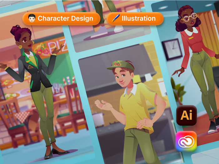
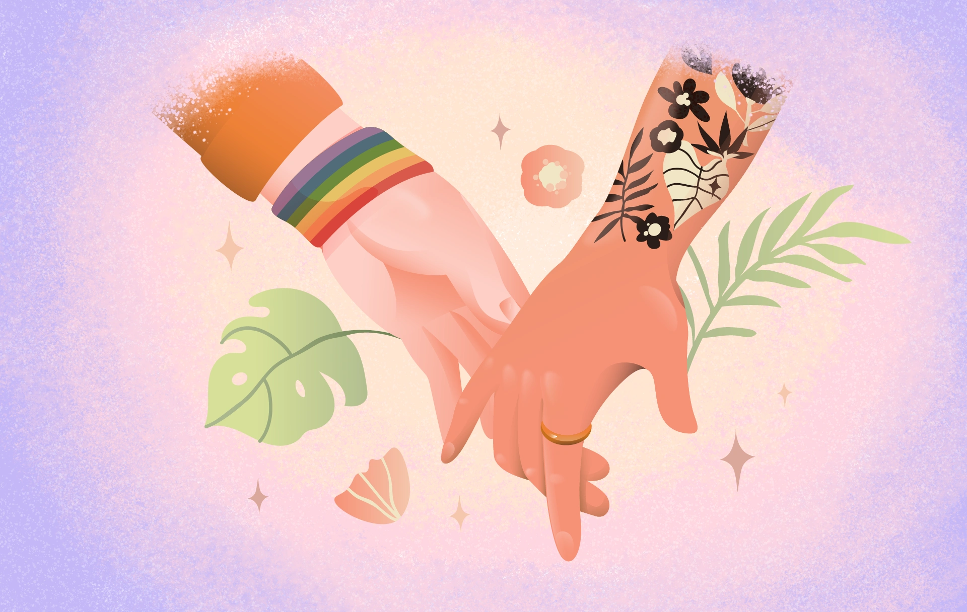
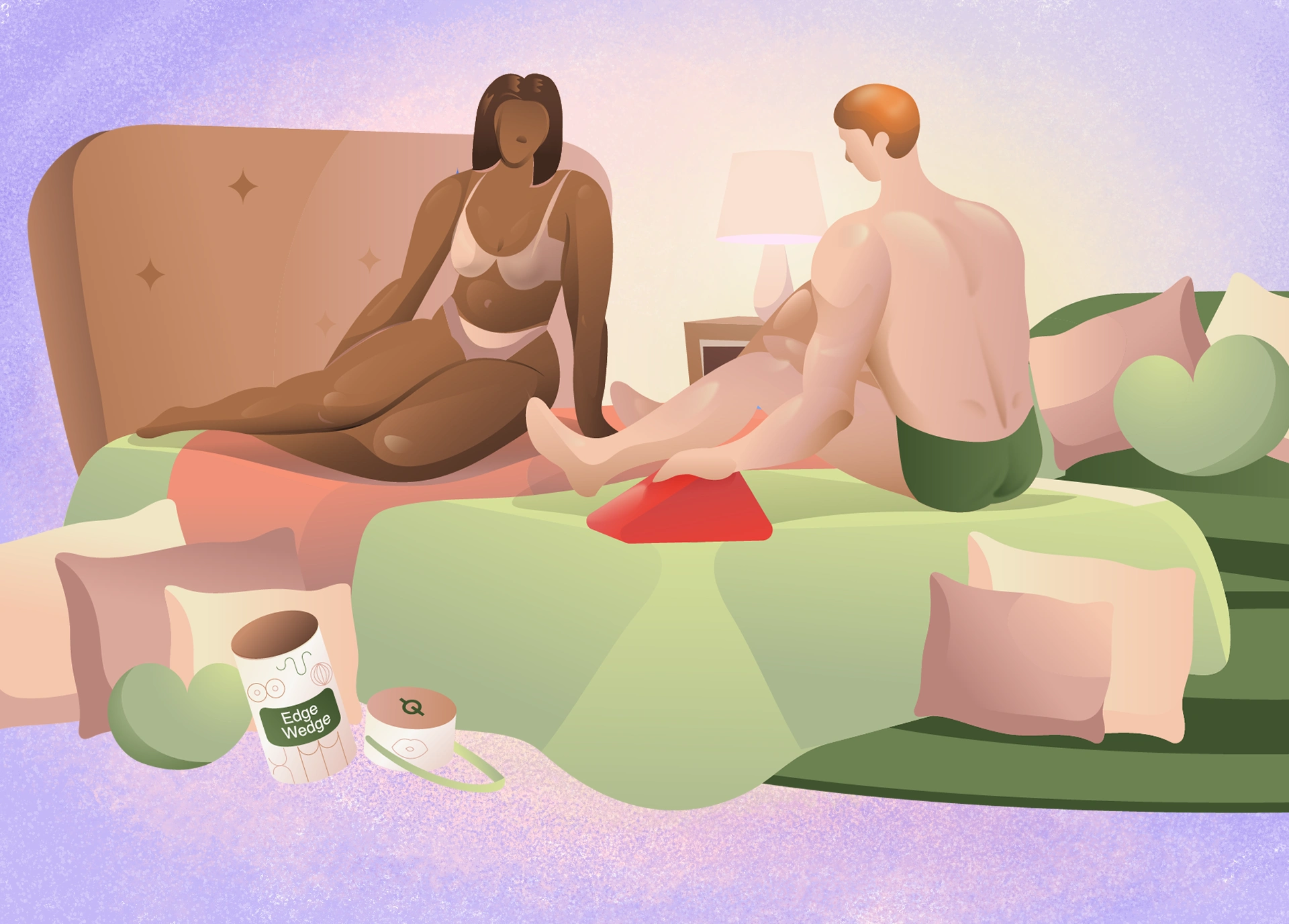
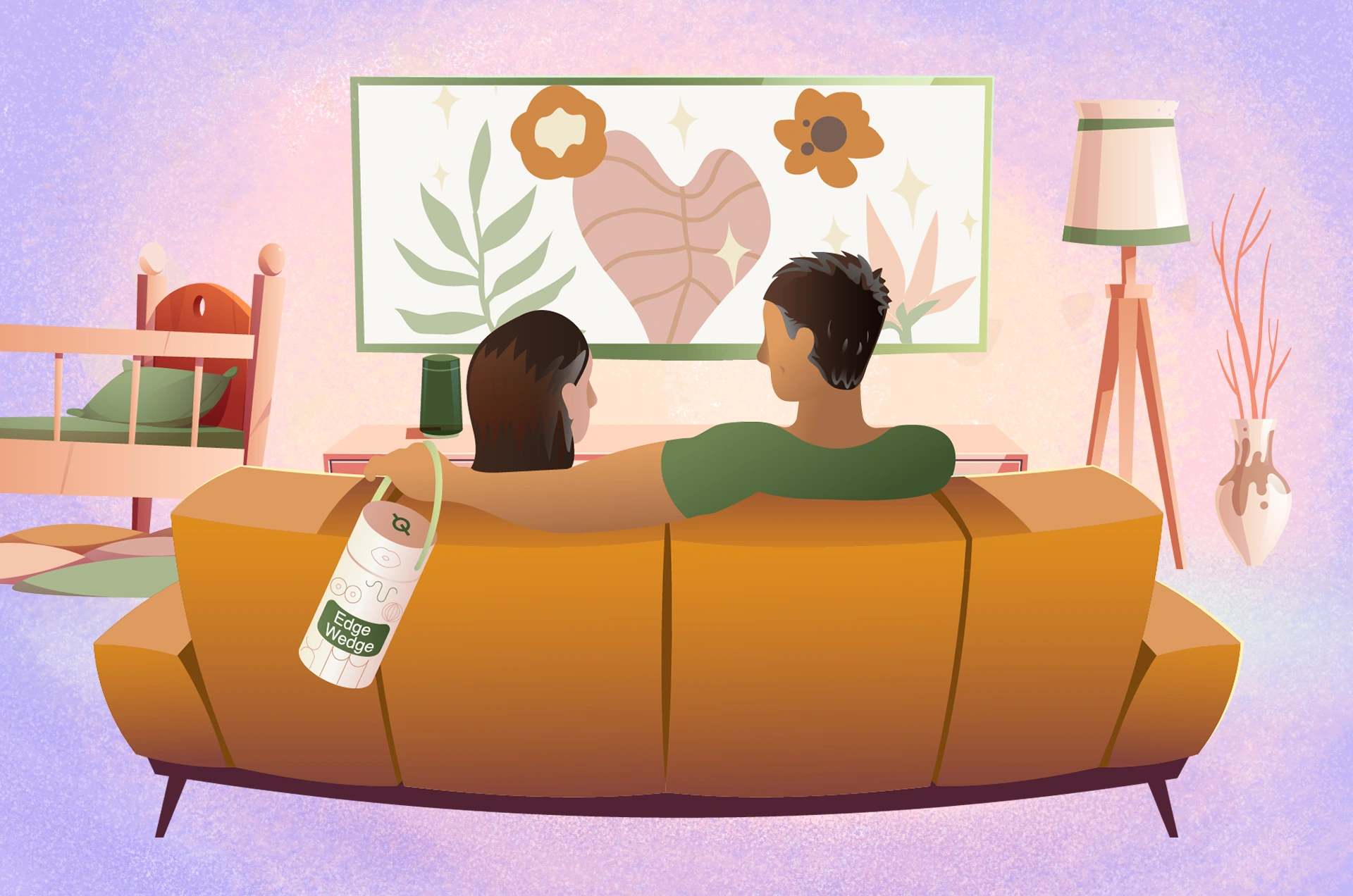
My task was to create a series of clean, character-driven illustrations that demonstrated how to use the products (Pill-Oh! and Edge Wedge) across different couples and settings. Each illustration followed specific brand guidelines for colors and proportions, ensuring consistency with the company’s identity and visibility on both web and mobile. Special attention was given to inclusivity.

Like this project
Posted Aug 5, 2026
Created character illustrations for product use across couples and scenarios, following brand guidelines and optimizing visuals for web, mobile, and animation.