
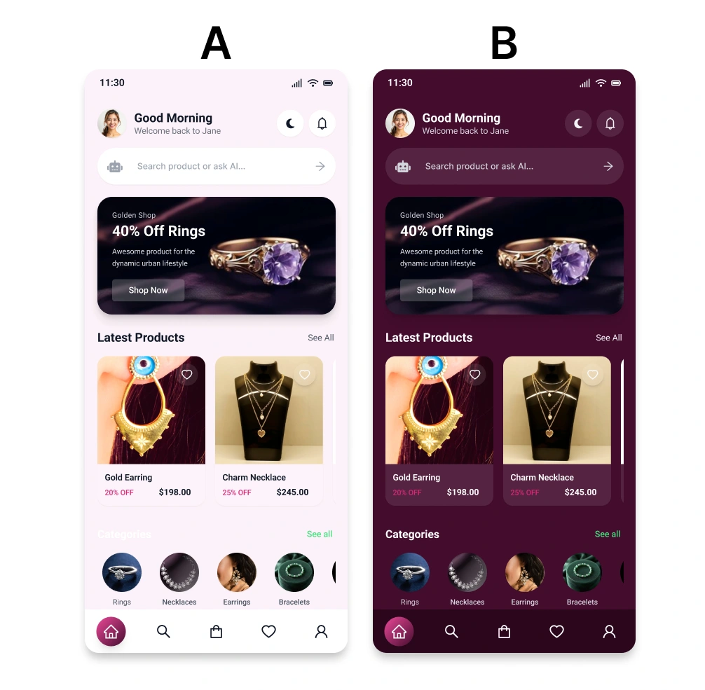
If you were shopping 🛍️for jewelry, which would you choose ?
A — Light Mode 🤍
B — Dark Mode 🖤
And more importantly—why? 👇
Light Mode or Dark Mode — which one would you choose? 👀
I explored two visual directions for the same jewelry e-commerce mobile app to see how color and contrast can change the overall shopping experience.
🤍 Light Mode
→ Soft, elegant & minimal
→ Feels clean and premium
→ Easy to browse products
🖤 Dark Mode
→ Bold & luxurious
→ Creates a more immersive experience
→ Makes jewelry imagery and highlights stand out
The goal wasn't just to make the interface look beautiful.
It was about creating a premium shopping experience while keeping usability, readability, product visibility, and visual hierarchy in mind.
0 likes · 1 view · Sep 22, 2026
If you were shopping 🛍️for jewelry, which would you choose ? A — Light Mode 🤍 B — Dark Mode 🖤 And more importantly—why? 👇 Light Mode or Dark Mode — wh...
