Framer Landing Page Design for Creative Retreat
Lorena Cecilia

The Backstory
This project started with a simple but tricky question:
How do you design a website for a deeply human, in-person experience, without losing clarity, structure, or usability?
The retreat was created for creative women leaders and needed a site that felt calm, welcoming, and intentional. But it also needed to do real work: explain the experience clearly, support decision-making, and guide visitors toward booking.
The risk was leaning too far into “vibes” and ending up with something beautiful, but unclear. So the goal became balance.
My Role
I worked on this project end-to-end, designing and building the site entirely in Framer.
From defining the structure and content flow to designing components, setting up the CMS, and implementing motion, every part of the site was built with usability in mind, not just aesthetics.
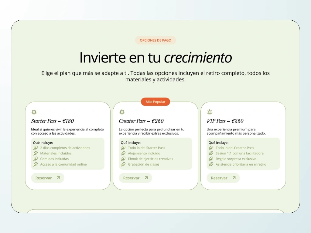
Payment Options Section
Rethinking the Experience
One thing became clear early on: this couldn’t be just a pretty landing page.
The site needed to:
Explain a multi-day experience without overwhelming the user
Create a natural rhythm between storytelling and information
Feel soft and human, while staying structured and easy to navigate
So I treated the project like an event platform rather than a marketing page.
I focused on:
Clear hierarchy and generous spacing to let the content breathe
Modular sections that could evolve as the retreat details changed
A simple, guided flow from discovery → experience → facilitators → booking
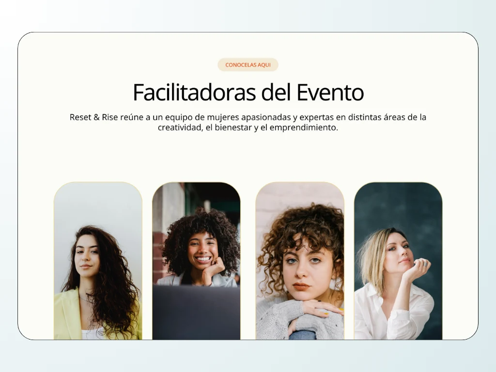
Facilitators Section
Building in Framer
The site was designed and developed entirely in Framer.
Some key decisions:
All layouts and sections were built with custom, reusable components
A CMS-driven facilitators section allows easy updates without touching the layout
Native Framer animations were used sparingly to guide attention and support flow
The site was built responsive-first, ensuring consistency across screen sizes
Performance and simplicity were prioritized over visual excess
The Outcome
The final result is a fun, conversion-focused event website that balances emotion with structure. It clearly communicates the retreat, helping users understand what they’re signing up for.
For me, this project was about restraint as much as creativity. Knowing when to pull back, when to simplify, and when to let the design speak quietly. And that’s what made it work!
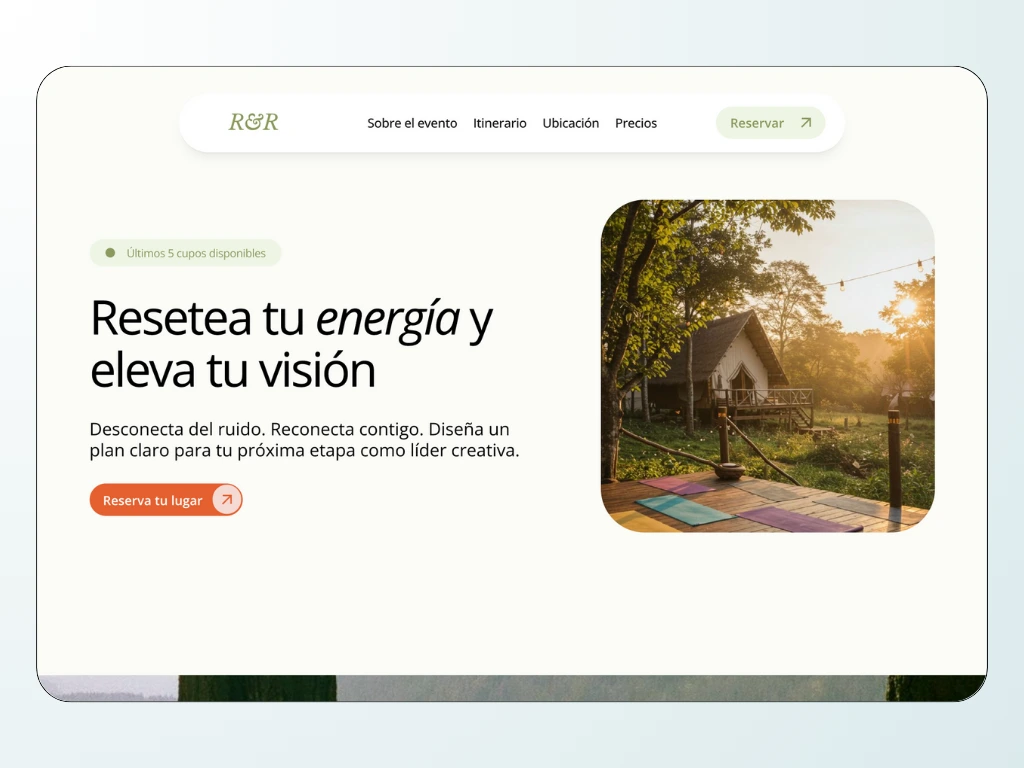
Hero Section
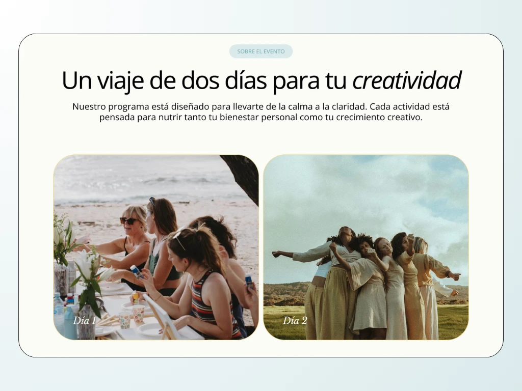
Itinerary Section
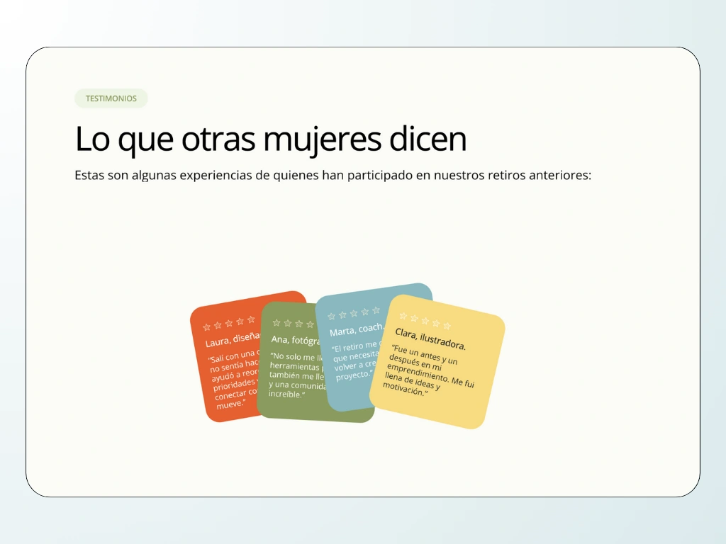
Testimonials Section
Have a project in mind? Let's chat! 💬
Like this project
Posted Nov 3, 2025
From defining the structure to designing components, CMS, and motion, every part of the site was built with usability in mind, not just aesthetics.
Likes
0
Views
5
Timeline
Oct 15, 2025 - Oct 30, 2025