Designing a Framer Website for a Growing Web Studio
Lorena Cecilia
The Backstory
This project started as an exploration around a simple idea:
What should a modern web agency look and feel like when its work is digital-first, product-minded, and deeply focused on quality?
The goal was to design a website for a web design and development studio that needed to communicate trust, technical capability, and clarity, without feeling heavy or overly corporate. The site had to feel confident, modern, and structured, while still being approachable.
My Role
This was a concept project where I worked solo across the entire process.
I was responsible for the structure, visual direction, UI design, and interaction thinking. The focus wasn’t just on how the site looked, but on how it explained what the studio does, how it works, and why it’s different, quickly and clearly.
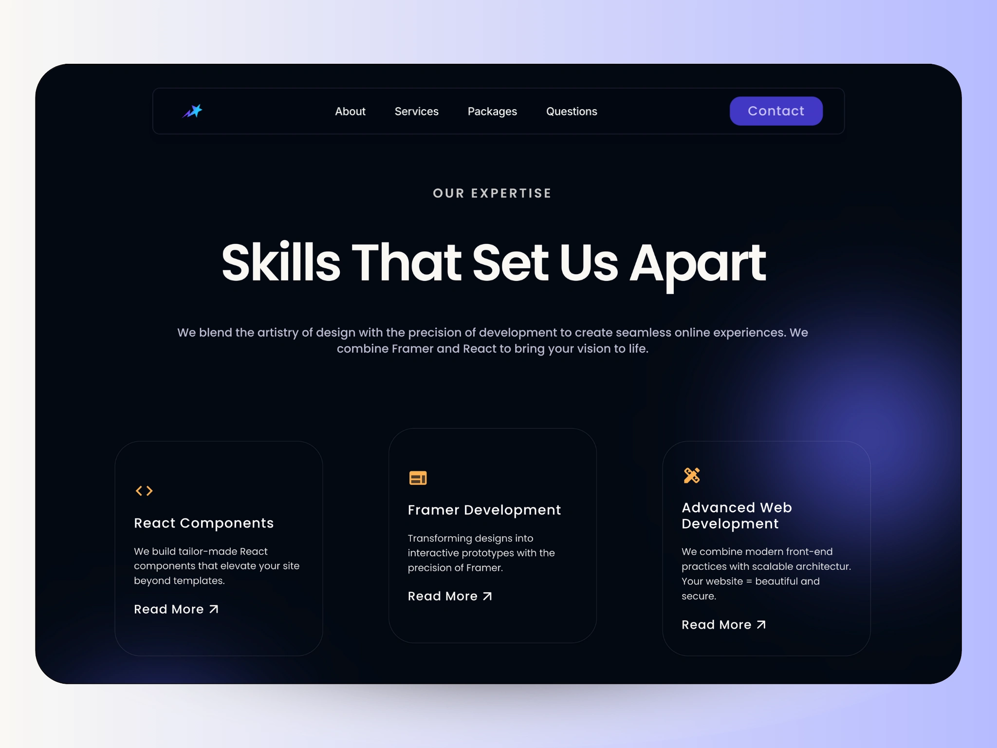
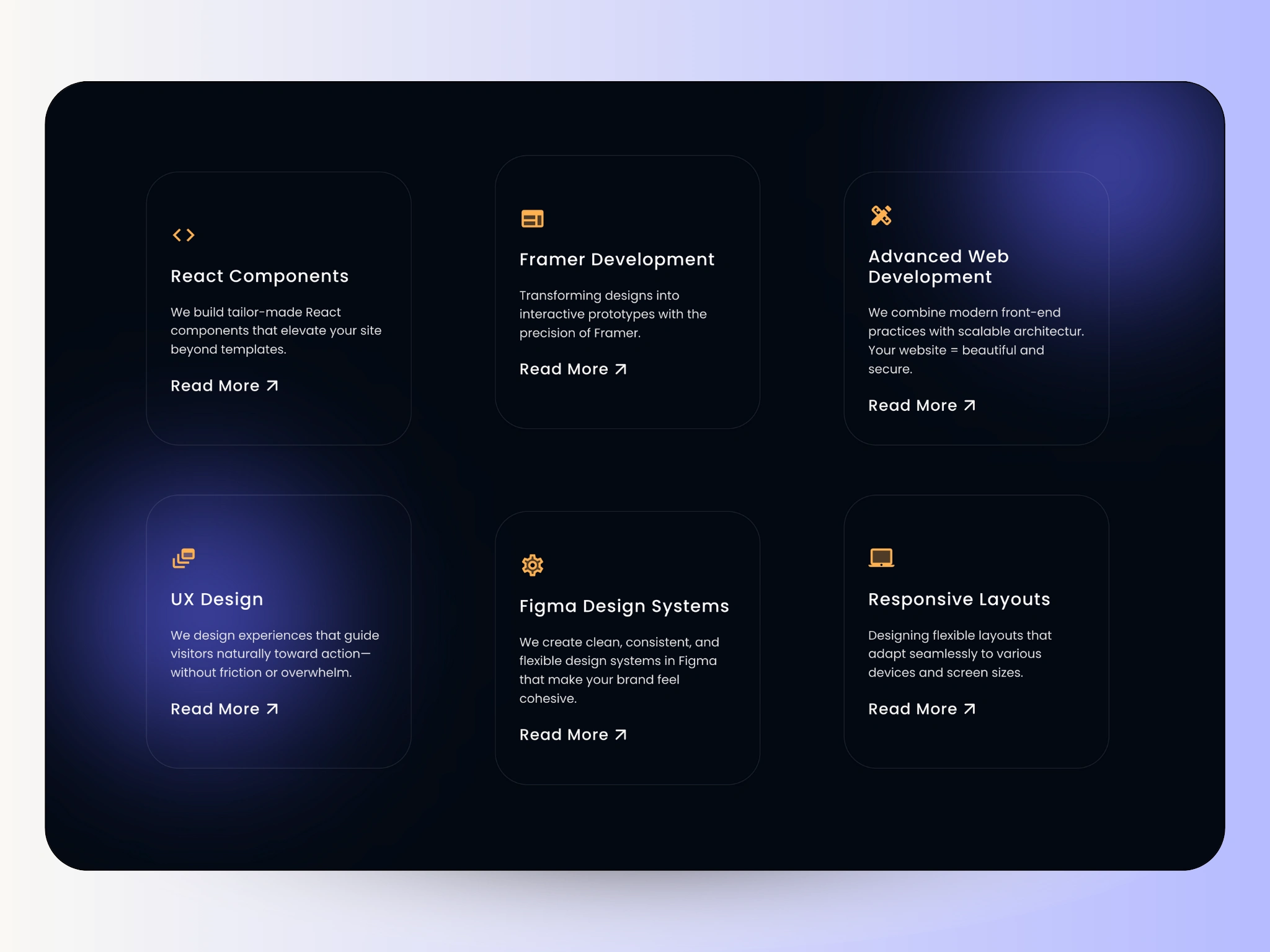
Skills Section
Defining the Structure
One thing I wanted to avoid was the “agency website overload”:
too much copy, too many buzzwords, and no real sense of hierarchy.
So I approached the project like a product site rather than a marketing page.
Key decisions:
A strong, focused hero that clearly states the studio’s value
Modular sections that separate services and capabilities
Content that feels direct and easy to scan
Every section had to earn its place.
Design System & Components
To keep the experience consistent and scalable, I designed the site using a modular component system.
This included:
Reusable UI blocks for services, features, and pricing
A defined color system
Clear typography hierarchy for readability and structure
Card-based layouts to organize complex information
The result was a layout that feels intentional and flexible; built to grow with the studio, not fight against it.
The Outcome
The final result is a clean agency website that communicates credibility, structure, and craft.
This project highlights my approach to designing scalable web experiences, balancing clarity, visual refinement, and usability in a way that feels intentional rather than over-designed.
Final Thoughts
What I enjoyed most about this project was the restraint.
Not adding more, but choosing what to leave out.
Letting structure do the heavy lifting.
And designing something that feels calm, confident, and ready for real use.
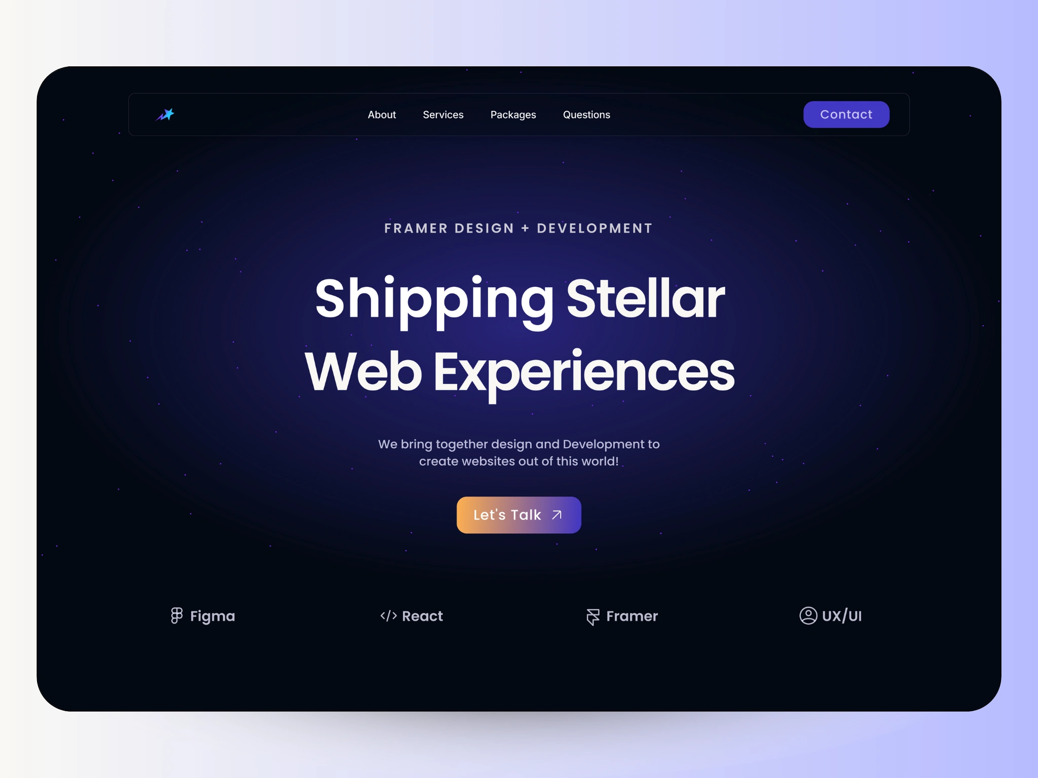
Hero Section
Skills Cards
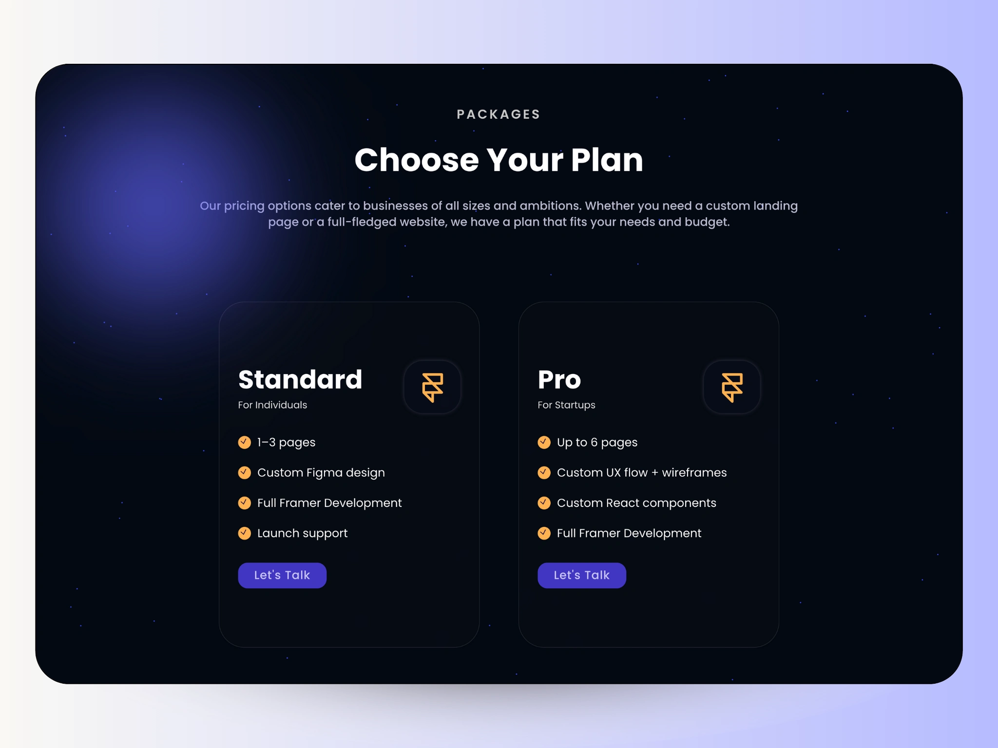
Packages Section
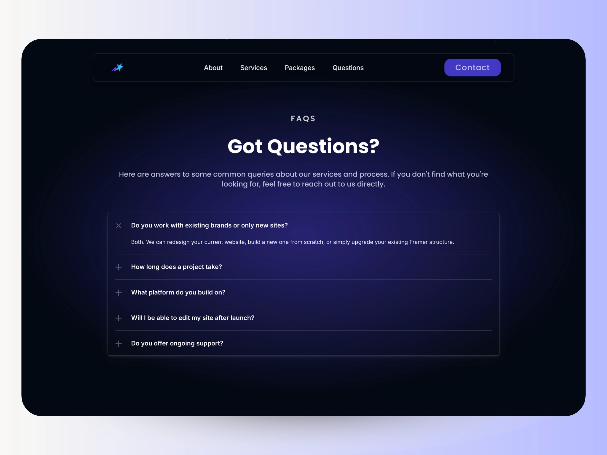
FAQs Section
Have a project in mind? Let's chat! 💬
Like this project
Posted Nov 25, 2025
Framer project that enabled me to design and develop a complete landing page reflecting the agency's identity.
Likes
0
Views
6
Timeline
Nov 11, 2025 - Nov 25, 2025